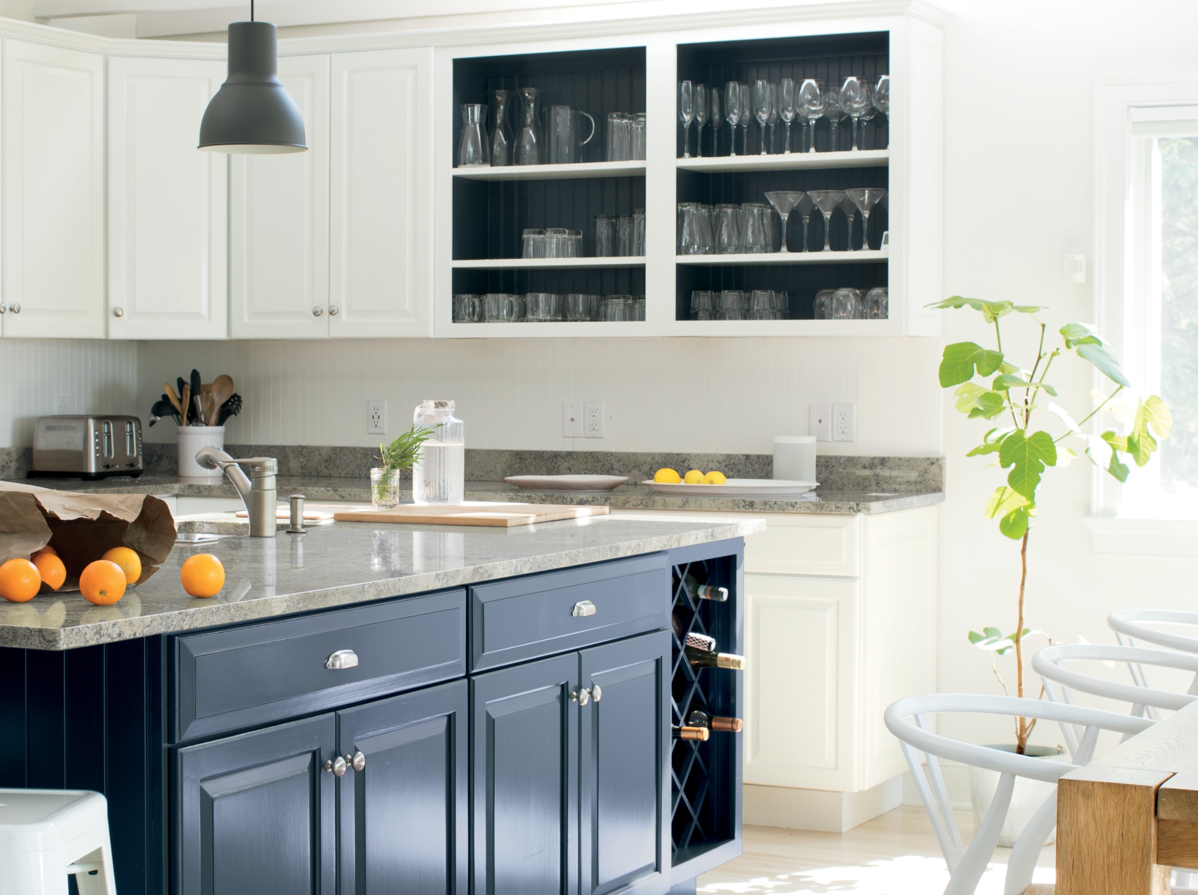
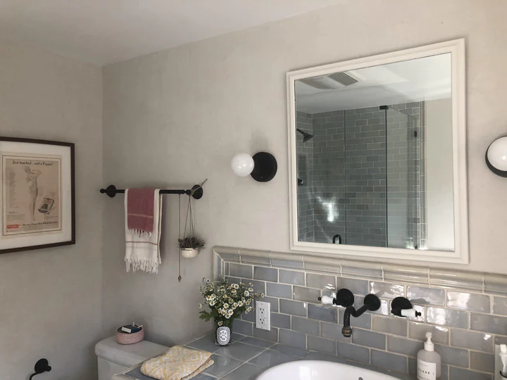
If you’re someone who chooses not to get too tangled up in trends, you need to know the go-to, timeless paint colors that will always look good. While new decorating styles come and go, it’s the appeal of a look that you can rely on to last for years to come that brings a sense of comfort at home. If you choose the right wall paint shade, you can change up furniture and accessories as you please, and the canvas to your space will easily support the shifts in decor.
To make your search for paint ideas easier, we asked four interior designers to share their favorite timeless paints that they go back to time and again to underpin their decorating schemes. If you're looking for color inspiration these trusty shades won't ever age, but don't just take our word for it - here's what the experts have to say.
1. Saint Sauvant by Portola Paints
Portola Paints’ Saint Sauvant is a favorite neutral of interior designer Nate Berkus who is known for his minimalist, ultra-chic, and calming schemes. In a video discussing his go-to neutral paint colors, the esteemed designer mentioned the shade was a personal favorite.
This is a beautiful off-white with a touch of grey and earthy undertones that give it a natural, stoney look. The finish it comes in as standard is Roman clay, smooth to the touch but with a marble-like effect similar to Venetian plaster. It looks great in a modern home as well as in more rustic settings, and the beauty of it is that you can play with the finish. For a more natural, low-sheen look, leave the final coat unsanded.
Price: $28 /1 kilo Roman Clay
An elegant white with a touch of grey, it has a sophisticated stone look.
2. Greek Villa by Sherwin-Williams
Interior designer and Real Housewife of New York star Erin Lichy knows a thing or two about decorating with white. As an expert in getting homes ready for resale, she knows the power of a good white to appeal to the wide majority of people, however, picking the right tone has its challenges, and she urges you to avoid the optical, pure white that's too harsh for a home.
‘Most people prefer light colors but don’t underestimate the power of small differences in tone,' she says. 'In a light room, I won’t use a crisp white, because it will be too harsh like you’re in a gallery, but I’ll introduce a creamier tone, and this can go a long way.' She goes on to say that Sherwin-Williams’ Greek Villa, a warm, sunny white that looks great in natural light, is her go-to.
Price: $89.99 - $95.99 / 1 gallon in Pro Classic
A sunny white will make any room feel warm and bright.
3. Chantilly Lace by Benjamin Moore

For interior designer Cathleen Gruver, one paint shade that consistently takes center stage is Benjamin Moore's Chantilly Lace, a hue that makes a great base for a neutral color scheme. ‘What sets it apart is its unique absence of specific undertones that often characterize other whites, making it a chameleon-like choice that effortlessly complements any existing furnishings or fabrics,’ she says.
‘Beyond its adaptability, Chantilly Lace holds the power to breathe life into any room, effortlessly brightening up spaces and creating a fresh, inviting ambiance,' Cathleen adds. 'Its neutrality becomes an asset, allowing other elements within the home to take the spotlight. This timeless shade emerges as a go-to, providing a canvas for personal expression while maintaining an enduring aesthetic appeal.’
Price: $98.99/ 1 gallon in Aura Interior Paint
This is one of the brand's best-selling, most beautiful whites.
4. Drive-Thru Safari by Backdrop
Interior designer and lover of color, Dabito, considers green a neutral. And if you think about it, as one of the most widely found colors in nature, it makes sense. ‘Currently, I’m into Backdrop, a company that's new to the scene and they have these really beautiful palettes of green,’ Dabito tells me, pointing out Drive-Thru Safari by Backdrop as a softer, more neutral green that can be easily paired with other colors.
‘Green is a very soothing, calming, color to play with. It reminds you of nature, it’s everywhere,’ Dabito explains. ‘Green is one of the colors that I think is so easy and natural. There’s so much versatility. You can go dark for a rich effect, or lighter with a pistachio. Sometimes I have to catch myself if I use it too much.' Try it with colors that go with green for a timeless color palette that will keep your home looking beautiful for years on end.