Whether it's a swatch of paint or a vibrant decorative trinket, each and every decision around interior colors is backed by plenty, and sometimes too much, thought. So why does this practice not translate to design choices around houseplants?
Well, perhaps it's the thought of them being tertiary aspects of an interior vignette. But all you really need to help your plants stand out is to find out what colors go with green. Plus, a little help from color theory will aid you in your color palette curation.
Let's take a closer look at how. And better yet, outline some color pairings based on the depth of green your houseplants are fashioning right now.
How to Use Color Theory to Decorate Around Houseplants

"Houseplants bring life into a room, literally and aesthetically," says interior designer Jen Baxter. "It is one of the easiest ways to transform a room. But not all greens are the same, and the right surrounding palette can enhance their presence dramatically."
So when it comes to using color theory, the key is to properly understand how to use the color wheel in interior design. And don't worry, it's not as complicated as it might first sound.
Simply put, as per the color wheel, the swatches that oppose each other are said to be complementary and offer more visual intrigue. And the colors in close proximity typically come together to create a more cohesive, well-transitioned palette.
Since green is the reigning color amongst indoor gardens, we can infer that red is directly complementary. However, considering transitional colors, we can also identify that blues and well-styled yellows can work, too.
However, there are a couple of cult-favorite color pairings that designers rely on based on the depth of green inking the leaves of your houseplants. So let's break it down.
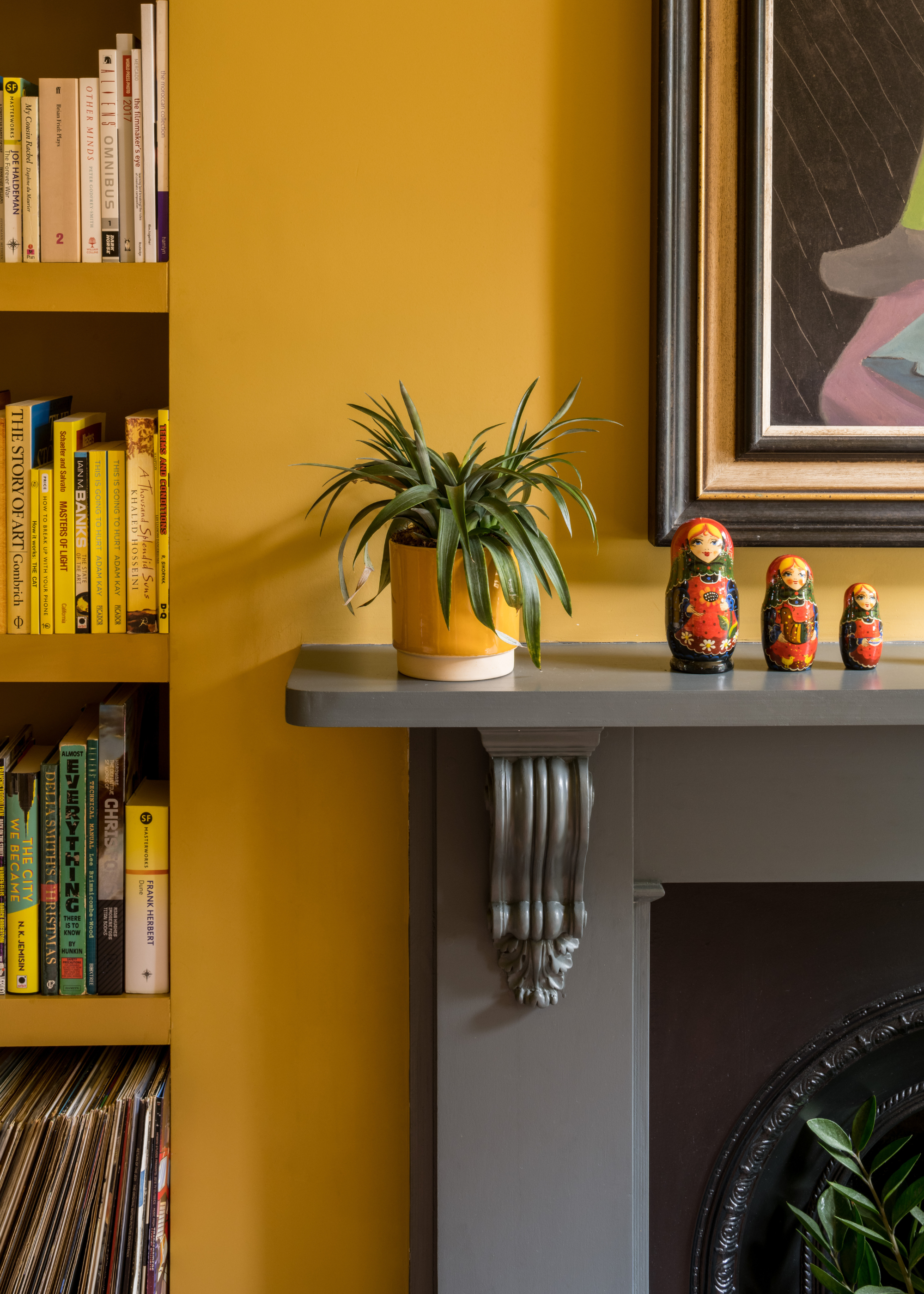
1. Pale and Light Green Plants
"Light green indoor plants, such as neon pothos or lemon-lime philodendron, go well with delicate white, powder blue, and muted pink tones," says Evelina Juzėnaitė, principal designer at Planner 5D.
"These airy, cheerful shades help enhance the freshness of the foliage and create a calming, inspiring atmosphere."
She also explains that light green houseplants look particularly appropriate in minimalist interior design or Scandinavian design, where you want greenery without excessive contrast.
Quantity: 2.5 Litre Tin
This gentle minty blue hue is just the kind of shade that will complement your light green houseplants for a calming color scheme.
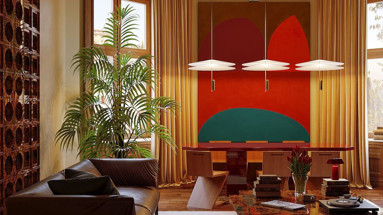
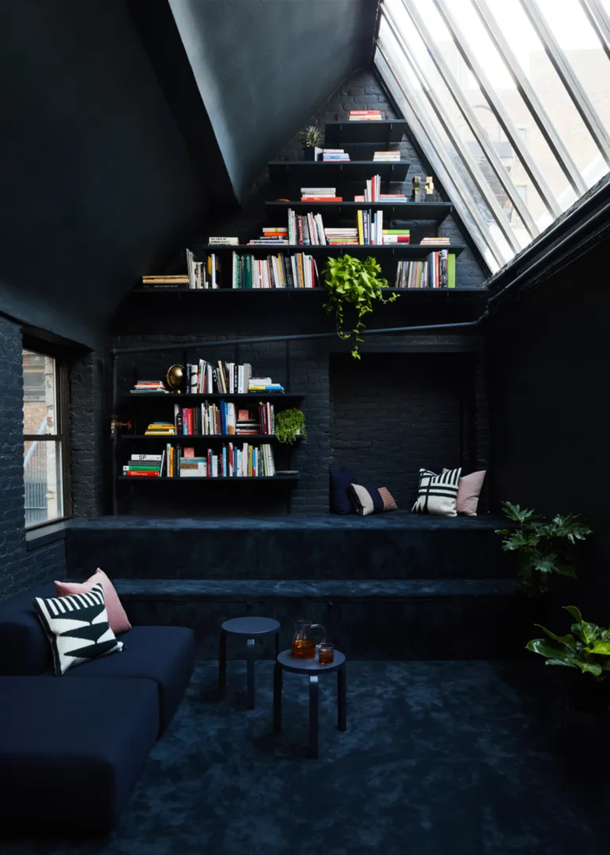
2. Rich, Deep Green Houseplants
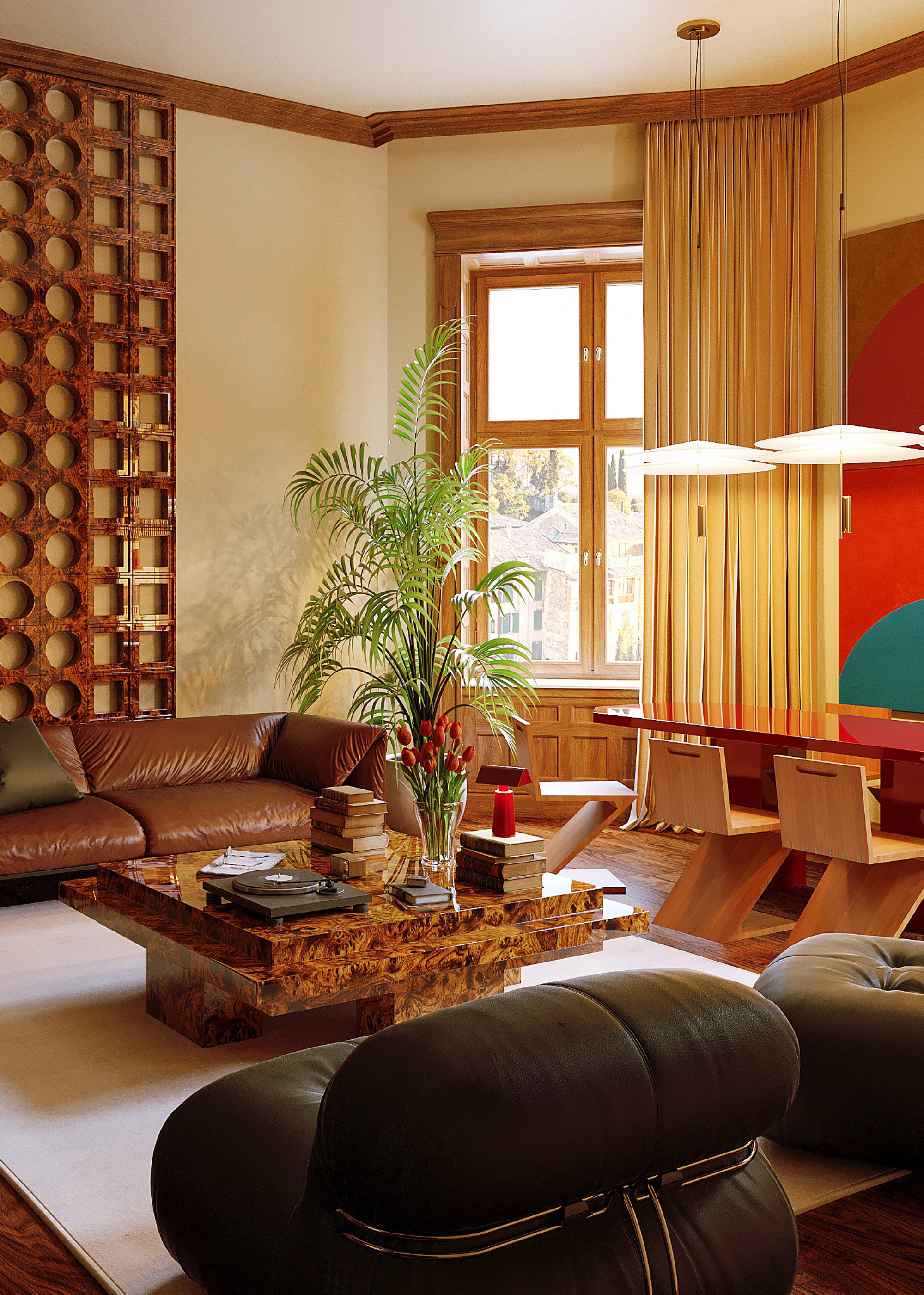
"For deep and slightly zesty green tones from bamboo or tropical foliage, I recommend letting these complex hues pop against a saturated shade of blue," suggests Jen. And if you're going by the color wheel, this palette checks out.
"This rich green and full blue make for a high-contrast color pairing that feels bold and intentional," Jen continues. "You can also introduce art and accessories in black or coral to help balance the palette."
Color: Cobalt Blue
A rich green is deserving of a full blue, so decorating with cobalt blue accents, like this striking Flowerpot Table Lamp, is an excellent choice.
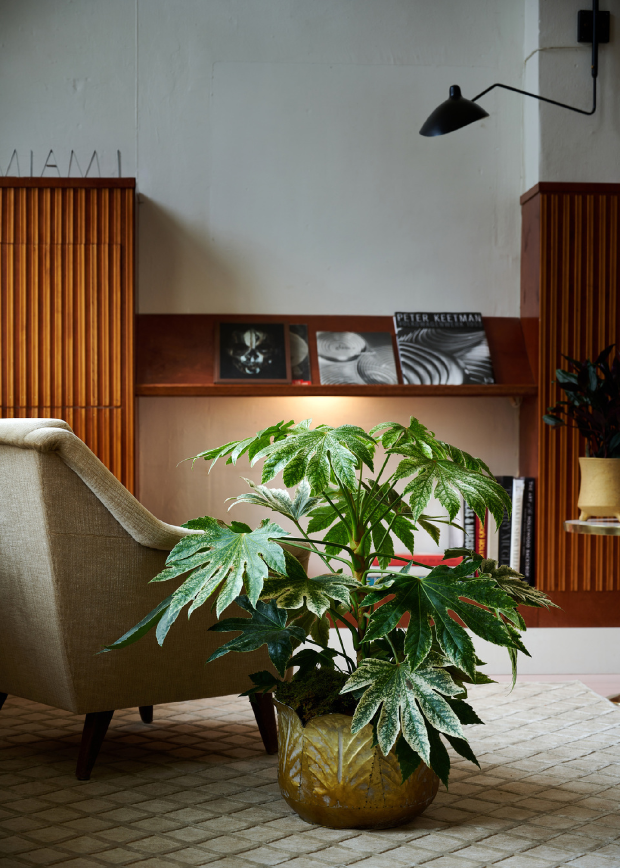
3. Medium Sage and Blue-Green Houseplants
"Medium green leaves, like rubber trees, monstera, or spider plants, are more saturated than lighter variants and less than more complex, enriched hues," says design expert Guillame Drew. And so the color palette surrounding it should feature a similar intensity.
"These look great with earth colors like warm taupe, cinnamon, burnt orange, or ochre," he notes. "Warm taupe with ocher accents will really bring out the richness of the plant without making too much contrast, grounding the room in an earth-inspired color palette."
Color: Ocher
If you have a garden room lush with medium green plants, bring in a gentle ocher rug, like this, to blanket the floor.
4. Chartreuse and Yellow-Green Houseplants
When it comes to houseplants that flourish in colors of chartreuse or yellow-green, such as some varieties of pothos or crotons, Evelina points out that they can be more energetic and striking at first glance.
"To deliberately maintain a sense of brightness, combine them with dark blue, charcoal, or rusty orange," she advises.
"These colors help add brightness and a touch of retro-modern style. Black or white accents can also make the look more expressive and give it a playful, graphic feel."
Color: Navy
This Luxe Linen Blend Cushion is navy in the light and an almost charcoal-y black in a dimmed space, serving up two hues that work with yellow-green plants.
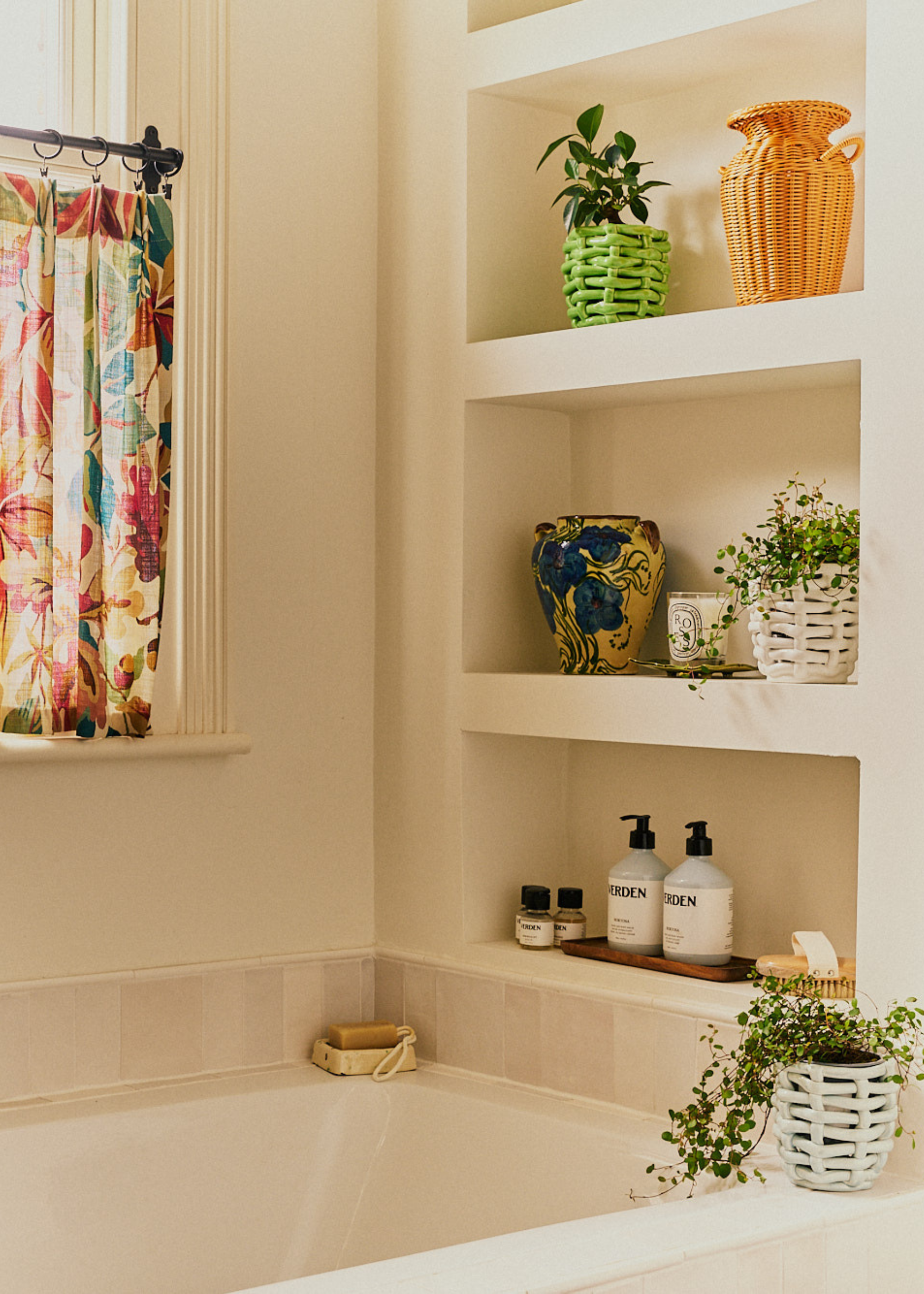
5. Stripey, Variegated Houseplants
If you have a container garden full of variegated plants, with stripes of white, cream, or pale green, Evelina recommends sticking to the theme since they tend to look best when surrounded by soft tones.
"Think warm white walls, cozy rattan furniture, or smooth sage-colored textiles," she recommends.
"The variegated plant patterns create movement and interest all on their own, so the best supporting colors are soft washes that allow the foliage to act as a calming focal point."
Color: Smoked Oak
As per color theory, variegated leaves with dual hues need an equal counterpart of two colors to complement them. And this Pal Stool offers a cool-toned wood and a light rattan weave in one makeshift plant pedestal.
Now, you can navigate the color wheel to organize your ideal plant color scheme. And if you prefer your interiors neutral and your plants bright instead, then here's a guide to the best houseplants to add color.