The best new logos of 2023 so far have been a mix of different approaches, providing plenty of design inspiration. Many of the best new logo designs we've seen have formed parts of rebrands that tapped into nostalgia with a nod to designs of the past. And some of the best new designs we've seen for entirely new brands have also taken a retro approach.
But new logo designs don't all look to the past. We've also seen the application of contemporary colours and some clever use of negative space to create memorable identities. It may be early to start giving out awards, but since we're already nearly three-quarters of the way through the year (no, we can't believe it either), we have plenty of material to start picking out the best new logos we've seen.
Below is our pick of the best new logos, including both rebrands for big names and entirely new brand launches, in no particular order. For more inspiration, see our pick of the best logos overall and the best 21st century logos.
The best new logos
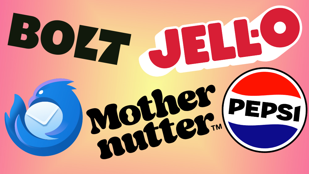
01. The new Pepsi logo
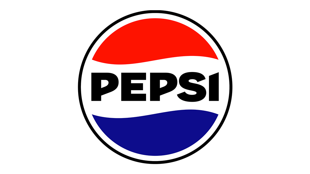
As part of its first major rebrand in 15 years, the new Pepsi logo has a notably retro feel, but it also feels bold and fresh. The brand's iconic 'globe' design has been straightened, and the wordmark (now a bold, upper-case sans serif) has been placed in the centre like it used to be back in the day (the day being from 1962 to 1991). But it's not a carbon(ated) copy of a previous design. The new logo features bold, black text, taking the colour from the brand's Zero Sugar product.
02. The new Nickelodeon logo
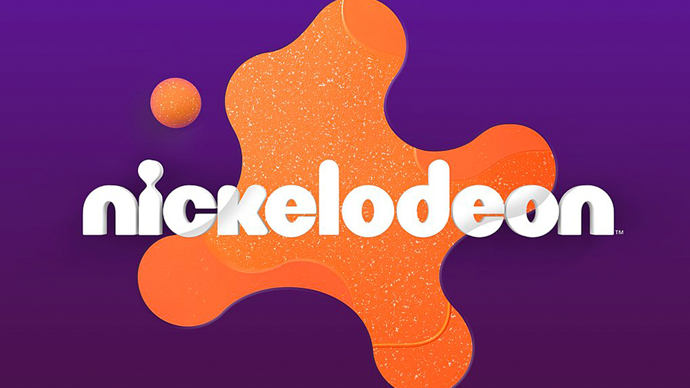
Kids TV channel Nickelodeon made a splash, or rather a splat, with its new logo design, and it's another one that looks back to the past. The channel's first rebrand in 14 years brings back the splat shape from the 1990s but with softer, more rounded and textured for a warmer modern look. Designed by Roger, the new Nickelodeon logo feels vibrant and fun, slightly nostalgic but vital and contemporary, perfectly fitting for the channel.
03. The new Jell-O logo
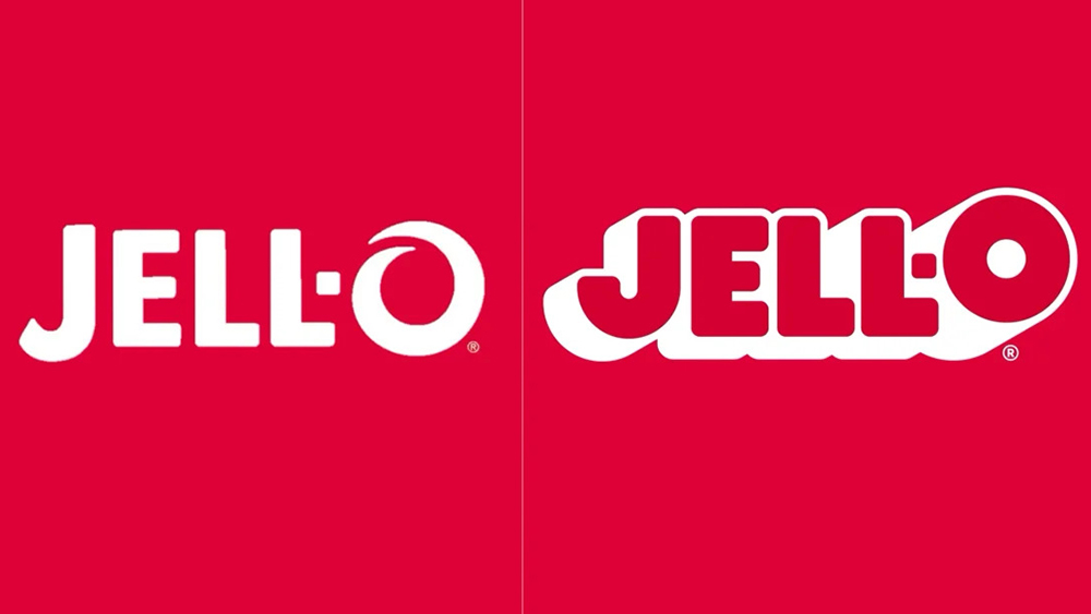
The new Jell-O logo makes it into our pick of the best new logos because of how desperately needed it was. The brand has been in a long decline since its heyday and has long lost its crown as the most popular US dessert. The new look aims to pull things back and make the product stand out better on the shelf by tapping into its nostalgia value while also making it look bolder, with a big fat 'O' and chunky dropshadow. Like the Pepsi logo, it's one of those new logos that manages to look retro but also more modern at the same time.
04. The Mozilla Thunderbird logo
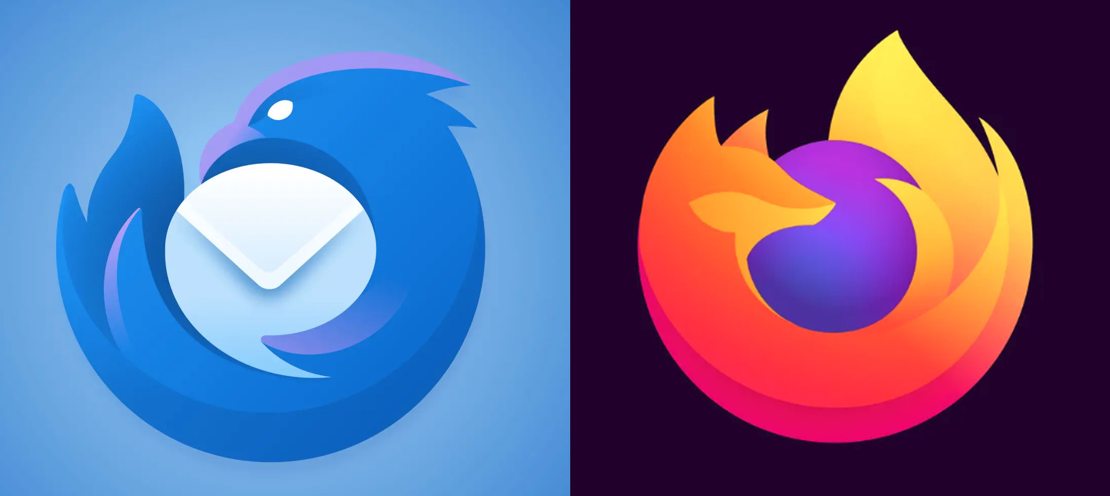
The new logo for Mozilla's email client Thunderbird is clever, streamlined and well aligned with Mozilla's better known product, its Firefox browser. The eponymous bird is now tightly curled up around an envelope and looks less passive than before. People have made fun of Mozilla's progressive simplification of the Firefox logo, but this one is a winner. We have fire and air; Mozilla just needs to find a product to represent earth and water and it will have all the elements.
05. The Mother Nutter logo
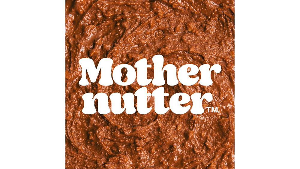
Most of our picks for the best new logos are redesigns for existing brands, but here's a completely new brand that made an impression. The peanut butter brand Mothernutter has a funky, psychedelic logo with a tasty little Easter egg lurking in the negative space. Created by Analogue, the 70s-inspired type fits in with the wider visual identity, and the peanut inside the 'o' is a lovely bonus.
06. The new Bolt logo
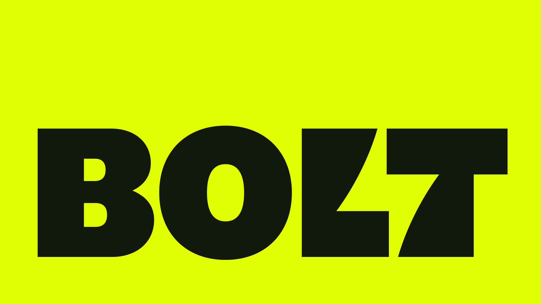
Speaking of clever uses of negative space, we loved this new logo for the fintech Bolt. In a decision that brings to mind the FedEx logo, the negative space between the 'l' and the 't' provides a clever visual representation of the brand in the form of a lightning bolt. The brand name and logo aim to represent the speed and efficiency of its checkout process, and the theme of electricity is echoed in the new colour palette with its bright yellow-green.
07. The new Glassdoor logo
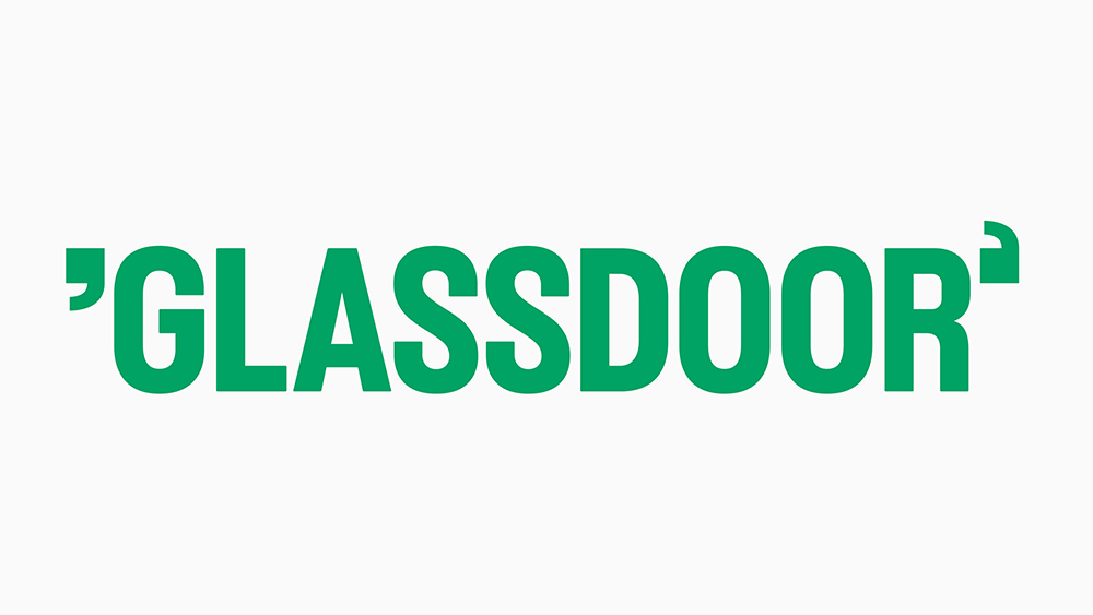
And here's another new logo with a little design secret – and it's the work of the same agency, Koto. We were a little unsure about this one at first since the 'hidden secret' looks like a mistake at first. The opening quotation mark around Glassdoor appears to be the wrong way around. But it's no mistake, that's intentional so that the quotation marks represent a 'g' and a 'd', standing in for the brand name.
In the wider branding, it starts to make more sense because the quotation marks are used to pull out quotes from users' reviews of employers, which is part of what the recruitment site is known for. The typeface is a custom sans serif, Glassdoor Sans, designed by Giulia Boggio.
08. The De-extinction logo
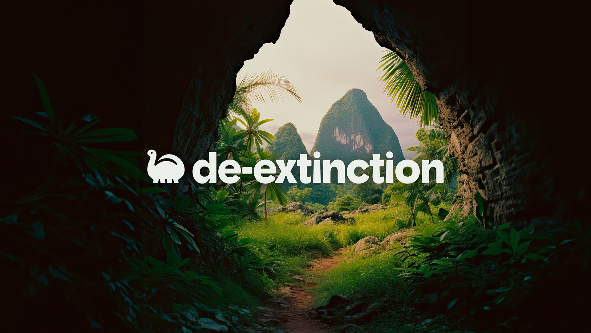
We include this new logo as an example of how breaking the mould can create a memorable identity. Eco-friendly packaging may be important but its branding doesn't tend to be very exciting, most usually recycling (sorry) the same tropes and the usual green colour palette. But Koto's work for De-extinction take a much more fun approach with a cute dinosaur in a rounded, childlike style. The playfulness conveys a rebellious spirit while the dinosaur makes a link to the serious issue of extinction and the need to make environmentally conscious choices.
09. The Sundance Film Festival logo
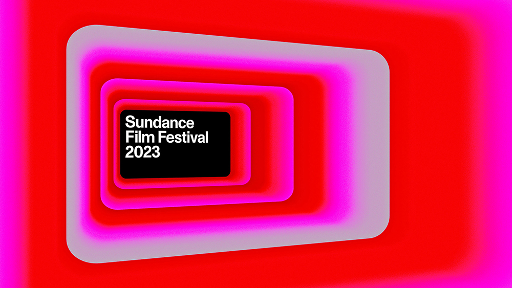
The new logo for the Sundance Film Festival looks very simple compared to some of the designs on our list, but despite its simplicity, it also packs in very relevant symbolism. The proportions of the horizontal rectangle were chosen to represent the standard cinematic widescreen aspect ratio of 16:9.
Okay, so the logo's just a cinema screen? Well, yes. But this is a logo design that shows the importance of considering the whole branding system since it works as a much broader resource, serving as a framing device, like the screen itself, for footage, stills from the festival archive and even film titles on cinema marquees. Designed by New York creative agency Porto Rocha, it uses Monument Grotesk as the typeface, making an impact while being neutral enough to fit diverse genres and titles.
And what about the worst new logo designs? Well Elon Musk's Twitter rebrand as X has been raising eyebrows, along with the slightly ambiguous logo for his new company xAI. The new Air India logo seems to be confusing people, the new Jaguar Land Rover logo makes it look like a company in a totally different sector and the new Nokia logo reminds us of another controversial recent rebrand.