The US culture war is getting very weird. After the Sydney Sweeney American Eagle ad debacle, the latest controversy is.... strange. On the face of it, the new Cracker Barrel logo is a routine modern rebranding, simplifying an out-dated identity to make it cleaner and more versatile. But the move has incensed right-wing figures, including president Donald Trump's son.
"WTF is wrong with Cracker Barrel?" Donald Trump the Younger asked on X about the new logo. It's called graphic design, Don. Read Creative Bloq, and you'll learn all about it.
WTF is wrong with @CrackerBarrel??! https://t.co/LkYB5N34QiAugust 20, 2025
If you're not familiar with Cracker Barrel (I can't say I am, and I suspect Donald Trump Jnr might not be either), it's a chain of over 600 Southern-themed US restaurants present in 44 states. And it's suddenly very controversial because it's modernised its design.
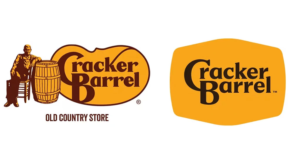
Cracker Barrel's old logo featured a man sitting on a chair beside the company name, which was wrapped inside a shape that was apparently supposed to resemble a pinto bean. In the '20 surprising facts about Cracker Barrel' on its website, the brand says the logo was created by Nashville designer Bill Holley on a napkin (it had to be) in 1977 “with the goal of creating a feeling of nostalgia with an old-timer wearing overalls”.
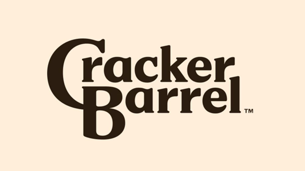
The design's been tweaked a few times over the years, but the new identity is the first to drop the anonymous 'old-timer'. The new identity is part of a broader rebrand. It takes the barrel and turns it into a versatile abstract motif that can be used as a background for various applications, including for a cleaner, modernised logotype. The colour palette has also been refined, although it keeps the classic mustard and brown.
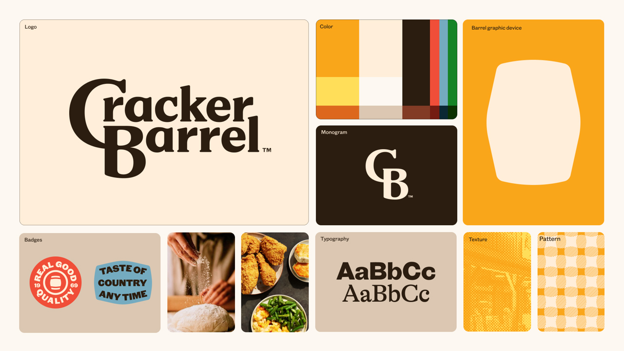
According to Cracker Barrel, the new identity is “now rooted even more closely to the iconic barrel shape and word mark that started it all." According to MAGA, it's anti-American. Because there's no longer an old man sitting on a chair.
Utah Republican Mike Lee took to X to ask “Which logo change is worse—(a) Cracker Barrel or (b) Land O Lakes?” (evidently, he's still not come to terms with the latter's decision to remove an image of a Native American woman from packs of butter five years ago).
The Woke War Room X account had a surprisingly nuanced analysis, saying the Cracker Barrel had “scrapped a beloved American aesthetic and replaced it with sterile, soulless branding.” That can be argued, but what's it have to do with wokeness?
Which logo change is worse—(a) Cracker Barrel or (b) Land O Lakes? pic.twitter.com/gXgFKyjzHwAugust 21, 2025
The left wants us erased completely. pic.twitter.com/53CZncDVqvAugust 21, 2025
The reality is that the new Cracker Barrel logo follows a design trend that we've seen dozens of brands follow in the last decade, including many car logo redesigns and many more fashion logos.
While some people complain that the simplification and flattening of logo designs makes brands all look the same, is fulfills a function, making the brand identity easier to apply in an array of different contexts, including digital use as an app icon and social media avatar.
I'm not saying the trend is all good or bad. Sometimes a change makes sense, and sometimes it doesn't. I believe Cracker Barrel traditionally aimed to tap into nostalgia for southern comfort food, so perhaps a fussy old-fashioned illustrated logo spoke to its core demographic.
I don't know because, like Trump Jnr, I'm not in the target demographic, and I haven't done the research. But I would bet that the decision to modernise the design was more an attempt to refresh a legacy brand that's losing its appeal than a conspiracy to erase the American way of life.
Surely in the land of the free, a company can do what it likes with its logo? Or is MAGA flip-flopping and now wants to impose mandatory DEI quotas requiring a certain percentage of logo designs to feature the underrepresented demographic of old men in overalls?
If it ain't woke, don't fix it, MAGA seems to be saying. And its definition of the word 'woke' now refers to anything that doesn't look or feel like it belongs in the 19th century. Is the Apple logo now "woke" because it no longer depicts Issac Newton sitting under a tree?
As for Cracker Barrel, maybe its rebrand is working. I'd never heard of it before, but now I'll be sure to visit one if I ever find myself in Tennessee.