A pied-à-terre, a home away from home, can often be a designer's dream project. There's usually more creativity, more of the unexpected, and fewer restrictions, since it's not a home anyone lives in full-time.
But for this New York apartment, designer Gabriela Gargano of Grisoro Studio had the challenge of designing what was to be a pied-à-terre for one family, while also being a full-time home for another family member. Something that worked when one family wanted to escape everyday life, and another lived everyday life within the space.
Flexibility was key with this renovation. Gabriela wanted to create a home that felt 'contemporary, collected, unexpected and calm,' that worked as both an exciting temporary space and a liveble permanent one.
'The apartment is a pied-à-terre for a young family that lives in London and visits several times a year. Additionally, the family shares the home with a sibling who resides in the space full-time. As such, the home is meant to be a flexible space to accommodate one permanent resident and occasional family visits,' explains Gabriela.
'We really thought about balancing aesthetics while prioritizing functional needs for both the family and the permanent resident to ensure everyone felt comfortable in the space.'
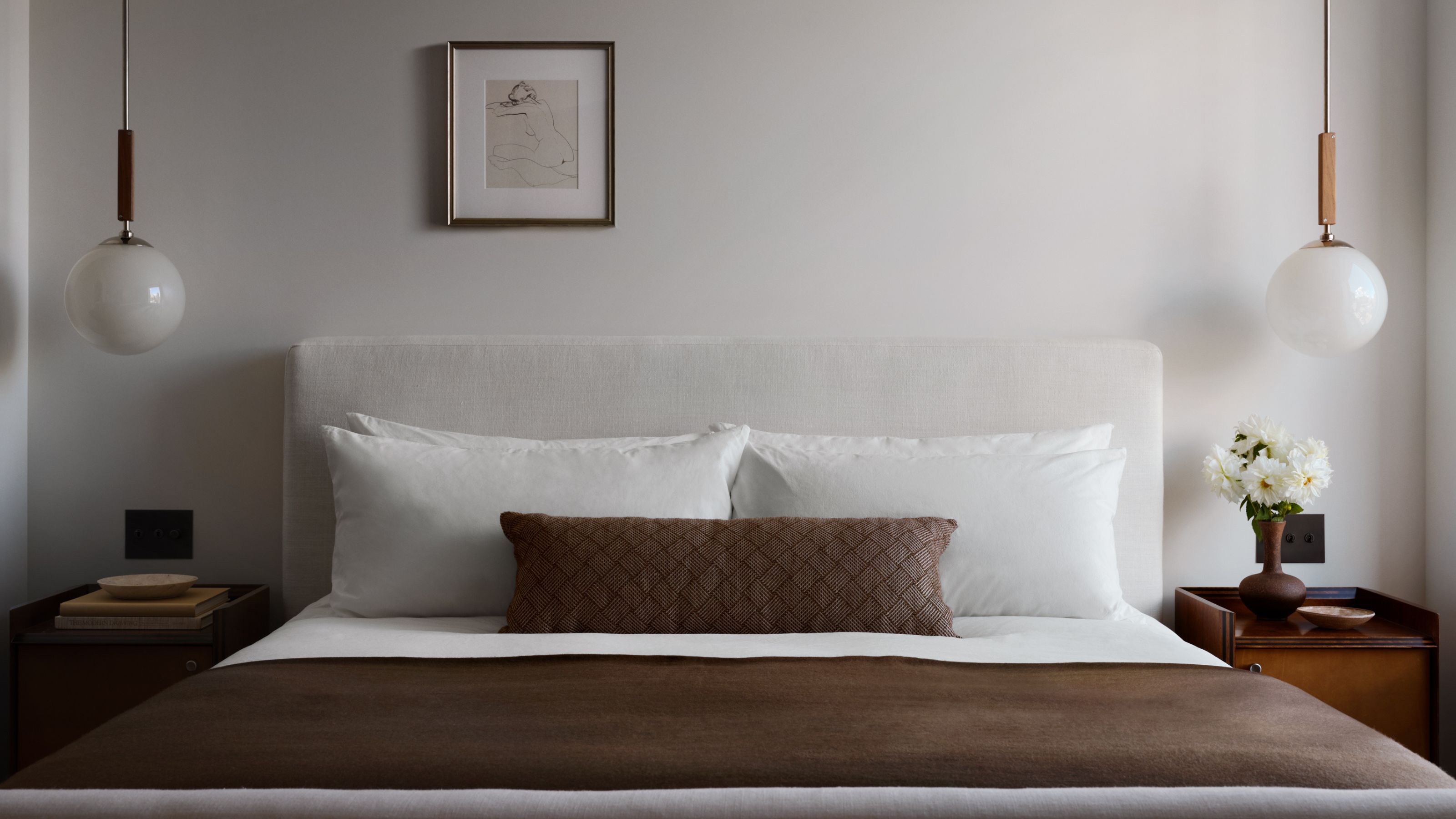
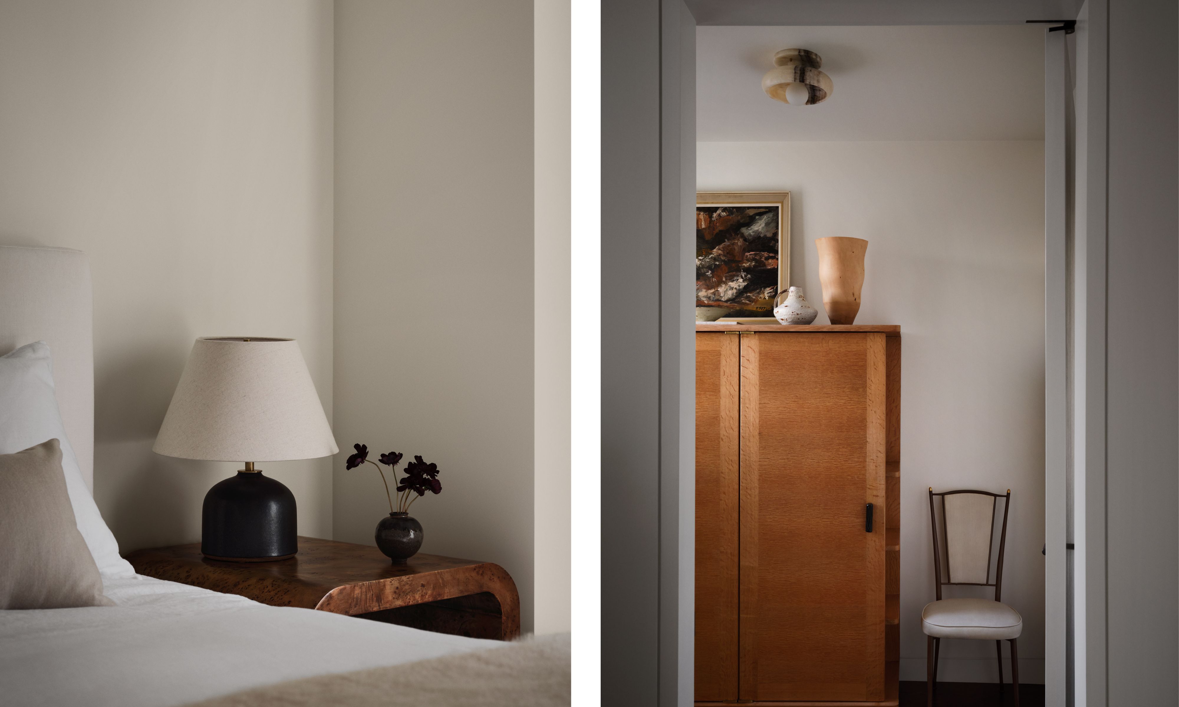
'From a layout perspective, we carefully allocated bedroom and bathroom spaces accordingly on the sleeping level of the duplex. The primary bedroom was reconfigured to have ample storage and an en-suite bathroom for the full-time resident, while the two guest rooms (one for the couple and one for the kids) were sized to stay comfortably for a week or two, but didn't require large closets and worked well to have a shared bathroom.'
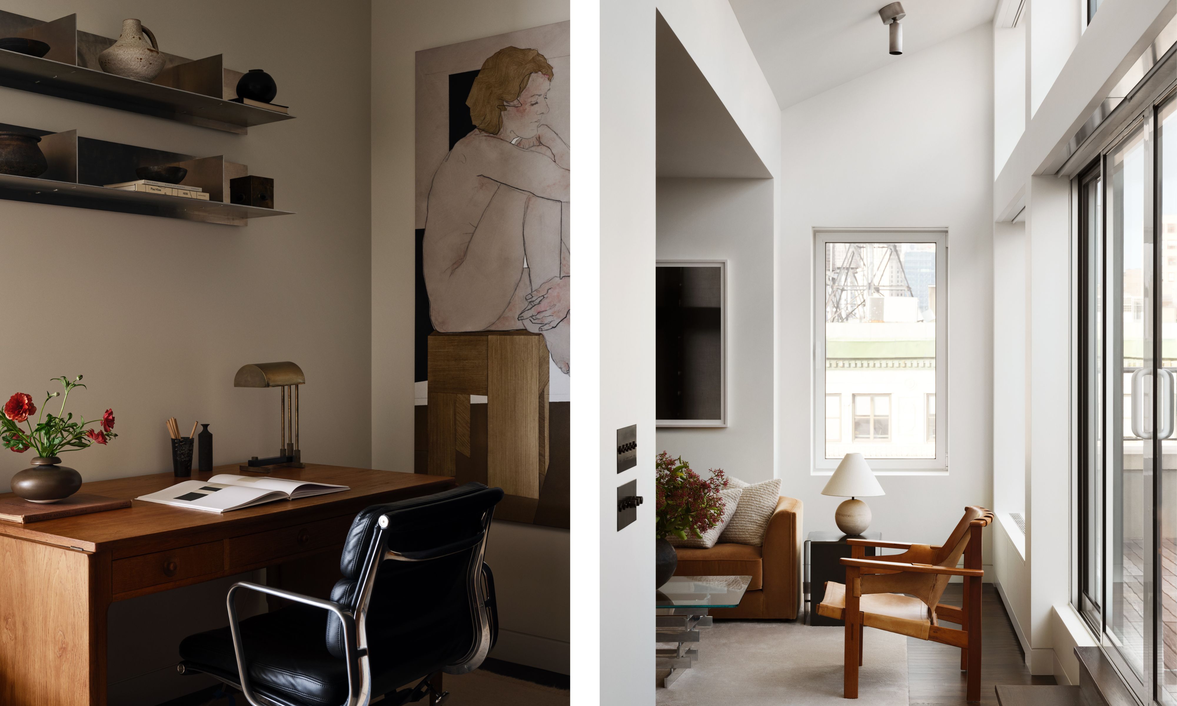
'On the upper level, priority was given to a larger living space, which everyone appreciated, and an efficiently combined kitchen and dining space. For the extra room, we decided to make that into a home office for the full-time resident instead of another bedroom, as that was what was most needed.'
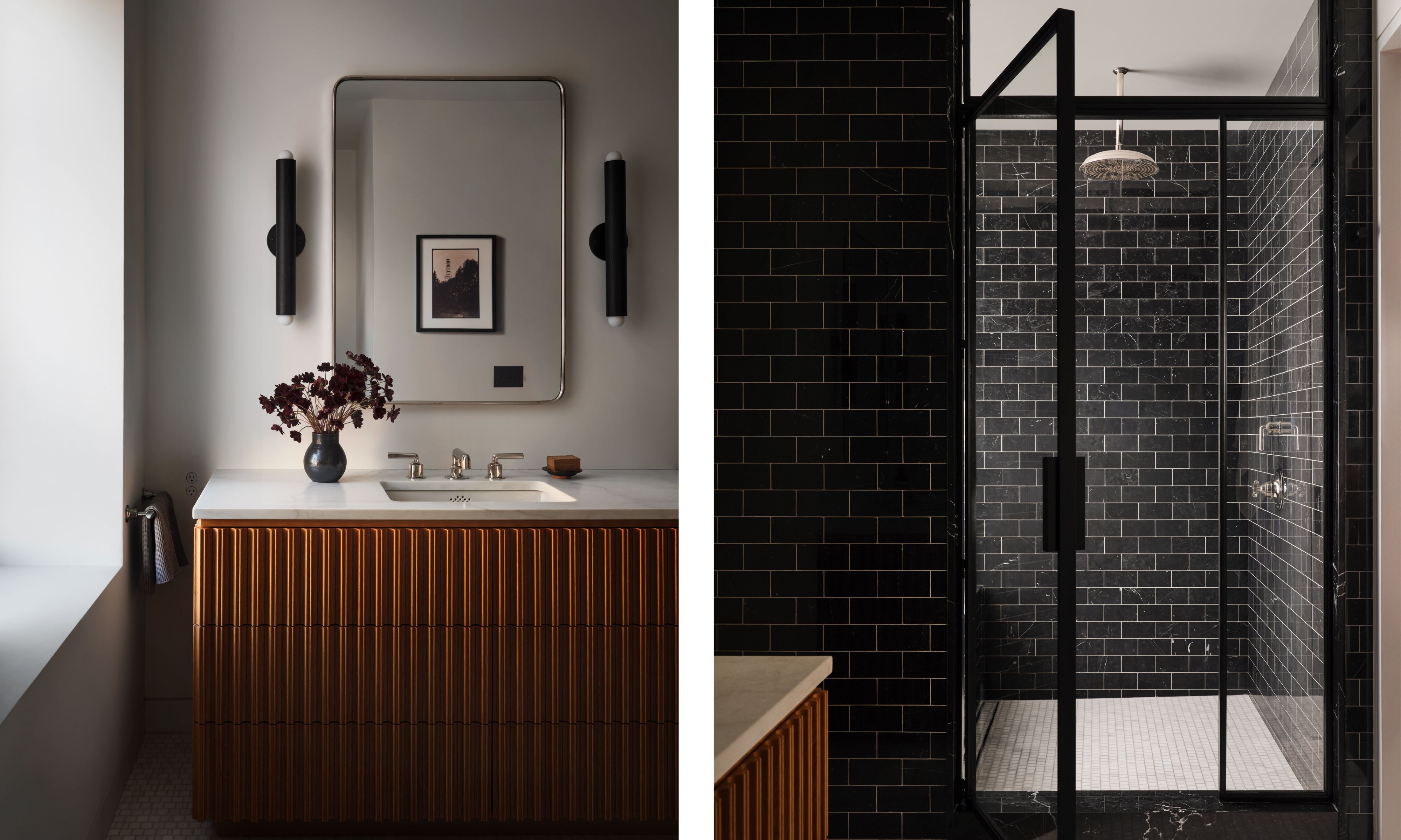
'In terms of design, we leaned into maximizing the stunning views by creating a minimal architectural language and filling it with a mix of streamlined contemporary furnishings and collectible vintage to give it soul. Dynamic color and stone choices for the kitchen and bathrooms allowed exciting moments in the home, while still keeping the footprint appropriate to their needs.'
'Since the family lives in a historic home in London, this contemporary, eclectic mix with sweeping penthouse views felt like a fun New York City experience quite different from the charm of their London life.'
The apartment building itself is rich in history; it was first built as housing, but in the late 1800s, it became The Hotel Albert, an iconic meeting place for New York creatives.
'It started as row houses in the 1850s, then converted into a hotel, then apartments, and then buildings were joined to house both hotel guests and residents,' explains Gabriela. 'The more notable aspect is that it was home and a gathering place for artists and creatives for many years – from Mark Twain to Jackson Pollock to The Mamas and the Papas. In the 1970s, it was converted into luxury apartments, where it now remains.'
But despite the age and character of the building, what Gabriela was working with was a dated renovation that felt more 2000s than 1800s. She explains, 'The home felt like a bachelor pad from the 2000s – dark floors, a lot of orange-toned millwork, and filled with dated architectural elements like oversized recessed lighting. Additionally, the layout felt misproportioned and lacked flow.'
Despite the 2000s decor, Gabriela could tell the space had so much potential.
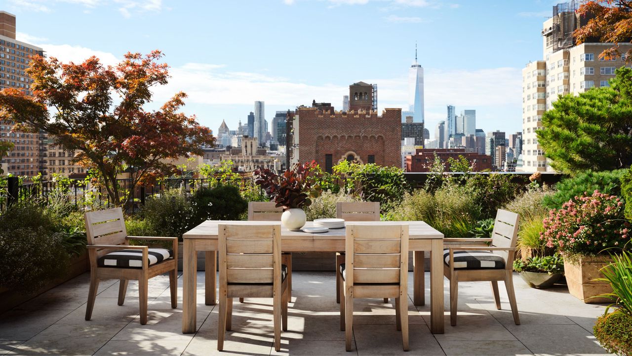
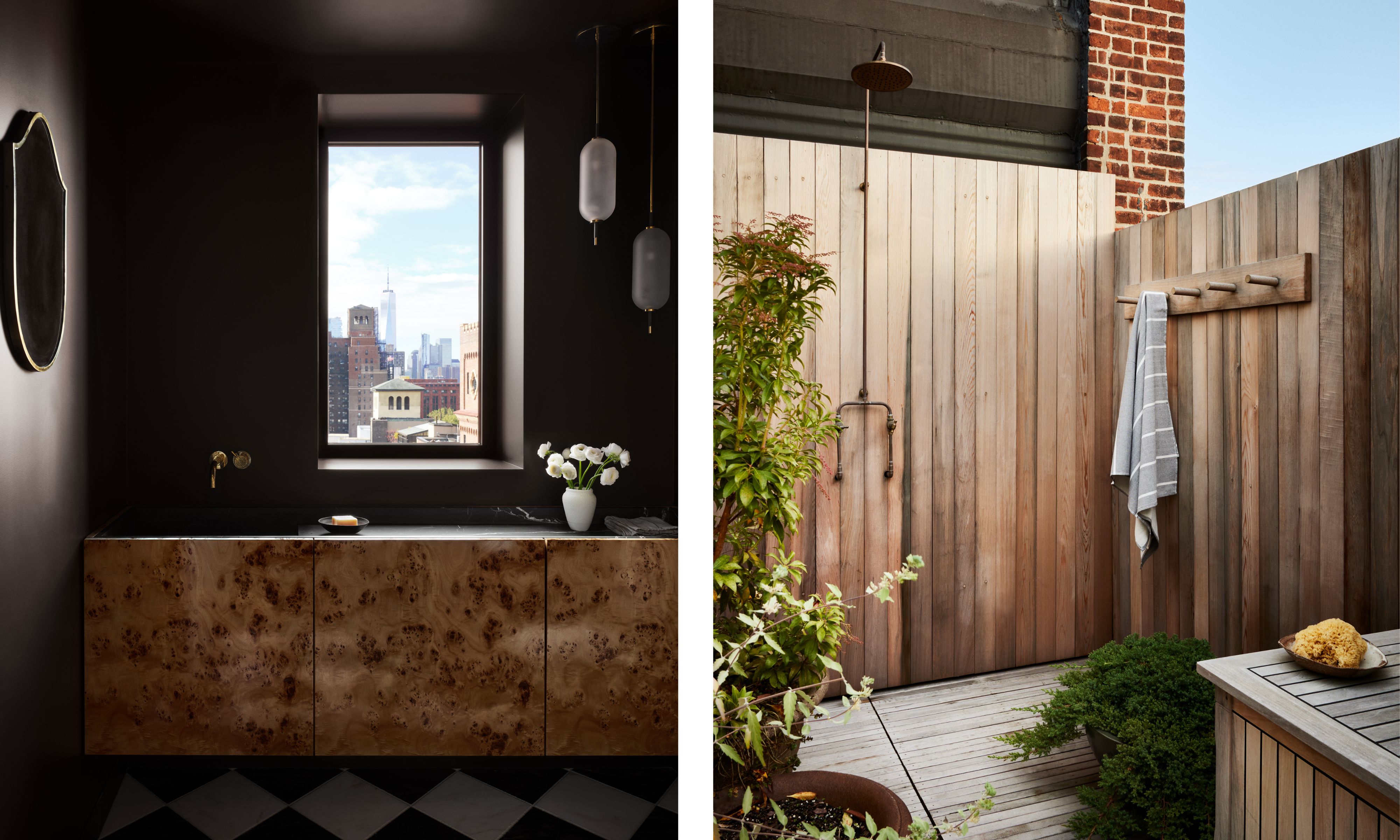
'The space itself was incredible – not only the views (which offer a unique vantage point far above most of the pre-war buildings), but the access to two private outdoor terraces looking over the village (and with an outdoor shower) is truly a dream. Additionally, our client is someone who values both the beauty of minimalism equally to the original patina of a vintage piece. Our alignment in design ethos felt organic from the beginning.'
The brief was to soften the space, create a warm, layered home that leaned contemporary but still had character and touches of vintage charm. 'The homeowners wanted to convert the apartment from a dated bachelor pad to a warm contemporary home that highlighted the panoramic views and felt distinctly “New York”.'
'This focus on the views was particularly important we wanted to create a real contrast with the family's more traditional home back in London. With that, the goal was to create a minimalist space (thereby bringing the views into the forefront) and where rich materiality would play a lead role.
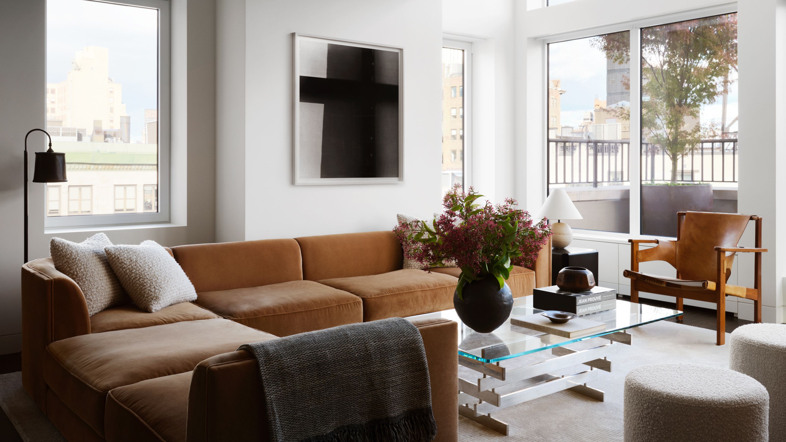
Alongside the brief of warm minimalism, the homeowners also loved vintage and antique pieces, which can be seen scattered throughout the home. There's a mix of Art Deco icons and European antiques; a Hans Wegner AT305 Desk and a Bauhaus Table Lamp in the manner of Marcel Breuer in the study, a Carl-Axel Acking "Trienna" Chair in the living room, a Guillerme et Chambron wardrobe in the guest bedroom, are just some of the key pieces.
The space needed to feel truly transitional, where modernity and minimalism could mix with these iconic older pieces.
Gabriela had to get that balance right, create a minimalist backdrop that would work with more ornate and characterful furnishings. 'The decision to create a minimal architectural style very much informed the furnishings, as their role became a true focal point, alongside the views,' continues Gabriela.
'Minimalism is oftentimes more difficult and laborious to execute, as there is nowhere to “hide” issues or decorative details to distract the eye. Decisions such as the clean reveal baseboards and door frames, pivot door hinges, Bocci System 22 outlets, forgoing a grid of recessed lights, and the lack of visible window treatments were all very conscious decisions.'
'This is to say that what is “missing” is equally part of the design, as it allows the eye to focus on the views and curated furnishings. The furnishings here are what make the space a home. By combining aged and patinated pieces alongside contemporary makers, the home has a gentle tension that is warm, fresh, and dynamic. On their own, the furnishings are quite contrasted, but a cohesive color palette and unified scale allow them to live together with ease.'
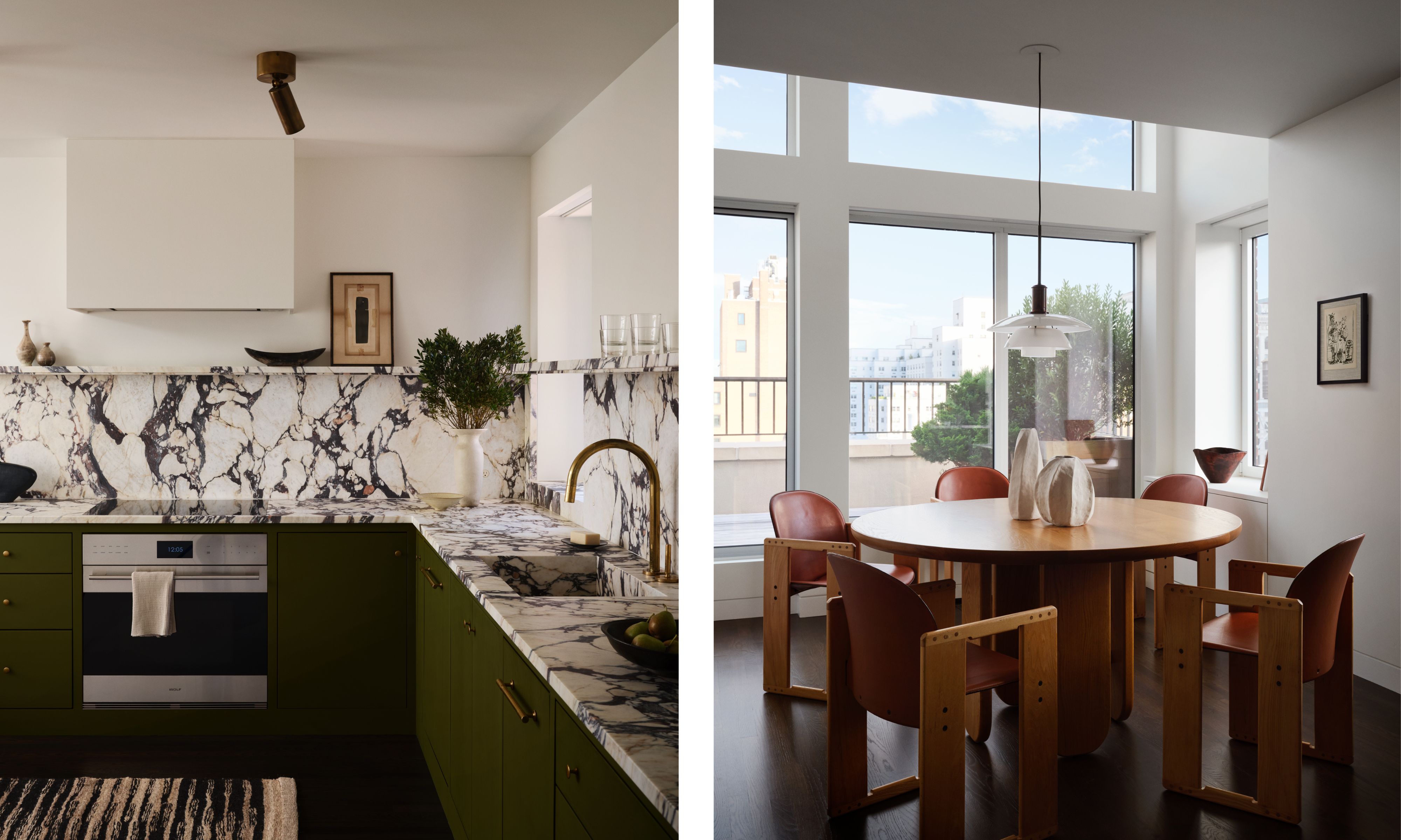
In the kitchen, a moderately sized space, the upper cabinets are totally omitted. The benefit of this being a pied-à-terre is that storage wasn't a huge priority, so the lack of wall cabinetry kept the space feeling lighter and larger.
'One of the first purchases we made was the stone, Calacatta Viola, for the kitchen countertop and backsplash. At the time we selected it, it was uncommon and drove the design and palette as it was meant to be the highlight of the room. Additionally, since the space is a pied-à-terre, we were also able to bring in more aesthetically beautiful elements and make that trade-off with function.'
'The kitchen cabinets are painted in a custom olive color that contrasts with the warmth of the stone and brings in an unexpectedly dramatic color palette. While the space is small, we used the dividing wall to the living room to store all of the practical items and did it in a wall finish so that it almost disappears and allows the focus to stay on the rest of the cabinetry and stone.'
'Hiding functional elements can be just as important as amplifying the decorative ones. By forgoing a traditional dining "room", we were able to connect the two spaces and flood the kitchen with light. This open and expansive feeling was critical to prioritizing the bright open space integral to the home.'

'A pied-à-terre is a unique opportunity to express a side of your design aesthetic that is perhaps a bit more fun, or unexpected. Ideally, it feels like “you” but a side of yourself that you live in less.'
'It seems that this Greenwich Village apartment does just that for the family. It’s fresh and contemporary but is still filled with pieces that are deeply personal. The homeowner was highly involved and extremely thoughtful in the design, down to the last detail. This is less common, but especially for a secondary home. As a result, I think it has made for something quite special for the family to enjoy for years to come.'