Color really can be transformative in interior design, so choosing the right hue for a living room can present endless choices and subtle nuances to understand and overcome, but if you've been following certain living room color ideas and rules religiously you could be doing more harm than good.
Choosing which colors to decorate with for any room color ideas can be a daunting process as there are so many to choose from, but becoming your own color consultant is easier than you think, and we are on hand to help inspire you with a range of colorful ideas for your living room.
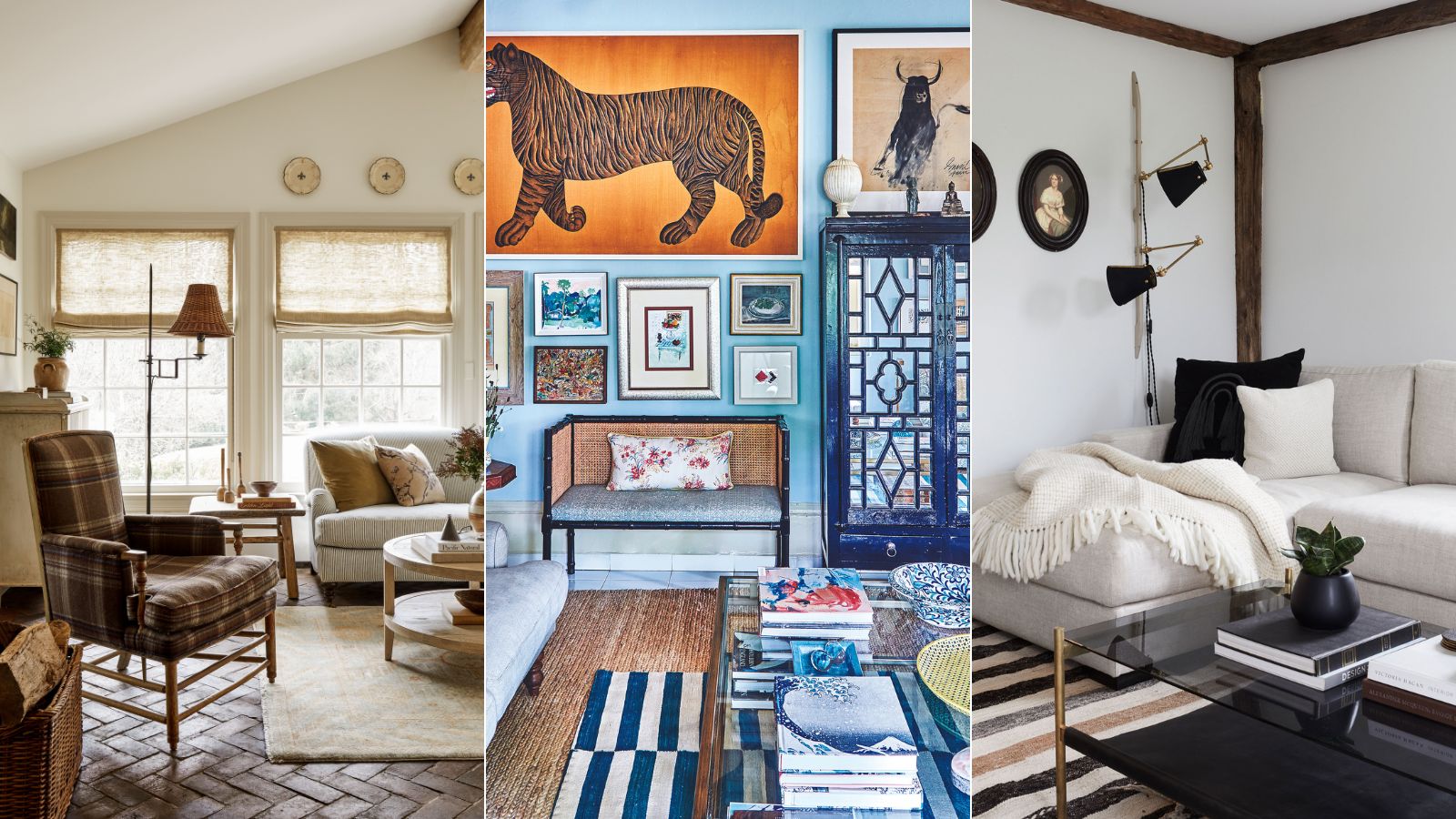
Living room color mistakes to avoid
'Choosing your room colors is one of the hardest parts of decorating because we only actually know the true color of something because it’s sitting next to another color,' says Rachel Chudley, an interior designer renowned for her use of strong color. So it is understandable why many people played it safe for so many years, but we know and understand color theory better now.
The following six living room color mistakes will provide you with all the know-how on choosing a living room color, as well as the best color trends and color combinations for one of the most important rooms in the home.
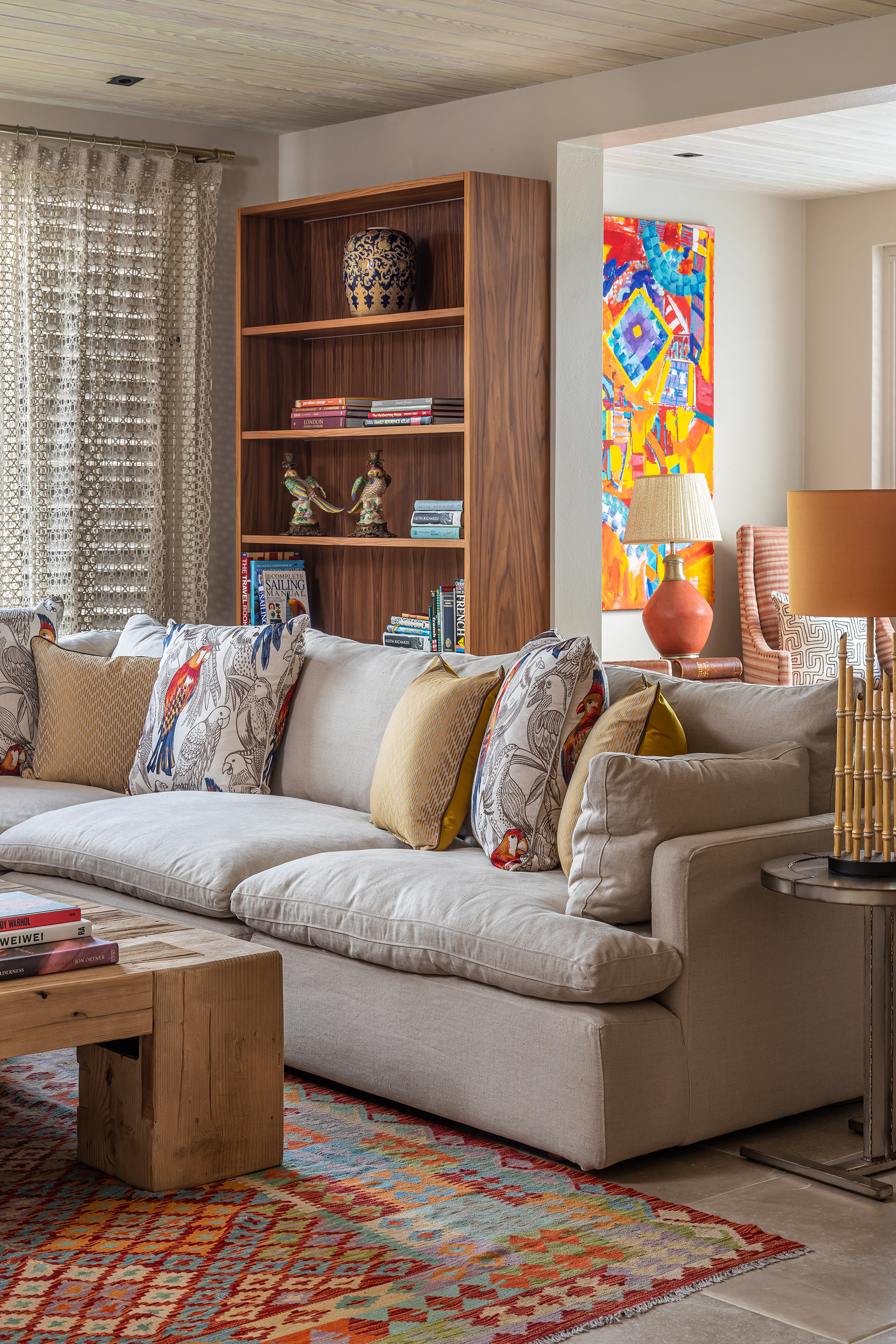
1. Thinking that you have to go for pale, cool colors in a small living room
If you only paint using pale or cool colors in a small living room, you could be missing a trick. It is a myth to suggest that dark or advancing colors don't work within small spaces. And, contrary to popular belief, light colors will not make a small or dark space light.
Advancing colors are classified as warm tones of red, violet, orange, and yellow as they give the appearance of coming towards you – and it’s these strong tones that can make a room feel really cozy and intimate, says interior decorator Emma Deterding, founder and creative director of Kelling Designs.
‘We particularly love a deep earthy orange which creates a snug effect in a room but you could also have the same result with colors such as navy blue and emerald green as long as they are rich in tone.’
Just be careful when choosing this kind of shade in any south-facing living room. ‘Warmer tones risk making the room feel uncomfortable in the summer months so opt for a darker shade to cool down a south-facing room such as a charcoal blue.
2. Not choosing color in harmony with the rest of your home

Many interior designers will say, as a general rule of thumb, that you should never paint your entire home one singular color for fear it will fall flat. That isn’t to say that you can’t use the same color palette throughout your entire home. For example, if you love decorating with neutrals, then use different variations of this one color palette to create harmony and interest from room to room.
'Choosing a living room color scheme in harmony with the rest of your home is crucial to not only your homes aesthetic, but also your mood and well-being,' says Becca Casey of Becca Interiors.
Some people feel the need to flood each and every room in their home with bold or vivid colors, however, if one color makes your heart sing, then use subtle variations from that color palette instead. When an entire home is considered as 'one' rather than a collection of individual rooms, there is instantly greater fluidity between different spaces.
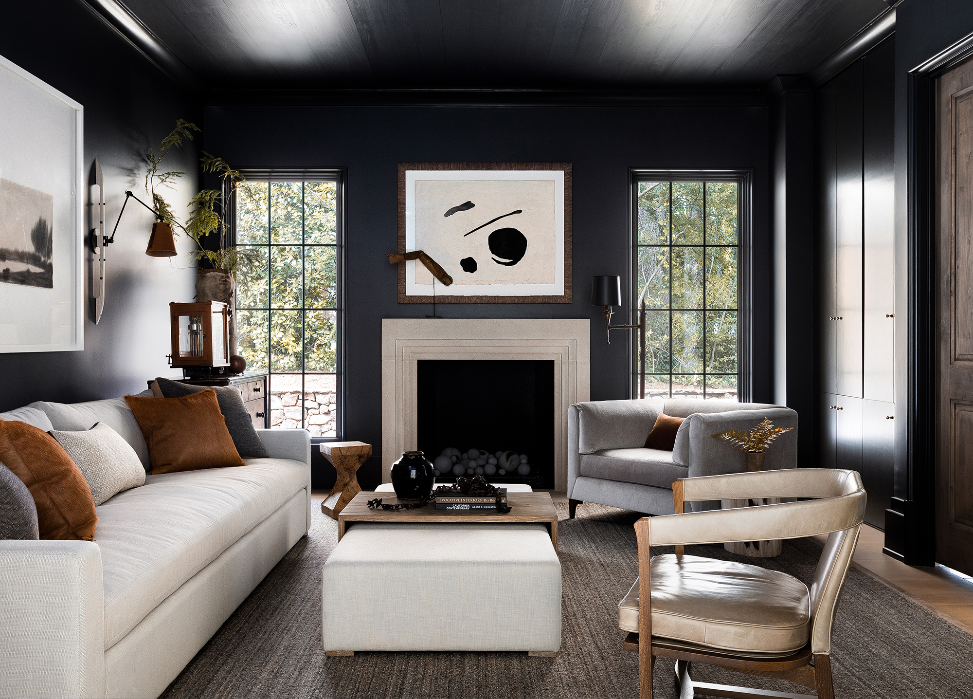
3. Only ever painting the ceiling white
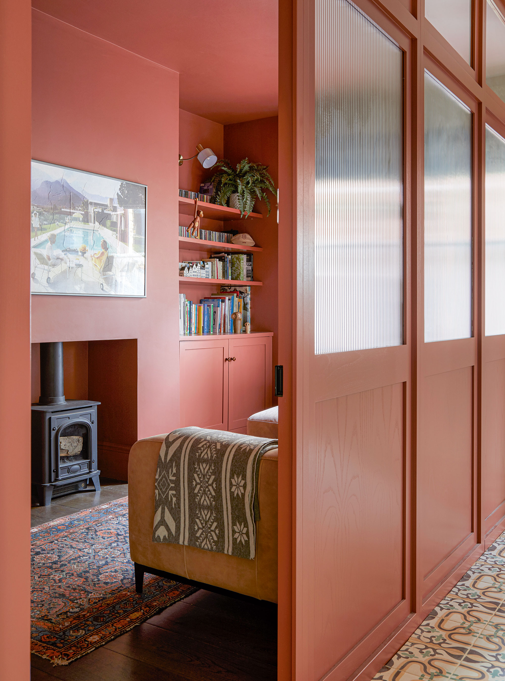
The architectural details and ceilings in our living rooms are ripe for rediscovery, and done right, can be an interesting way to enhance the feeling of space and character. Ceilings offer scope to expand your creativity beyond your four walls, therefore painting a ceiling white is certainly not the only color option you should consider.
There is a multitude of ways to elevate your ceiling with materials, color, texture, and even wallpaper, but one of our favorite ways to go for a whole-house color scheme.
‘When a single color is used on both walls, ceiling, and woodwork, a room suddenly feels bigger because having no contrast means that you are less aware of the confines of the space,' says Joa Studholme, color curator, Farrow & Ball. 'The eye does not stop to register a second color and glides straight out of the window to the view, blending the outside and room together.’
This snug room, designed by Fiona Duke of Fiona Duke Interiors, shows that spending time choosing the right color for a room, especially one with limited natural light can pay dividends. Continuing the warm hue across walls and ceilings results in a cozy, enveloping feel.
4. Not taking color psychology into consideration
Your living room is one of the most seen parts of your home’s interior and makes an important impression on friends and family as this is usually the place where we congregate. Therefore, choosing the right color for your living room – one that truly makes you happier at home – is vital.
When it comes to designing a living room, it can be a minefield of styles, colors, and materials, so while we can often be led by interior design trends, you should consider the psychology behind each color, and how they make you feel.
'Color is an amazing phenomenon,' says Karen Haller, color psychology specialist, teacher, and best-selling author of The Little Book of Color. 'Color comes in through our eyes, but it makes its way into our hearts. It influences how we think and how we behave.'
While color psychology may not be a deciding factor in your final color choice, it is an intriguing topic, and it is certainly worth digging a little deeper into the meaning of certain colors, especially when used in the living or family room.
Here are some of the most common living room colors, and the meanings associated with each one:
- Red: This color is linked with passion, energy and action. The color is also associated with increasing our metabolism, hence its popularity in dining rooms and kitchens.
- Blue: Blue has many emotional attributes: at the paler end, tranquillity and calm, to intelligence at the darker end.
- Yellow: Yellow (orange shares similar characteristics) is the color of energy, happiness, and optimism and therefore brilliant for spaces that are not centered around rest.
- Green: This color is a joy to use: the primary color of nature. It is the perfect color to deliver calm and serenity and therefore has the flexibility to be applied in every room in the home.
- White: White represents purity, innocence and new beginnings, as well as cleanliness and clarity.
5. Not considering the living room as a family space
Beautiful and decorative living rooms are those that balance practicality and personality, so it is worth considering pattern alongside your paint ideas. Quite often, many people forget that pattern can be just, if not more, exciting than adding single color schemes.
‘The living room is a communal space and should reflect everyone who lives in the house,' says Eva Sonaike, creative director, Eva Sonaike. 'It is a room where we socialize, entertain, and relax so the design should be functional, but also fun. I like to play with patterns and colors here. For example, I might use patterned scatter cushions on a sofa alongside occasional chairs and poufs upholstered in fabrics of your choice. These themes can then be echoed in accessories such as ornaments with colorful designs.’
Mary Graham and Nicole Salvesen, founders, of Salvesen Graham also share a similar adoration for adding pattern in a living room: ‘Layering patterns of a similar scale and tone will distract from a room feeling small, and ensure it feels cozy and inviting. Nothing should shout louder than anything else, so that the eye is not drawn to one feature and the space will not feel too busy.’
6. Not matching color combinations according to color theory

Color theory in its entirety can be complicated but there are a few basic principles to help steer you in the right direction, explains Patrick O’Donnell, brand ambassador for Farrow & Ball.
A carefully considered color-clashing combination can create a living room that truly sings with joy. This is a space for both socializing and retreat, so you want shades that both enliven and comfort you.
Designers also talk about another element when using color: contrast. As a result, don’t be tempted to lean on analogous colors – those that sit side-by-side on the color wheel – the result will be harmonious but might lack vitality. Equally, a scheme based on complementary colors will result in maximum contrast but will need to be softened by neutrals.
Another approach is to begin with what is already decided or what you can’t change, says interior designer and paint specialist Edward Bulmer: ‘it might be a wood floor or an old fireplace, for example. Then base your tonal choices on the color of these elements – effectively, warm, or cool. If you get the tonality right, you will then have a wide variety of colors that will work and so the choice comes down to personal preference or other elements of your scheme – like fabrics.
‘Pink and green is one of my favorite room color combinations – they play really well off each other and it’s a great way to cheer up a room,’ says Lucy Barlow, founder, of Barlow & Barlow. Balance is key, especially as many people are still working from home. Integrating more neutral tones to offset your bold hues can help bring calm for when you need to focus, but then you can turn around and be energized when it’s time to switch off for the day and allow the room to return to its primary function.
Any living room project can be clearly defined by having solid rules in place. These basic interior design rules and standards exist to help you accomplish harmonious interiors that convey character, but while we suggest you follow these simple rules, it is important to follow your own heart and mind.