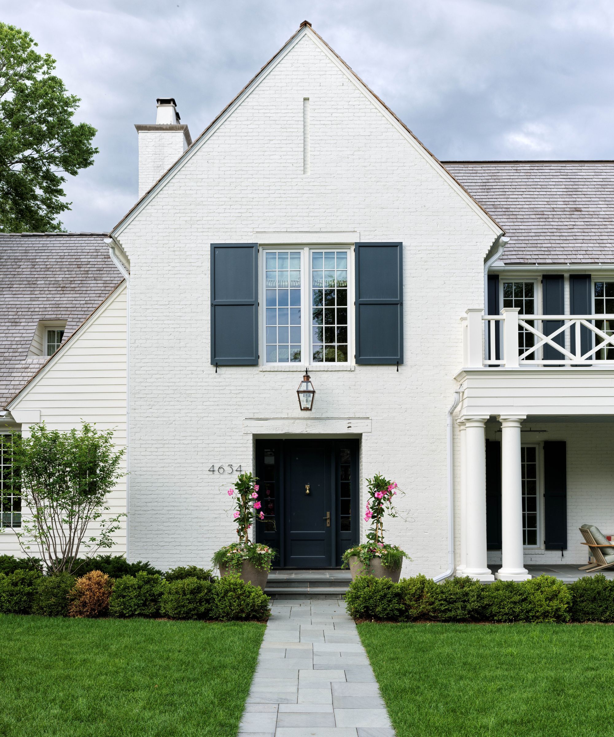
How do you make a new house feel old? That’s a question interior designer Victoria Sass debated many times over when creating this classic American white brick house for a family of five in a leafy neighborhood close to Minneapolis in Minnesota. The family had spotted the plot’s potential in 2019, drawn to its tranquil waterside setting, and gained permission to demolish the existing neglected home, replacing it with a sympathetic build.
‘It’s much harder than it looks,’ concedes Victoria. ‘New builds can feel a bit too perfect. In this case, we asked architecture firm Murphy & Co to loosen things up a little, make the house feel older. Older houses don’t always make sense; sometimes the flow is a little off; a small room might be sequestered off a bigger space; shapes are asymmetrical. We knew we had to undo things a little because if it was too sensible it wouldn’t feel old.’
Not that this house is a pastiche of other heritage homes in the area – instead, it has an evolved, lived-in feel that’s hard to date, and that’s what its owners wanted. ‘Relaxed, unpretentious, and not remotely grandiose’ is how Victoria describes the home, which features wooden balconies, floor-to-ceiling windows, screened verandas, a classic all-American porch, and a wooden dock in the garden leading straight onto Minnehaha Creek.
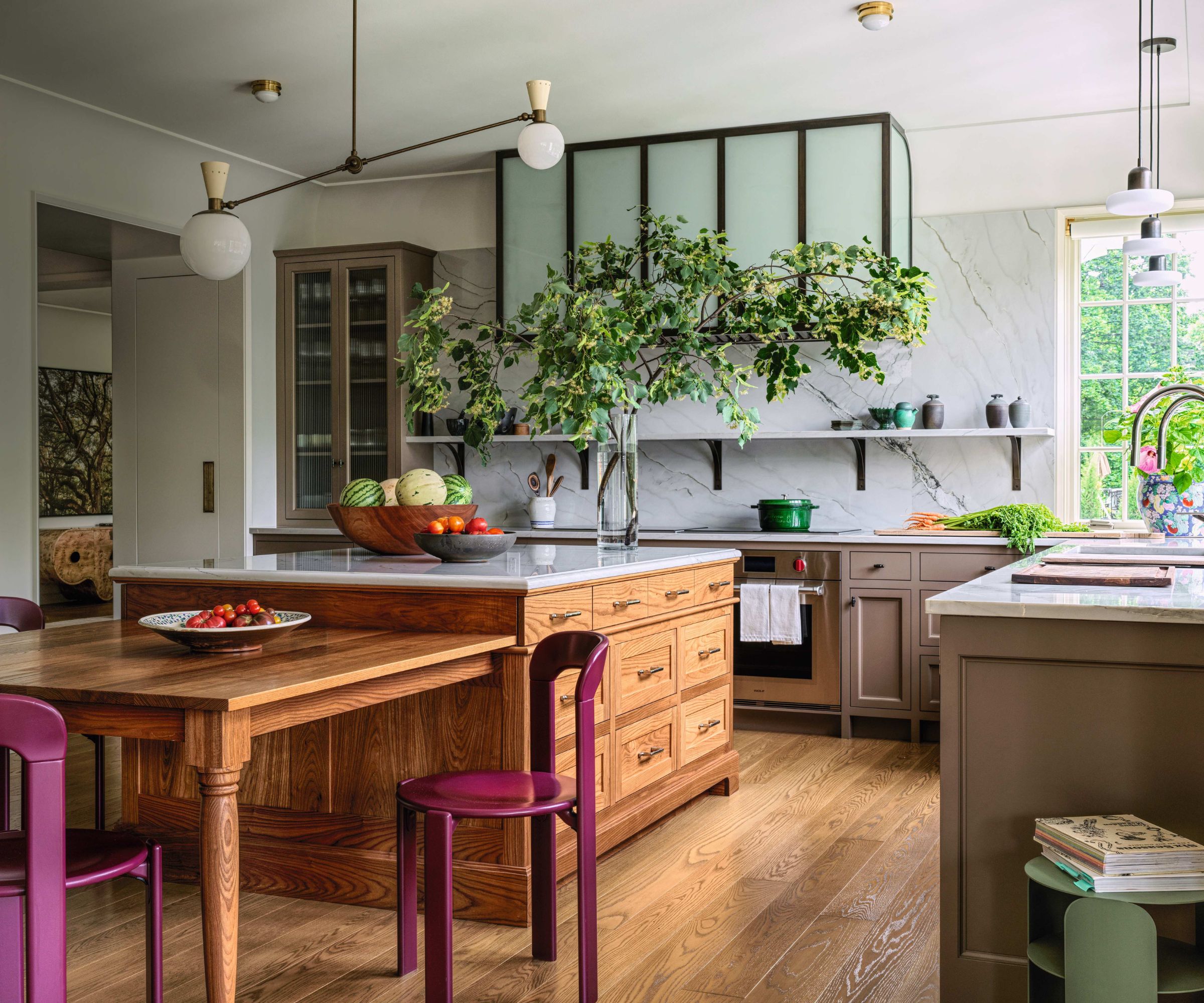
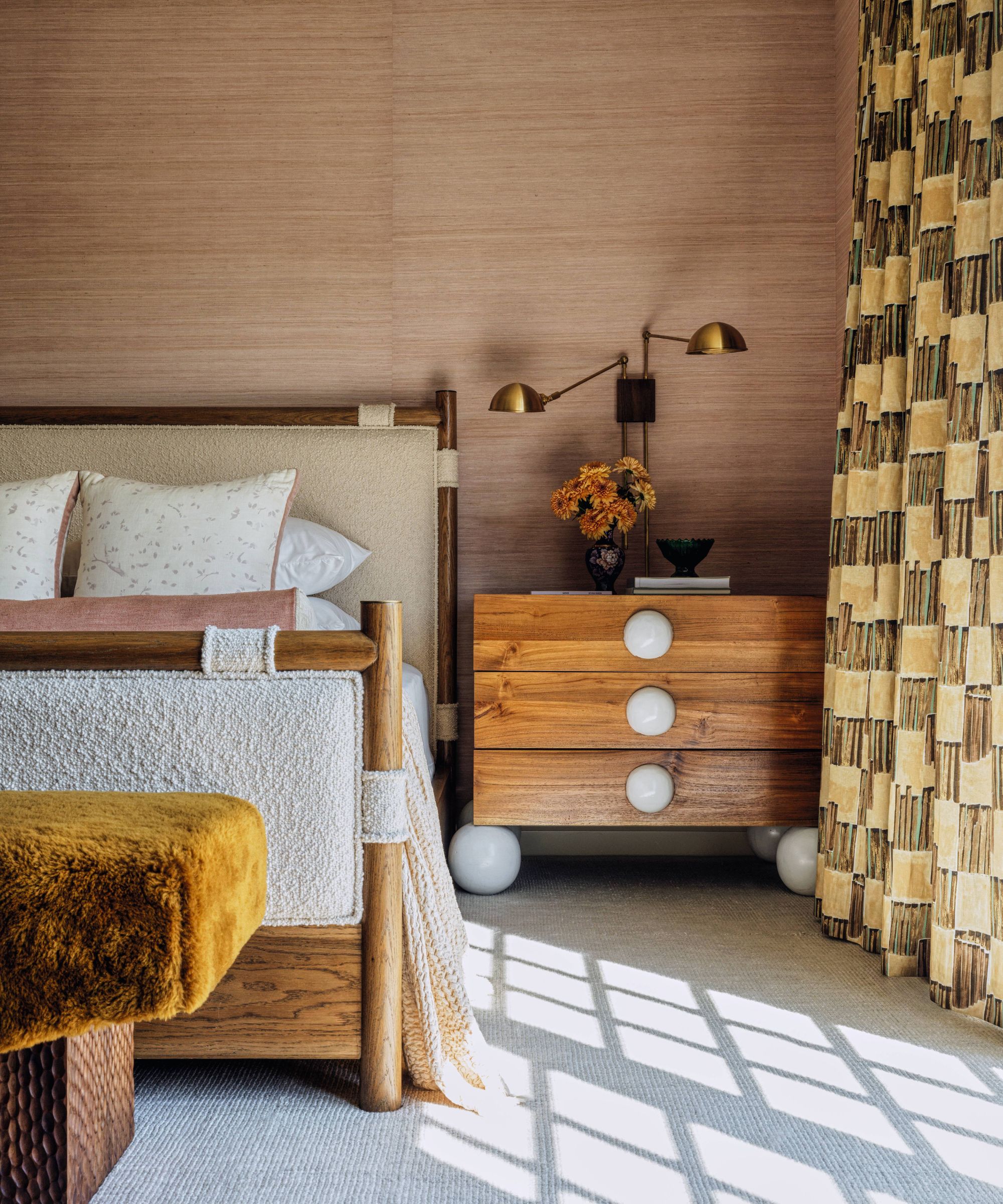
A traditional palette of off-whites, rusts, and caramels set against oak flooring and timber windows provides a grounding backdrop across three stories, with the main living spaces sited on the middle floor.
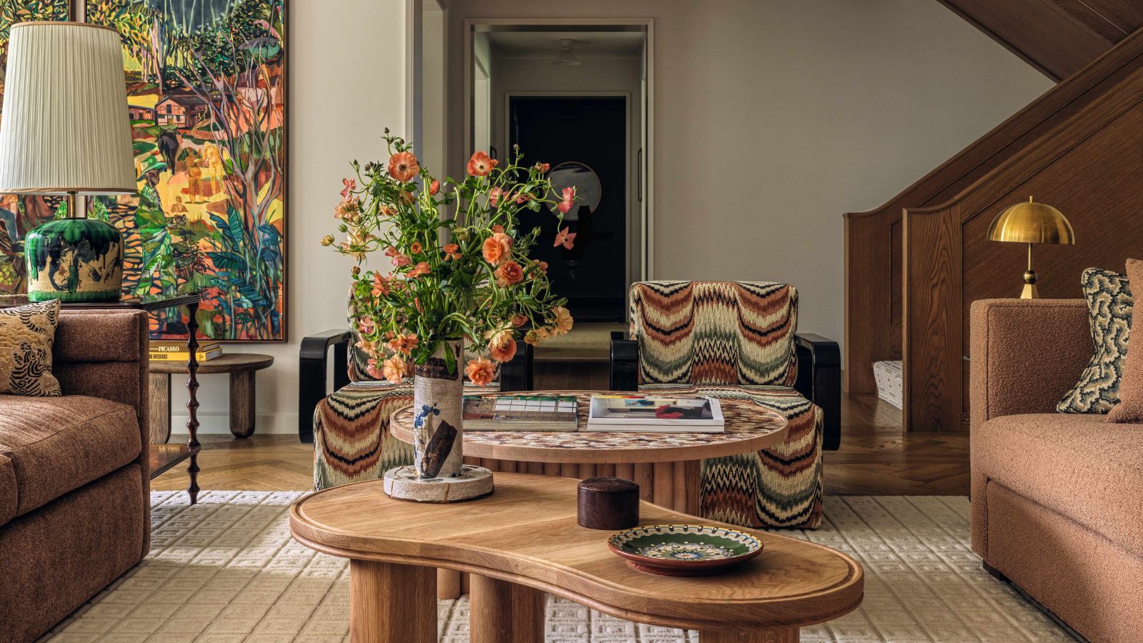
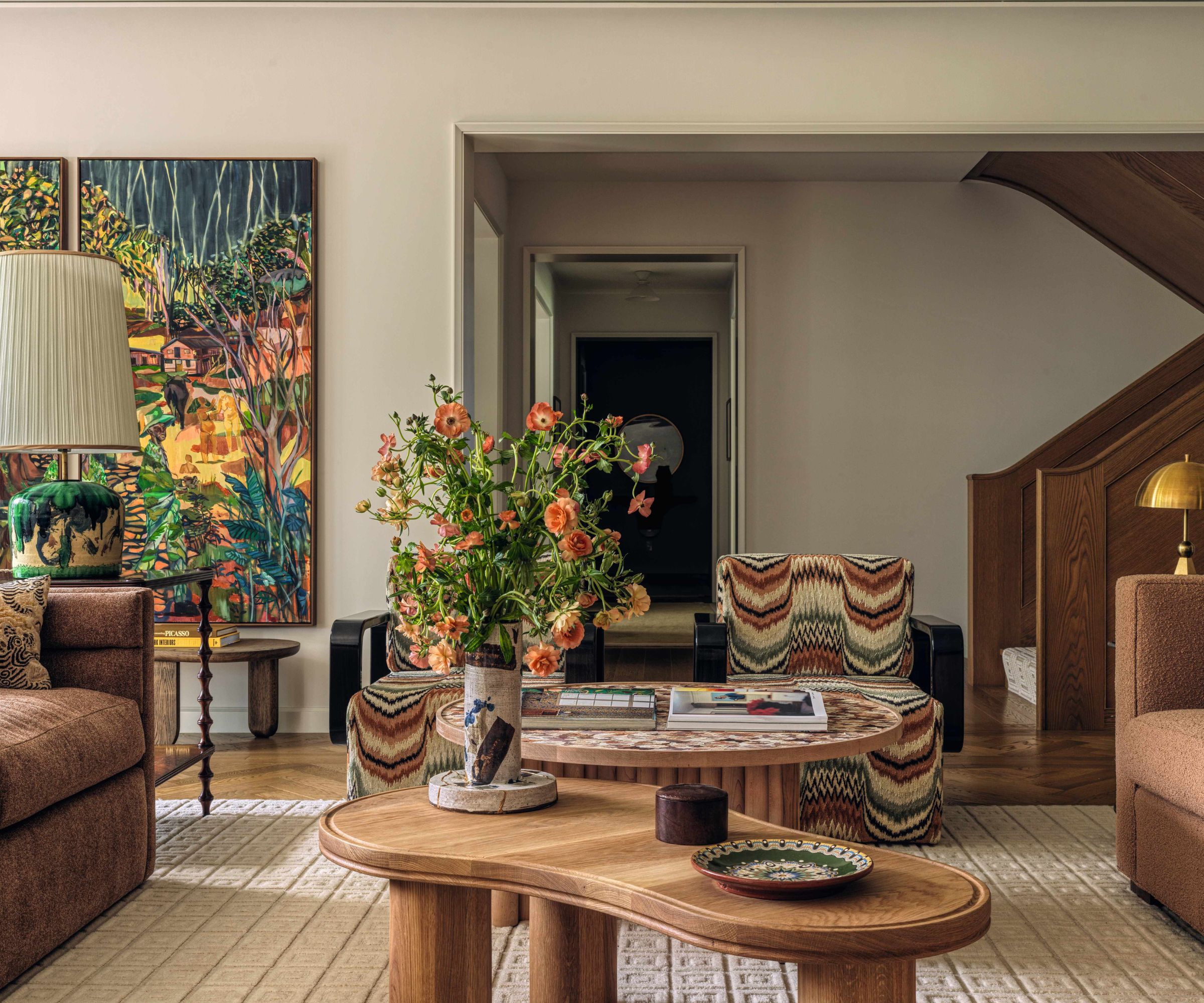
Yet there are a host of left-field decorative choices too, from the flame-stitch armchairs in the sitting room to the sculptural Moon light in the entryway – part light fitting, part art installation. That contrast has come out of this home’s surprising design journey, which gently changed course from inception to completion.
The family had commissioned Prospect Refuge to build their home just as the pandemic struck. ‘The wife mentioned that she loved the casual but tailored look of a white button-down shirt,’ recalls Victoria. ‘That comment stayed with me, and we drew up plans for a house that reflected that sensibility. I knew they wanted something understated, as opposed to the decorative equivalent of a ball gown.’
A little later, the family decamped to Barcelona and the build was put on ice. ‘When they eventually returned to pick up the reins, they wanted to inject some color and joie de vivre,’ continues Victoria. ‘Their time in Spain had altered their perspective; the family’s energy had changed. I realized that we had to add jewelry to that shirt if we were to create a home to truly reflect their passions.’
That meant going back to the drawing board, focusing on furniture, fabrics, hardware, and lighting to inject something a little unexpected. In the living room, a mosaic table made from corn husks is the work of a Spanish artist the family came across while abroad.
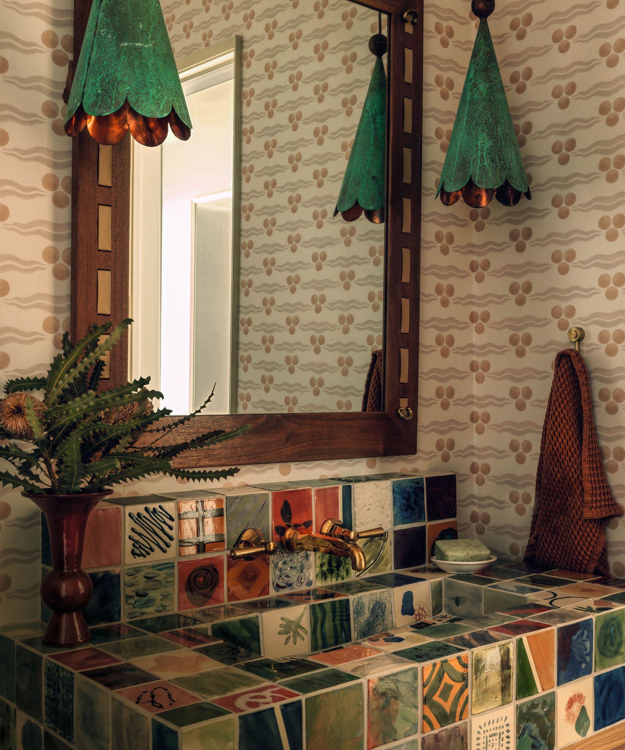
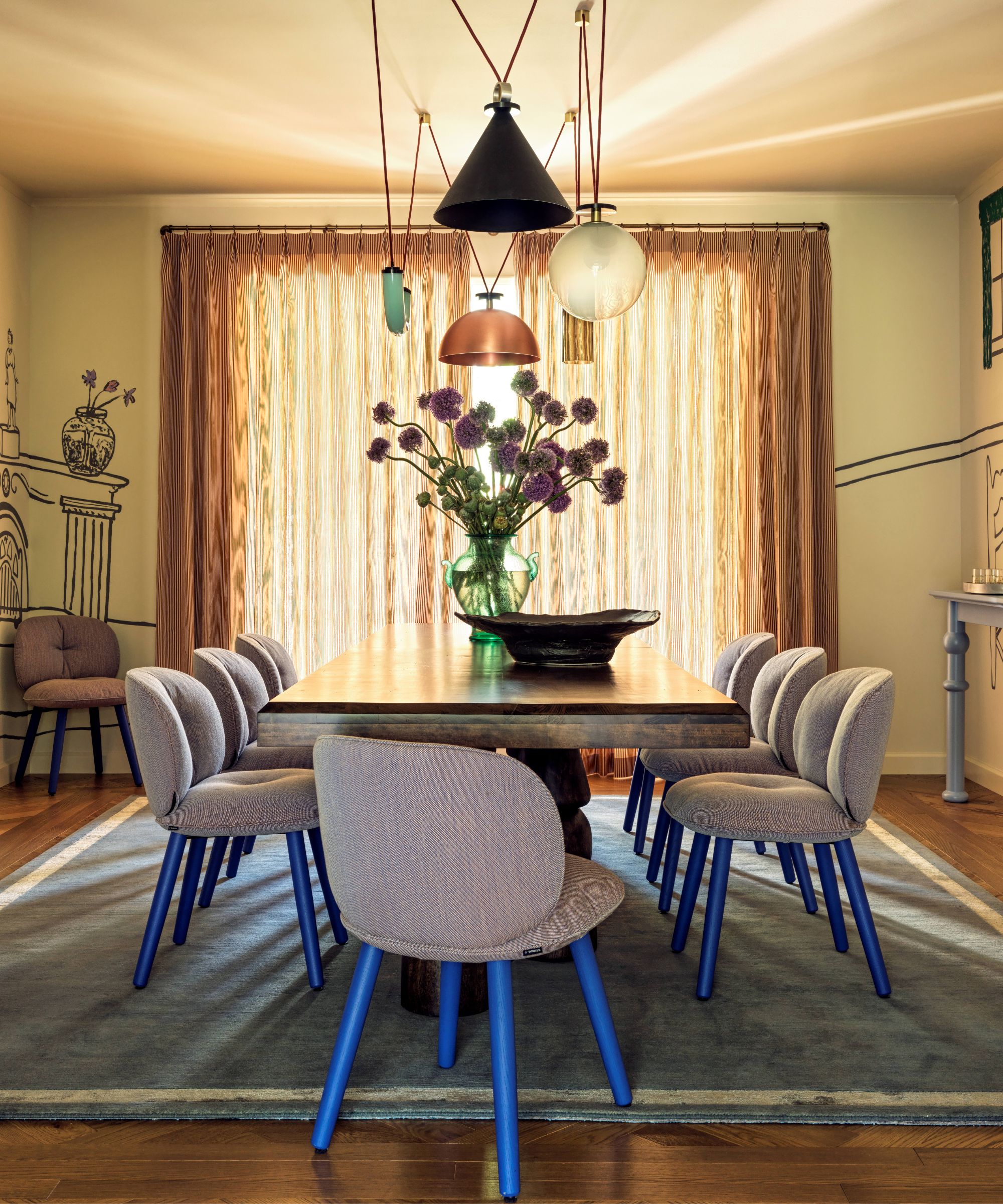
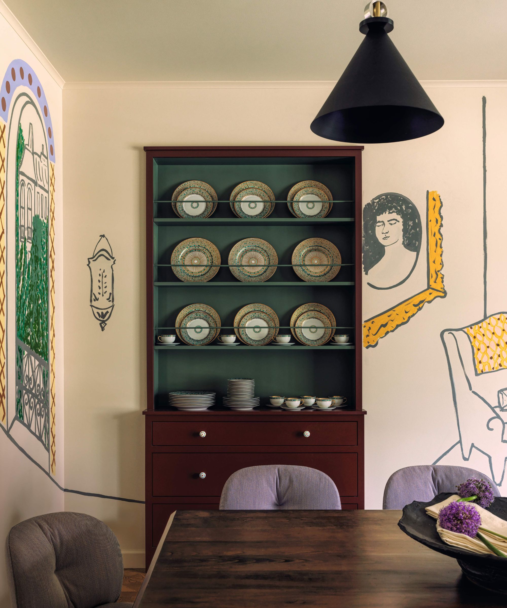
One of the powder rooms features a vanity covered in beautifully mismatching tiles, inspired by Mediterranean design (‘Each one feels like a painting; I could get lost in them,’ says Victoria), while the dining room has been given edge thanks to highly personal wall art by Ginny Sims, whose visual narrative contains subtle nods to the family’s story.
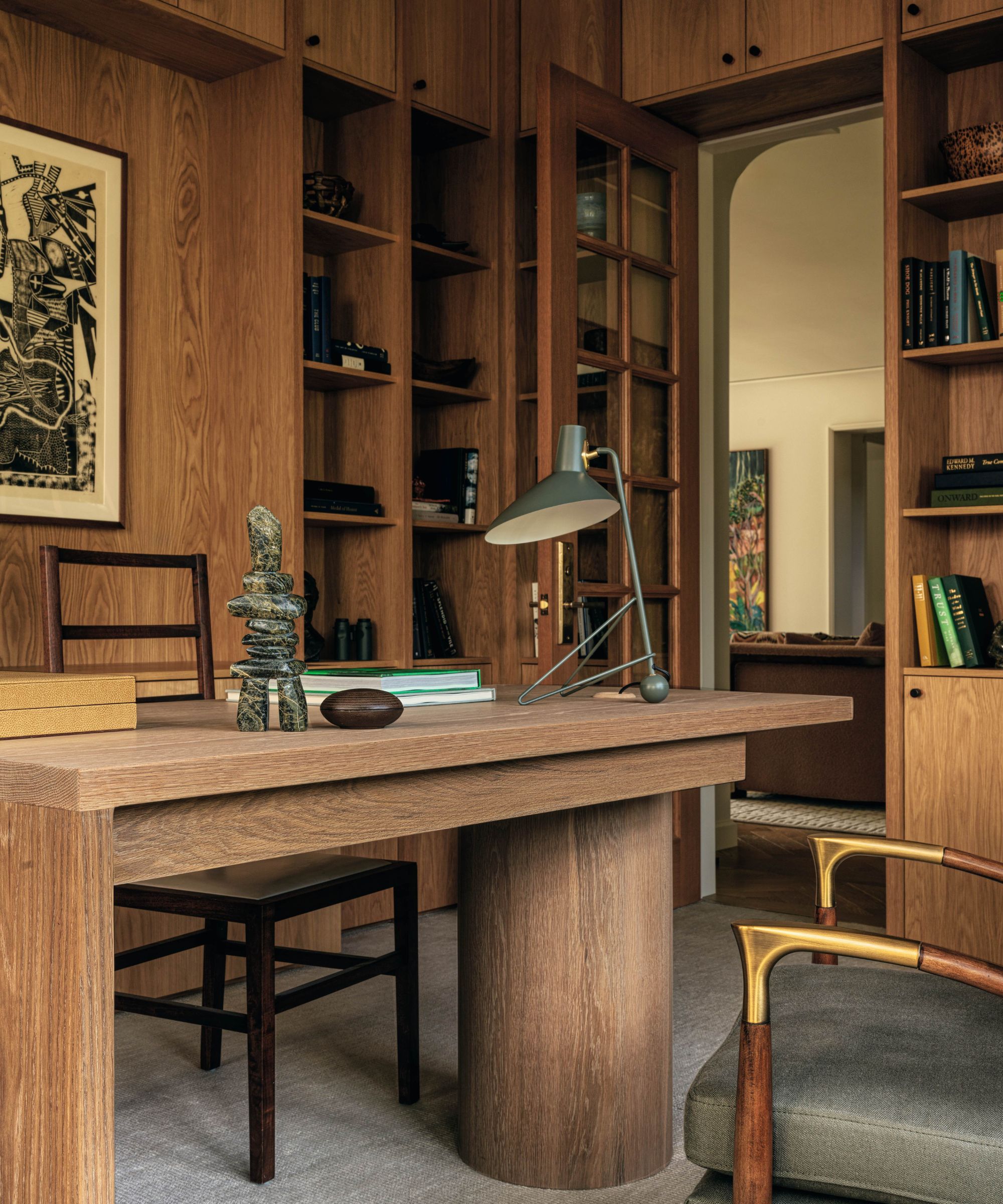
The snug features a chimney breast finished in hand-fired tiles – perhaps a subconscious reference, says Victoria, to a sense of Scandinavian coziness inspired by her husband’s Danish heritage. There’s an emphasis on texture that has an almost 3D feel, whether large-scale photographic prints, custom-designed wall sculpture, or the tactile marbleized wallpaper that brings movement to the smaller study, with its utilitarian but warm oak desk stretching between two walls.
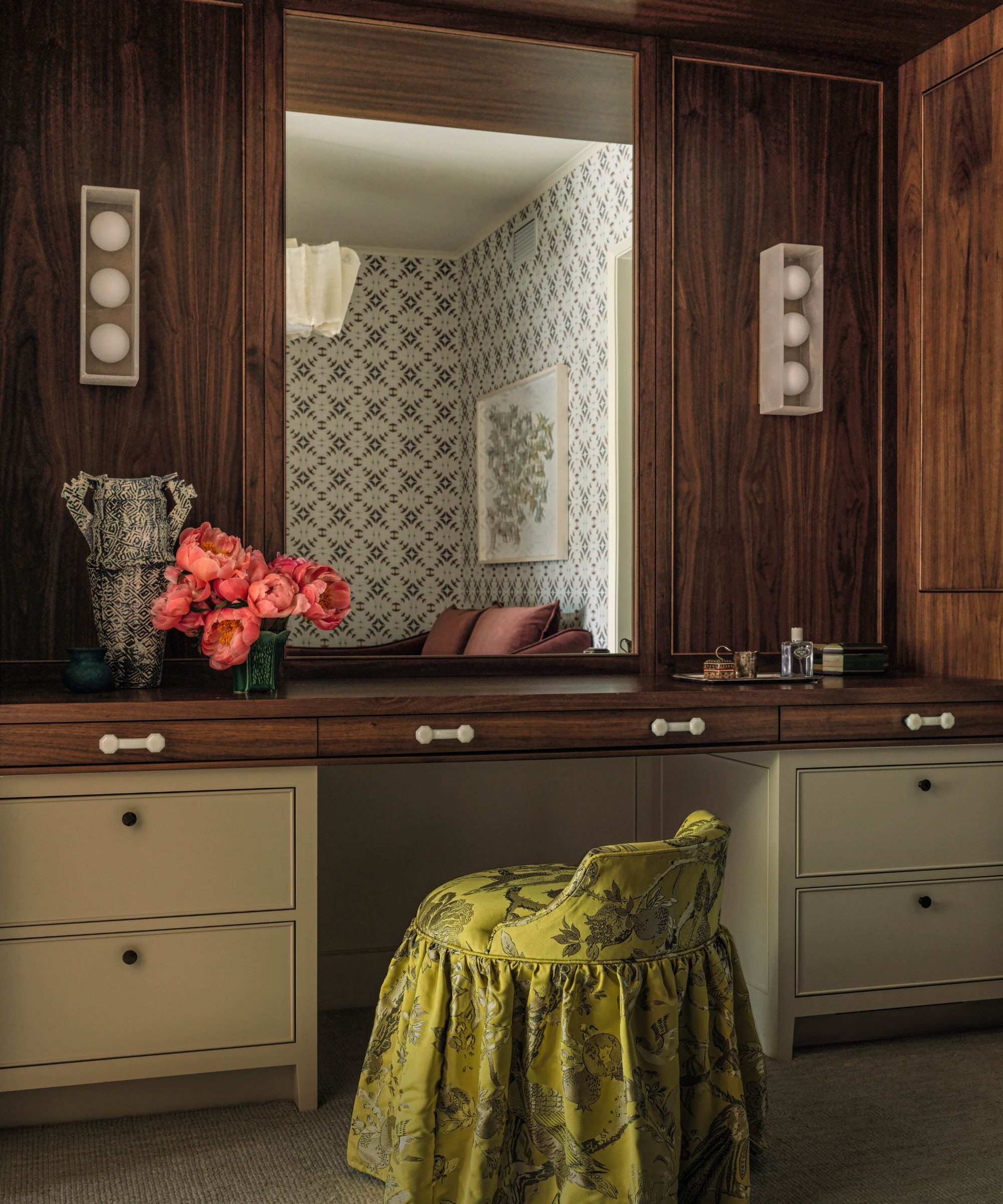
‘There are a lot of decorative influences but a cohesive color palette and an eye for scale balance them all out,’ explains the interior designer. ‘Everything is a dance. If you turn one dial up, you have to turn another down. For example, sculptural shaping only sings when you allow it space.’
The result is a home that easily pairs classic elements with experimental; graphic silhouettes with undulating shapes. It all adds up to something that Victoria describes as ‘perfectly imperfect’ – perhaps the very definition of a new house gently made old.