What you need to know
- Google is rolling out a redesign today for Search that brings all its quick settings under one roof with Material You-styled flair.
- All of its additional settings can be found within the "More from Google Search" section, and its "More settings" page also gained a redesign.
- The redesign brings better notice to the "Interests" page, which serves as a place where users can rediscover saved or "liked" content from the web and mobile.
Today, Google started rolling out a redesign for Search settings that collects all its offerings in one place with its modern design theme.
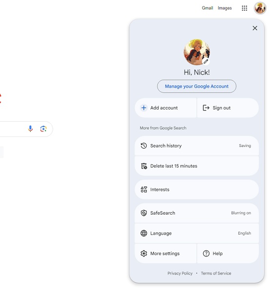
As spotted by 9to5Google, Search's settings on the web are now collected within your Account menu. Clicking your Account photo produces a new floating Material You themed menu in the top right corner. The redesign brings some new goodies, such as a "More from Google Search" button.
Leading the section off is "Search History," which informs users if they have Google saving their latest "Web & App" activity or not. Beneath that is the option to "Delete last 15 minutes."
Next, Google has included an "Interests" button, which brings more discoverability for an update it pushed last year. This option takes users to a page that shows products, pages, and articles they've "saved" before for rediscovery.
At the bottom, Google Search's "more settings" page has also gotten in on this Material You redesign. Google has organized this page with two tabs: Privacy & Safety and Other Settings. The former contains your search history settings, content information (for personalization), and Parental controls. The latter lets you swap to Google's dark theme, hear spoken answers, and Google's continuous scroll toggle.
The publication notes that this redesign for Search's settings on the web mirrors Google's previous work on mobile, as well. The changes should begin appearing today, and if you're not seeing them yet, give things a little more time.
Back in December, Google updated Discover to give users an easier experience finding their saved or liked content on its main mobile app. This brought about a grid view for any YouTube videos or articles users saved on their devices. That, in turn, affected those on desktops, which saw a similar design change.
However, it was evident during the rollout that Google hadn't optimized the redesign, effectively leaving desktop users with a view that echoed mobile.
A week ago, Google started pushing another redesign that brought its Account sign-in page into the Material You world. Web and mobile users received this change, as those on the former saw a horizontally placed sign-in area. Those on mobile will continue to see things vertically with the addition of a more modern interface that echoes Google's app ecosystem.