What you need to know
- Google is known for constantly changing its Android app's interface and is considering relocating the search bar to the bottom, a concept tested since 2021.
- A new experiment involves a Material 3 redesign for the bottom bar, incorporating a pill-shaped search field.
- The updated design introduces a default blue tint, replacing the Dynamic Color, to enhance visual appeal and modernize the app's appearance.
Google's Android app loves to shake things up, especially with its interface, and it's back at it with the idea of putting the search bar at the bottom. This experiment has been kicking around for a while, starting way back in 2021 and popping up again in late 2023.
As spotted by a user on X (via 9to5Google), there's a new test going on. Google is apparently playing around with a Material 3 redesign for the bottom bar, where it's putting a pill-shaped search field right into the bar itself.
New Google UI pic.twitter.com/HGGVpw8ER9April 5, 2024
The big visual change is perhaps with the search bar. Currently, it's situated at the top of the app, but the redesign moves it down just above the bottom bar. This might seem like a small move, but it actually makes the bar way easier to reach, no matter what kind of phone you have.
This move might be Google's way of admitting our phones are getting huge. The search giant may be thinking that having a UX element up at the top might not be getting as many clicks as it likes. So, bringing the search down to the bottom could make it way easier to tap on and make your search experience a whole lot smoother.
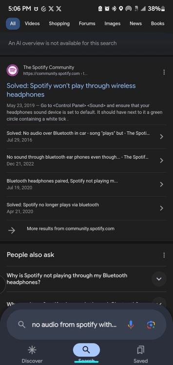
In the old version, the search bar shrank when you actually started searching. Now, it stays big and bold, no matter what you're looking for.
In the updated design, Google swaps out the Dynamic Color for a default blue tint, which really pops against the Search results page. This redesign of the bottom search bar gives the Google app a much more modern vibe compared to how it looks right now.
One big change you'll notice is that in this redesign, the "Google" logo isn't up there at the top anymore. Instead, you'll see search filters like Images, Videos, News, and more right off the bat.
However, this shift means more space is taken up, which could have been used to show search results instead.
Sure, the new design might cut into how many search results you see at first, but hopefully it makes searching way easier and faster to use overall. We'll have to see if it works out when they roll it out to everyone.