
Pantone made a huge splash when they announced the serene and airy off-white, 'Cloud Dancer,' as their color of the year for 2026. The postmodern pick sparked a surprising amount of controversy, stirring conversations around the evolution of trend cycles and the nature of color itself. However, quietly and behind the scenes, a bolder shade has been dominating pop culture: tangerine.
Most recently, the shade was worn by Kylie Jenner and Timothée Chalamet at the premiere of Marty Supreme (and then recreated by Meg Stalter and Paul W. Downs).
The sartorial moment came on the heels of a viral 'leaked' Zoom call where the actor suggested using 'Hardcore orange. Corroded orange. Falling apart orange. Rusted orange' to market his highly anticipated film. Before that, Taylor Swift chose the shade as a key color for her 2025 album The Life of a Showgirl. No question, decorating with orange is in the zeitgeist.

So, what does tangerine's cultural moment signify for interior design trends in practice? Blockbusters from previous years, like Barbie and Wicked, also came with a built-in promotional palette, but it would be untrue to say that meant we all instantly redid our entire homes in Barbiecore pink or Wicked green. Instead, these tones subtly influenced how we accessorized and inspired new colorways for furnishings.
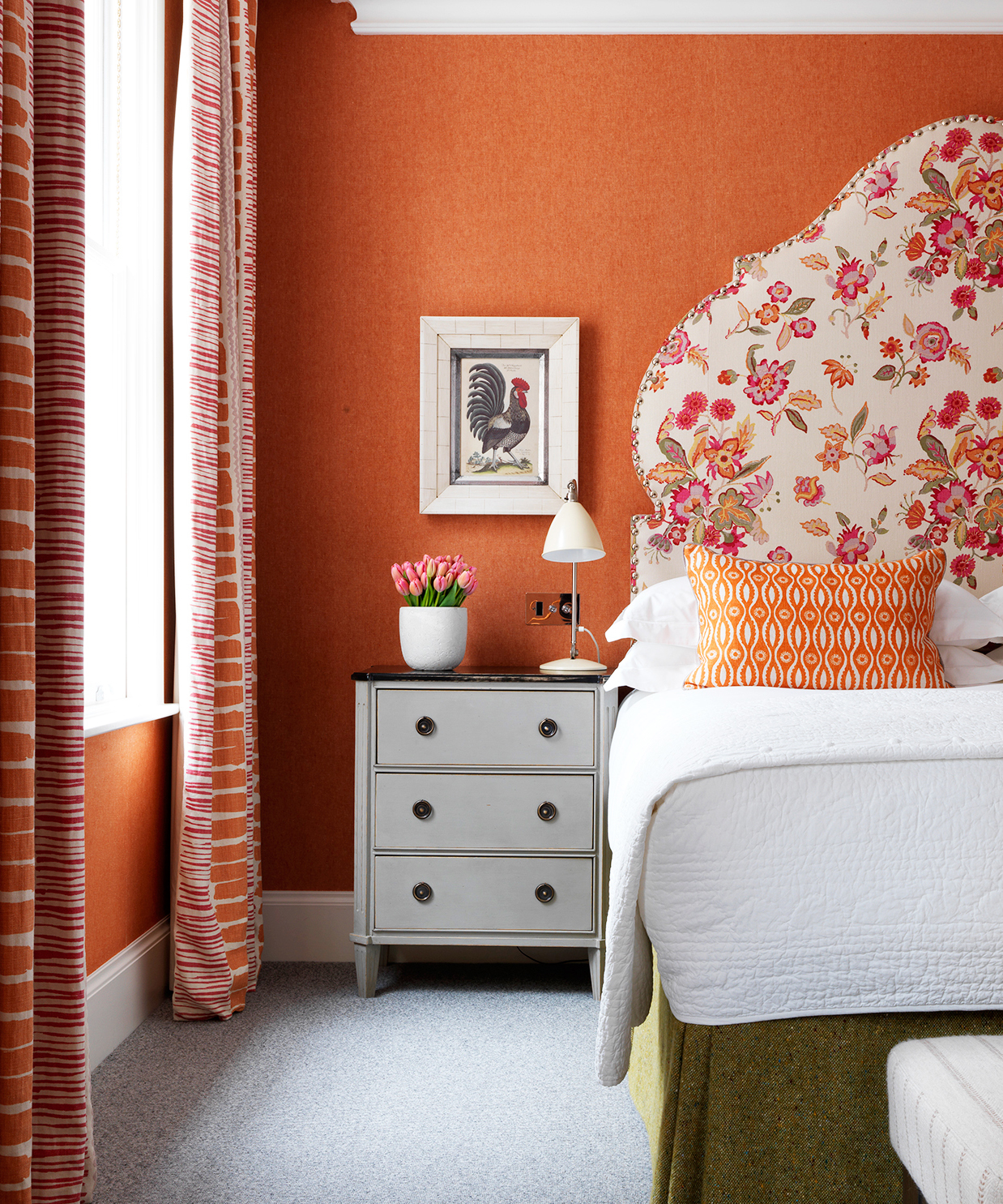
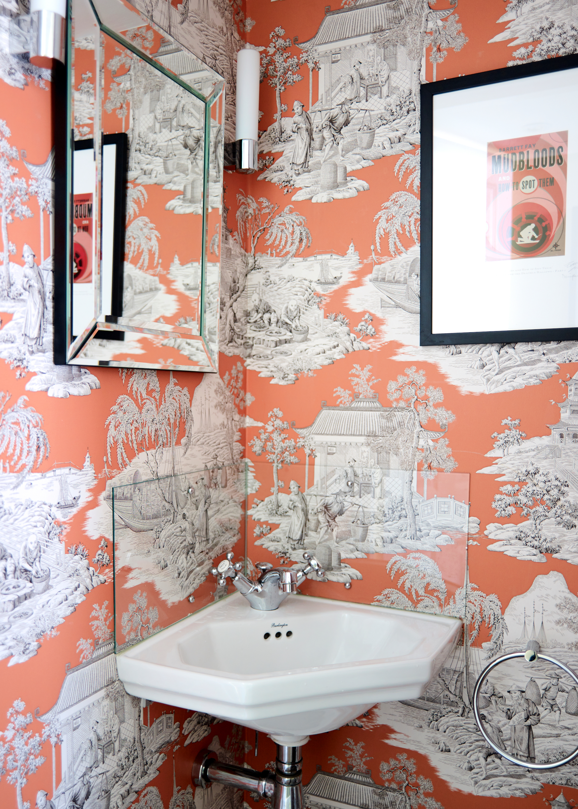
However, shades of orange are much more timeless and versatile hues in interiors than either of these viral shades. Designer Tyler Ellis explains: 'In the fashion world, orange already carries an air of prestige, most notably as the signature of Hermès, whose iconic box whispers exclusivity and heritage. For decades, that particular shade has belonged to the elite, its quiet confidence understood by those who can afford it.'
Shop The Orange Edit
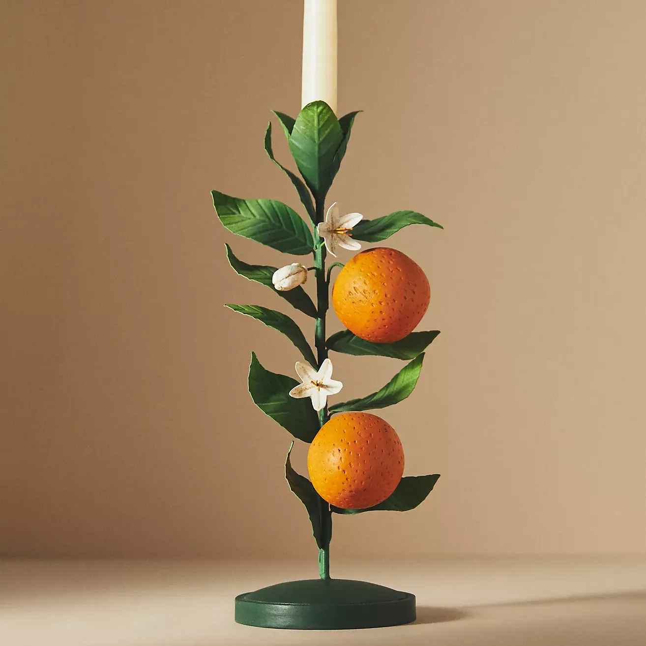
This candle holder is beautiful enough to use as decor. Whether it's on your dining table for a dinner party or styled on a coffee table, it's sure to make an impact.
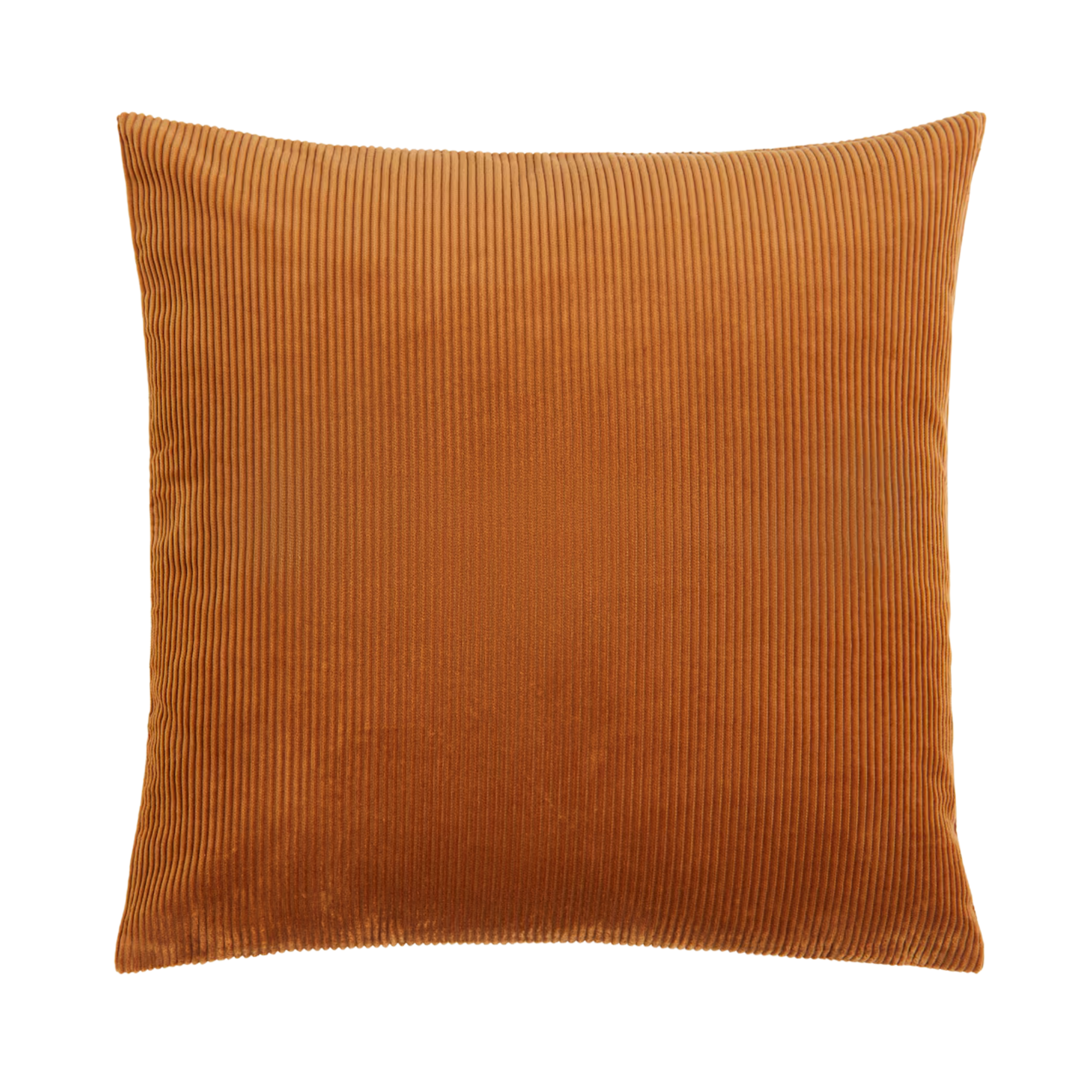
The subtle stripes and fluffy feel of corduroy is the ideal choice for adding a touch of texture to a neutral sofa. Its burnt orange color would introduce warmth without overwhelming the room.
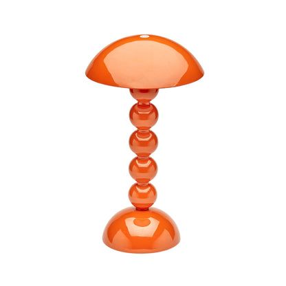
The rechargable bobbin lamps from Addison Ross are iconic, and this orange color is especially so. It would be so striking styled in an orange living room.
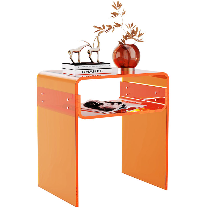
It's a special end table that both reflects light, and adds color. This unique acrylic piece adds bold interest with a design-forward feel.
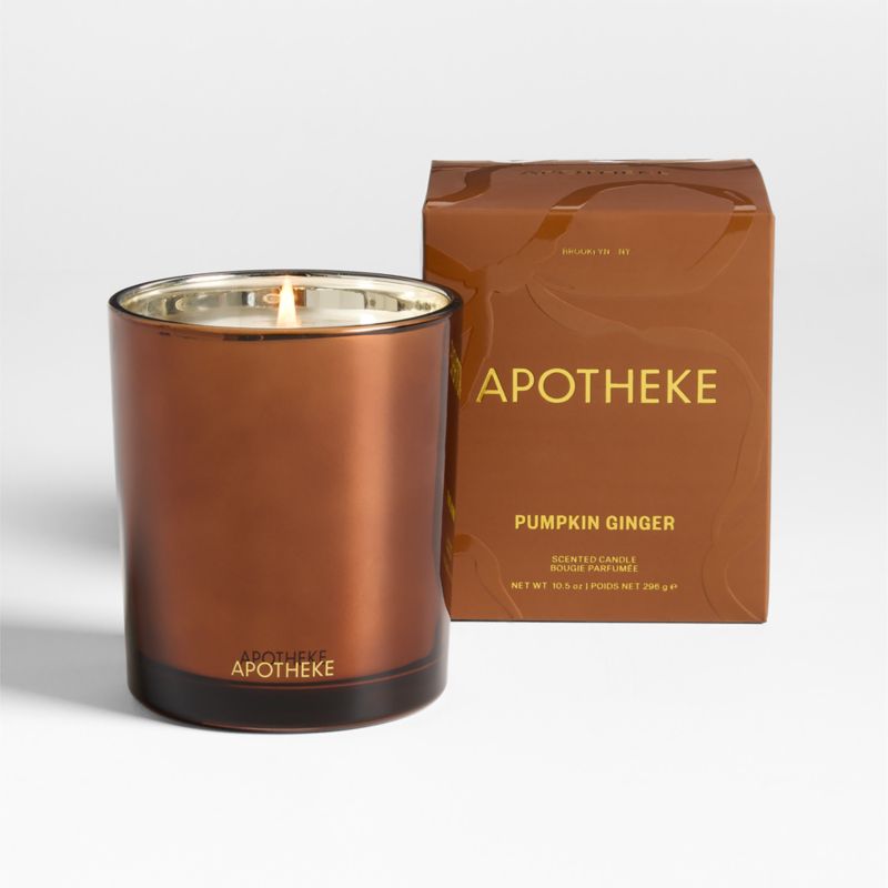
If there’s ever a scent that embodies a color, it’s this one – Pumpkin Ginger. Fresh roasted pumpkin and spicy notes of ginger, clove, and cinnamon blend beautifully with creamy coconut milk and the warmth of vanilla and musk.
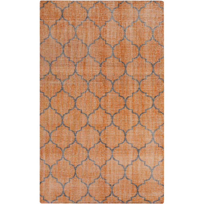
This geometric floral rug is both whimsical and grounding, perfect for any living space. If you want to integrate a touch of orange without committing too heavily, it's a great place to start.
Designers have sworn by the powerful, if underrated effect of the color for years. They've also complimented the sheer amount of colors that go with orange. Tyler states: 'Historically, orange has often been overshadowed by its flashier neighbors red and yellow, both of which dominate seasonal trends. Yet in the right tone, particularly a rich burnt orange, it becomes almost a neutral, grounding a space with unexpected sophistication.'
She adds: 'When done in the right hue, it can transcend decades from Marilyn Monroe’s shimmering satin gown in Gentlemen Prefer Blondes, radiating Hollywood glamour under studio lights, to Zendaya’s sweeping Louis Vuitton creation at the 2025 Golden Globes, a modern masterclass in bold elegance. This shade carries a rare versatility, able to command attention in its vibrancy while offering warmth and depth that never overwhelm.'
Luckily, the Timothee Chalamet and Kylie Jenner-approved palette is versatile to emulate at a variety of scales. Tyler advises: 'A mid-century armchair upholstered in cognac-toned leather can anchor a room with quiet authority. A sculptural ceramic pot in a warm terracotta can bring life to a minimalist corner. A large-scale modern art piece in shades of orange can draw the eye instantly while adding a sense of energy and warmth. In the home, orange works best when it feels intentional, a carefully placed punctuation mark in a thoughtfully composed space.'
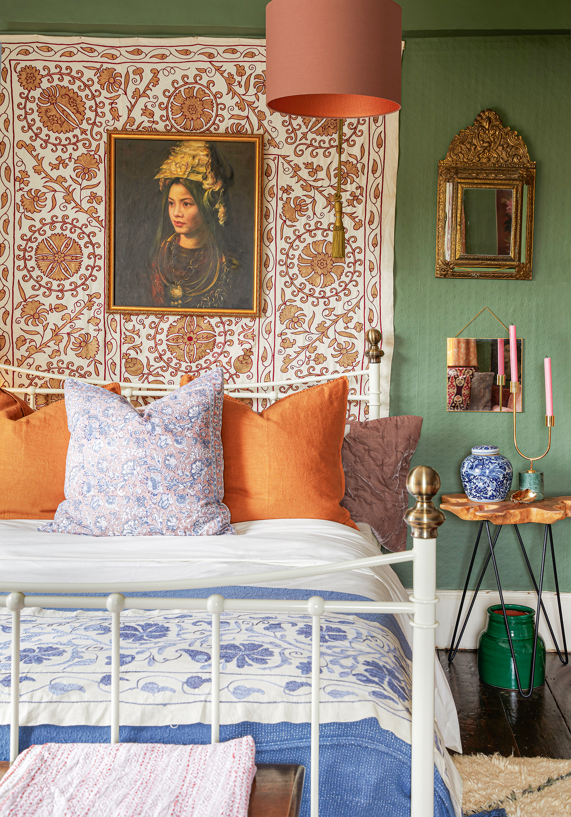
Her recommendations align with the idea that a film-inspired color trend is unlikely to overturn everything we've known about design to that point, but they will likely be subtly integrated into our interiors with small accents. If you are a fan of orange, this year might be the perfect time to try it out in your home.