You may think your grocery choices come down to taste or price—but the truth is, color plays a powerful, subconscious role. Supermarkets spend millions on design research to guide your eyes and emotions before you even touch your wallet. From bright fruit displays to calming dairy aisles, every hue is carefully chosen to influence behavior. Experts call it “supermarket color psychology,” and it’s the secret weapon behind many of your impulse buys. Once you see how it works, you’ll never walk down an aisle the same way again.
1. Red Creates Urgency and Appetite
There’s a reason red dominates sale signs and snack packaging—it triggers excitement and appetite. In supermarket color psychology, red is linked to energy and hunger, prompting shoppers to grab food quickly. You’ll notice it around deli counters, meat sections, and “buy now” promotions. It’s not just eye-catching; it subtly makes you feel like you’re missing out if you don’t act fast. The next time you see a red tag, pause before letting that sense of urgency guide your cart.
2. Yellow Signals Happiness and Impulse Buying
Yellow is the color of cheerfulness and optimism—but it’s also one of the most manipulative shades in retail. Supermarkets use yellow to make products appear friendlier, fresher, and more inviting. It’s often paired with red in clearance signs because the combination sparks attention and quick decisions. Research shows yellow can even release dopamine, putting shoppers in a “feel-good” mood that leads to impulse purchases. That bright, sunny label on your cereal box? It’s not there by accident.
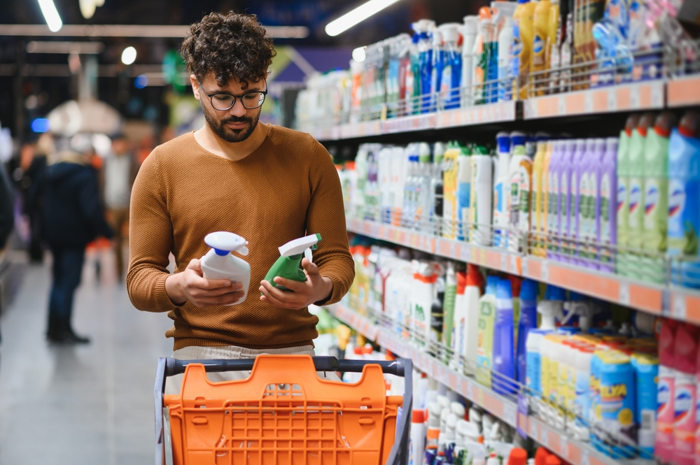
3. Green Suggests Freshness and Health
In the world of supermarket color psychology, green is the ultimate cue for “natural” and “organic.” Stores use it to signal health, sustainability, and freshness—even if the product itself isn’t particularly wholesome. That’s why you’ll see green packaging in everything from produce aisles to snack foods, trying to appear more nutritious. Studies show shoppers associate green with trust and eco-consciousness. When you reach for a “green” brand, check the ingredients—sometimes the color is healthier than what’s inside.
4. Blue Calms You—and Slows You Down
Supermarkets use blue strategically to create a sense of calm and trust. Because blue isn’t naturally associated with food, it doesn’t stimulate hunger; instead, it makes shoppers linger. That’s why you’ll often find blue tones in signage, checkout lines, and frozen food sections—places where stores want to slow your pace. A slower shopper tends to browse more, and browsing leads to more purchases. Blue may feel relaxing, but it’s a clever way to keep you shopping longer.
5. Orange Evokes Warmth and Affordability
Orange is the “approachable” color in supermarket design—it’s energetic but not intimidating. Brands use it to suggest value, enthusiasm, and accessibility. You’ll often see it on budget-friendly or family-oriented products, where it implies warmth and fun. It’s also a go-to for bakery displays, evoking feelings of comfort and hominess. In supermarket color psychology, orange walks the perfect line between excitement and trust.
6. White Communicates Purity and Simplicity
White space isn’t just about minimalism—it’s a marketing tool that signals cleanliness and transparency. Supermarkets use white backgrounds on private-label or “healthy lifestyle” brands to convey purity. Shoppers subconsciously equate white with honesty, assuming the product has fewer additives or hidden ingredients. You’ll also see white packaging dominate dairy aisles, reinforcing the idea of freshness and wholesomeness. The effect is simple: less clutter equals more trust.
7. Black Adds Luxury and Exclusivity
When supermarkets want to make a product appear premium, they go dark—literally. Black packaging conveys sophistication, power, and exclusivity. It’s often used on high-end chocolates, wines, and gourmet products to justify higher prices. Even everyday items like coffee or olive oil look more expensive in sleek black containers. In the psychology of color, black whispers luxury without saying a word.
8. Brown and Earth Tones Suggest Authenticity
Earthy tones like brown, beige, and tan appeal to shoppers’ desire for authenticity and craftsmanship. These colors hint at tradition, natural ingredients, or “farm-to-table” origins. Supermarkets use them on bread, granola, coffee, and organic goods to trigger a sense of comfort and trust. It’s an especially effective tactic for eco-conscious buyers seeking rustic or sustainable vibes. Brown may seem dull—but it’s one of the most persuasive hues in grocery marketing.
9. Bright Contrasts Boost Brand Recognition
Ever notice how certain brands stand out instantly, even from across the aisle? That’s not luck—it’s deliberate use of contrast. Supermarkets and manufacturers pair bold complementary colors to make logos and labels pop. These high-contrast designs catch your eye, even when you’re not consciously looking for them. From soda bottles to cleaning supplies, contrast ensures the product sticks in your mind long after you’ve left the store.
Why Awareness Is Your Best Shopping Tool
Supermarket color psychology works because it operates below the surface—guiding emotions, hunger, and decision-making without you noticing. But once you’re aware of these tricks, you regain control over what ends up in your cart. Look past the bright reds and greens to compare labels and prices objectively. The most powerful shopper is an informed one who understands the science behind every color-coded temptation. After all, in the battle between marketing and mindfulness, awareness always wins.
Have you ever bought something just because the packaging “looked good”? Share your biggest color-influenced purchase in the comments below!
What to Read Next
- 9 Store Layout Secrets That Influence What You Grab First
- 7 Times Grocery Stores Used Music To Influence Spending
- How Grocery Stores Use Aisle “Wayfinding” to Influence Your Purchases
- Understanding ‘Best Before’ Dates: 13 Ways They Can Influence Your Grocery Shopping (And How Not to Be Rushed)
- 9 Lobbying Groups That Influence What Ends Up In Your Grocery Cart
The post 9 Sneaky Ways Supermarkets Use Colors to Influence What You Buy appeared first on Grocery Coupon Guide.