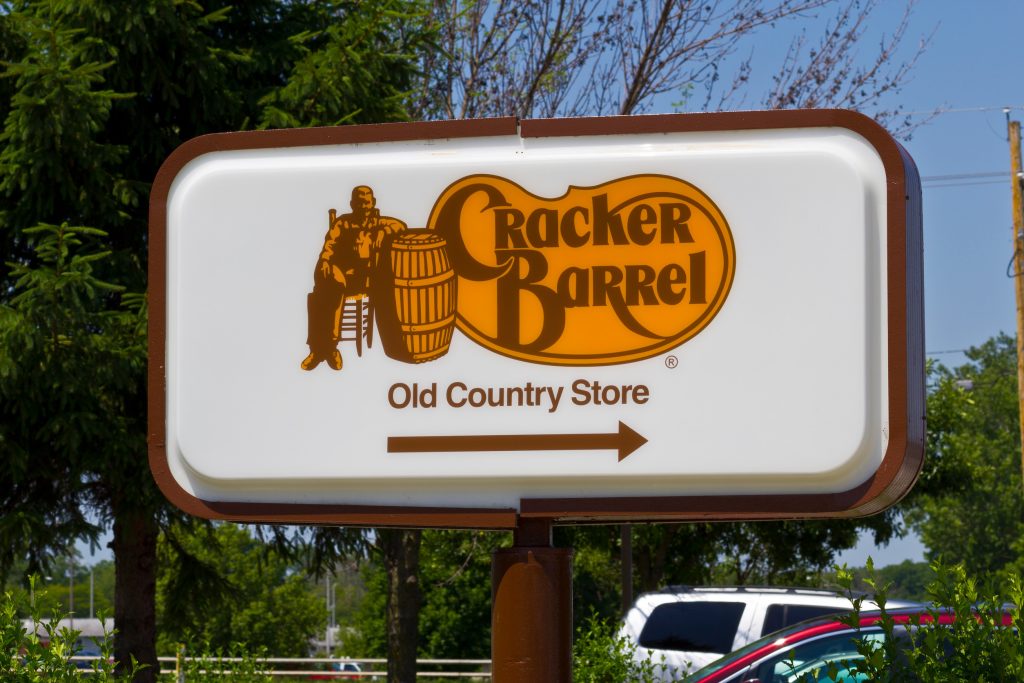
Cracker Barrel is a brand synonymous with Southern comfort and hospitality. It recently unveiled a logo refresh that sparked an unexpected wave of criticism. This isn’t just about a minor design tweak; it’s a fascinating case study in brand loyalty. The emotional connection customers have with beloved establishments runs deep. Let’s explore the surprising reasons why this simple change ignited such a passionate response.
The Weight of Nostalgia in Brand Identity
The original Cracker Barrel logo evoked a sense of timeless Americana. It directly called to mind pleasant memories for many customers. This strong association with positive past experiences made any alteration feel like a personal affront. The brand’s identity symbolized simpler times and comforting traditions. This deep-seated nostalgia proved to be a formidable opponent to the new design.
The Rocking Chairs: More Than Just Furniture
Inviting rocking chairs adorn Cracker Barrel’s front porch, forming an integral part of its charm. These chairs represent a welcoming atmosphere and a slower pace of life. When the new logo subtly shifted away from these traditional visual cues, many felt it was a departure from core values. The rocking chairs were not merely decorative; they were symbolic anchors of comfort and community. Their downplaying in the new visual identity contributed significantly to the discontent.
The Font Fiasco and Authenticity
The original logo’s typeface looked rugged and homespun. It perfectly mirrored the brand’s rustic aesthetic and country store origins. It conveyed a sense of handcrafted authenticity that resonated deeply with its audience. The updated font seemed more modern and streamlined, losing this essential character. This change felt like a shift away from the genuine identity that had defined the Cracker Barrel brand for decades.
The Subtle Shift from Rustic to Refined
The backlash also stemmed from a move away from Cracker Barrel’s rustic roots. Many saw the new design as a step toward a more polished and generic appearance. The original logo, with its rough edges and folksy charm, perfectly embodied the brand’s concept. The new design, while aiming for broader appeal, stripped away some of this distinctive character. Customers feared this subtle shift might signal a broader change in the experience they cherished.
The Illusion of Corporate Overreach
Many customers interpreted the logo change as a top-down corporate decision. They felt it disregarded their emotional investment in the brand. This perception of corporate overreach alienated a segment of the loyal customer base. They felt the company undervalued their long-standing connection. The incident highlighted the delicate balance companies must strike between modernization and respecting customer relationships.
The Power of Social Media Amplification
The digital age ensured that individual grievances quickly escalated. Social media platforms provided an immediate forum for customers to voice their dissatisfaction. This created a snowball effect of negative feedback. The sheer volume of comments on platforms like X and Facebook demonstrated the collective power of a devoted customer base. Cracker Barrel faced a public relations challenge magnified exponentially by online communities.
The Unspoken Promise of Consistency
For many, Cracker Barrel represents a consistent, dependable experience. It is a familiar haven in an ever-changing world. The logo, therefore, wasn’t just a design; it was a visual promise of this reliability. Altering it felt like breaking an unspoken contract of stability. Customers seek comfort in the predictable, and a major redesign can disrupt that sense of assurance.
The Identity of “Home Away from Home”
Cracker Barrel has cultivated an image as a “home away from home” for travelers and families. The brand created a place that honors tradition and prioritizes comfort. The original logo contributed significantly to this feeling of warmth and familiarity. When the logo changed, it subtly threatened this established identity. Patrons felt as though someone was altering their sanctuary.
Missed Opportunity for Customer Engagement
Perhaps the biggest oversight was the lack of customer engagement surrounding the change. Brands that involve their community in such updates often fare better. It fosters a sense of shared ownership and understanding. Without this crucial step, the logo refresh felt imposed on customers. A more transparent approach might have softened the blow and turned critics into advocates.
Reflecting on Brand Evolution
The Cracker Barrel logo backlash is a potent reminder that a brand’s identity is more than a marketing tool. It holds memories, emotions, and deeply held values for its customers. When considering changes, companies must carefully navigate the emotional landscape of their audience. The incident shows that even subtle shifts can resonate profoundly. This is especially true when they touch the core of what people love about their favorite brands.
What are your thoughts on brand redesigns for classic establishments? Share your perspective in the comments below!
What to Read Next…..
- 7 Surprisingly Sweet Reasons People Miss Rotary Phones
- 6 Stores Boomers Still Talk About Long After They Closed
- 7 Guest Habits Millennials Say Boomers Just Won’t Stop Doing
- 10 Childhood Toys from the 90s That Were Surprisingly Hazardous
- Do Boomers Really Think Gym Rats Are Narcissists? Let’s Talk About It
The post 9 Secrets Behind Cracker Barrel’s Logo Backlash (Even the Rocking Chairs Played a Role) appeared first on Budget and the Bees.