
Q: Kitchen cabinets in two colors seems like a more modern approach, but how do I pick two colors that work together, and how do I decide which shade goes on the top and which on the bottom?
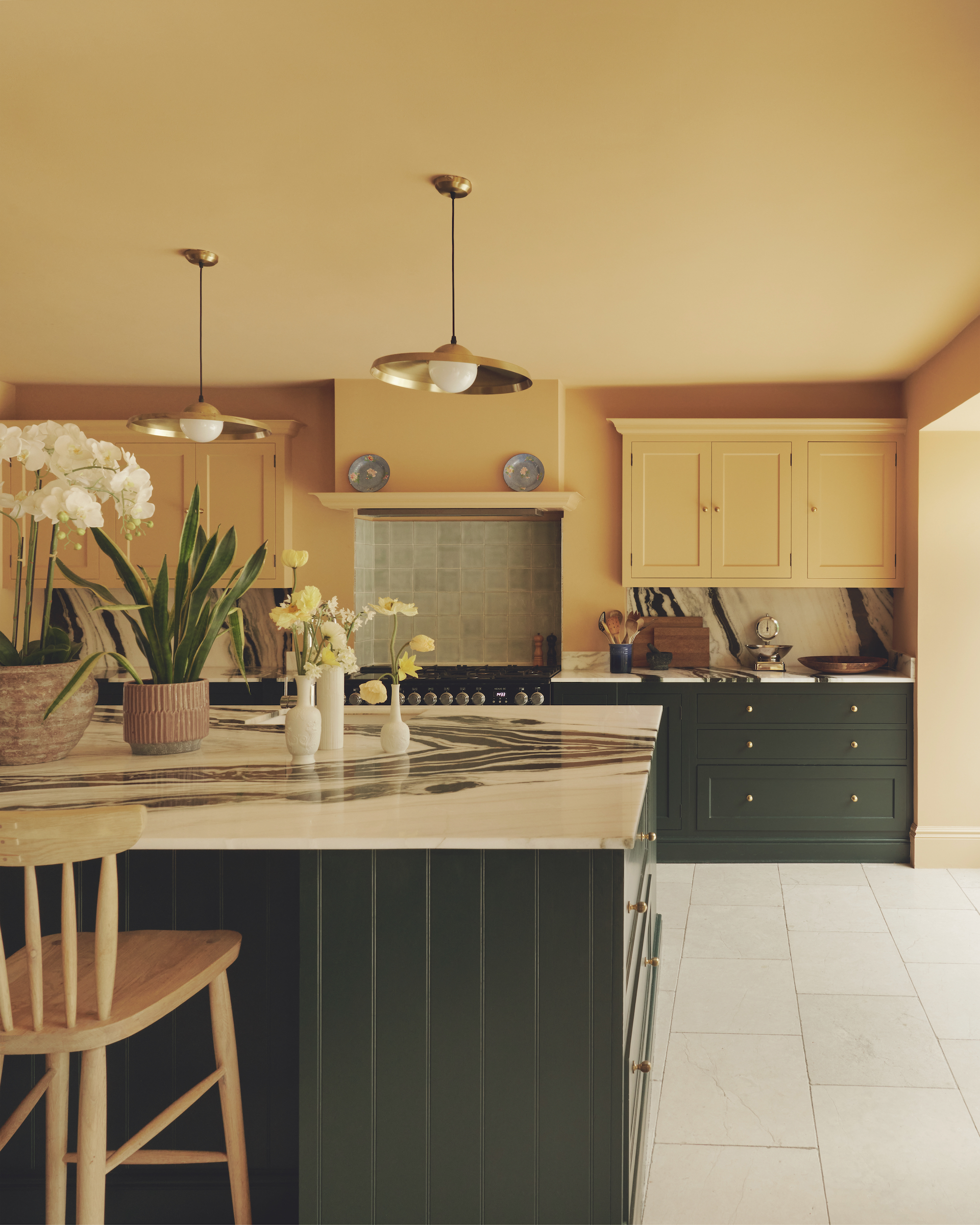
"We have cabinets in two colors all the time. Very often, there is so much cabinetry in the kitchen that if you keep it one shade, it ends up being an overwhelmingly large block of a single color, and without much other furniture in the room, it has nothing to break it up. Having two hues is an easy way to make the cupboards feel more bespoke (it’s worth remembering that the timber itself also counts as a color, and you might decide to only paint half the cabinets and keep the others as natural wood).
The rule I always follow is to put a lighter color on the wall cabinets and the darker color on the floor-level ones. This means that the darker shade grounds the space while the paler one, which is more directly in your sightline, recedes a little.
To pick the right kitchen colors, we usually start with the marble or countertop material. There are so many different pigments in a single slab of marble, and when you look at it up close, you can find something in it that would work on the cabinetry, perhaps a hint of green or ochre or pink… it could be anything, really.
And then make sure that both colors you choose have the same tone. Perhaps both are earthy, or both are punchy. Even when paint choices are different, they should feel like siblings in some way, and that depth of hue in them is the way to ensure they’re connected."
Q: What do I need to consider about picking a hallway color to drench the space in, using it all over? I don't want to go dark, but surely a light color isn't practical for the floor?
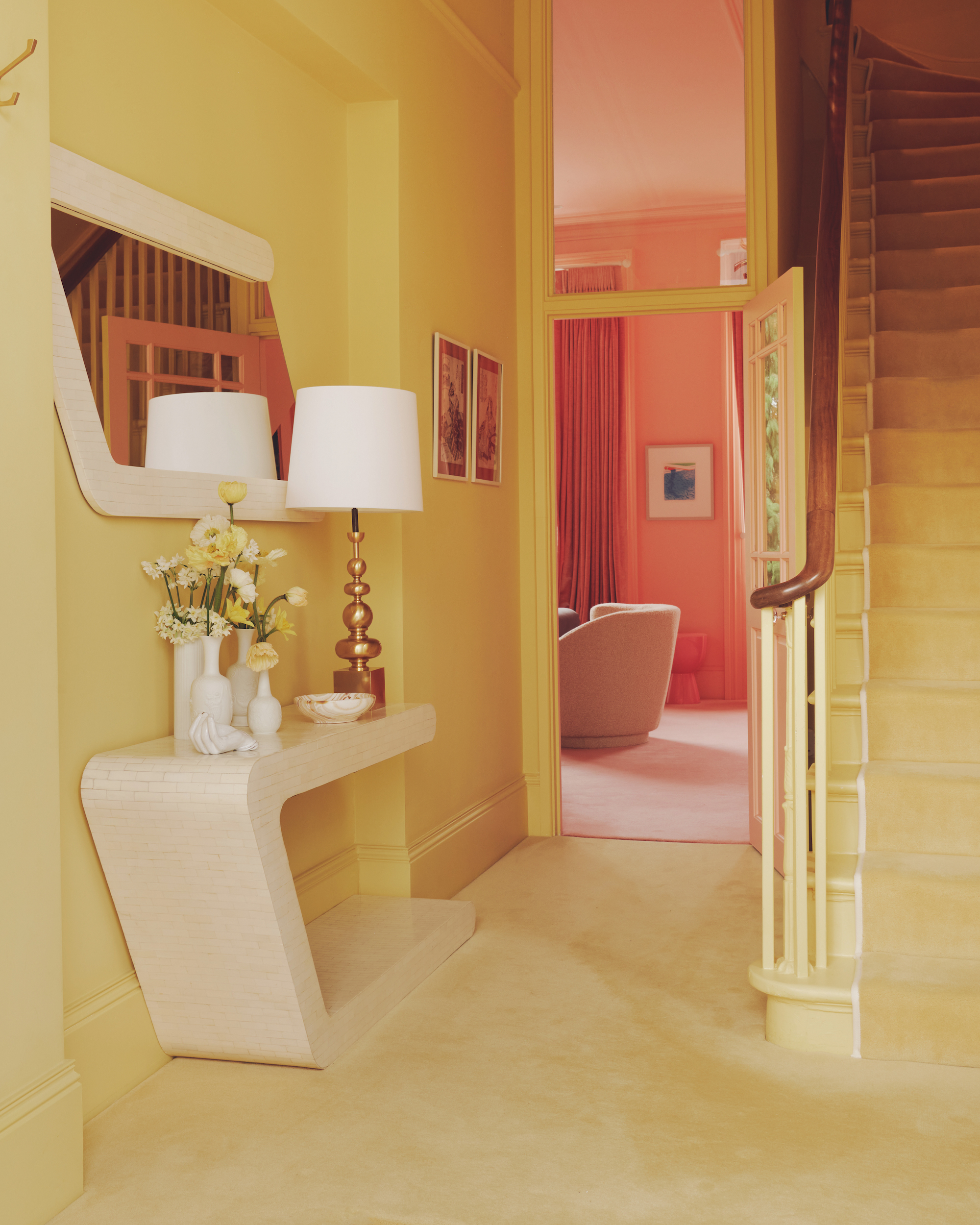
"We did a hallway recently that our client said she really wanted to glow. She is our bravest client and pushed our boundaries, so it was exciting to collaborate on. Her brief was for it to feel like she was stepping into a cocoon of heavenly light the moment she got home, and we ended up using Ming Gold, a sunny yet slightly muted yellow from Sanderson.
The thing to remember about entryway colors is that, because the walls are very close together, colors used in them will always feel more intense than when you put them in a larger space — it will seem more saturated than it actually is, so do go for mid-shades rather than super-bold.
Is the matching yellow carpet we added practical for a hallway, I hear you ask? Well, their main entrance is on the lower ground floor, and this one is more for guests. We also added a vast recessed door mat that you can’t see in the photograph, so there is scope for wiping feet. Anyone wishing to emulate this for a hallway they use more often should probably look for beautiful tiles in a matching shade, which they’d find to be more hardwearing."
Q: What's the perfect pink paint, and how do I use it?
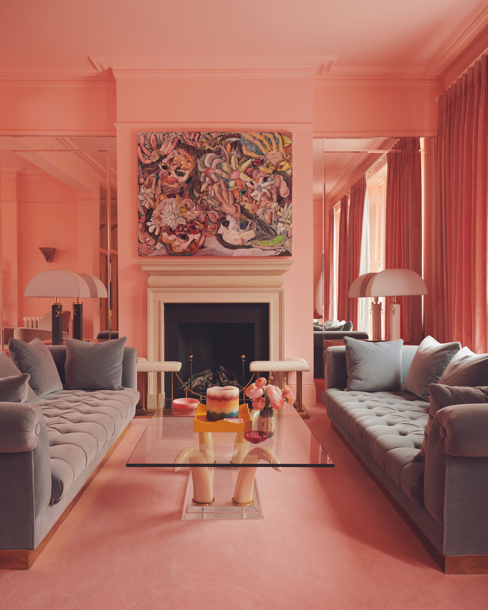
The perfect pink paint color has a yellow base, which gives it warmth. Farrow and Ball’s Setting Plaster is so popular, as it goes quite fleshy. We’re moving towards a more subtle way of using it, just on ceilings, with a more muted, yellow-beige on the walls. It’s very glowy, and the pink ceiling makes the whole room feel warm. A way to make a statement without the pink dominating the room.
We also love Farrow and Ball’s Templeton Pink, which is bright and intense, but without being too bubblegum or sweet. We covered a whole reception room in it, but that only really worked because the space was so large. For a more regular-sized room we’d probably have gone with Setting Plaster, which is more knocked-back. Our favourite neutral with a hint of pink is Dimity, also by Farrow and Ball. I have it on my own kitchen walls and it can look almost white, then in some lights the pink just manages to shine through.