In today's digital age, great visual branding is essential – get the right look and you can have customers emptying their pockets en masse. As a design journalist, it's something I analyse daily, but I'm ashamed to admit I'm not immune to the allure of sexy branding with a killer campaign. In the past, I've fallen into the trap, but for some reason, I couldn't seem to get enough.
Looking back at some of the most iconic brands, you'll start to see it's much more than clever design – great branding sells a fantasy. While the concept is nothing new, the online obsession with generational divides and micro-aesthetics is ripe for targeted branding that appeals to a desire for identity. This curated exclusivity often comes with an elevated price tag, yet we still yearn to be part of the design cult, no matter the cost.

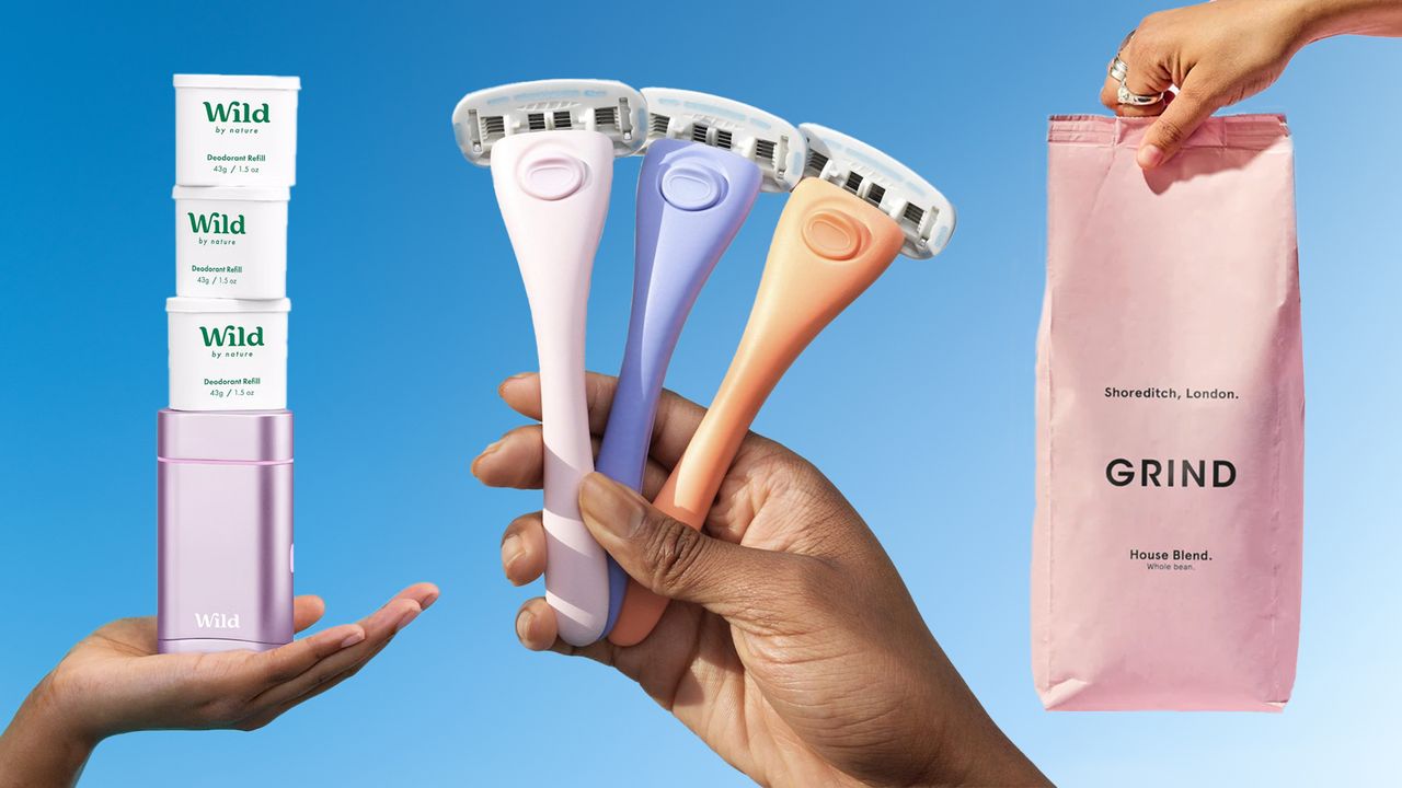
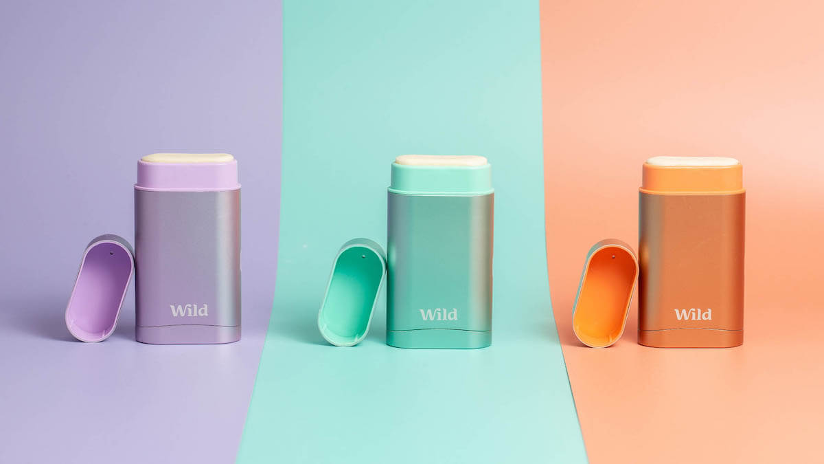
Branding has always been about capturing a 'vibe', whether it's Chanel's heritage luxury or BrewDog's gentrified blokecore aesthetic. I found myself settled in the elder Gen Z camp, desperate for branding that fed me the illusion of counterculture – something grown up without feeling stuffy or matronly. Enter brands like Estrid, Wild and Grind (to name just a few).
Monosylabic, minimalist and (seemingly) made for me, these stripped-back brands created a fantasy of attainable luxury in their unfussy design awash with matte pastels and understated typography. Subconsciously, I knew the design was targeted to me and yet I was more than happy to splash out on these products, not necessarily because they were better, but because the design brought the promise of some intangible 'it girl' status.
The sad truth is that great branding has the power to make a £30 bag of coffee beans feel like a chic purchase, rather than daylight robbery. Throw in a little bit of greenwashing and a £10 razor became a radical act of environmental conscientiousness. Who really cares if the products are on par with that slick design? I was blinkered by branding, infatuated with the fantasy these brands had spun.
Today I find myself at a moral crossroads, fed up with being flogged formulaic branding at undeservedly high prices. I staunchly believe we should pay for quality design. What irks me is how cut-and-paste design has become.
These minimalist brands are a post-luxury figment – an appropriation of refined high-end brand aesthetics quirkily repackaged for the Zillennial. While I have no issue with targeted branding, I find myself longing for something that feels authentic and original. Good design is worth investing in, but when everything looks the same, it's increasingly difficult to define what's 'good', and what's simply an empty aesthetic ploy.
While I don't see this branding aesthetic dying out anytime soon, I've certainly become more attuned to it and the fantasy is finally wearing thin. I'll always be a moth to a flame when it comes to good design, but at least now I can look beyond the brand. For some quality design inspiration, check out Matheson Food Company's classy packaging or take a look at why you need to adopt a 'fix and flex' approach to branding


