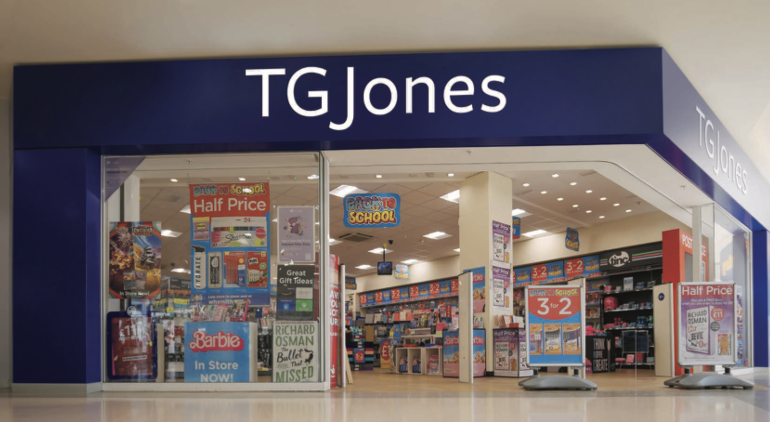
To understand the branding of TGJones, the rebranded chain of newsagents and stationery/book shops replacing the WHSmith brand on the UK's high streets, we can only really start in one place.
The South Pacific, in the Second World War.
During and after World War II, Melanesian islanders witnessed foreign armies arrive with vast supplies of goods, most often clothing, food, medicine and other equipment, airlifted into remote regions. These materials, often shared with locals, seemed miraculous to communities unfamiliar with industrial production. Some Japanese troops even posed as ancestral spirits to gain cooperation, while Allied forces also distributed cargo.

The sudden influx of goods inspired spiritual movements known as cargo cults. One of the most famous, the John Frum movement on Tanna in Vanuatu, blended traditional rituals with Christian elements and predicted American aid, which arrived in 1942. After the war ended, the militaries left and the cargo stopped appearing. In response, the islanders began reenacting military routines in hopes of summoning more supplies. They built straw aeroplanes, carved wooden radios, and lit signal fires, believing these acts might attract planes or ships.
Of course, the concept of cargo cults encompasses a wide range of examples dating back to the late-19th century, but these are perhaps the most famous instances of the phenomenon.
To these indigenous populations, what they had seen were strange, technologically advanced human beings, arriving via giant metallic vessels, gifting them 'cargo', to them an unprecedented bounty of treasure, and then disappearing again, as abruptly as they had appeared, and with as much explanation.
So they didn't understand that by replicating the mere surface elements of what they had seen (aeroplane-shaped straw piles, wooden radios, straw-and-mud runways, etc.), the ritual was an empty, meaningless one. No cargo would appear, and they were doomed to failure.
And that, in a nutshell, is the TGJones branding.
Replacing WHSmith on our high streets and in our shopping centres, it features a similar blue background, with plain white lettering on top. It's just done without any understanding of the subtle design cues that made the WHSmith logo and branding so enduring, even in its final, declining twilight years.
And to top it off, it's designed with a font that was seemingly chosen because whoever made that decision has no idea what purpose fonts and typesets really serve and merely focused on the 'spelling-out-the-name' part, as if that's the key ingredient.
Even 'TGJones' itself is a cargo-cult name. WHSmith very directly refers to the son of the company's founder, William Henry Smith, the man who took advantage of the 19th century's railway boom to make the company a huge success. 'TGJones' refers to no one and means nothing. It only imitates the visual appearance of the previous, once-hugely successful brand, and like the cargo cults of Melanesia, its vacant ritual is doomed to failure.
For better work, see the best rebrands of all time.