Benjamin Moore has 177 white paint colors listed on its website, Farrow & Ball and Little Greene both have 35, and Sherwin-Williams has 118 variations of white paint available for sale. Each brand's collection ranges from bright, snow white, to colors that could be better classified as brown or even green. Why mention these numbers? The sheer volume of choice proves that white paint is not as simple as just white paint. And whether you choose to use white vs off-white in your home will greatly impact your space.
"Whites are some of the most deceptively complex paints you can work with," says Pennsylvania-based interior designer Krystal Reinhard. Decorating with neutrals can lean warm or cool, shifting undertones depending on their base and what they’re reflecting off of in a space — floors, furniture, even the greenery outside your windows.
Krystal explains, "When we think of 'white,' we often imagine a true, crisp white, which typically pulls cooler. 'Off-white,' by contrast, is softened with warmth — ivory, cream, or chalky tones that read gentler and more forgiving." The aesthetics of each morph to however you use it. A creamy, off-white living room wall feels soft and inviting, while stark white cabinetry will feel clean in a kitchen. So how do you choose the right white paint for your home? Designers share the nuances of white vs off-white, and how to decorate with each.
When to Use True White
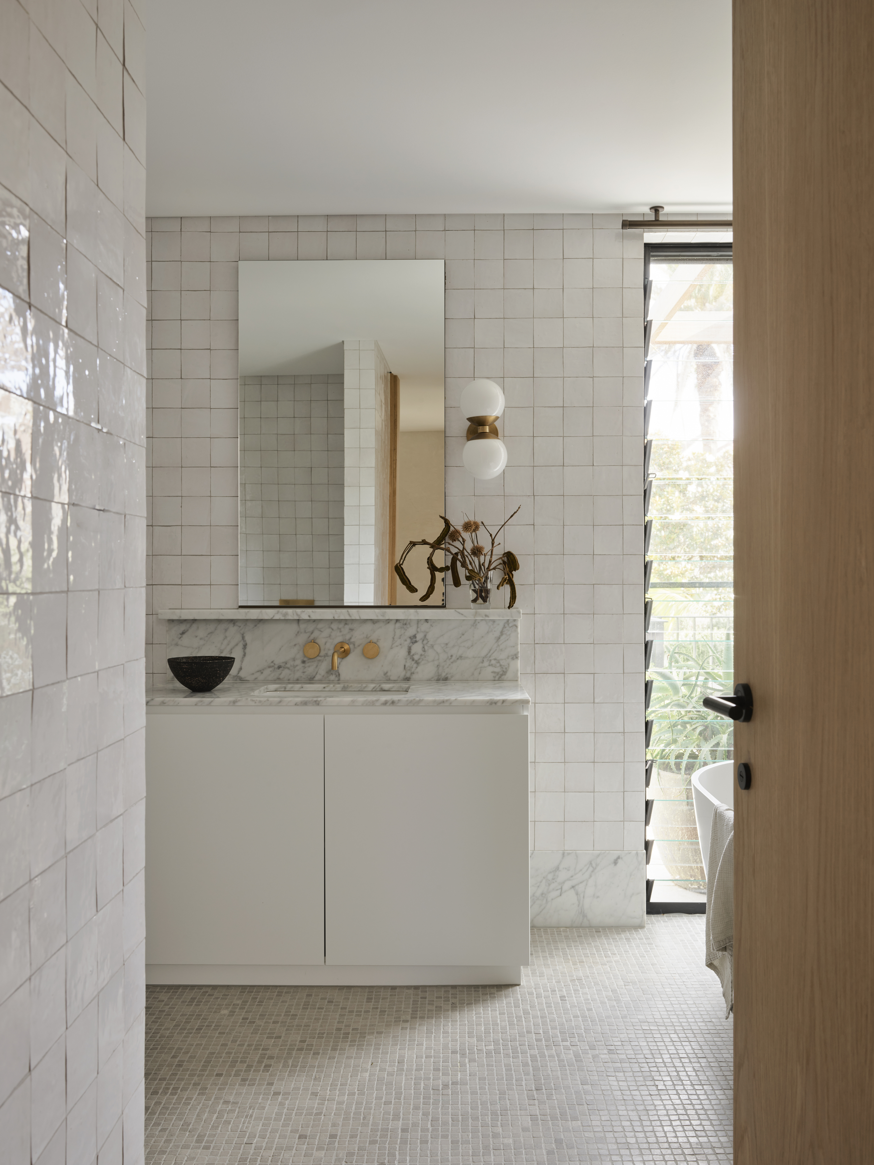
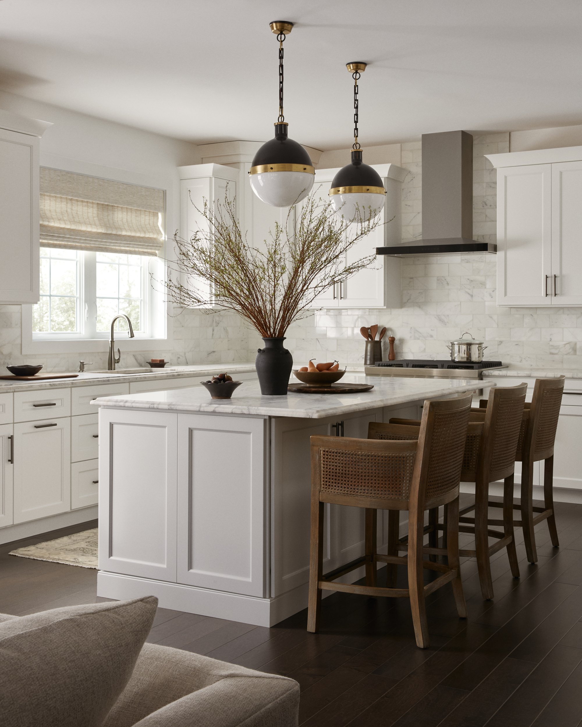
True white is like a solid and dependable baseline. It's a snowy, blank slate, from which you can build a sleek and streamlined environment. Krystal says, "A pure white is fantastic in spaces where you want clarity and energy — think kitchens and bathrooms. That sharp brightness makes a room feel clean, fresh, and functional. It also allows finishes like stone, tile, and polished fixtures to stand out."
The best white paint for interior walls will be ones that give that gallery-like crispness that enhances details without distraction. Krystal says, "White sharpens. It creates a crisp, alert environment — perfect when you need light to see details clearly, whether you’re cooking, getting ready, or working at a desk."
White reads beautifully in purpose-driven spaces like kitchens and bathrooms, especially when you add materials like tile and marble to create depth in the design. However, where white kitchen ideas can prevail, there is also room for error.
There is an inherent timelessness to pure white hues, but their sleekness can easily turn sterile, creating several problems with painting walls white. Oftentimes, pure white has cool undertones that can clash with warmer neutrals, and pure white can be tricky to style and maintain.
It's a bolder color choice than meets the eye, and when done well, it results in a very visually striking space.
When to Use Off-White
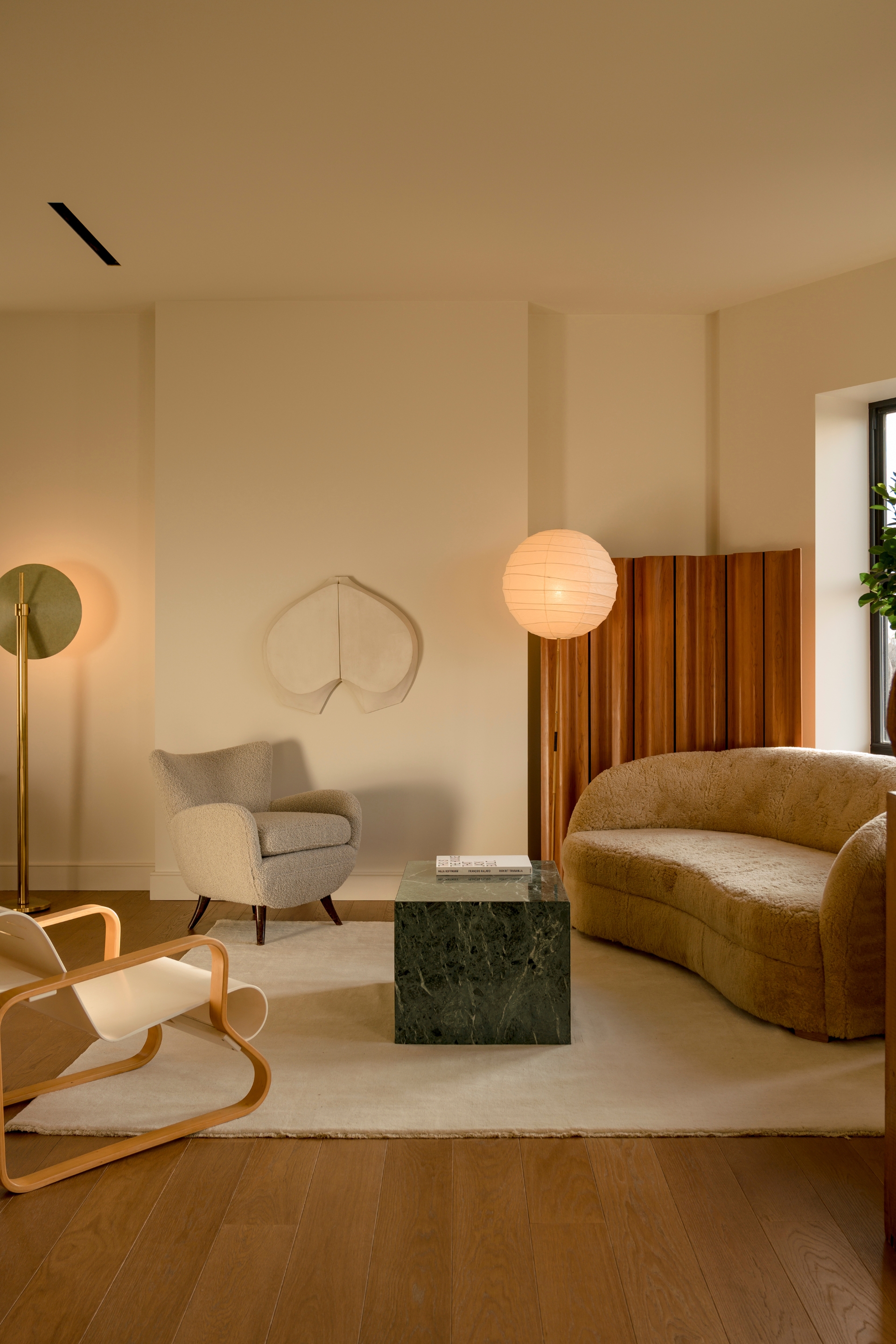
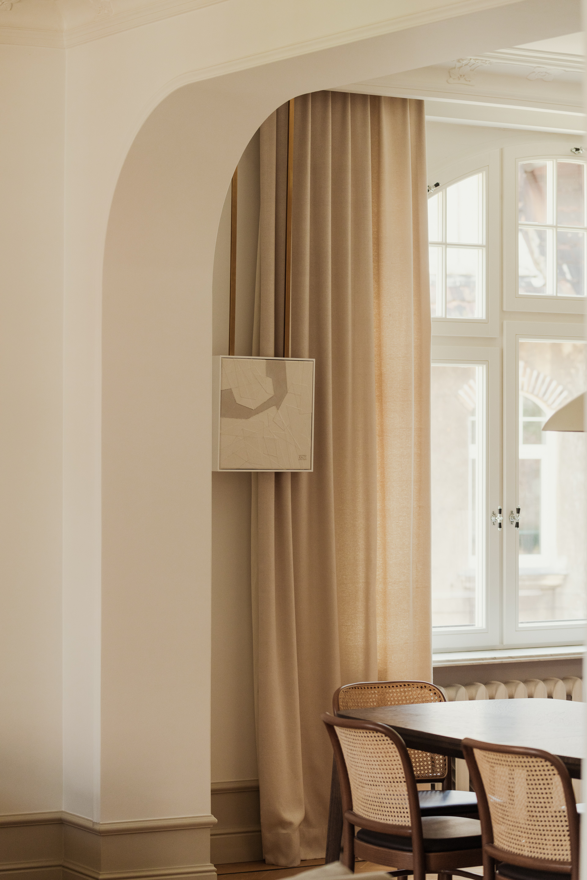
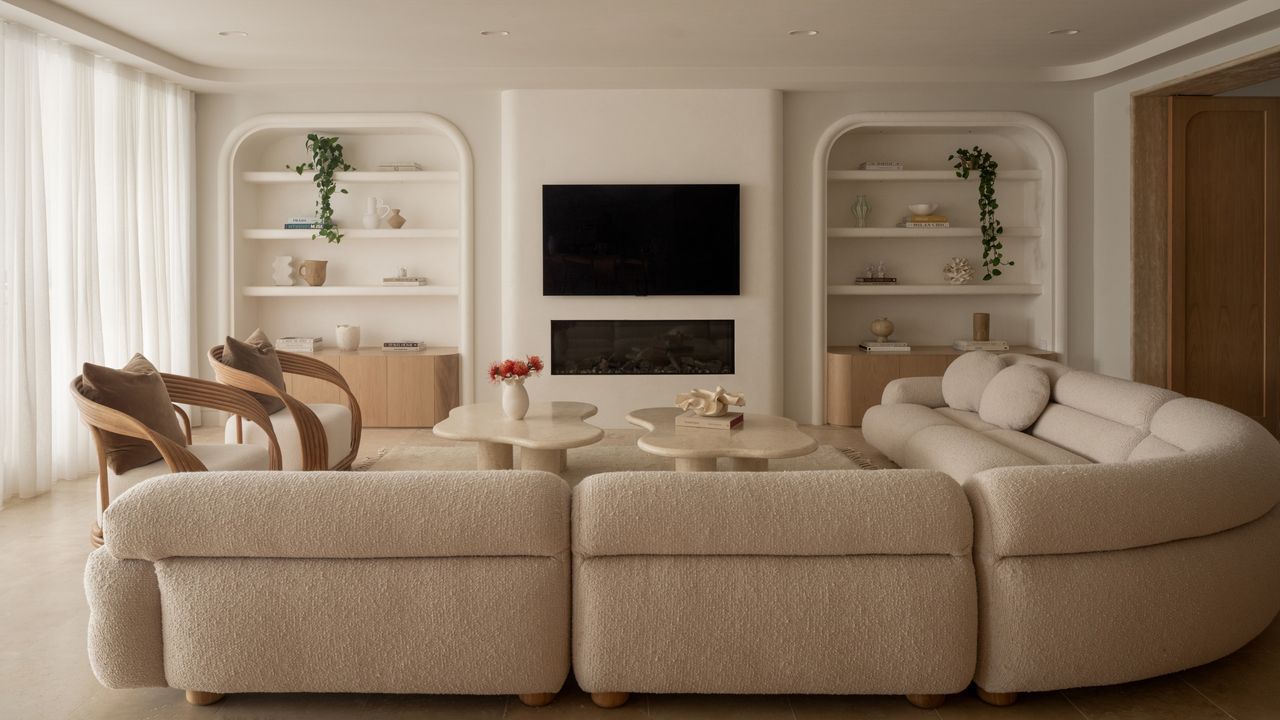
On the other hand, off-white is like a calming embrace, gentle on both the eye and the atmosphere of the room. Krystal says, "Off-whites are my go-to for living spaces and bedrooms, where the goal is to feel cocooned and at ease. They add subtle warmth that encourages you to exhale and sink in, making a space more relaxed and inviting."
Paint colors like Benjamin Moore's Swiss Coffee or Little Greene's French Gray are beautiful in these rooms — they soften edges, complement natural textures, and help the room feel lived-in rather than stark. Off-white thrives in social spaces and adds more contrast to white living room ideas and cozy bedroom plans.
Off-whites also toe the line between neutral paint colors and beige paint colors. The true definition of where off-white stops and brownish-beige begins is up to interpretation. This ambiguity translates to versatility in design, making off-white a more accessible white to incorporate in interiors.
Krystal says, "Off-white soothes. It gives just enough brightness while inviting you to slow down."
How to Blend White and Off-White Together
While it's good to know the nuances of white vs off-white paint, the true magic happens when you employ an expertly blended palette. Don't worry, it's much easier than you may think.
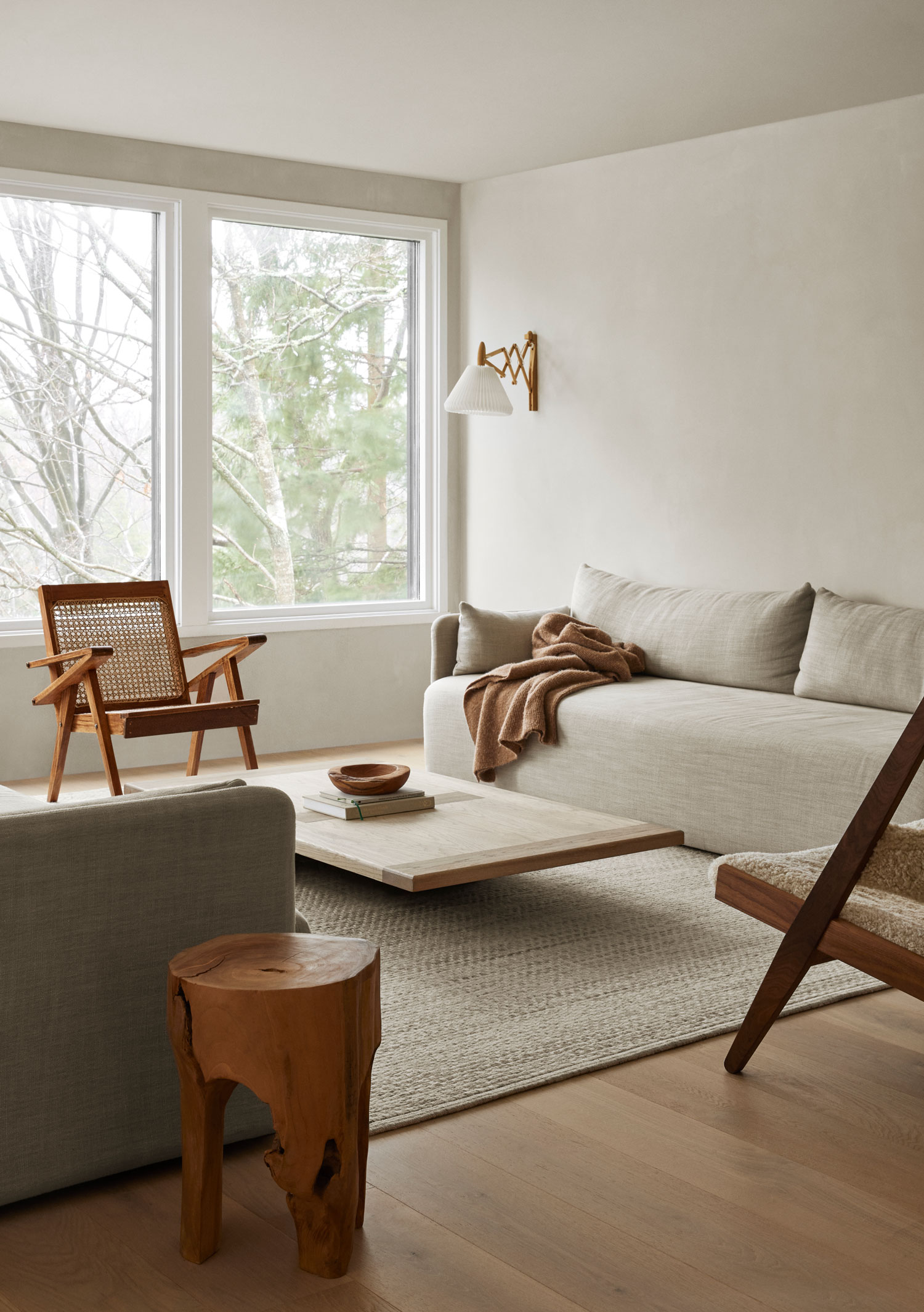
Combining white and off-white colors is essentially the same as building a neutral color scheme. To do this, Denver-based interior designer Peggy Haddad says, "When we’re going for light and airy in a more modern home, I love a warm off-white for most of the walls, trim, and ceilings. This creates a welcoming backdrop that supports other design choices, furniture, and textiles."
Off-white is also beautiful on cabinetry and larger furniture pieces, as it typically adds more depth and interest than plain white. Just make sure that you are paying attention to the temperature and undertone of the paint colors. Peggy says, "Subtle warm or cool undertones can completely change the mood of a room, and clashing them will result in an inharmonious space."
From there, layer, layer, layer. Texture and material will be your guiding light when combining true white and off-white tones. A cream throw pillow that matches the color of your curtains will tie the room together.
This marble side table from H&M has several different shades of off-white within its grain. A piece like this makes styling several neutral colors together so easy. Pair it next to a crisp white accent chair for a little contrast.
Something about a cream-colored rug is simply stunning in any living room or bedroom idea, and this dusty off-white rug from Nordic Knots is no exception. You may have to be a little stricter about the 'no shoes in the house' rule, but it will be well worth the payoff.
I couldn't believe I spotted this luxurious-looking sherpa sofa on Wayfair. The texture gives the white upholstery more depth, making it great for pairing in a room full of blended neutrals. Add some beige or tan throw pillows, and you'll have a stylish off-white palette.
It can all sound a bit complicated, diving into the white vs off-white colors, but the profound subtleties are what make using them in design so interesting. If you're unsure where to start, the hidden hue rule is a fabulous beginner's guide to perfecting neutral pairings.