Buying a home sight unseen is always a leap of faith – but for the owners of this Georgian-style property in New Albany, Ohio, it came with one very clear caveat.
While the setting and architecture felt spot on, the interiors told a different story: think gray walls, minimal charm, and all the hallmarks of a builder-grade finish. It wasn’t a question of if they would renovate, but how to turn a characterless shell into something far more considered.
Enter designer Erin Hackett Nordholt of Hackett House Studio, who approached the project with a surprisingly restrained mindset. Rather than stripping the home back entirely, Erin leaned into its traditional bones, using them as a framework to layer in depth, detail, and a sense of permanence that felt missing from the original house design.
The real challenge, however, lay in balancing two distinct interior design styles.
One half of the couple was drawn to modern, wabi-sabi minimalism; the other preferred a more traditional aesthetic to mirror the Georgian-style property. The result is a home that somehow does both – where clean-lined furniture sits comfortably alongside classic materials.
Erin was brought in to rework the first floor, where 'their priorities included adding a centrally located powder bath, incorporating a butler’s pantry, and restructuring the oversized mudroom to create a more functional mudroom, laundry room, and full guest bath.'
'The goal was to improve flow and function while elevating the overall aesthetic,' Erin explains. 'We focused on eliminating wasted space and ensuring every square foot served a purpose.'
On top of trying to please the client's differing aesthetics, it also had to be kid-friendly, too. 'The story of this home is that you don’t have to sacrifice good design when you have children… you just have to be strategic,' says Erin.
From the outset, this first-floor renovation was about rethinking how the home actually worked, ensuring that every space felt intuitive, practical, and easy to live in, and giving the home back a sense of character it was so desperately craving.
'We aimed to elevate what was already there rather than fight it,' she explains. 'We did this by layering classic textiles, natural materials, and thoughtful detailing to create a home that felt collected rather than newly built.'
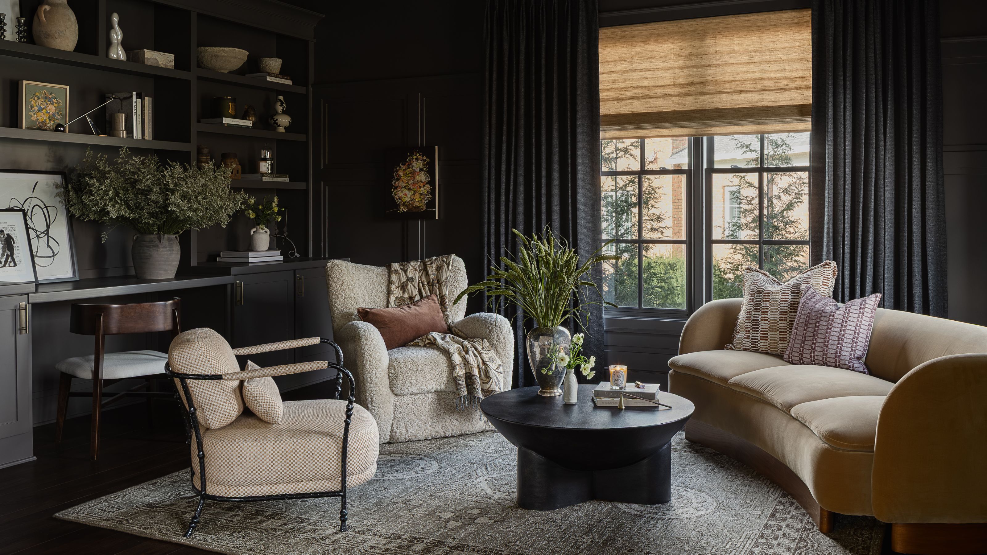
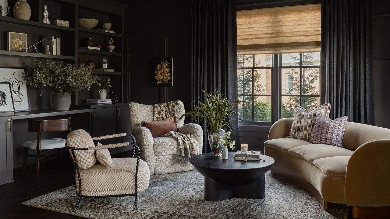
Positioned just off the entry, the color-drenched study delivers the most confident moment in the home. 'The spirit unfolds as you move through the house.'
'Immediately off the entry, the study makes a strong first impression. It’s color-drenched in a brown-gray on the walls, trim, millwork, and ceiling,' Erin explains. The effect is immersive without feeling heavy, setting a mood that’s both intimate and inviting for a multi-purpose space.
To balance the minimalist and traditional styles, a curved velvet sofa introduces a distinctly modern silhouette, softening the paneling and built-in cabinetry. 'Artwork by Sali Swalla adds depth, and color-matched drapery softens the mood and lends to the tonal character of the space,' she adds.
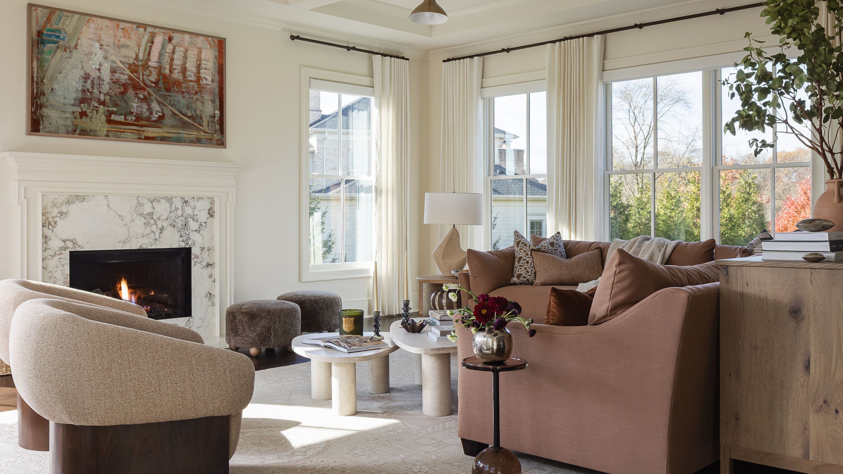
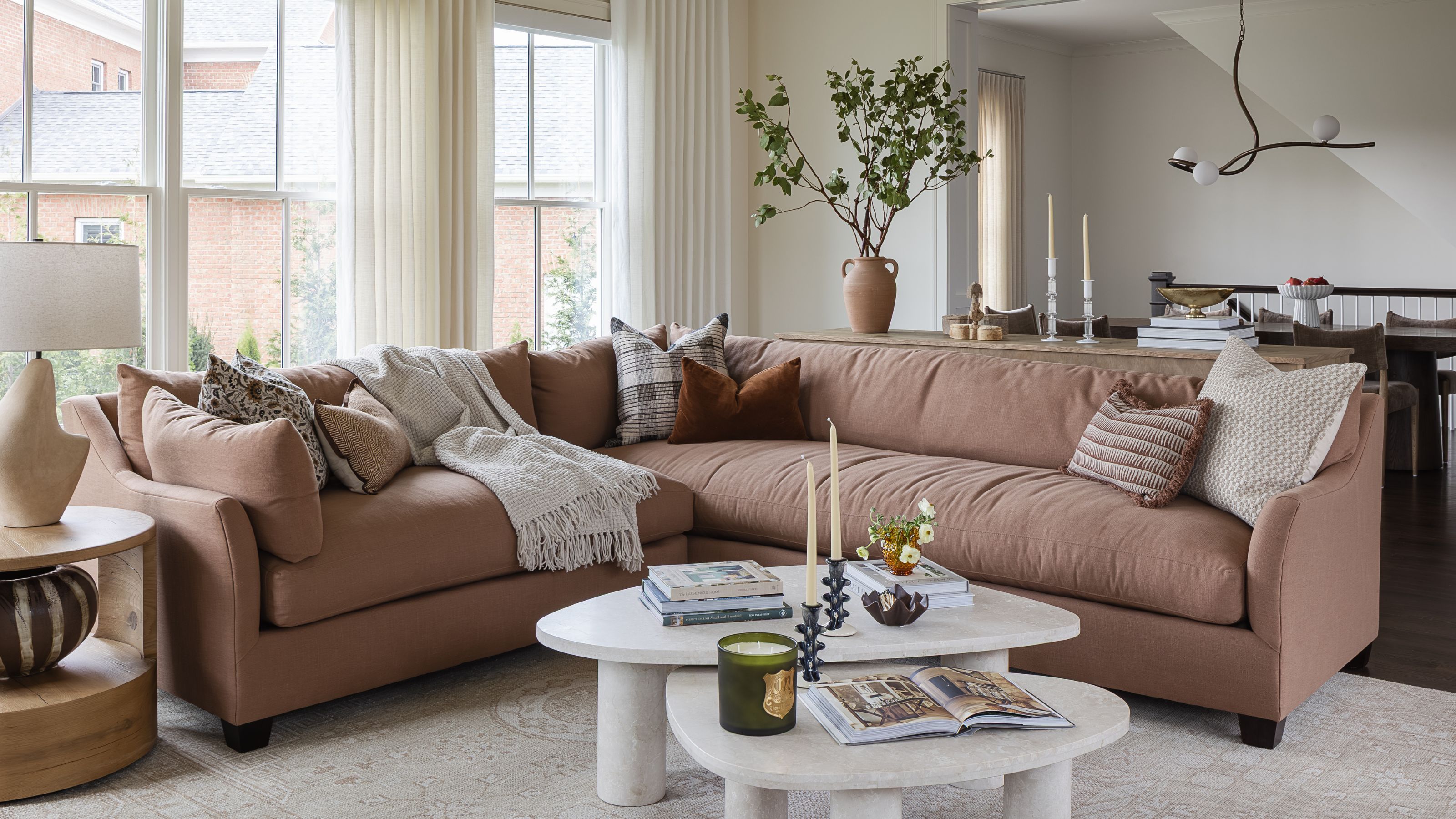
If the study sets a moody, introspective tone, the family room offers a gentle exhale. Here, the color palette shifts to a subtler take on color drenching, with walls, trim, and millwork enveloped in one warm neutral.
'The family room is color-drenched in Benjamin Moore's Line White for a softer, creamier feel compared to the White Dove used throughout the rest of the home. This subtle shift makes the space feel relaxed and inviting,' Erin explains. 'Soft ivory linen drapery keeps the palette cohesive and layered, and adds a softness that was much-needed in the space.'
'This space balances comfort with elevated details. The custom clay-colored sectional is designed for everyday living, while a Calacatta Monet marble fireplace surround adds refinement,' she continues.
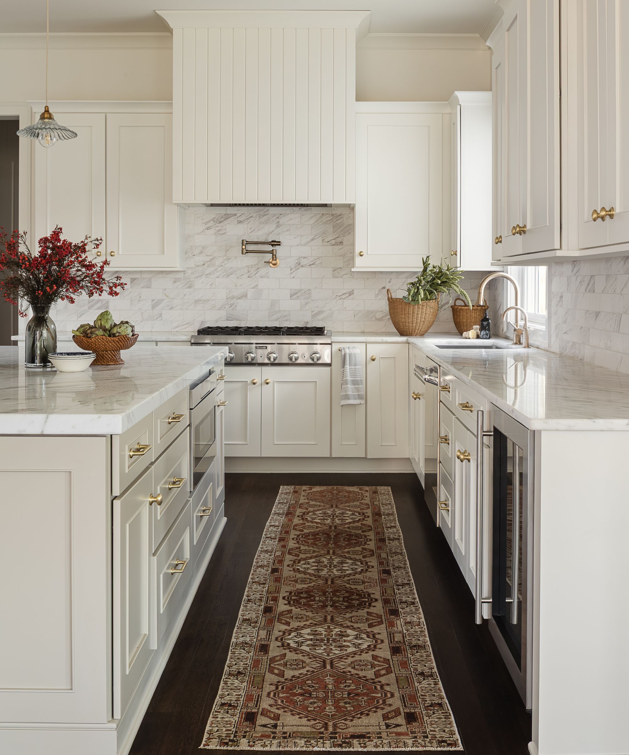
Rather than opting for a full gut renovation for the kitchen, Erin took a more strategic approach to help maximize the client's budget – one that focused on giving a 'facelift' to what was already there.
'There was nothing inherently “wrong” with the original finishes,' she adds. 'But that’s exactly the point. When a kitchen isn’t thoughtfully designed by a professional, it can fall flat, even if everything is technically “fine”.'
'We didn’t gut it – we refined it,' she says. 'We repainted the cabinetry, added brass hardware, and enclosed the existing stainless-steel hood in custom paneling to create a custom, built-in look and infuse character into what was previously a very standard, builder-grade kitchen. It’s proof that you don’t always need a massive renovation; you just need someone who understands how to create depth and cohesion, even within constraints.'
Beyond aesthetics, pieces of the existing kitchen were also reworked to improve functionality.
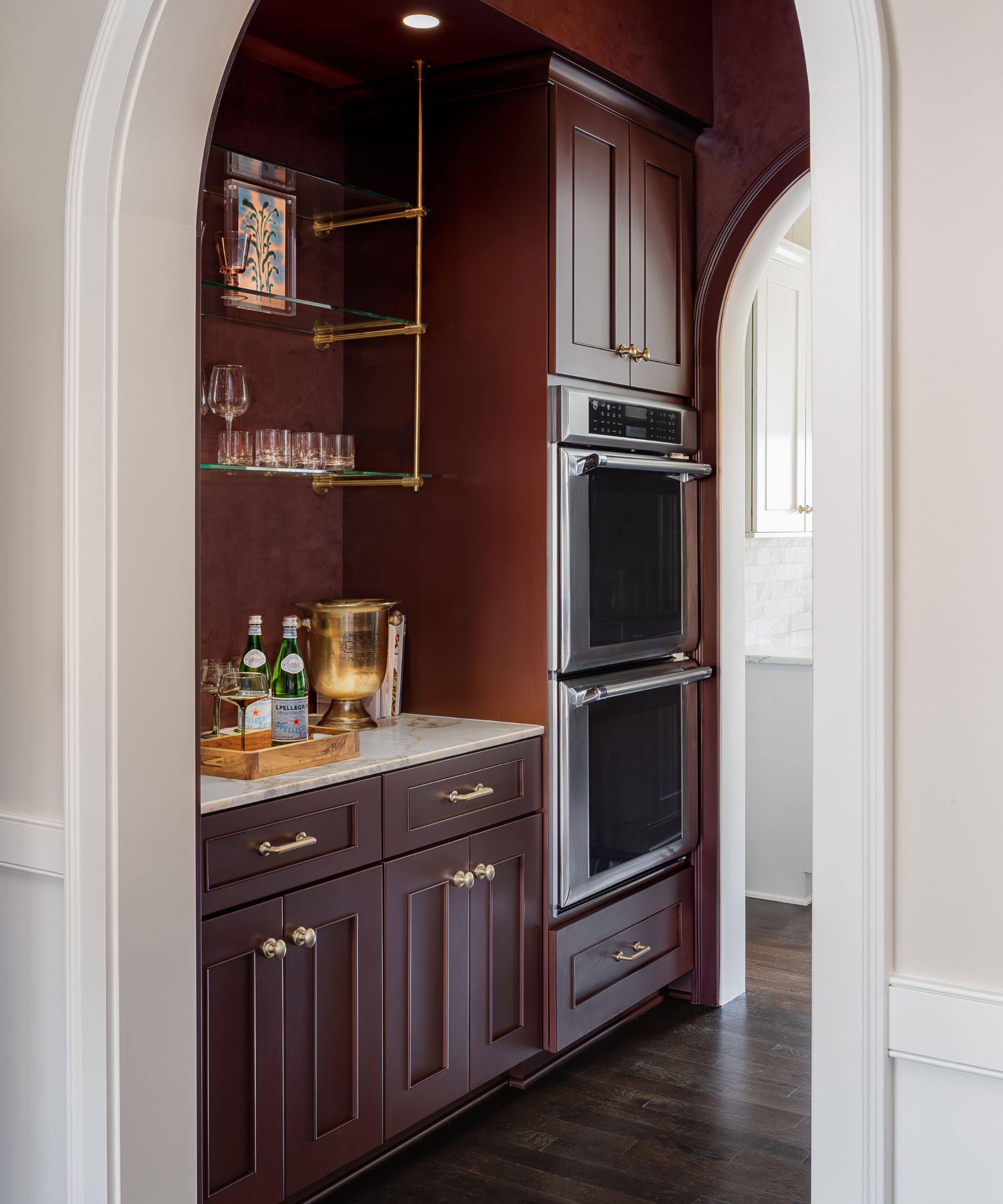
'We also relocated the 72” Electrolux refrigerator to the butler’s pantry, which is drenched in a brick-red plaster-like finish with matching dark red cabinetry. Two arches frame the entry, and brass-and-glass shelving adds visual interest and an opportunity to display glassware and visually appealing collected kitchenwares,' Erin adds.
'We sourced one marble slab large enough to use across three spaces: the fireplace, powder bath, and butler’s pantry,' she continues. 'The cohesive use of stone elevates the living room dramatically, even though the wood mantel itself was budget-friendly.'
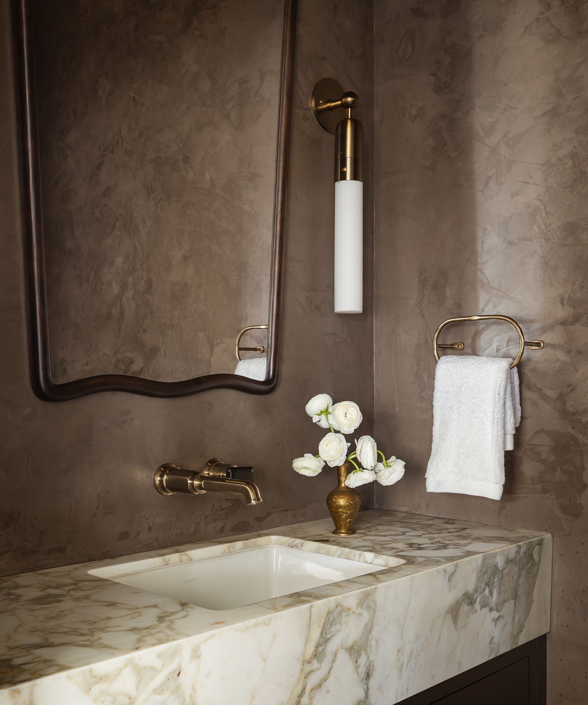
After the lightness of the family room and kitchen, stepping into the powder room feels like a shift in mood. And it took a lot of clever thinking on Erin's behalf to pull it off.
'Reworking the floor plan to maximize function was incredibly rewarding in this project,' she explains. 'The clients prioritized usability over oversized rooms. For example, they reduced a large laundry room to gain a centrally located powder bath. We focused on eliminating wasted space and ensuring every square foot served a purpose.'
'The powder bath is drenched in a brown clay paint, while a wall-mounted faucet with a black gem-shaped lever adds a sculptural detail. The custom vanity features the same marble used elsewhere in the home. Accessories were key in bridging the gap: vintage vessels paired with sculptural pieces create a dialogue between timeless and contemporary,' Erin adds. 'It’s small but impactful.'
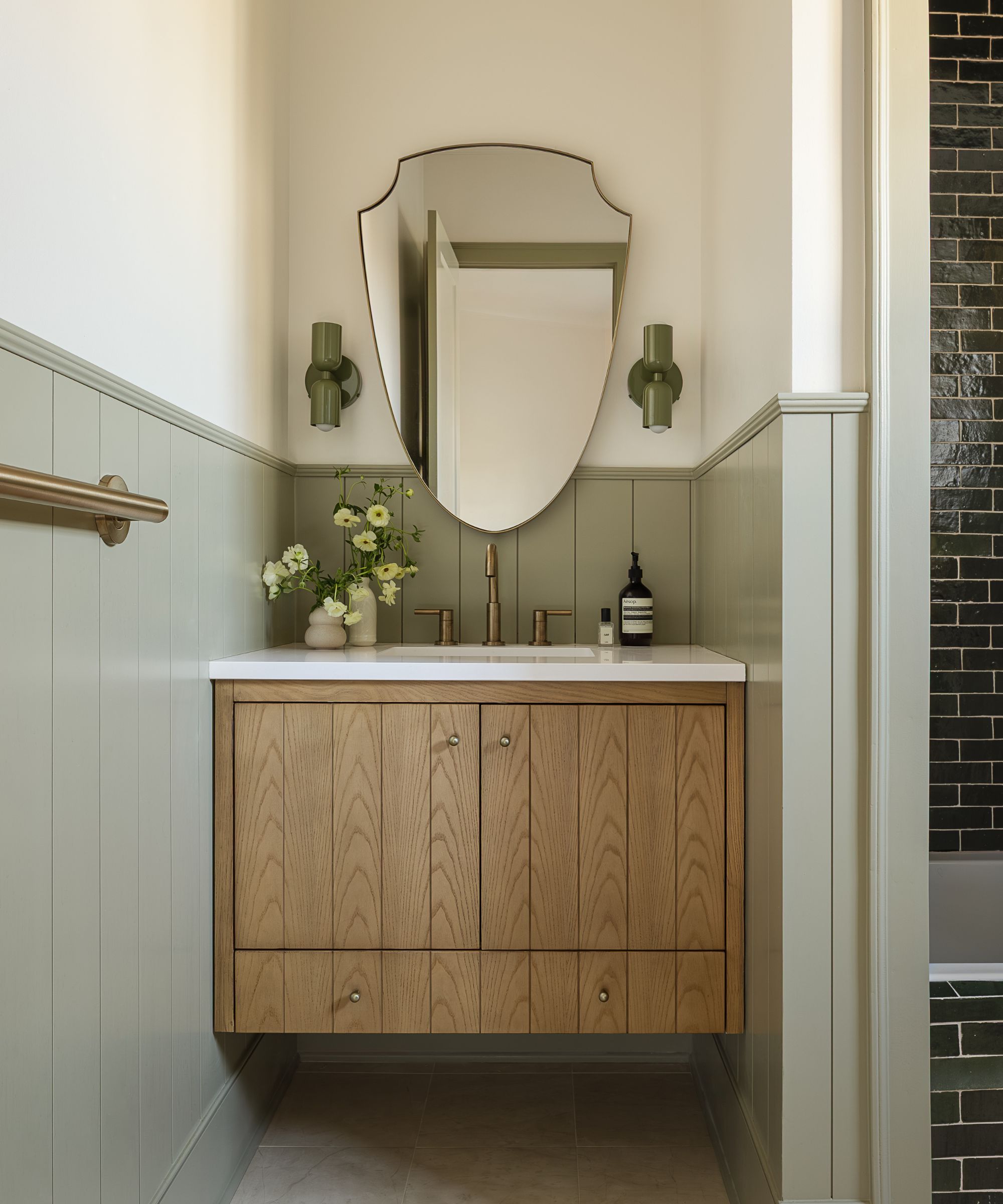
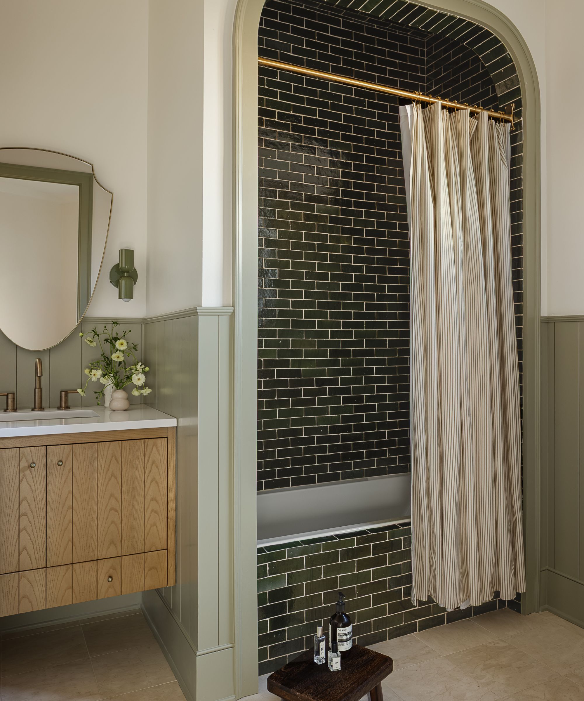
In the guest bathroom, it’s the architectural intervention that makes the biggest impact. The arched alcove wasn’t part of the original build, but its addition completely reframes the space.
'We created a trimmed-out arched alcove over the shower to form a bath nook, and the vanity was customized to appear floating,' she adds of her favorite room in the house.
'The arched alcove was designed intentionally. It’s not original to the home. It allowed us to make the space feel incredibly special, while also having an architectural element to play with color and texture.'
'The pistachio sconces paired beautifully with the green zellige tile, while the limestone floors feel amazing underfoot and balance the space, allowing the tile and lighting to remain the main characters of the space. It’s a thoughtful mix of traditional form and modern detailing that really came together beautifully.'
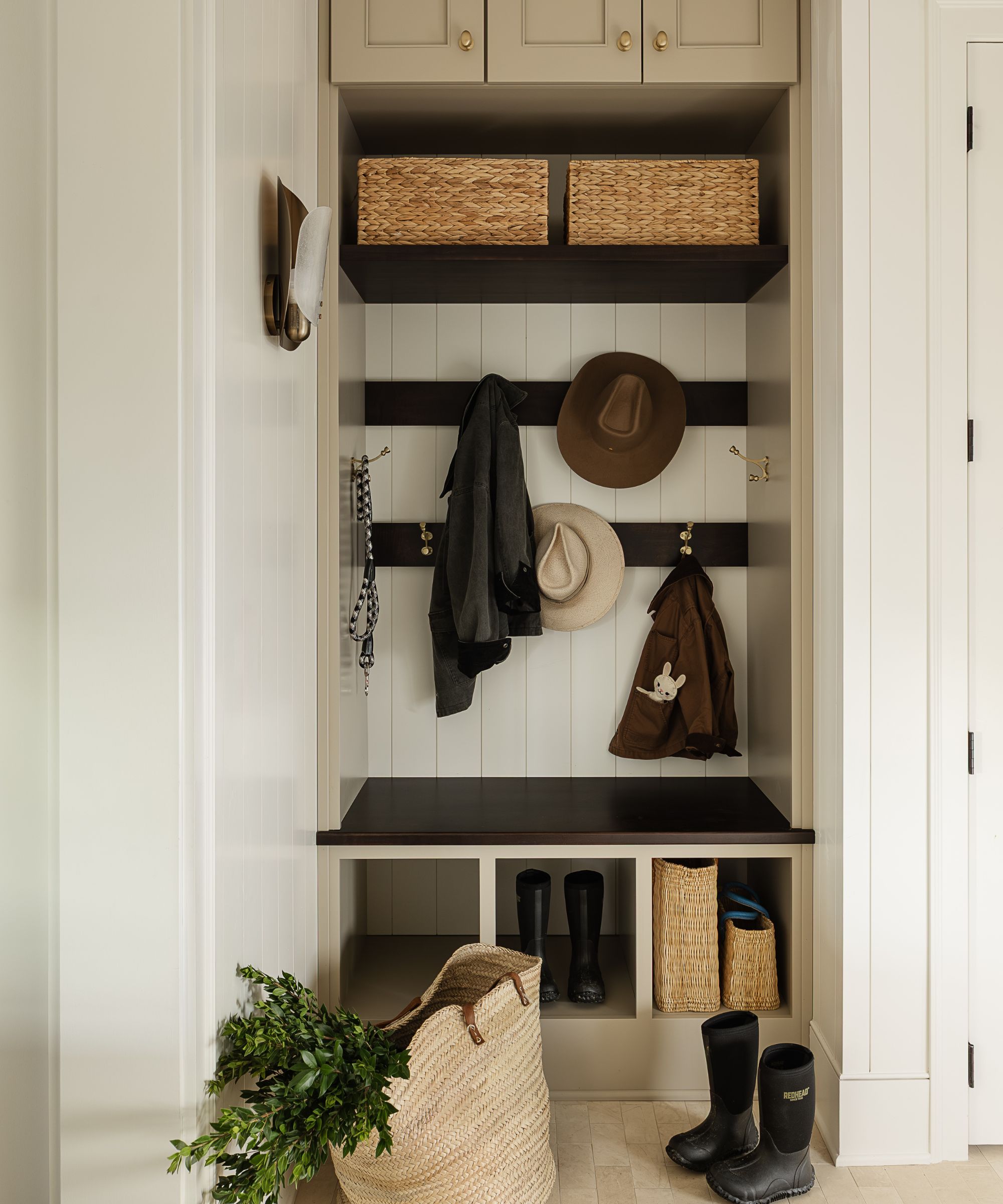
Often overlooked in smaller homes, the mudroom is where Erin's function-first philosophy really comes into focus. Reimagined as part of the wider layout overhaul, the space now works far harder for the family.
'The custom built-ins maximize storage,' says Erin. 'We continued the same limestone floors from the guest bathroom in here to ground the space, with light stone gray cabinetry.'
'The overarching theme was balance: visually interesting yet highly livable,' adds Erin. 'With three young children, performance fabrics and durable materials were essential. The goal was to prove that thoughtful design and family life can coexist beautifully.'
Stepping back, what makes this home feel so welcoming is the consistency of its materiality, which helps balance the couple's opposing design styles.
'Eric gravitates toward a modern, wabi-sabi aesthetic, while Lisa prefers a more traditional style. Because the home is Georgian, we wanted to respect its architectural roots while honoring both perspectives,' Erin explains.
'We layered traditional materials, such as a Calacatta Monet marble fireplace surround, with furniture that has cleaner, more contemporary lines,' she continues. 'Character was the primary priority. We replaced every light fixture on the first floor and carefully refined the architectural details to give the home more presence and personality.'
Ultimately, there's a gentle ease to the spaces in this first-floor renovation – nothing is too precious, nothing is overly formal – despite the level of design consideration throughout. In many ways, this home is a rebuttal to the idea that good design requires gutting it all and starting from scratch.
'I hope it feels both visually compelling and deeply inviting; magazine-ready when needed, yet comfortable enough for everyday life. It’s a home meant to be lived in fully,' Erin notes.
Love beautiful design ideas, expert advice, and inspiring decor trends? Sign up for our newsletter and get the latest features delivered straight to your inbox.