Design journalist and author Amy Moorea Wong is an expert on color in interior design. To help decode the secrets behind a successful palette, she picks her favorite schemes and breaks them down, from the wow moments to the hidden details, and everything in between.
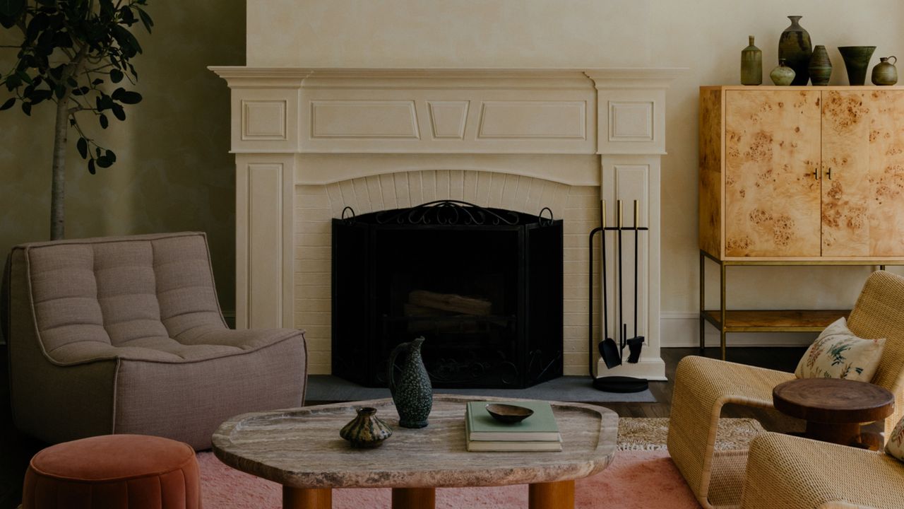
What makes this palette so dreamlike is how it’s almost natural. Almost. Soft peach and cream, wicker and wood, sand and stone are buffeted against how-did-they-get-there streams of lavender and mauve, which rise up from the rug like smoke drifting from a genie’s bottle, tipping things slightly off-kilter and giving it all a hint of ethereality — while keeping it contemporary and nonconformist. It's a masterclass in decorating with color, without feeling like you're using color at all.
It’s tantalizingly cozy. I can practically feel the balmy, soul-stirring breeze that would wash over me if I stepped inside. Please can I sink into the peach and purple-toned ocean — or at least bob on top of it on a wicker lounger?
"The summer sunset palette of soft oranges, muted corals, and golden yellows adds a lot of warmth to the space and makes it feel glowy," explains its creator Emma Beryl Kemper, founder of New York-based Emma Beryl Interiors. "It’s cheerful, bright, and effortlessly relaxing. The warm colors add a lot of energy, but not overwhelmingly so, the carefully curated muted tones enveloping the space in a sense of comfort, making it feel inviting."
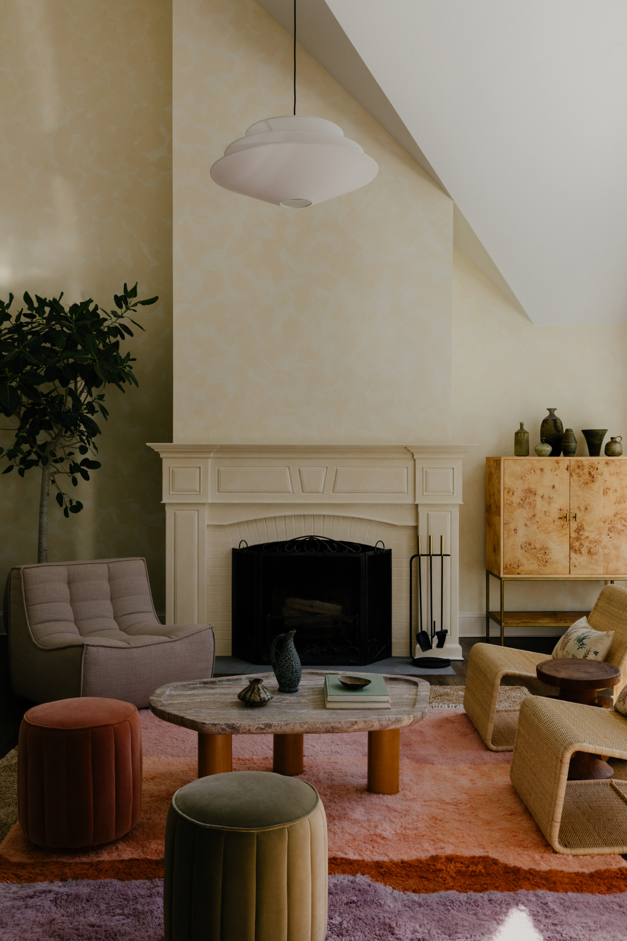
A thread of rich orange-red flows through the room, bringing heat, weight, and vigor to the otherwise gentle and delicate colors. Most notably rippling across the long-pile rug, the red hue is subtly woven into the fabric of the space by the footstool, floating buoy-like on the woollen waves, and it also chimes with the rich timber coffee table legs and the other wood in the vicinity.
The cream living room wall imbues the space with a delicious sun-kissed glow. That feeling of light-filtered-through-newly-grown-tree-leaves is heightened thanks to its limewash paint finish, which creates movement across the large surface, adding tactility and depth, and reminding us that a human hand was here.
The slash of white ceiling emphasizes this, making it seem like the sun’s hitting the wall at just the right angle and the whole area is being bathed in the honeyed lustre of golden hour.
The exact chair used in Emma's scheme, this rattan accent piece adds to the scheme's calm, chilled feel.
Farrow & Ball's peachy clay-hued shade is a good match for the colors in the room.
Designed by Justina Blakeney, this rug pulls in similar warm hues to the one in this scheme — but with a geometric edge.
Green plays a supporting role, juxtaposing the warm shades and linking more with the left-field, free-spirited purples. Under-the-radar olive tones are discreetly dotted around, bringing the most soothing type of contrast in design with their muted earthiness. They smoothly melt into the room, linking in neatly with a coordinating pouf, as well as a collection of vases and a tree, which hammers home the connected-to-nature feeling that laps around the whole space.
It’s texture that’s the CEO of this space. The thick wool rug. The smooth travertine tabletop. The mottled burl wood cabinet. The undulating wicker chairs. The plush velvet footstools. The rough ceramic vessels. All watched over by the dappled wall. The effect is one you want to run your hands all over, through, and around.
It’s alluring, calling to you to physically interact with it. Stroke me! Brush your fingers through me! Run your hands around me! Or me! Or me! The melange of surfaces is a love letter to the organic, the room’s scheme bouncing off what nature provides and amplifying it a little here and there to keep us even more attentive.
Soho Home's Romi footstool in a soft peach ties into the gentle colors of the room.
A shock of bright white draws the eye upwards in this scheme, courtesy of this shapely pendant light.
For an interior filled with such eclecticism, everything sits together so comfortably. The overall palette envelops the room with a quietly rich radiance and the hushed hum of serenity, allowing texture to flex its muscles and experiment. It’s rare that any two surfaces are the same, yet each piece stays within the palette’s boundaries, the warmth pulling all components together and drawing us in like a siren’s song until we contentedly nestle down and become part of the group ourselves.
For more inspiration on using color and contrast in your space, I also explain how to use the color wheel in interior design so you can "unlock the unexpected" in your next design project.