Color brings a home to life, but it can be one of the most intimidating aspects of interior design. Committing to a palette, taking a chance on a bold hue, and learning how to contrast colors effectively takes courage and plenty of nuance. That's why introducing color in small moments feels less intimidating — all you need is a little flash of red or blue to show off your style without drowning a space.
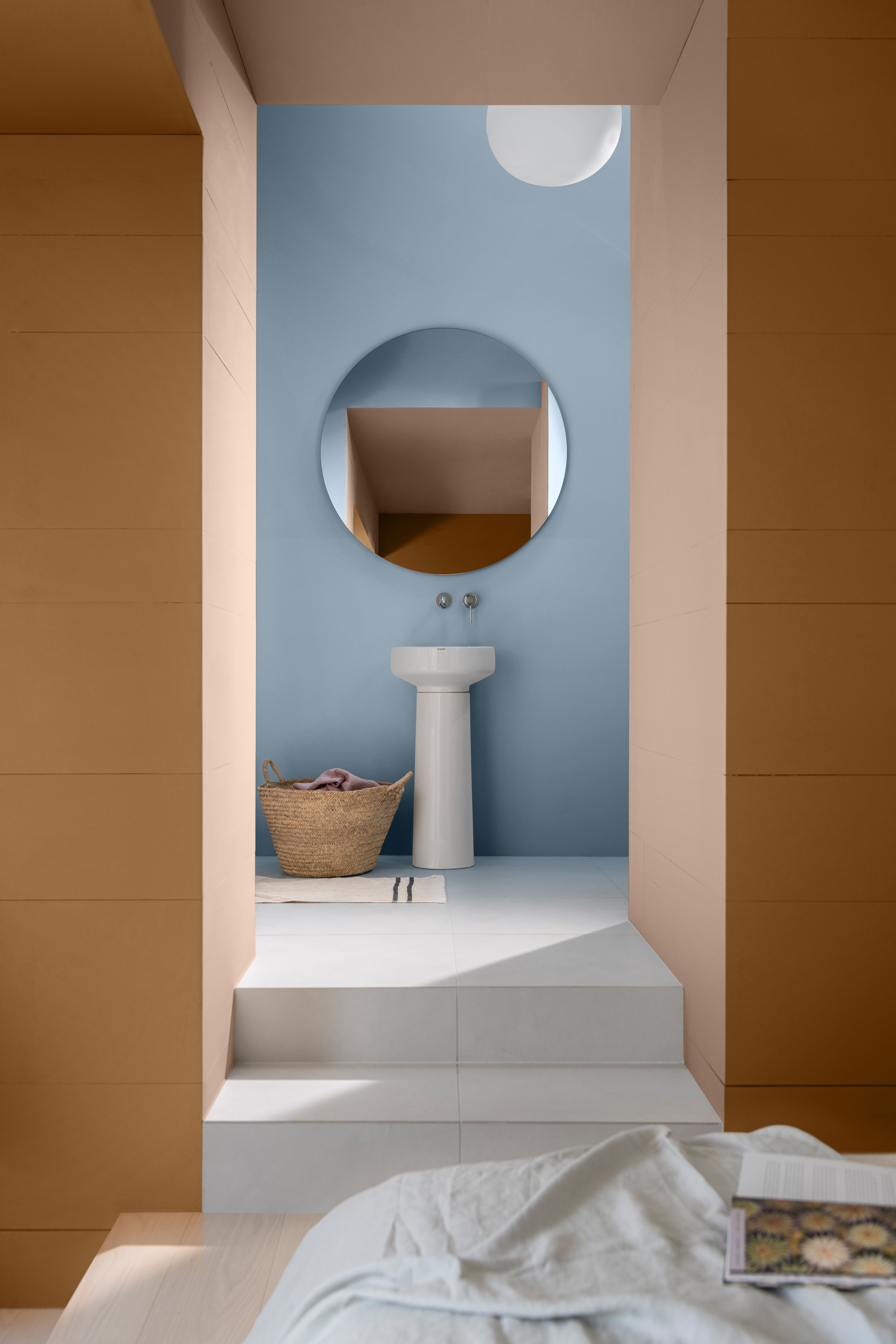
That's the essence of the 'Peek-a-Boo' paint theory, an idea coined by paint brand Dulux. By decorating with color in bite-sized moments it's more approachable, and harnesses the power of hidden or unexpected moments (hence, the name 'Peek-a-Boo'). Think of it like a blue wall visible through the doorway of an orange room, or a red cabinet in an otherwise green kitchen. It's subtle, but effective.
"It's something we've long seen in fashion, like a bright lining inside a jacket, and it translates beautifully into interiors," explains Marianne Shillingford, creative director and color expert at Dulux. "These subtle details add personality and interest without overwhelming the space, making color feel much more approachable and personal." Here's everything you need to use this color rule.
What is the Peek-a-Boo Paint Theory?
When you strip it back, the Peek-a-Boo paint theory translates basic color theory principles to something far more digestible. Complementary colors on the color wheel are directly opposite each other and provide the highest possible contrast, but they are complementary for a reason — they balance the eyes' receptors.
This theory is rooted in complementary color combinations. In a study conducted by Dulux, the brand found that 76% of the homeowners revealed they thought they should avoid 'clashing' colors altogether, while 43% admit their biggest fear when decorating was getting high contrast rooms wrong.
And, fair enough — contrast can read as jarring, but it doesn't have to. "What Peek-a-Boo paint theory does is remove that pressure," explains Marianne Shillingford. "People often think of these color combinations as 'clashing', but in reality, they create balance in interior design and enhance one another in a really beautiful way."
"By introducing contrast in smaller, more subtle ways — through details, trims or even accessories," she adds, "you can experiment without feeling like you're committing to something too bold. It's a really gentle and easy way to build confidence with color."
And because these combinations are rooted in color theory, they naturally work together. Even when they feel unexpected, they tend to feel balanced and harmonious, especially when you use softer or more muted versions.
How to Use the Peek-a-Boo Paint Theory in Your Home
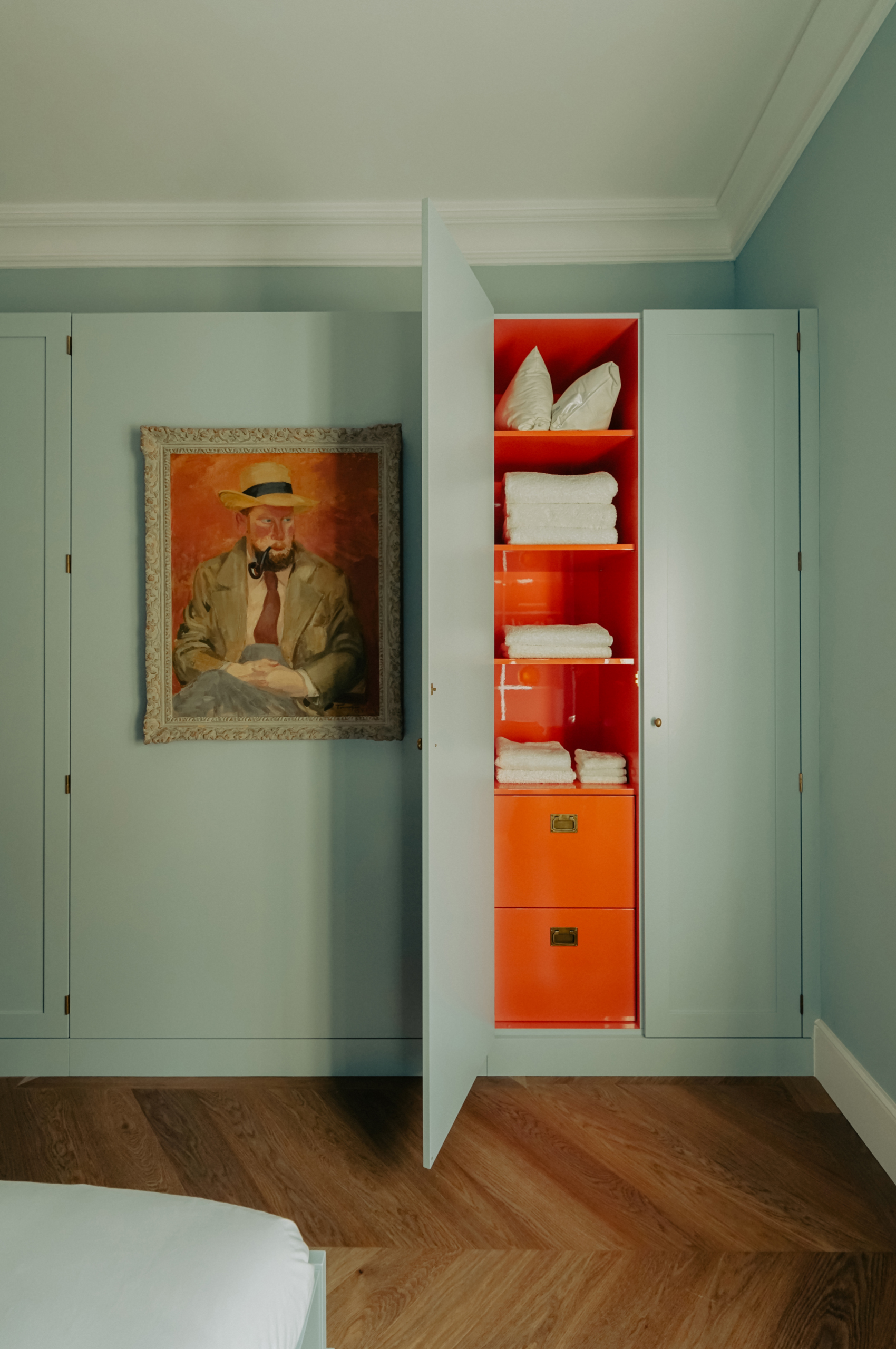
Color trends in 2026 aren't just about the shades we're using, but how we're using them. It's less about bold, all-over statements and more about thoughtful placement, "like a warm terracotta inside a cupboard set against a calm blue room, or a contrasting color revealed through a doorway," says Marianne. It creates a layered, expressive look that feels modern and considered rather than overpowering.
"The Peek-a-Boo paint theory is all about using color in a way that feels joyful, surprising, and a little bit unexpected," she adds. Instead of committing to bold, energetic colors across an entire space, it's about those hidden moments — little flashes of contrast that reveal themselves as you move through a room.
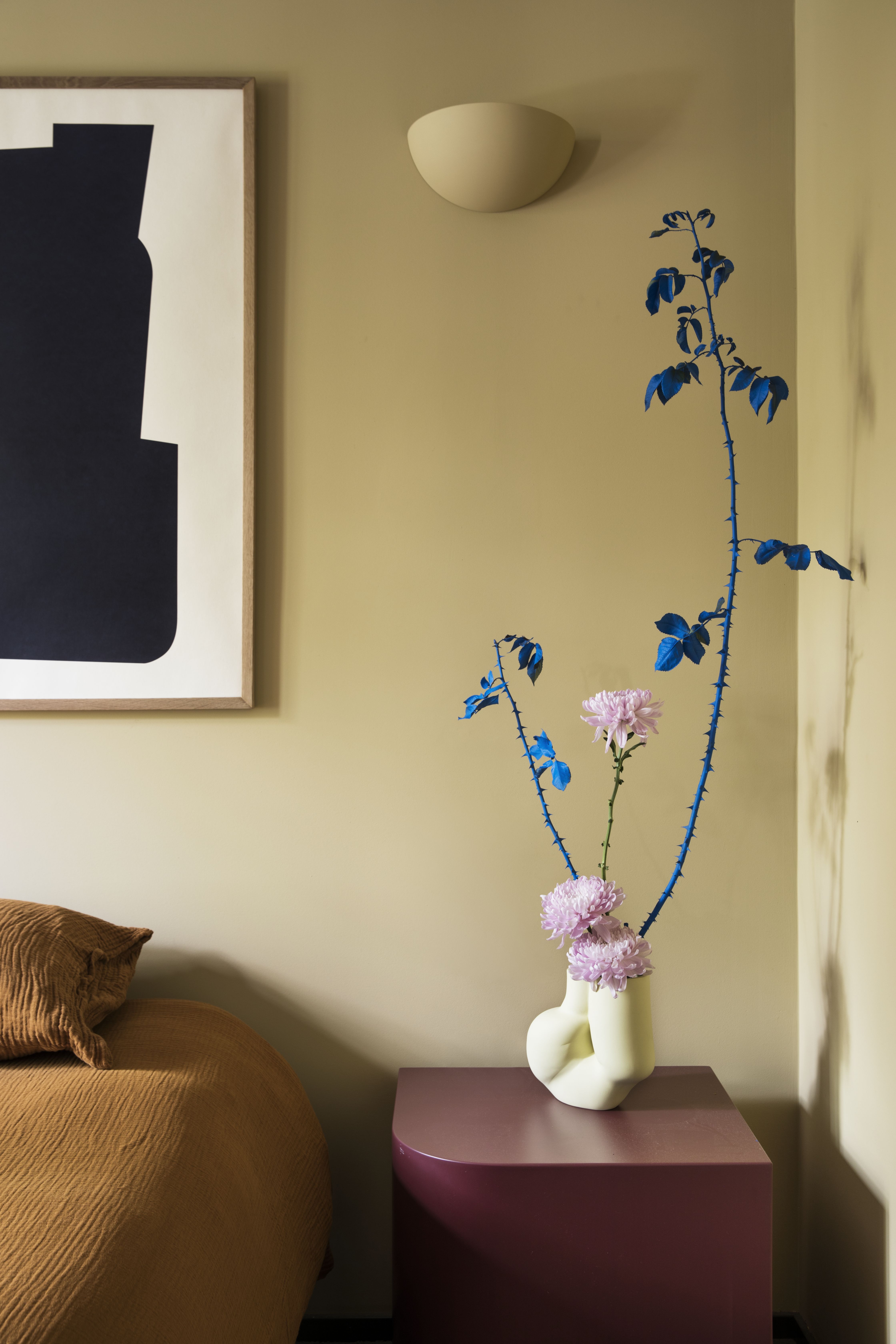
And it works in a variety of places; it's not limited to walls or doorways. Try introducing pops of color through accessories and furnishings. Ultimately, "it's all about where and how color is revealed," says Marianne.
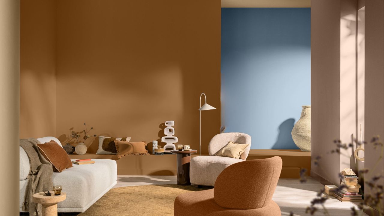
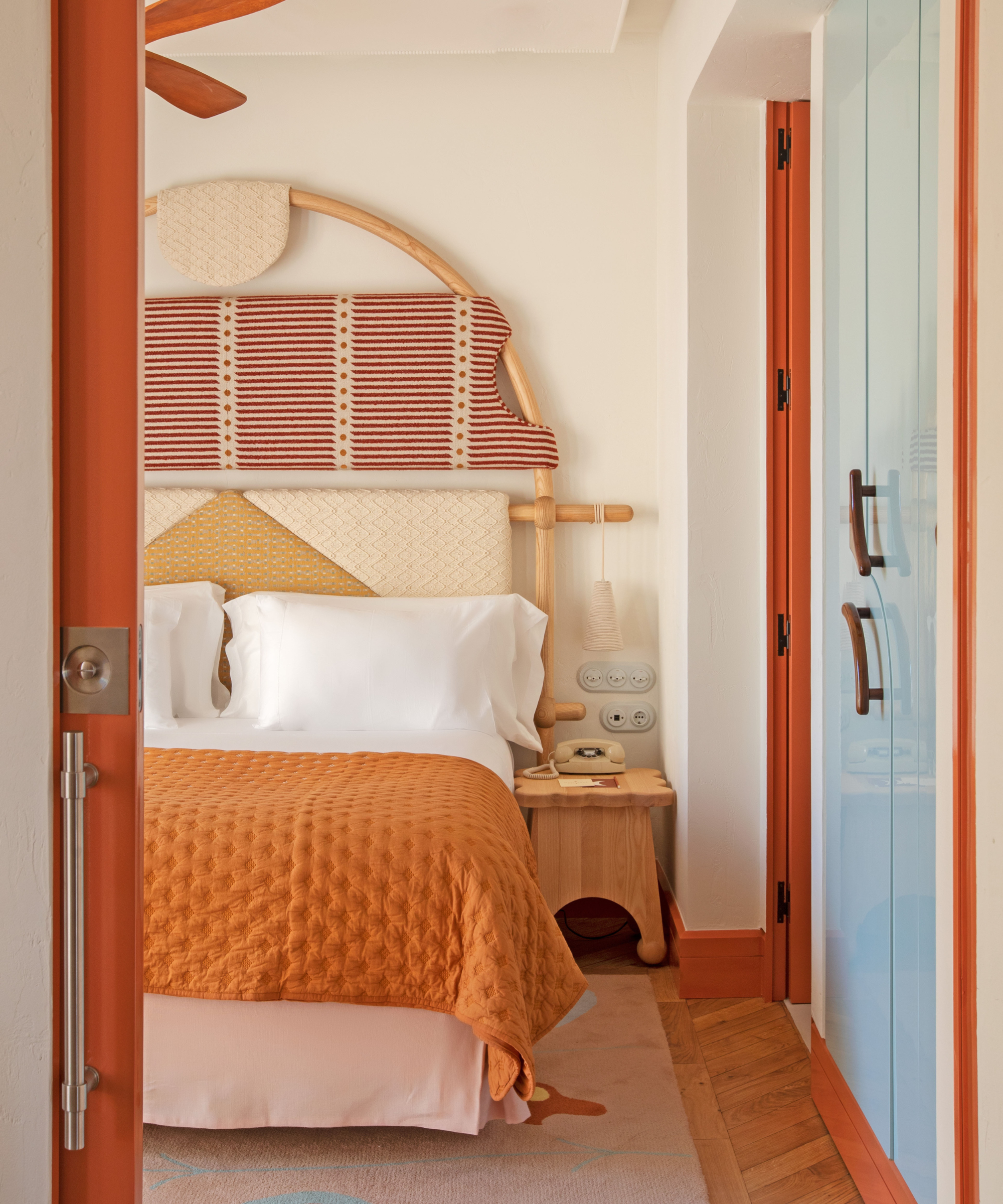
"One of my favorite combinations is a calm, expressive blue paired with a warm, earthy terracotta -like Mellow Flow alongside Clay Pot," says Marianne. "They’re very different, but they're intrinsically connected, and that contrast brings real warmth and depth to a space."
Another classic combination is variations of red and green together. Green walls with a muted or dusty red (such as on paintings or picture frames) feel grounded but still full of life.
Or, if you’re looking to refresh your home for spring or summer, lilac paired with butter yellow is a beautifully soft option, and blends harmoniously with spring color palettes. "It's fresh and uplifting, yet still gentle enough to live with every day," says Marianne. Try introducing yellow and purple together through soft lilac walls complemented by butter yellow cushions or accessories for a subtle, seasonal update.
And of course, blue and orange are another classic. "When one of the shades is softened or warmed, it feels vibrant yet balanced, perfect for those peek-a-boo moments through doorways or on smaller architectural details," says Marianne.
There are so many more combinations you can create through complementary colors than meets the eye. And when you employ color and paint techniques, like the Peek-a-Boo paint theory, the process becomes far less intimidating.
As always, be sure to subscribe to the Livingetc newsletter for more inspiration.