The brief for this New Jersey family home was simple: Create a soothing sanctuary for a young family that would feel like a new chapter after living in the heart of bustling SoHo for years. To do this, the family turned to Melissa Lee and her team at the New York-based interior design firm, Bespoke Only. Melissa relied heavily on color, coming up with an earthy color story that flows through the home, ushering calm into each space.
There aren't many homes that summarize the biggest color trends of 2023, but this home does just that, with room after room leading you through an exploration of the palette that has proved most popular this year. 'They're colors that feel almost tactile,' says Melissa. 'They give out a sense of encouragement for indolence.' Here, we speak to the designer of this modern home to find out more.
Color inspiration
To create the palette, the team at Bespoke Only was first and foremost inspired by the clients' brief. 'The clients were looking to start a new chapter in a lovely tree-lined suburb where one of the parents used to roam around as a child,' explains Melissa. 'While the house is much more vast compared to their former cozy city abode, they wanted to inject a sense of place: Lived-in and authentic, enriching and grounding.'
Aside from the brief, the clients' collection of heirloom furniture and artworks was a great source of inspiration to the designers. 'We were particularly drawn to a series of vintage watercolor paintings - a romantic, evocative impression of light was prominent in these drawings,' explains Melissa.
'It’s from there that a nuanced palette was born and later informed a general design outlook.' The team set out to study, capture, and celebrate the effects of light and bring out a palpable sense of warmth with earthy paint colors. 'We wanted to create an interconnected scheme throughout,' says Melissa.
An 'era of green'

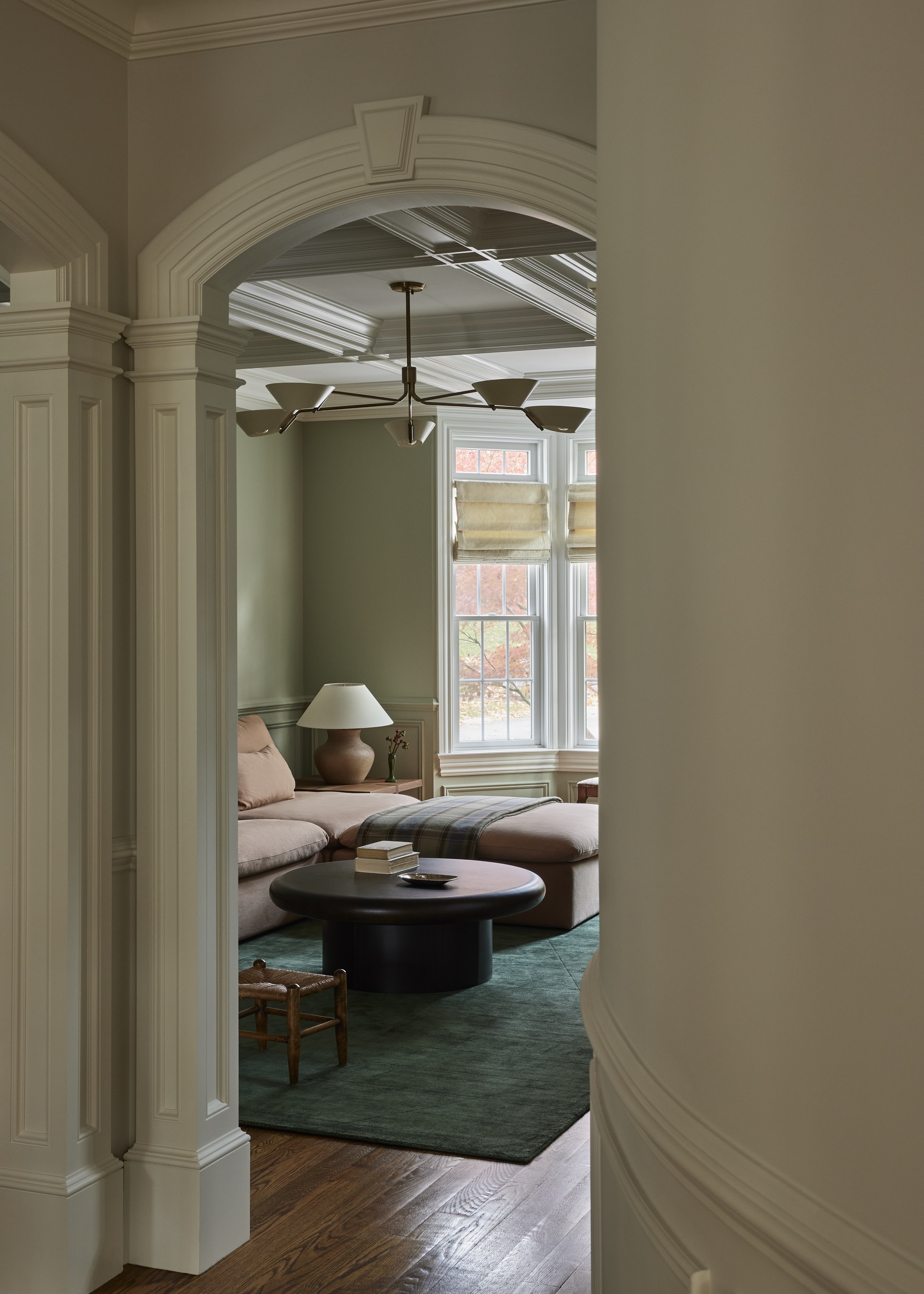
The main color that runs throughout the home is green in its varying hues. 'We’ve been jokingly saying in the office that it’s our green era - be it pastel sage, pale meadow, moody olive, or rich hunter green, we have been playing with them all a lot lately and wouldn’t be mad to see more in 2024,' says Melissa.
In the music room (above), Farrow & Ball's Lichen adorns the walls. 'According to Farrow & Ball, Lichen is a calm and muted green, and named after the ever-changing, subtle color of creeping algae that ages stone so beautifully,' says Melissa. 'Farrow & Ball say that it has a quiet and subtle feel to it, due to its underlying blue and we couldn’t have said it better. It’s precisely how we saw the north-facing music room. It’s unassuming and subdued - and you can almost hear the piano playing in the background.'
Meanwhile, in the cozy den (below), Benjamin Moore's October Mist creates a monochromatic feel. It's a slightly darker shade to October Mist and creates a more moody aesthetic. The difference between the two colors is slight, but crucial, as each room plays with the natural light that floods the space differently. 'The house sits amongst lush landscapes, which gives the light a gentle, overcasting green tint,' explains Melissa.
'As the design scheme was inspired by the various conditions and effects of light in the home, we leaned into the evident presence of the hue and used it in a series reflecting its evolving qualities when mingling with the transitory light.
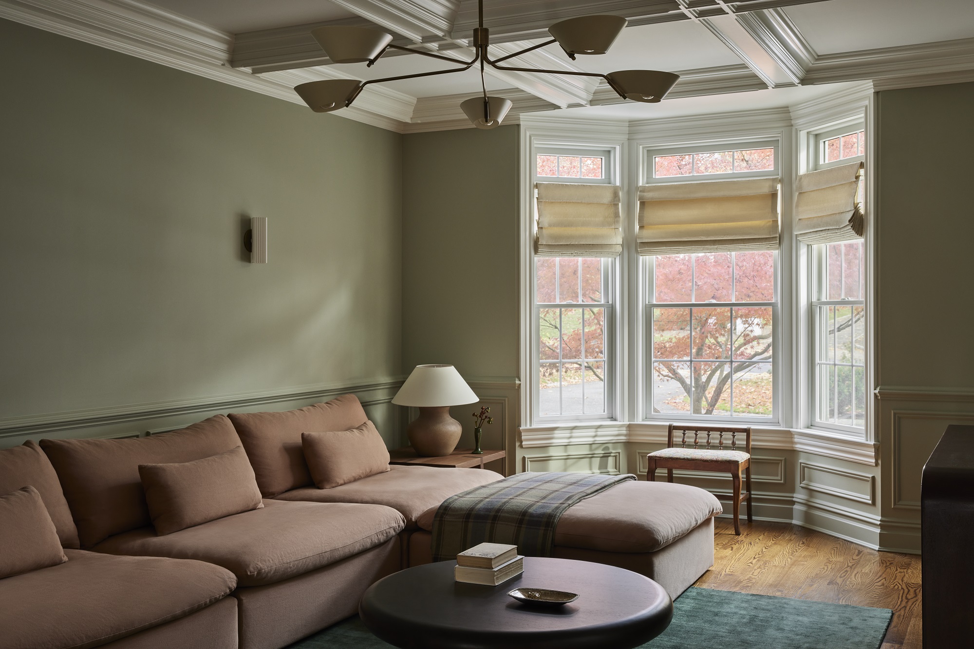
To accessorize the space and balance out the moodiness, Melissa relied on that age-old combination of pink and green. It's a tried and tested formula that we've seen in interiors for years, with the rosy pink balancing out and cutting through the moodiness of the green. Here, it manifests in a muted and elegant way.
'We absolutely love pink and green,' says Melissa. 'It’s a color combo used a lot in historic homes. Similar palettes can often be found in landscape paintings - the haze of key with greens from the horizon together form a tender base of atmospheric nature.'
In the music room, the pink couch is from CB2, with a Lulu & Georgia rug picking out more pink detail. Meanwhile, in the den, the plaster-colored couch is Sixpenny.
Warm grey

2023 has also been a year for warm grey paints, with designers shunning bright white shades and instead picking greige with more earthy undertones. Melissa used Benjamin Moore's Balboa Mist on the walls of the living room, selected because of the room's southern exposure. 'Because it is south-facing, it is an area blessed with an abundance of natural light at nearly all times,' says Melissa.
'There’s a jolly nature in the space, and we felt it was only natural to outfit it with more cheerful and illuminating hues. After all, not many spaces can pull off two pink sofas, and here they are paired beautifully with the rest of the earthy colors and materials.'
To emphasize that gorgeous natural light, the team opted for a space that lacked curtains. 'As for the living room window treatments, we have them painted in a complementary soft white with an undertone of blush. The white highlights the architectural details of the grand room and frames the perimeter with views without overpowering the space.
Dark trim
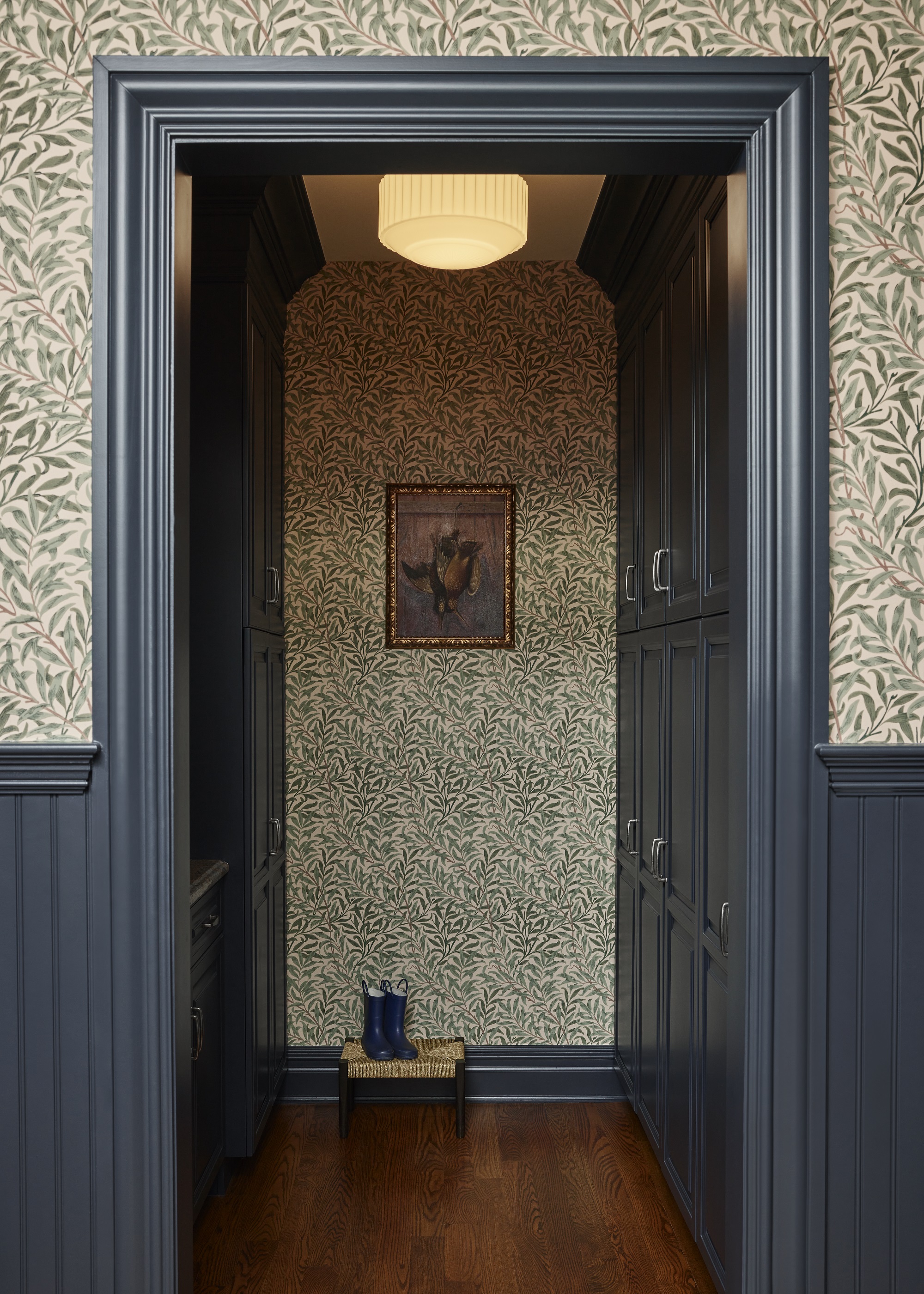
In the mudroom, the William Morris wallpaper is complemented by Benjamin Moore's Hale Navy. The use of wallpaper and paint showcases another big trend for 2023, which is complementing light walls with dark trim. The result brilliantly captures the mudroom aesthetic.
'We’re partial to navy for a mudroom,' says Melissa. 'There’s a classic utilitarian feel to it, originating from perhaps its equestrian root. It’s fitting for its high-traffic nature and versatile to layer with whimsical or more traditional patterns to add visual interest.'