Brands tend to be very protective of their logos. The designs are to be handled with kid gloves, and revered with a defined amount of white space around them at all times. You can't use them on the wrong background, and mustn't, under any circumstances, place them at a jaunty angle. But what if a logo design were more flexible? What if it could be adapted ad hoc at anyone at any moment, creating infinite possibilities?
We've seen experiments with flexible, adaptable logo designs before. The LA28 Olympics logo allows for interventions by artists (and more controversially by sponsors), and the Super Bowl logo seems to be going in the same direction.
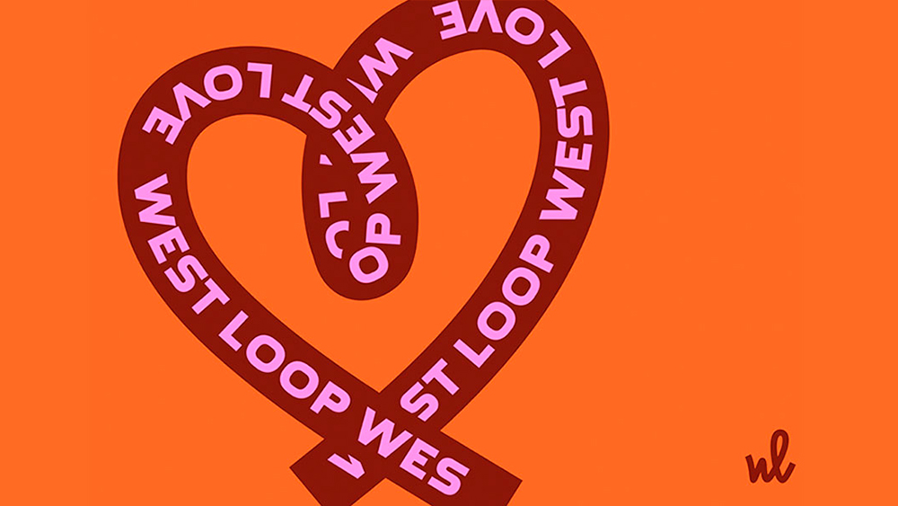
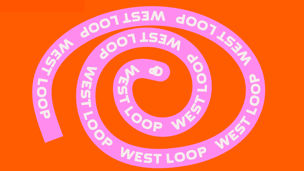
We've also seen clever interactive logo designs like Pentagram's design for the Natural History Museum in London, which you can wear on social media. But Landor's work for the West Loop Community Organisation (WLCO) in Chicago is particularly 'loopy'. The community is invited to interact with the design and create their own looping logos, with no end to the number of possibilities.
West Loop is a neighbourhood in a former industrial area. The non-profit WLCO was founded to promote the area and attract more businesses and people. It's had quite some success, with the neighbourhood officially gaining "hip" status, and it now focuses on community engagement, safety initiatives and more. Landor was brought in to create a new brand identity that reflects the community ethos.
Yes, there's an official logo, and it loops to reflect the name. There's also a vibrant colour palette and funky industrial custom type inspired by the neighbourhood's history. But the logo also reflects the fact that a neighbourhood is made up of many people with their own stories. People are invited to create their own loop, and can do so on the organisation's webpage by simply dragging the cursor and drawing.
The result is a "constantly modulating love letter to a beating heart of Chicago crafted in, by and for the people living and working in the West Loop," Landor says.
Landor creative director Jérémie Barry said “This brand is genuinely made in West Loop, by and for the people living and working there. More than a brand, it’s a tool that is accessible to everyone experiencing the West Loop which they can use to share their story.”
The brand identity almost becomes a typeface that can be used to communicate the ideas of those in the community while still retaining its own identity. It's loopy but it works.
For more logo inspiration, see our piece on logo trends for 2024.