Brown is the new black - or well, maybe blue. It's a color that's taken over in modern interior schemes as a shortcut to moody, atmospheric spaces - however, we're finding that everyday decorators aren't as confident using this shade as they were with the dark, jewel-tone blue it has replaced.
For those looking to add depth, dimension, and a sense of calm to a space usually gravitate towards earthy hues. These have a natural allure, and a psychological effect on the dweller, calming them down. One such tone is Farrow & Ball's Broccoli Brown. This quiet, mid-tone hue has a muted quality and an anchoring effect on a space. But at times, can be challenging to use – should you paint walls and ceiling with this tone? Which rooms are best suited for it?
To answer these questions, we asked color experts and designers who have experimented with this paint. Take a look at these paint ideas for making this on-trend color work for you.
Why is Broccoli Brown trending?

For a rooted interior that instantly feels calming, there is no better hue than brown. Whether you're designing a brown living room, bedroom, or bathroom, this inherently tranquil tone ensures that the space always looks and feels timeless.
'Brown, in all its forms is effortlessly chic and essentially is a fantastic neutral whether dark or light,' says Patrick O’Donnell, International Brand Ambassador at Farrow & Ball. 'The joy of Broccoli Brown is its wonderful ‘softness’ as a color. Despite being a relatively dark, mid-weight tone, it will act as a brilliant foil for almost anything you throw at it – from complementary shades to fabrics of every ilk, or a great background for pictures. It will bring a cosseting ambiance to any space.'
'This is a great brown because it has a tiny bit of green in it, so it reads more neutral than other browns we looked at, which tend to have red undertones,' says Alison Damonte, founder of the design studio Alison Damonte.
What type of a mood does this paint create?
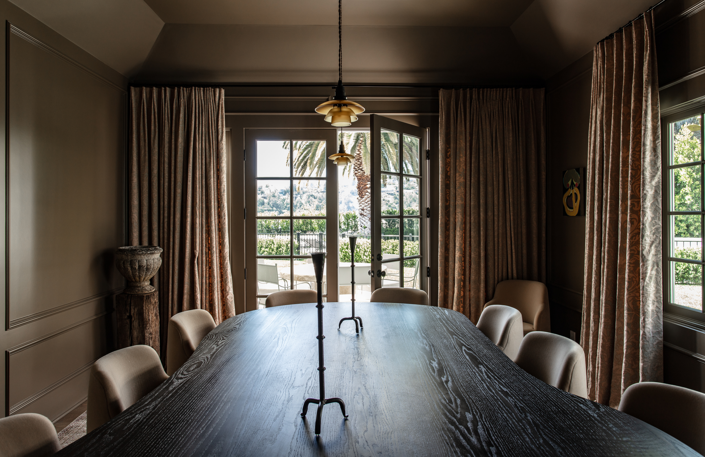
Since the color has a restrained, understated yet elegant quality to it, it can create a deeply pensive mood; one that would be ideal as a bedroom color, for the dining or the study. The paint tone conjures up a more intimate mood, perfect for 'me time' or special moments with close friends and family. It can be used across walls and ceilings, enveloping the room like a warm hug.
'In this dining room, we wanted to bring a feeling of warmness and coziness to this space, and so we chose Broccoli Brown,' says Jake Arnold, founder of Studio Jake Arnold.
What colors are the perfect pairing with Broccoli Brown?
'Try mixing Broccoli Brown with a verdant green like Yeabridge Green for some added oomph, such as fitted bookcases, or pair with dusty pinks like Setting Plaster for the dreamiest of bedroom palettes,' says Patrick. 'To add more drama, throw in a gun-metal blue for your woodwork such as Inchyra Blue, for a calming yet elegant hallway paint idea.'
What are the best ways to use this color in interiors?
'You can use this paint color anywhere – from a utilitarian boot room (all over please!) to hallways, bedrooms, and living rooms or a smart alternative for kitchen cabinetry, mixed with a drab eau de nil on your walls such as our timeless Blue Gray,' says Patrick.
Consider adding this tone to a small modern bedroom, and to lift its look, add pop-colored accessories to restrain the room from looking too dark.
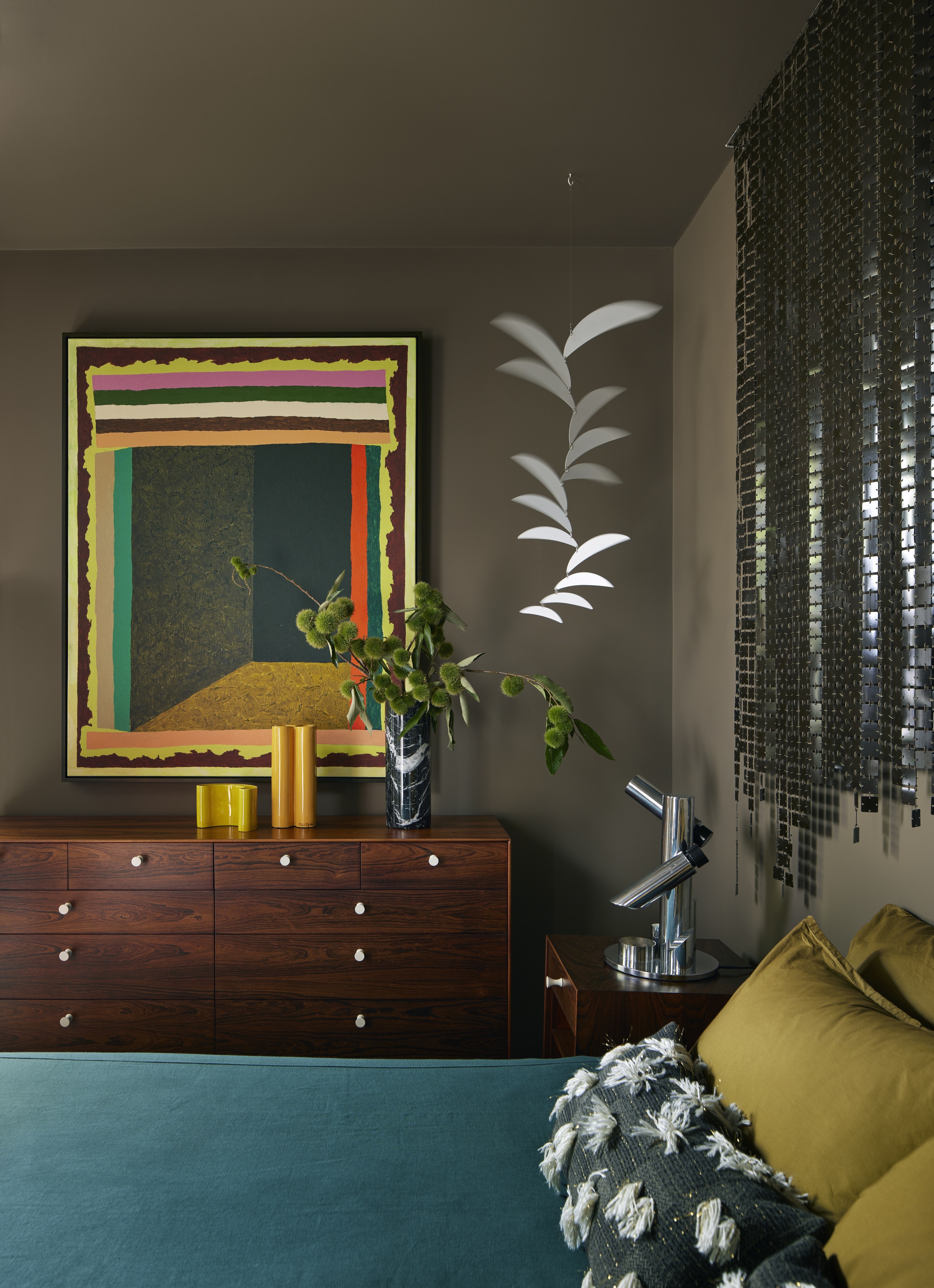
'We had tried a lighter color in this room, but it never looked right and because the room doesn't get much natural light, so we decided to lean into a dark color,' says Alison. 'The room is small so painting the walls and ceiling with the same color creates a cozy, cocoon feeling, perfect for sleeping. We wanted to hang the vintage Paco Rabanne screen, made of bronze-colored palettes, over the bed. The brown walls create a nice tone-on-tone effect with the screen, allowing the screen to reflect light, but not overpower the small room.'
Broccoli Brown is a paint tone that looks wonderful in all paint finishes, but it depends on the type of room and its use. In a more public space like a dining room or a family room, consider a semi-gloss effect to give the space a more formal feeling. This will also be useful to bounce more light in the room, in case it doesn't receive enough sunlight.
In smaller, private spaces like a powder bathroom or a bedroom, consider a matte or eggshell finish to give the space a more earthy, subdued touch.