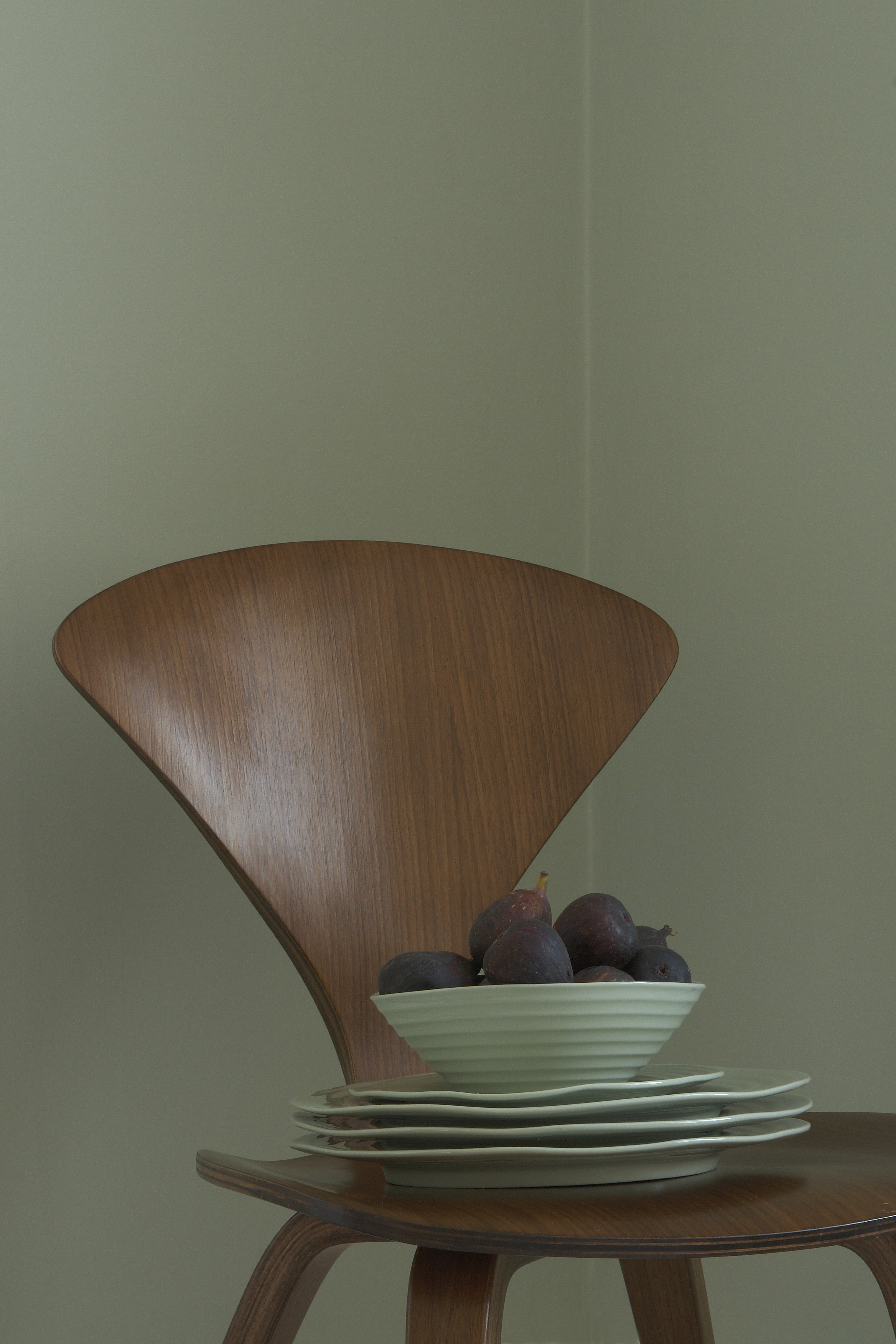
Have you heard of 'Celadon' before? I know someone out there has, because searches for this color are currently going through the roof online. Celadon refers to a type of pottery glaze, dating back to some 1600BC in China, known for its green-gray finish. It's a much sought-after style, but more than just the ceramics, the color is what's transcending into modern design right now, as a sophisticated and nuanced green hue.
What that actually translates into in the color that's trending today is hard to pinpoint, however. Celadon, as a reactive glaze, has such variety in color that the way that it's interpreted is sort of up to you. It's also one of those chameleon color trends — it can look different at different points of the day, shifting in tone even as you look at it.
I think, in my mind, I can maybe best describe it in what it's not. It's not necessarily muted like sage green — it has a luminosity about it which gives so much more energy than that. And it's not mint green either — "[it's] a delicate and pretty porcelain color with enough warmth to avoid any hints of mint," says Edward Bulmer, founder of Edward Bulmer Paints, who also created a paint shade named after the color. " It is a surprisingly simple recipe of yellow ochre, Prussian blue, and a touch of black."
For other paint brands, the color is captured differently. Graham & Brown's Celadon is super vibrant, more pastel; while House of Hackney's take on the color is far deeper and richer.
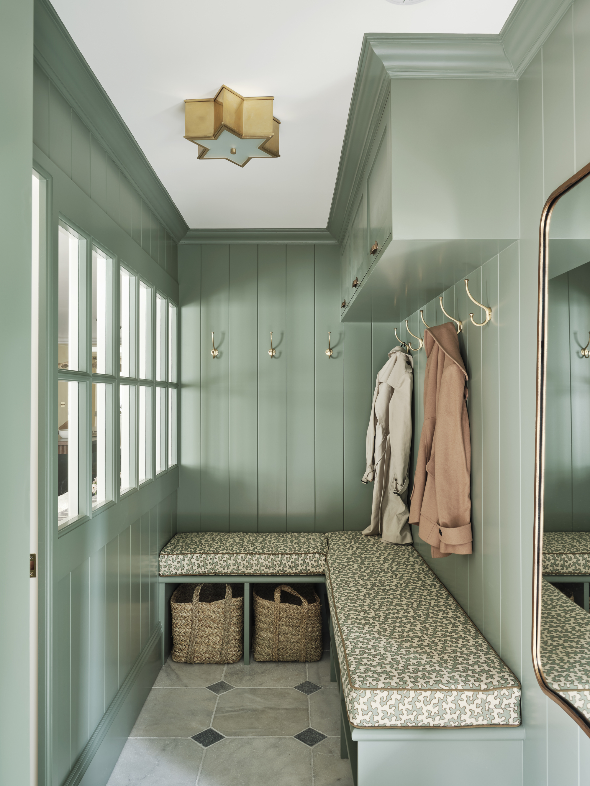
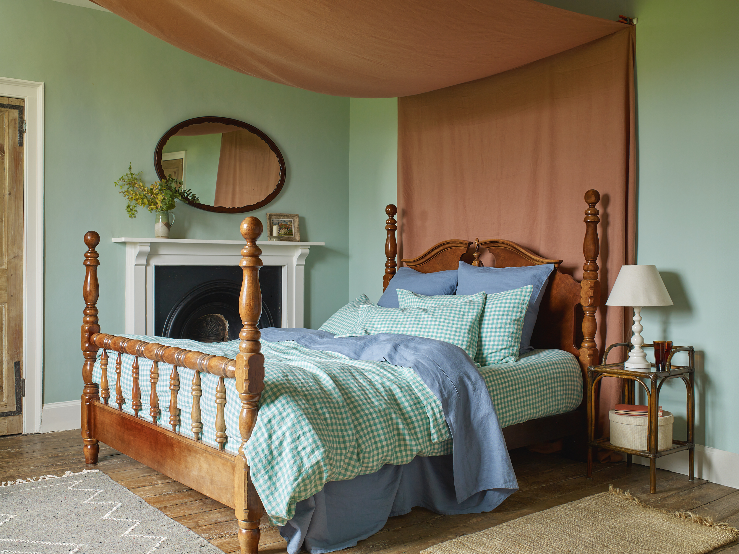
When it comes to decorating with Celadon, it's a color that has both modern and more classic interpretations. "It brings a sense of calm and has a fresh softness perfect for bedrooms and bathrooms," says Lena Dahnsjo, a color consultant at Edward Bulmer Natural Paint. "It’s a very versatile color, though, and works beautifully downstairs too and would let works of art dance on the walls in a sitting room."
To round out a palette, look to colors that go with pistachio for inspiration. "Celadon is elegant enough to be used as a soft backdrop to antique furniture and gilded frames in more formal settings, whilst at the same time being neutral enough to sit happily with deeper, contrasting colours like lacquer red," Lena says. "Pair with Fair White for a fresh but soft look, or with Aquatic for more contrast. Celadon can also work surprisingly well with more earthy colors: try it with Drab Green or Mummy for a hallway or boot room perhaps."
Aside from painting a wall in Celadon, it's quite a popular shade to find in home decor, too — whether that's traditional Celadon-inspired ceramics, or more modern interpretations of the color trend. Take a look at some of my favorite finds below.
The translucent glass of the this H&M bowl gives it the brightness and lightness of Celadon.
The subtle variation in color of this enamel stool design perfectly captures the feel of this shade.
You get a sense of the warmth of Celadon in this four piece plate set from the Conran Shop.
Look for reactive glazes for your serveware to embrace this summery color trend.
A slightly cooler take on the color — Habitat says pistachio, I say this still feels like a shade of Celadon.
Jade is a similar color to Celadon, so anything drawing on this eastern-inspired hue feels like a good fit.
A slightly warmer take on the color, this jug picks up the brightest spots of the Celadon pottery glaze.
Mylands is another paint brand with a color named after Celadon — a warmer, richer shade than some others.
The darker, cooler green spots balance the warmer, lighter variation on this vase for a Celadon-inspired finish.
What I love about Celadon is that it feels vibrant, but also in a lot of ways neutral, as more muted greens often can. I can see it being a new go-to color if you've be warned off 'millennial green' for being too boring, or as an alternative to the light blue walls trend we've seen take over so far in 2025.