At this time of year in the middle of winter, with limited hours of daylight and seemingly endless cold weather, it can quickly begin to take a toll on our mood. The good news is, for those of us who spend lots of time at home, improving our surroundings can do wonders to lift the mood and generally create a more cheerful environment while the weather outside remains dreary.
Decorating with color is one of the easiest yet most impactful ways of doing so. A fresh lick of paint throughout the home can reinvent the way a room feels, and with the right colors, they can certainly spark joy. It's a no-brainer for a mood-boosting room color idea this winter.
We're turning to the expertise of Farrow & Ball, whose color expert Patrick O'Donnell recently shared three different color schemes to try with paint ideas, with which he aims to 'gently push away the gloom of the latter half of winter.' We've rounded them up below to help lift winter blues with your colorschemes.
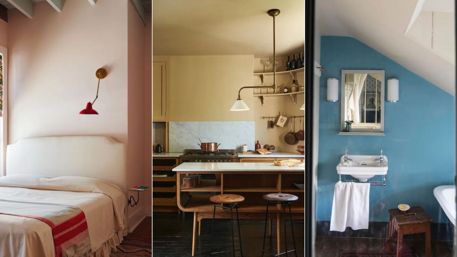
Scheme one: A restful guest bedroom
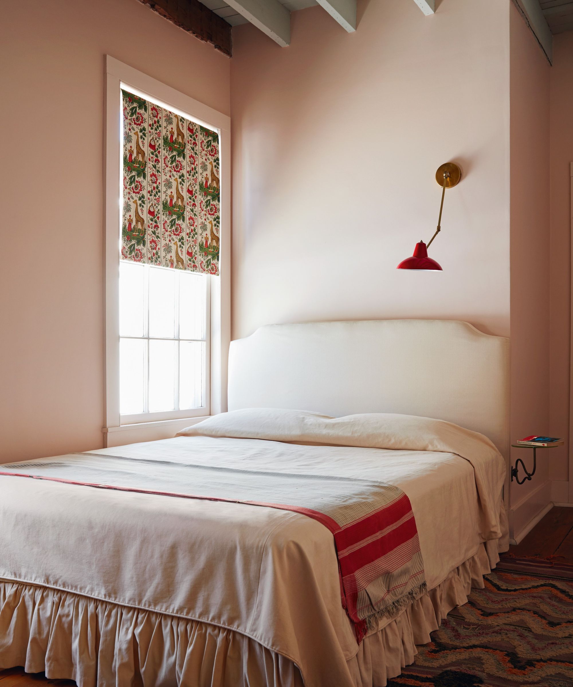
First up is a restful scheme for a guest bedroom, which Patrick advises would also work well in a living room. This color scheme pairs Farrow & Ball's Calamine, a gray-toned pink hue, and Treron, a slightly muted dark green. Patrick suggests Calamine as the primary wall color, which he recognizes is 'not overly bright and joyous,' yet it has a 'lovely subdued quality.'
'Play with that slightly drab quality – which doesn't sound very cheery but trust me it is – with Treron on your lovely woodwork. And then your ceiling color in this space is School House White. Really pretty, very restful.'
Scheme two: An energizing yellow kitchen
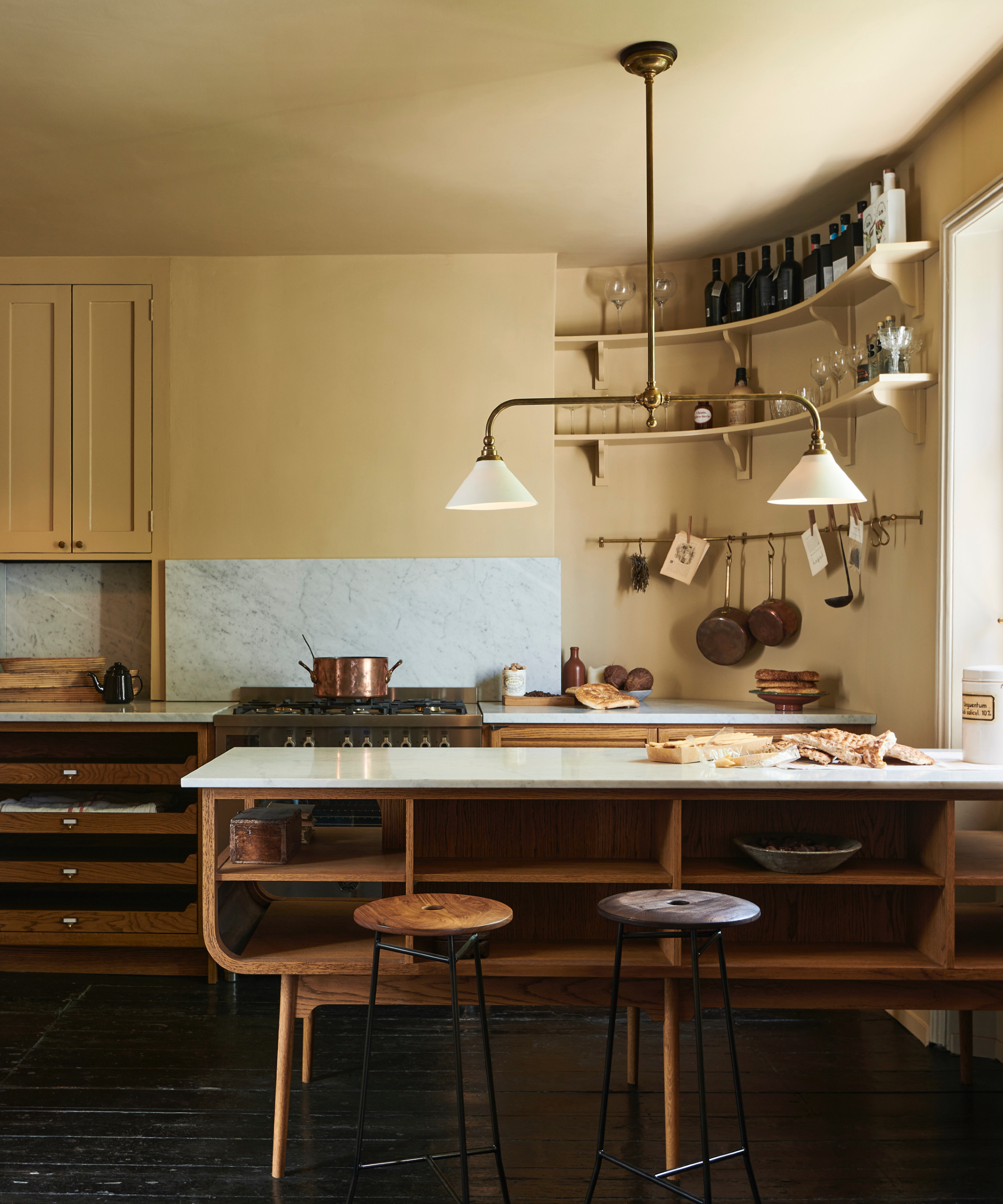
For an uplifting color scheme to try in your kitchen, Patrick recommends using Farrow & Ball's Sudbury Yellow, Tanners Brown, and Wimborne White. 'I know a lot of people are scared of using yellow, but Sudbury Yellow has this lovely knocked-back quality. It’s not too shouty and strong.'
Patrick advises using this statement yellow hue on your kitchen cabinets, and then Tanners Brown on a kitchen island or table. To complete the look, 'your ceiling color here and woodwork and trim color is Wimborne White. Just very gentle.'
Scheme three: A playful bathroom
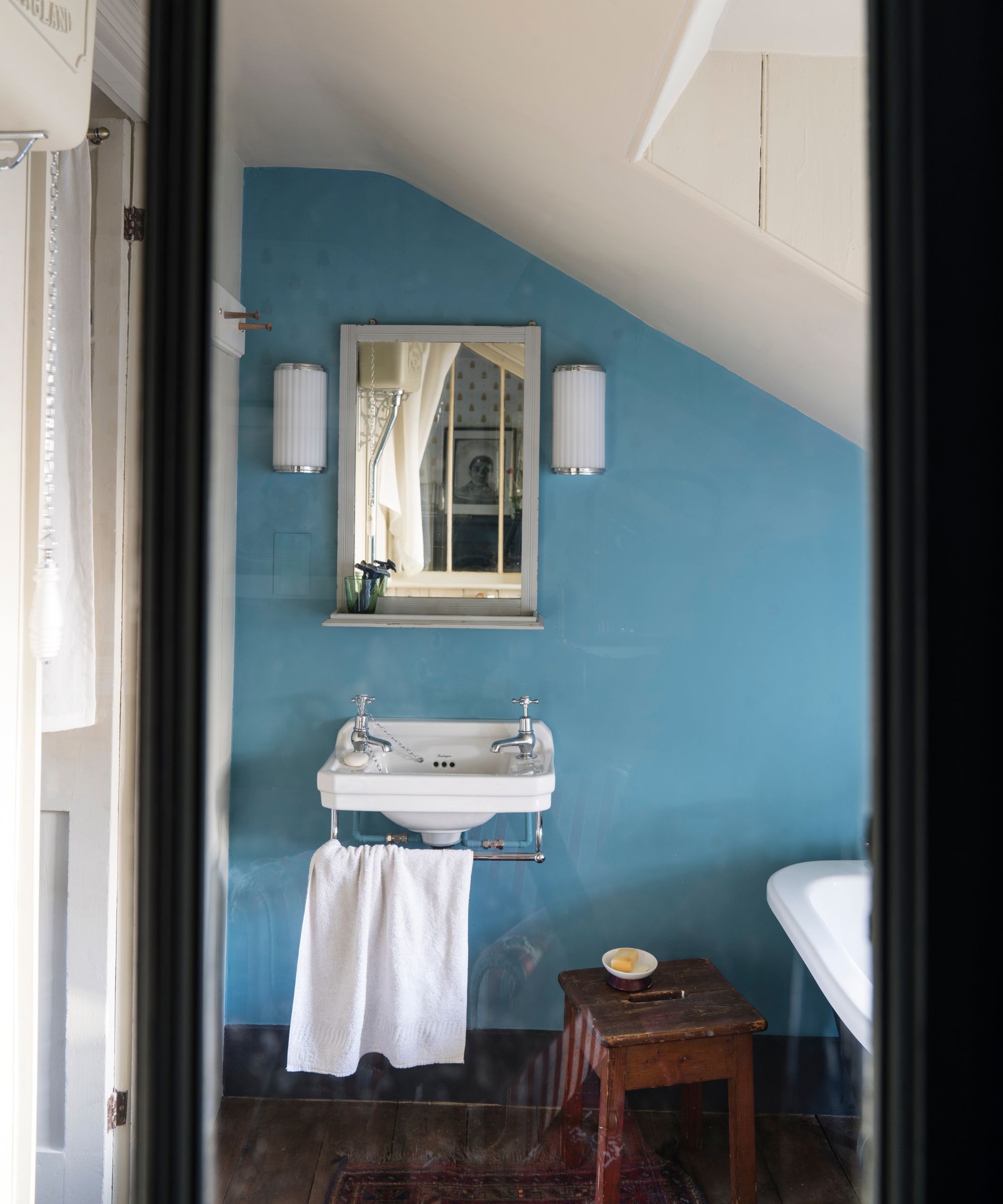
Lastly, consider adding a playful and energizing feel to your bathroom with Farrow & Ball's Arsenic on the walls, a vibrant blue-green hue, which Patrick explains 'seems to lend itself really well to bathrooms, especially with all white sanitary ware.' However, there are other ways to decorate with this bright hue more subtly, as the color expert suggests: 'If that's too scary to commit to all the walls – but lovely for a small bathroom – put it on a vanity unit or clawfoot bath.'
To finish the bathroom color scheme, Patrick suggests using James White as a secondary hue, which he explains has 'that little dose of green so it plays beautifully against the Arsenic.'
Looking for some more color inspiration for your home decor projects? We've explained how to choose a color scheme for your entire home to ensure a balanced and cohesive result throughout each room.