As we near the end of 2025, we're eagerly looking ahead to the design trends beginning to emerge for the soon-approaching new year, and when it comes to decorating with color, experts have a lot of exciting predictions for 2026.
From the rise of teal interiors to the continuation of red color schemes, 2026 is set to be a color-confident year, favoring bold yet soothing shades that celebrate the mood-boosting power of color.
Here, you can take a deep dive into the biggest color trends for 2026 that interior designers and color specialists are championing above all others. Whether you enjoy bold room color ideas or the timeless appeal of neutrals, these seven shades can be adapted to so many decorating styles.
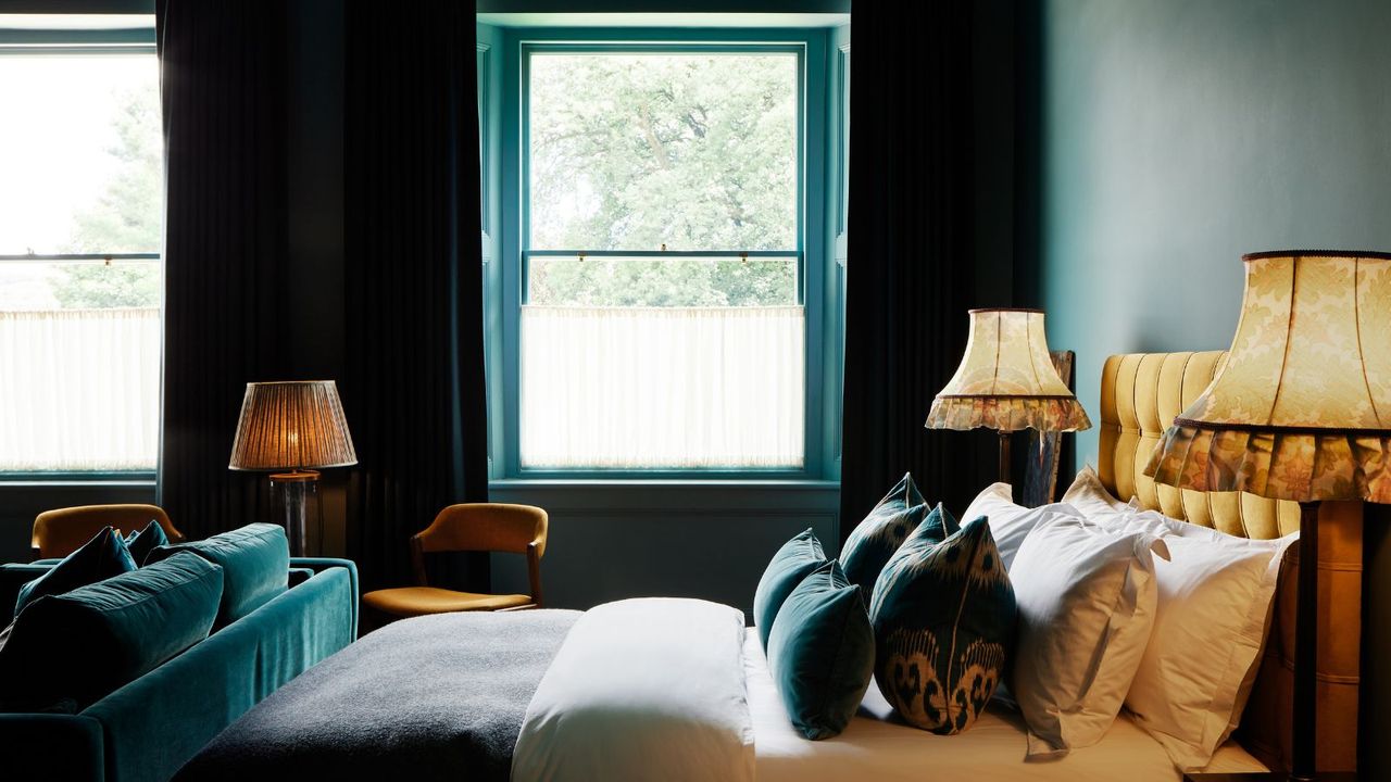
1. Tranquil Teals
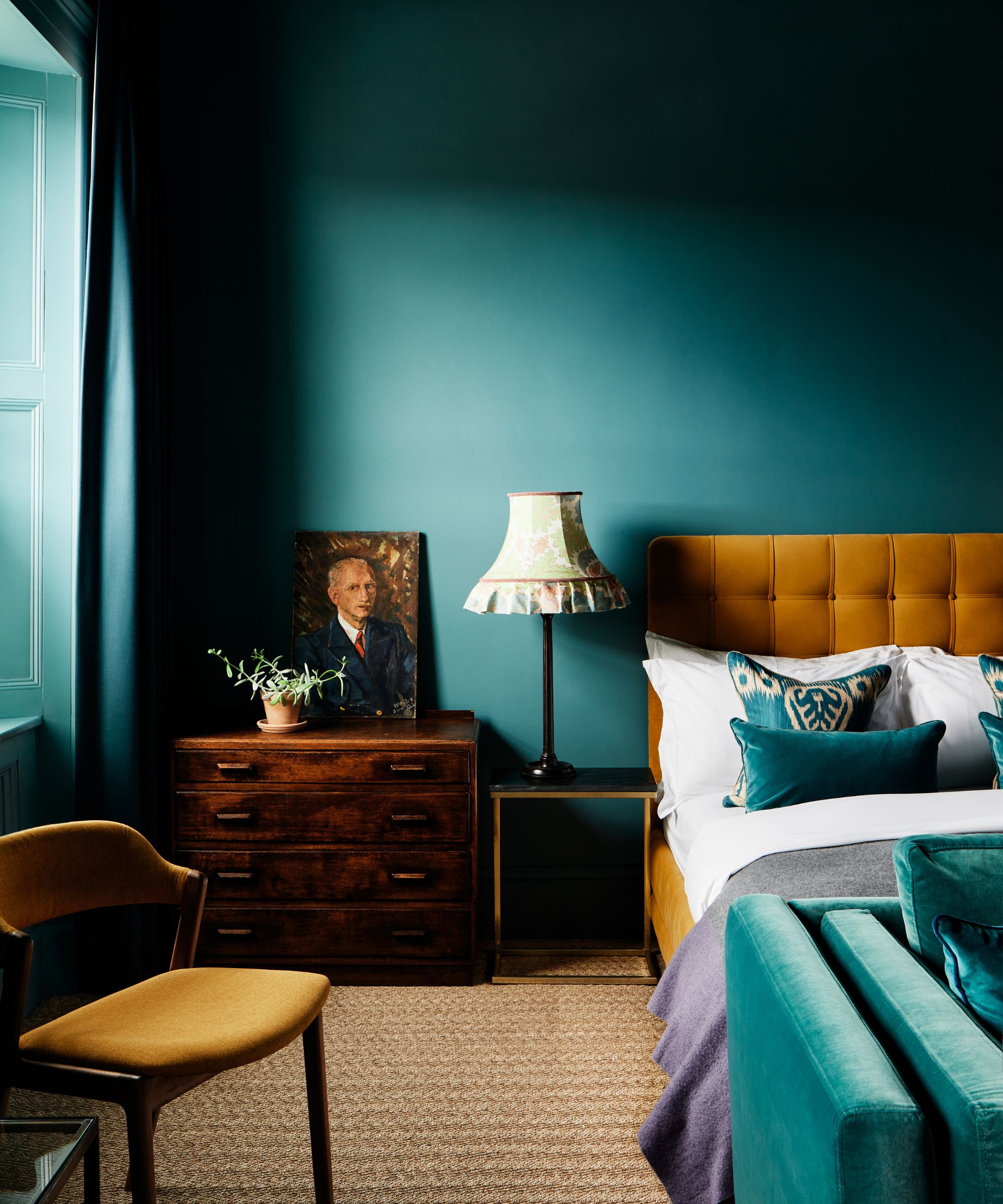
Blending the soothing tones of blue and green, 2026 is set to see the rise of decorating with teal, which offers a tranquil and bold look. This hue has been cropping up in many homes, but it is further cemented as a key trend for the year ahead since Behr's Hidden Gem was revealed as the paint brand's Color of the Year for 2026.
'People are leaning into more blues and greens, as they want a paint color that makes a statement yet remains subtle,' explains Erika Woelfel, Behr’s vice president of color and creative services. 'Hidden Gem is a smoky jade that embodies both understated elegance and timeless sophistication. It's a rich blend of blue and green that is highly versatile for many areas of the home.'
Interior designers are also championing the use of blue-greens for the year ahead, not least because of their association with the natural world. 'The best blue-greens feel like they came right from nature, such as moss, eucalyptus, and lichen,' says Lauren Saab of Dallas-based Saab Studios. 'They can ground a room, but still feel alive, and pair beautifully with travertine, light oak, and aged brass, which let the color breathe instead of compete.'
'We love the direction of Behr’s Hidden Gem,' adds Marli Jones, the creative director at Chicago-based design studio Rebel House. 'It’s a fresh, calming blue-green shade that’s slightly unexpected and a perfect choice for color-drenching a smaller space like a powder room, or going bold and drenching a kitchen, all without making the space feel overwhelming.'
Perfect for adding a touch of teal to any surface, this teal bowl can be used to elevate the everyday. Use it to house fruit, keys, makeup anything you want to have easy access to while still looking beautiful.
Teal can pair beautifully with neutrals, as this throw pillow proves. It needn't always be bold but will add a pop of color to your bed or couch.
Bring a wash of teal into the bedroom with this cozy throw. Layer with creams and whites for a fresh look, or to lean into the drama mix in some moody burgundy and browns.
2. Mellow Reds
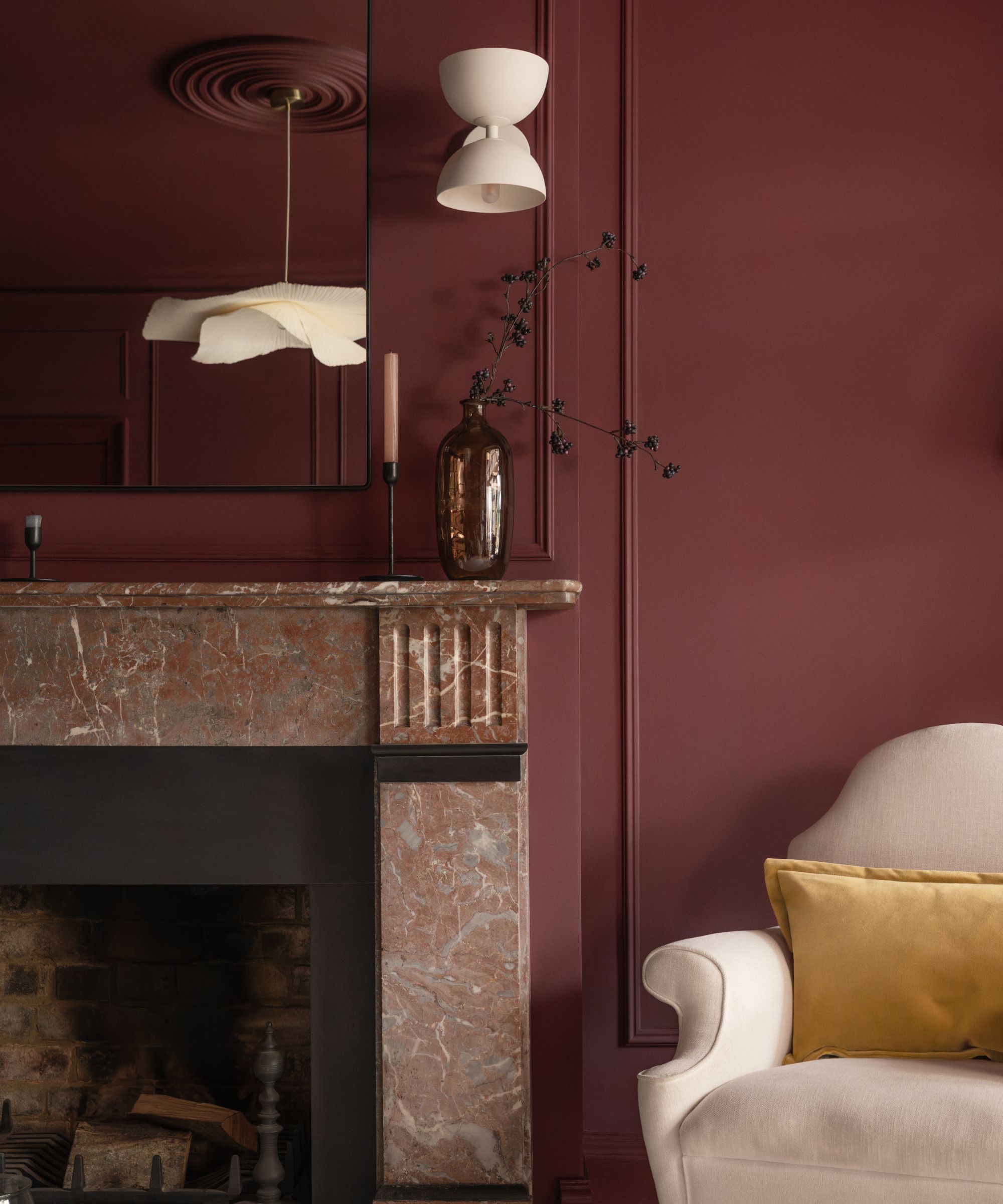
Decorating with red has seen huge appeal this year, and that's set to continue into 2026. But instead of vibrant cherry reds, experts are pointing towards earthy, mellow shades, which ground a scheme with richness and sophistication.
'When I think about the color that’s going to define 2026, it has to be Red 06 from our 2026 Color Edit,' says Tash Bradley, director of interior design at paint brand Lick. 'It’s a rich, sophisticated berry red with soft lilac undertones that feels both luxurious and grounding. It’s bold without being overpowering, the kind of color that instantly makes a room feel cocooning and full of character.'
'What’s exciting about next year is that people are being so much braver with color –they’re creating schemes that feel deeply personal, and that’s exactly what this shade encourages,' adds Tash.
Red's appeal is echoed by the Texas-based designer, Marie Flanigan, who is favoring similar hues for the months to come. 'For 2026, I’m drawn to rich, grounded reds, particularly Sherwin-Williams’ Carriage Door and Aurora Brown. Carriage Door is a deep burgundy that feels sophisticated and timeless, while Aurora Brown is an earthy, warm tone with subtle red and violet undertones.'
'These shades are perfect for “jewel box” rooms where intimacy and drama are key – think a butler’s pantry, a bar, or a lounge area,' adds Marie. 'They can be layered on walls, cabinetry, or even incorporated in textiles like upholstered seating, rugs, and throw pillows. Pair them with soft neutrals, natural wood, or brass accents to create warmth, balance, and a sense of quiet sophistication.'
Throw pillows are out, bolster pillows are in. Pair this dark red velvet pillow with dusky pink sheets (like these from Anthropologie) for a tonal look that's luxurious.
The most affordable way to add any color into your home? Candles. These taper candles are sure to add some drama to your table or mantel.
A pop of (portable) red with this lamp. It would be ideal for adding this on trend hue into a kitchen, or try adding to your bathroom for a softer light that's wire free.
3. Uplifting Yellows
Butter yellow was one of the most defining color trends this year, and for 2026, experts predict this happy shade to continue in popularity, whether that's with vibrant yellow room ideas or with the more grounding ochre.
'I think we’ll see yellow used more frequently in 2026 – it is already growing in popularity,' says Courtnay Tartt Elias, the creative director at Houston-based Creative Tonic Design. 'Kitchen Aid came out with a yellow for appliances this year, which I think is a signal of its popularity.'
'Painting a room yellow is a lovely background for so many different styles – a more pale, buttercream will give a wildly different impression from a vibrant sunshine shade,' Courtnay adds. 'If a client isn’t ready to fully commit to painting a room yellow, it makes a lovely contrast color. A blue room with yellow drapes, cushions, or trimwork is a lovely way to add the pop of contrast without diving fully in. There are so many shades of yellow that there’s bound to be one that works with just about any color scheme.'
Add some sunshine to your shelving with this ceramic frame.
Addison Ross' Bobbin Lamp is a cult favorite, and comes in all the most popular shades of 2026. They last for 10 hours, and are remote-controlled too.
Butter yellow and whimsical? This throw pillow nails two of the biggest trends in one.
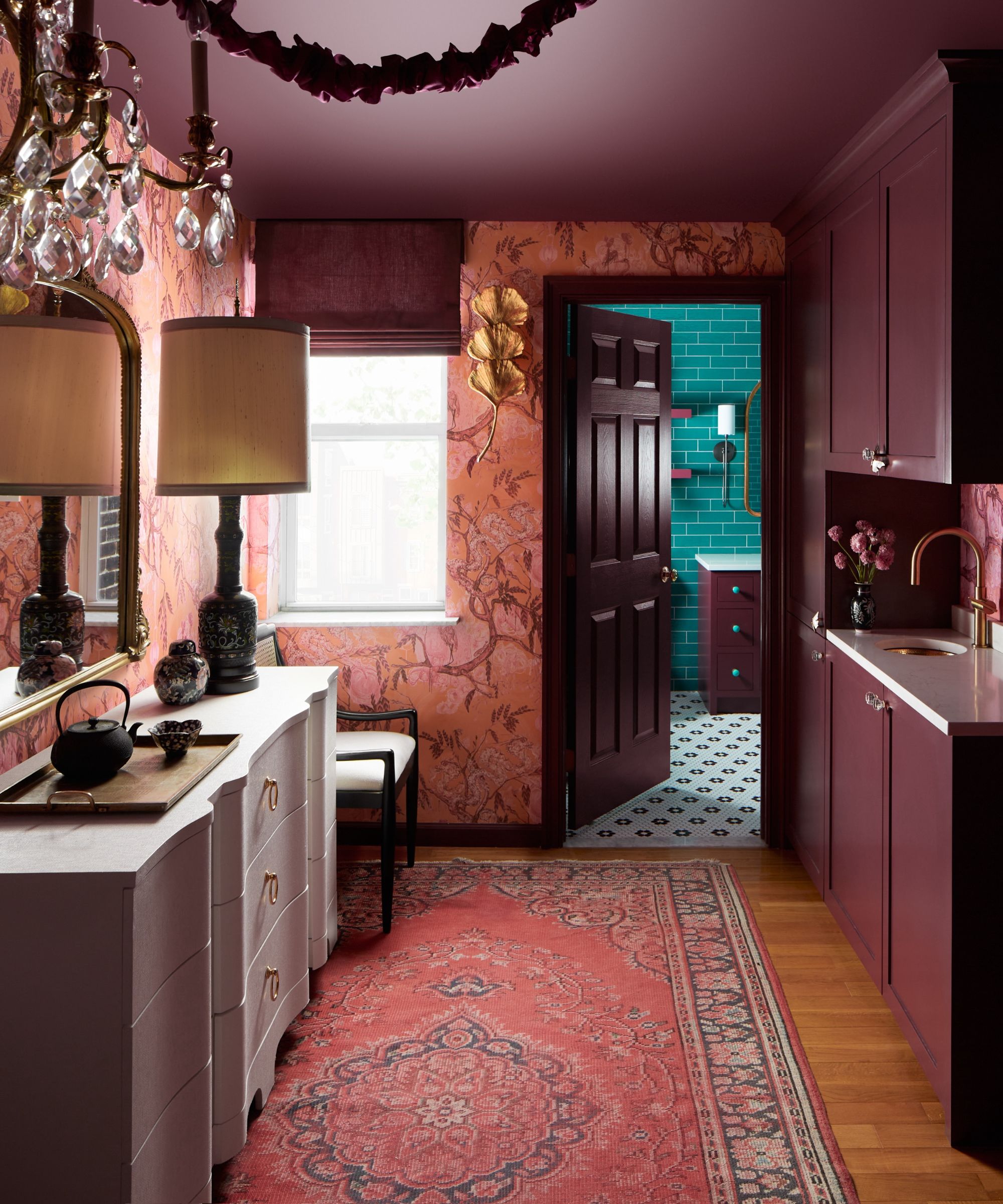
4. Warm Blacks
The boldest of colors, decorating with black is a brave choice, but the rise of warm-toned blacks is making this daring hue more livable.
'We are going to see a lot more warm black tones for 2026,' predicts the interior designer Linda Eyles of Houston-based Linda Eyles Design. 'It is a dramatic shade with a rich and earthy side that makes it a beautiful neutral. A deep black can add elegance to a bar or bring a handsome, calming quality to a study.'
This color trend is reflected in Benjamin Moore's Color of the Year: Silhouette, a rich espresso tone that adds drama to any room. 'Dark chocolatey hues like Benjamin Moore’s Color of the Year 2026, Silhouette, can be equally parts inviting and chic,' says Helen Shaw, color expert at Benjamin Moore. 'This alluring mix of rich espresso hues with subtle notes of charcoal can be designed in a variety of styles and spaces, but it has a distinctive presence. Similar to a tailored touch in fashion, it can elevate a design and take it from expected to exceptional.'
'This hue creates a perfect backdrop when color drenching a space, or a moment of contrast when used with a lighter color – this contrast to textured fabrics and materials in lighter colors will enhance the depth of the wall color, while creating a layered space that blends sophistication with a relaxed feel,' Helen says.
This rug might be dark in color, but its subtle print and distressed look is far from dramatic. It would work wonderfully to ground a room without overwhelming.
This color trend is all about softness; it's dark, but it's not harsh, and the warm charcoal shade of this throw pillow is exactly that.
The key about decorating with black is to add in plenty of texture, to stop the space feeling too stark and flat. This marble trinket dish will add the drama, but all the dimension.
5. Earthy Dark Greens

Continuing the appeal for nature-inspired colors, decorating with green is predicted to remain popular in 2026, with deep, earthy shades replacing once-popular sage green. 'A lot of what’s been popular – earthy, old European-inspired colors and textured finishes – continues to be strong,' says Portola Paints' co-founder, Jamie Davis.
'Based on trends from design colleagues and paint vendors for 2026, we expect a deep, earthy green to be the enduring color for interiors,' says the interior designer Pamela Forman of PBF Homes. 'This trend is driven by a desire for spaces that feel restorative, grounded, and connected to the outdoors. We hear from our clients that they are seeking tranquility in their homes, and deep green provides that natural, calming backdrop.'
While deep shades of green work timelessly in many rooms, Pamela says that it works especially well as a kitchen cabinet color. 'This immediately provides an element of natural, bespoke luxury that contrasts beautifully with lighter countertops (marble, white quartz) or brass hardware.'
In living spaces, it is best paired with woods, which continue the natural, earthy look. 'The deep green will make the natural grain and texture of warm woods (like oak or walnut) look richer and more intentional,' says Pamela.
Earthy greens work wonderfully in a bedroom, adding calm and coziness and the slubby quality of linen lends itself so well to this nature-inspired shade.
Created in collaboration with design duo Pierce & Ward this earthy green rug would add instant warmth to a living room or bedroom.
If you have shelving in your kitchen to display your nicest crockery, add a hint of earthy green with this serving tray. It would also look lovely as a fruit bowl filled with oranges and lemons.
6. Rich Plum Shades
This year's purple trend familiarized us with using this nostalgic – and sometimes divisive – hue in our homes, but for 2026, we're expecting a shift towards rich plum tones as a grown-up and arguably more timeless take on purple room ideas.
'For 2026, we will see a natural progression in the use of burgundy in interior design, with shades of red, pink, and purple all becoming more popular as customers continue to demonstrate more color confidence in their homes,' says Ruth Mottershead, creative director at Little Greene.
'My color prediction for 2026 is plums and purples,' adds Florence Sherwood, color consultant at Georgie Wykeham Designs. 'In recent years, we have seen interiors turn to warmer tones, and brighter colors are much more widely used now. I regularly use more saturated tones of reds, greens, blues, and yellows, so purple is going to become exciting for designers looking for something fresh.'
'It is a contrasting color to yellows, so it will work well in ochre schemes,' Florence adds. 'Farrow & Ball’s Paean Black is a lovely purple-black that will add depth to warm berry schemes, while Great White is a good fresh pink-purple-white which will sit softly with a purple scheme.'
If painting your walls in a dark plum seems daunting, bring this trending shade in with you accessories. This tray is a versatile piece that will add a touch of deep plum to any room.
This vivid pinky plum jug filled with flowers and foliage, placed on an island or countertop, would lift any kitchen color scheme.
This would look lovely as part of your tablescape, but this is the kind of plate that would work hung on the wall too as part of a characterful gallery wall.
7. Red-Based Taupes
When it comes to decorating with neutrals in 2026, experts are favoring taupe tones with red undertones, which ensure a warm color scheme. 'The rise of red-based taupe feels particularly significant,' says the Milan-based color consultant Charlotte Cropper. 'Whether it leans more mushroom, like Smoked Trout by Farrow & Ball, or towards an earthy clay tone such as Taupe 03 by Lick, this color sits beautifully between a neutral and a color.'
'The red undertones lift it from being a safe, stereotypical neutral to one that feels both classic and contemporary, depending on your design style,' Charlotte adds. 'It might not be bold enough to be crowned "color of the year", but it’s the shade I’ve noticed homeowners gravitating towards in real life. It leans into the ever-growing desire for colors that comfort us; for hues and homes that nurture us and, most importantly, allow for individual expression.'
When decorating with warming shades of taupe, Charlotte advises that you don't need to play it too safe. 'It is one of those colors you can really get away with clashing against, so have fun introducing bold accents that add personality and soul: a blue lamp, a green sofa, terracotta cushions, dark wood furniture, or multicolored artwork. It's a neutral with a twist – warm, grounding, and one to watch.'
As Charlotte recommends, these pale warm hues are the perfect backdrop for bolder shades, so layer a set of sheets like this with throw pillows in yellows, greens and blues.
The mushroom shade (and shape) of this lamp is an easy way to bring 2026 biggest neutral into any room.
A soft taupe lends itself to a soft alpaca throw blanket and this one from Serena & Lily has a lovely texture that's perfect for layering.
Color trends for 2026 present rich, bold tones that align with the wider shift toward soulful and personality-led homes, as well as comforting and warm-toned neutrals that establish a calming backdrop in rooms. Whichever of these trending shades you're drawn to, it's worth taking inspiration from designers' color rules to ensure a balanced scheme.