2025 has been a refreshingly colorful year. From the return of brown to the much-loved butter yellow, it's fair to say the spectrum of trending colors has been vast. While many of these shades prove to be a popular choice among designers and homeowners, there are some trending hues from this year that designers say they would never actually use in their own homes.
Color trends don't always live for very long; they can be gimmicky, or seasonal, or just not very usable. The reality is that many of these fleeting colors aren't quite as appealing to designers when it comes to creating a timeless home.
To find out what popular 2025 colors designers aren't that enamored with, I asked designers which trending shades they would avoid, which ones lack longevity, and won't be seen past the end of the year.
1. Butter yellow
A color trend that feels like a 2025 time capsule, butter yellow has dominated social media feeds since January. While many love it, not all interior designers would use the shade in their homes.
Interior designer Sabah Mansoor, founder of Sabah Mansoor Design thinks that butter yellow is too much of a fashion-forward trend. She explains, 'Butter yellow, which made a comeback in fashion, is best kept on the runway and on one's garments. As an alternative for the home, shift from buttery tones to a soft, muted yellow.'
Not only do more subdued yellow paints work as an alternative (I love Hay No.32 by Farrow & Ball), but interior designers also suggest that other colors are replacing butter yellow, from heritage blues to terracottas. These alternatives feel equally as cheerful and warm, but less trend-led and more timeless. Read as: wear butter yellow, decorate with a more muddied, muted version.
2. Neons
'Brat Green' (based on the singer Charli XCX's album cover) has been hanging around since last summer, and even its creator has declared it's over. Despite being a trending color in fashion, many interior designers say they would avoid overly saturated brights entirely.
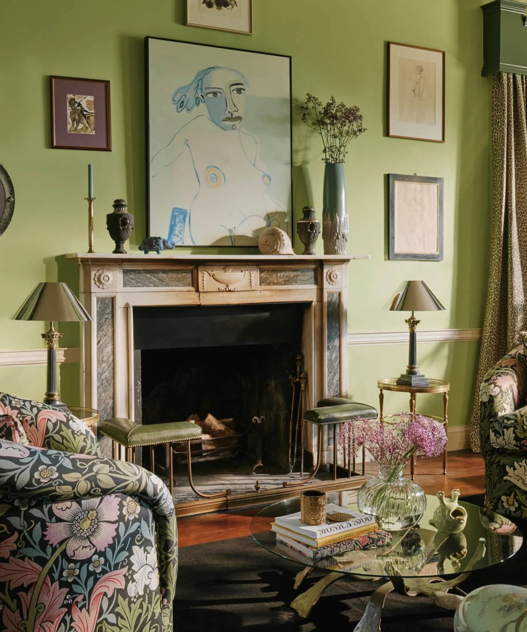
Interior designer Nina Lichtenstein says, 'This loud, ultra-lime green made a bold entrance, but its synthetic feel clashes with the shift toward natural, calming interiors. Instead, look to chartreuse or pear green, tones that bring energy without overwhelming the senses.'
It's not just neon green paints that designers wouldn't use; most overly bright, highlighter-like shades aren't popular. Nina adds, 'High-voltage color is exciting in small doses, but when it dominates a room, it quickly overwhelms. Designers are leaning away from neon walls or overly intense brights in favor of deeply saturated tones like inky navy, muted wine, or burnt orange, which have both impact and staying power.'
Little Greene's Sage Green is a refreshing choice that acknowledges the trend for bolder, brighter colors, yet feels more grounded and timeless. Again, everything is suggesting, take those trending fashion colors and make them more muted when it comes to interiors.
3. Bright reds
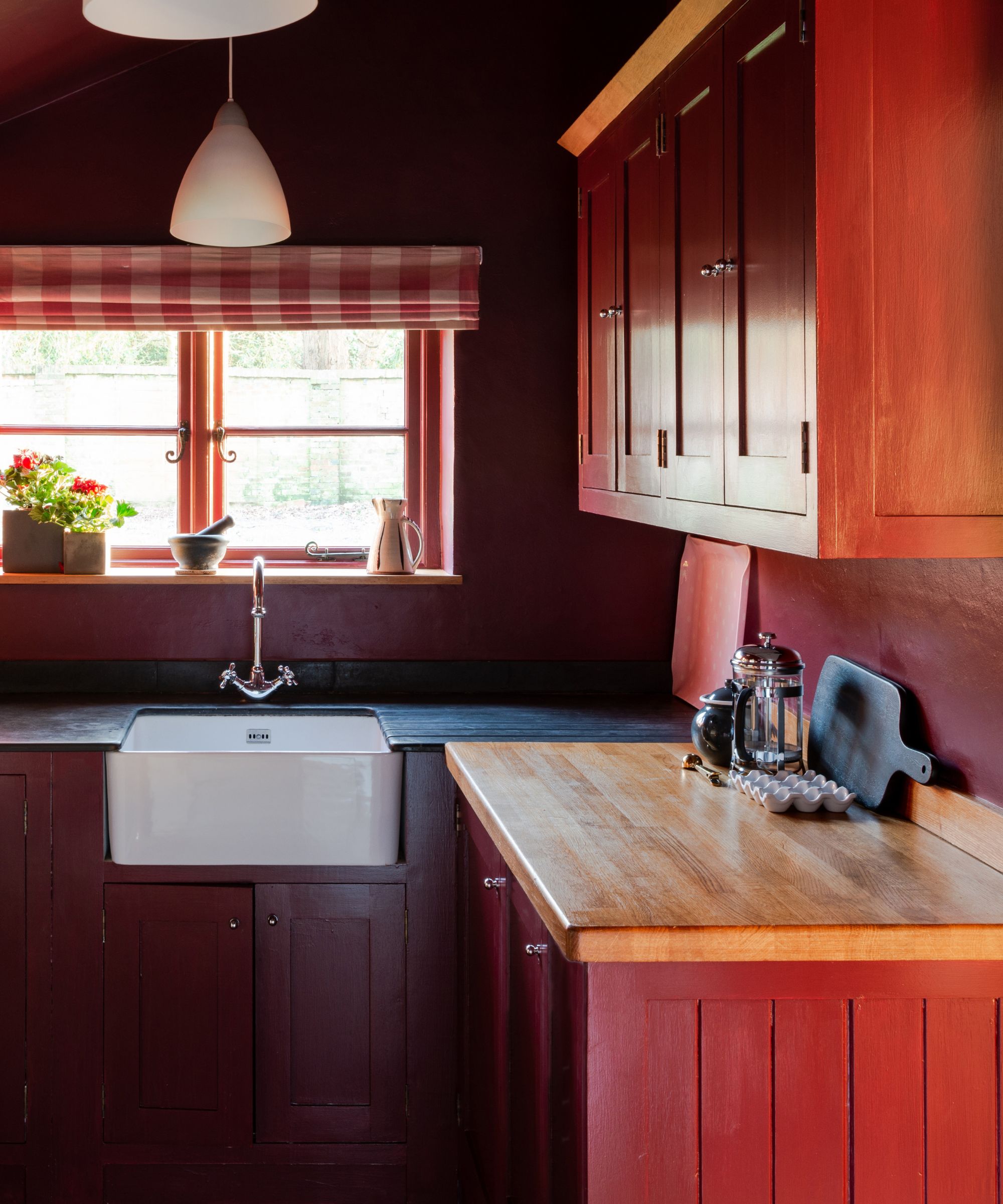
The unexpected red theory took the internet by storm at the end of 2024, leading to its subsequent popularity this year, too. Although there are plenty of ways to decorate with red paint, brighter variations of the shade don't resonate with all designers due to their stark and striking qualities.
Sabah says, 'The cherry red color trend can have a nice retro feel when used sparingly and in the right context, but for the home, I prefer deep reds, like burgundy, to create richness.' For a heritage look, try Benjamin Moore's Classic Burgundy HC-182; it feels trendy and timeless all at the same time.
Mollie Ranize, Founder of Dmar Interiors, agrees. She says she avoids red, specifically dusty-toned shades. 'One color you won’t find in my own home, or in most of the spaces I design, is dusty red. Red in general can feel harsh and overly energetic, while I’m drawn to earthy tones that create a calmer atmosphere and stand the test of time.'
Red can work in some settings, though, explains Mollie. 'However, when it comes to commercial spaces or restaurants, bring on the red. It can be vibrant, memorable, and exactly the kind of energy those environments thrive on.'
4. Barbie pink
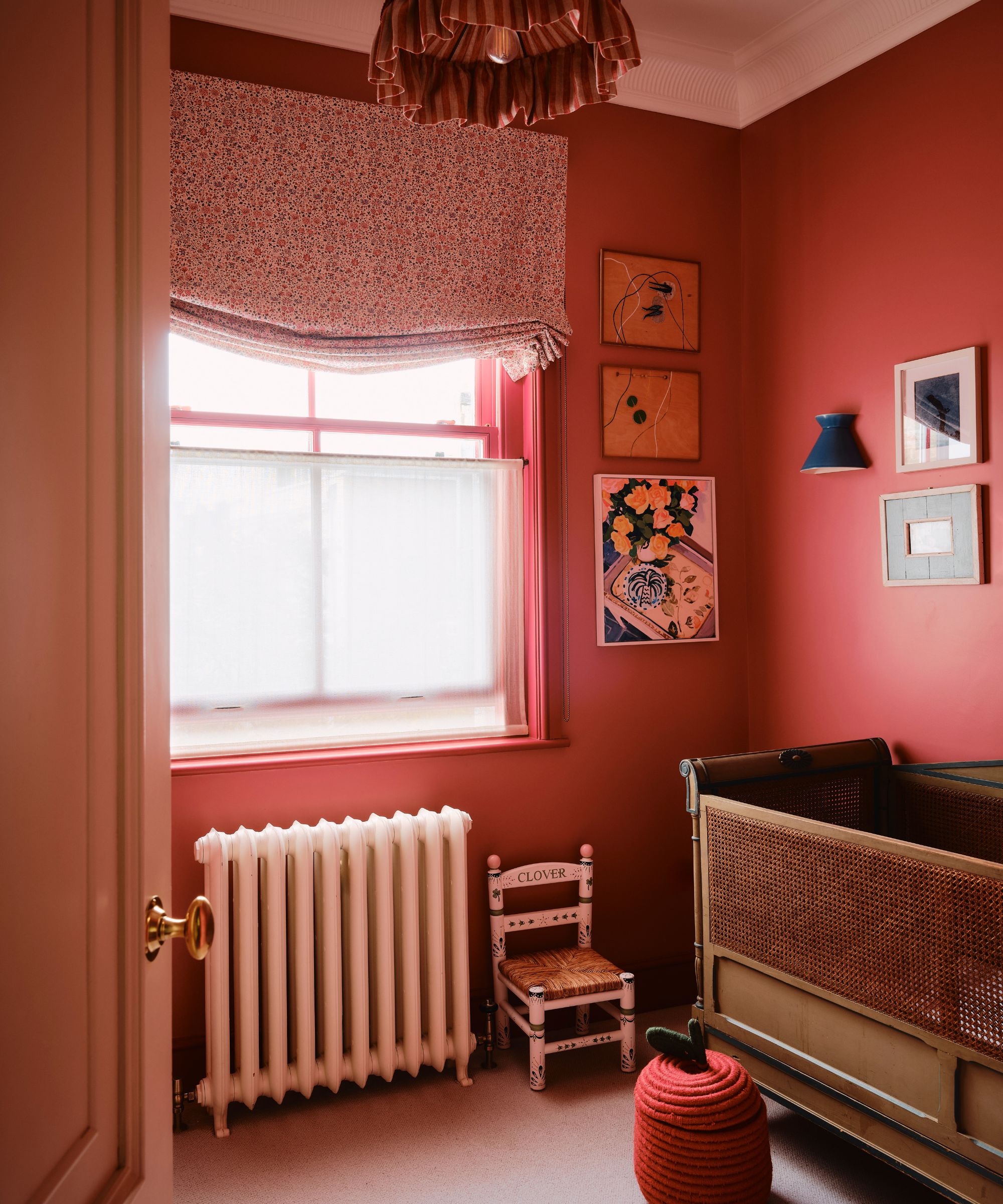
Although decorating with pink can be chic (think dusty rose tones or uplifting pastels), there's one variation of pink that designers say they would never actually use in their own home – Barbie pink.
You can probably guess what Barbie Pink looks like if you're familiar with the brand; it's a stereotypical pink shade with rather vibrant undertones. Sabah says, 'Barbie pink is never sophisticated; however, blush, earthy, and nude pinks can be integrated nicely into a home's color scheme.'
It's not just Barbie Pink that designers wouldn't use; in fact, Millennial pink is another pink paint they're unlikely to incorporate into a home. Nina says, 'That dusty, bubblegum-adjacent pink that defined a design era has officially worn out its welcome. Once playful and charming, it now feels overly kitschy and too tied to a particular moment in time.'
Farrow & Ball's Cinder Rose No. 246 is a more chic alternative that is perfect for decorating with dusty pink. Nina says, 'For a softer, more lasting approach, swap it for a blush with terracotta undertones that is still warm, still inviting, but has a grounded elegance.'
5. Truffle brown
Although decorating with brown was a big trend this year, some designers are sick of seeing overly brown schemes and say they'd never use them in their own homes.
Interior designer Olga Goykhen says, 'I would toss truffle brown out the door. I absolutely love deep browns layered with textured stone, but too much brown can make the space feel heavy. Truffle brown can feel overbearing if it’s not carefully balanced with taupes or other natural elements.'
Suggesting a chicer alternative, Olga says, 'In my own home, I gravitate toward colors that accentuate the architecture and texture of the space. Muted neutrals or darker shades like oxblood or olive can help highlight the structural design rather than competing with it.'
2025 has been an exciting year for color trends, but the takeaway I am getting from all of these designer suggestions is to avoid being too influenced by fashion trends when it comes to decorating your home. Fashion is fast, it's fleeting, and it's easy to follow them without making big switches, but when it comes to cultural trends, keep them out of your home unless you know you are going to love them for more than one summer.