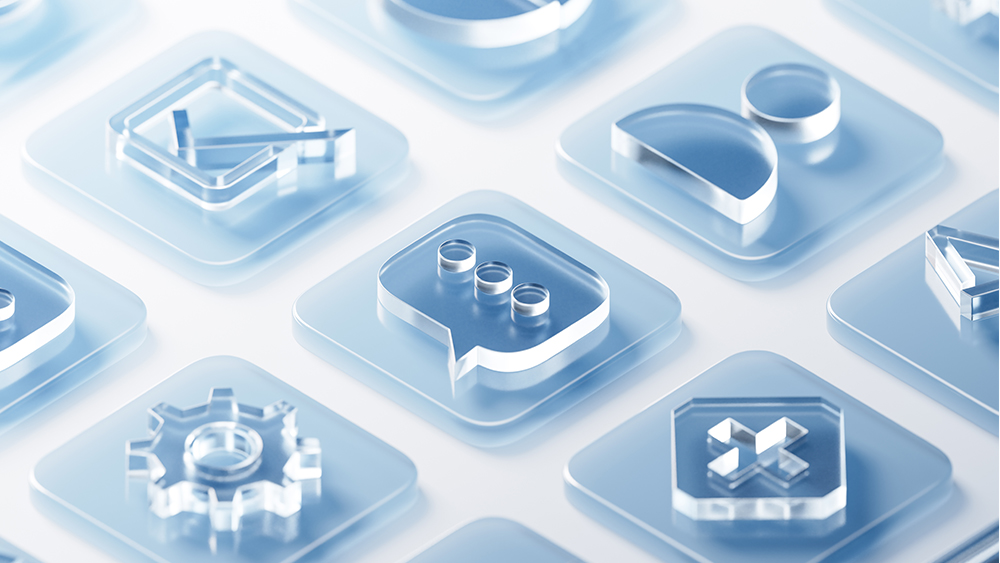
After the flat design revolution in user interfaces, going back to skeuomorphism would feel so old and outdated. But 'glassmorphism'? Glass looks clean and shiny. Maybe it could disguise a step backwards?
This week, glass has become as ubiquitous in UI design concepts on social media as it is in urban architecture. After Apple's launch of its new Liquid Glass design language for its rebranded operating systems, including iOS 26 and MacOS Tahoe 26, everyone's mocking up translucent buttons, typically frosted, with blur, transparency and lighting effects.
But glass UI was all the rage, what, 15 years ago? (Apple suggests Liquid Glass was inspired by VisionOS; Microsoft suggests otherwise). We need to consider why it's coming back and if we really want it.
I have two theories about Apple's reasons for introducing Liquid Glass. Firstly, I suspected it was for aesthetics rather than usability. Apple's facing increased competition in the smartphone market, and Liquid Glass helps to make its phones look more sophisticated even if they aren't.
There's something about digital glass that feels modern and premium despite real-world glass having been around since ancient Mesopotamia. Perhaps that's party because it's been technically challenging to pull off in a realistic way.
The 3D animation below, for example, is a thing of beauty. Created by the designer and 3D illustrator Reijo in Blender, the glossy surface, soft shadows, the timing of the flip motion are all wonderfully satisfying, and it's so realistic it looks like the buttons would shatter if you hit them too hard.
Tune out. #b3d pic.twitter.com/l1Sxfg4qaAJune 13, 2025
Whether it would make for a good user experience is a different matter. It takes us back to the idea that UI design for digital products needs to reflect the physical world. Sure, a button needs to look enough like a button for us to understand what it is, but that doesn't take much. The skeuomorphism trend in UI design had a logic to it at the time. The digital world was new. People needed to to be eased into it with interfaces that looked familiar.
We're beyond that now. We know how apps works. Aiming for real-world authenticity is difficult to implement and looks fussy. Glass makes sense for VisionOS, where you might have relevant information behind a glass element, but less sense (at least to me, you can try to convince me otherwise in the comments) for phones or laptops, where it hinders legibility for no obvious benefit.
this is how proper Liquid Glass™ buttons should look like 🤌 pic.twitter.com/R9m1rXFU4BJune 11, 2025
Liquid Glass Style Button in React. 准备实现一套react版本的liquid glass 风格的UI,感觉应该有一点技术难度,主要是要在Web里面实现玻璃边缘的形变效果。 pic.twitter.com/IdZdIlyx2UJune 12, 2025
🚀 Dropped a hold-to-press Liquid Glass button for #ReactNativebuilt with @expo + Reanimated.Frosted blur, smooth long-press feedback.Grab the code below👇 pic.twitter.com/tgstKkvqHJJune 12, 2025
If we really want realistic glass, we should have fingerprints like this.
ooo noo, don't touch my liquid glassa closer look at a glassmorph button displaying fingerprints, using css blend modes, inset shadows and border gradients using masks pic.twitter.com/KToVOR4Tk9June 12, 2025
But is Liquid Glass preparation for something bigger? I think the other thing the sudden trend for glass UI concepts is missing is that Apple's Liquid Glass doesn't really attempt to mimic real glass . The interesting bit is the 'Liquid' part, not the 'Glass' part.
Apple often works a step ahead, preparing users for things to come, so I wonder if Liquid Glass's implementation in iOS 26 and MacOS 26 isn't the end objective but an awkward stepping stone to a more fluidly intelligent interface for devices that don't yet exist – smart glass and XR experiences that require UI elements to be placed over reality. That's the only explanation that makes sense to me from a user experience point of view. In the meantime, let's hold back on the glass buttons.
For more UI design news, see the Apple Design Awards 2025 and the Switch 2 eShop upgrade. We also have a guide to the best UI design tools.


