It takes a special kind of interior designer to be able to take a period property – in this case, one straight out of the 1970s – and turn it into a family-friendly home that doesn't disappoint in style.
When Jessica Helgerson, of Jessica Helgerson Interior Design, took on this riverside fixer-upper for a family of four in Portland her only brief was to meet the client's desire for a colorful, playful home. And boy did she deliver.
Wrapping almost every room in wood and delivering a muted, earthy, Seventies-inspired, and just plain groovy color palette, the team created a scheme for this home that feels like a signature interior design style in and of itself. Want to take a look around? Let's go.
Sauvie Island, a river island just outside Portland, OR, is surrounded by wildlife and charming stretches of sandy beach and was the perfect place for this family with two young boys to settle. The idyllic island is split between agricultural land and a nature preserve where the designer of this project, Jessica herself, lives. So it makes sense that the river is honored throughout the design of the home.
With the surroundings lending a serene backdrop, the JHID team became advocates for the house, seeking to preserve what they could of this 1970s home. While many might have torn down the structure, Jessica and her team decided instead to 'radically simplify the circulation'.
They completely redesigned the floor plan to suit the family’s lifestyle and maximize the house’s potential, paying close attention to the sightlines of the river.
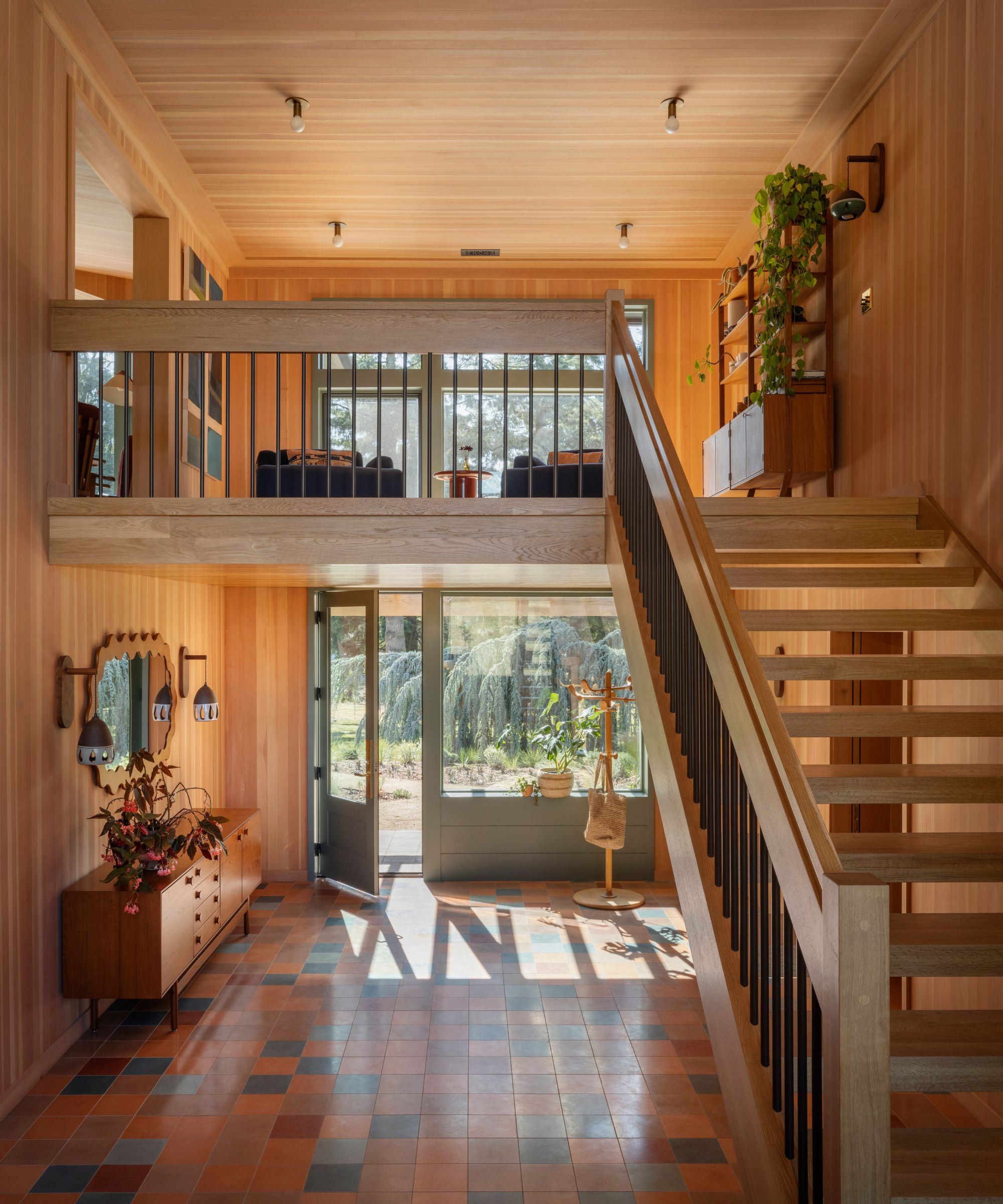
'The most tricky part of the ‘before’ of this house was the circulation; it was confusing to know where to come in, and how to move through the space,' says Jessica. 'The entryway is open and full of light, with double-height windows both at the front and back of the house. It’s quite a bit of space to devote to the entry, but it feels so welcoming.'
'I often think transition spaces in houses get downplayed or under-prioritized, but honestly, you’re walking through your house almost as much as sitting down in it,' she continues. 'So the quality of those spaces really matters.'
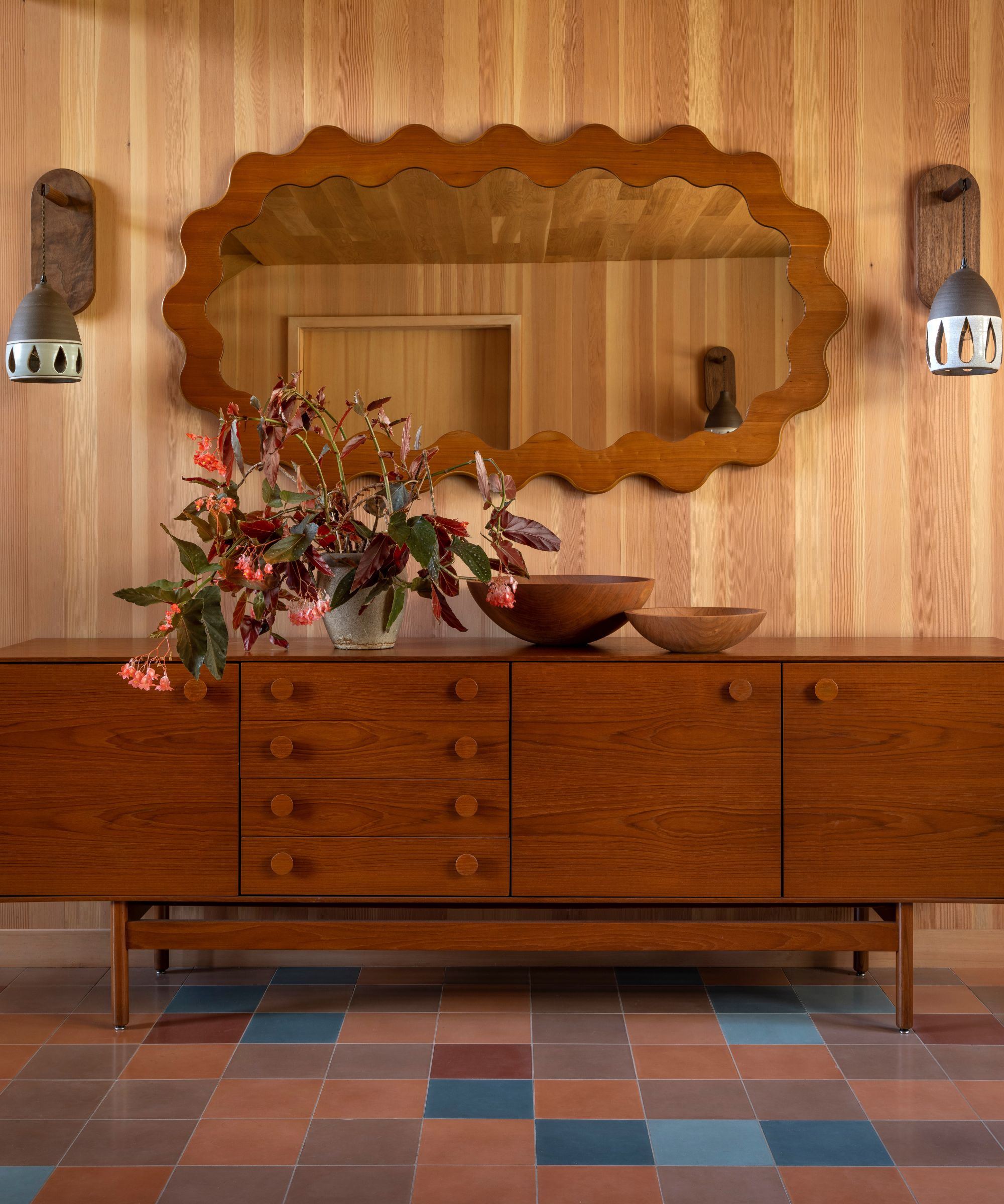
Following the family's plea for a colorful home, Jessica created a signature color palette of bright yet earthy tones that is echoed throughout the home with multi-toned, checkerboard encaustic floor tiles from Zia Tile that welcome you upon entry to the first floor and are then repeated throughout the house. Their retro teal, mustard, and terracotta hues form the basis for the entire scheme.
Speaking of color, on the first floor, the bedrooms and family room [above] are deceptively lacking in height. 'We wrapped the wall color up the walls and onto the ceiling,' explains Jessica. 'In the kid's rooms, we also created big ceiling roses with painted circles to anchor the lights and make it appear as though the ceiling is farther away.'
The two boys’ bedrooms have color palettes that mirror each other, one is teal with yellow accents, the other yellow with teal, and both feature natural wood accents, custom built-ins, and art by local Portland artists.
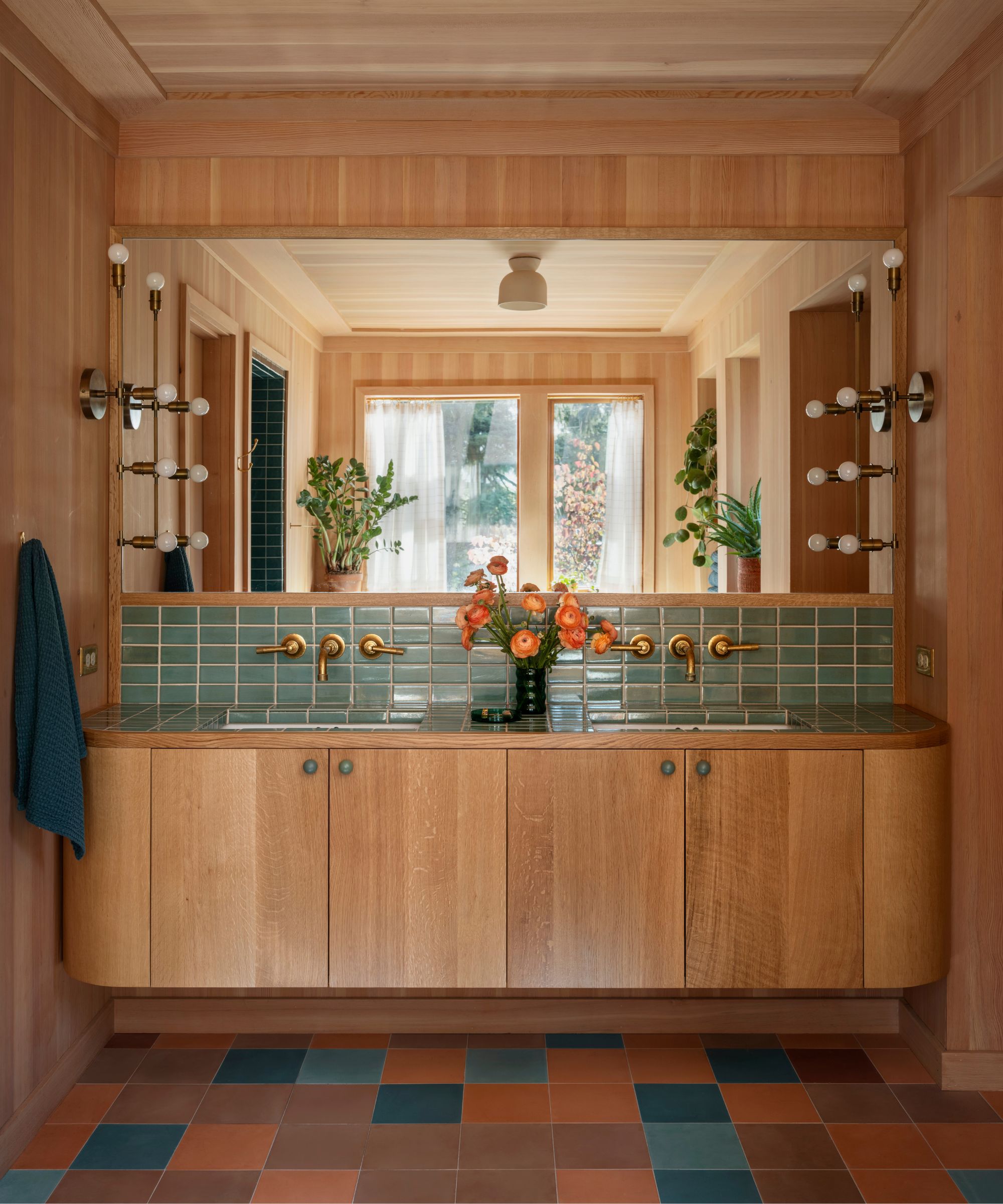
'When we’re working on a design project, we’ll make up a set of ‘rules’ for the project that give it architectural coherence,' says Jessica. 'In this case, one of the rules was that painted cabinets got round oak knobs, and natural oak cabinets got painted ones. That happens everywhere in the house. Repetition like that, of materials, colors, and design decisions.'
'It lets you be playful in other ways without things feeling incoherent,' she advises. You will also notice another recurring design element in this home is the circle shape or motif. They show up on the ceilings, hardware, backsplashes, and in the fluid forms and recirculation of the home's layout.
'Those ‘rules’ once they’re set up for a project, really help with decision making. Yes, there are lots of cute shapes out there, but on this project, we stuck to this one.'
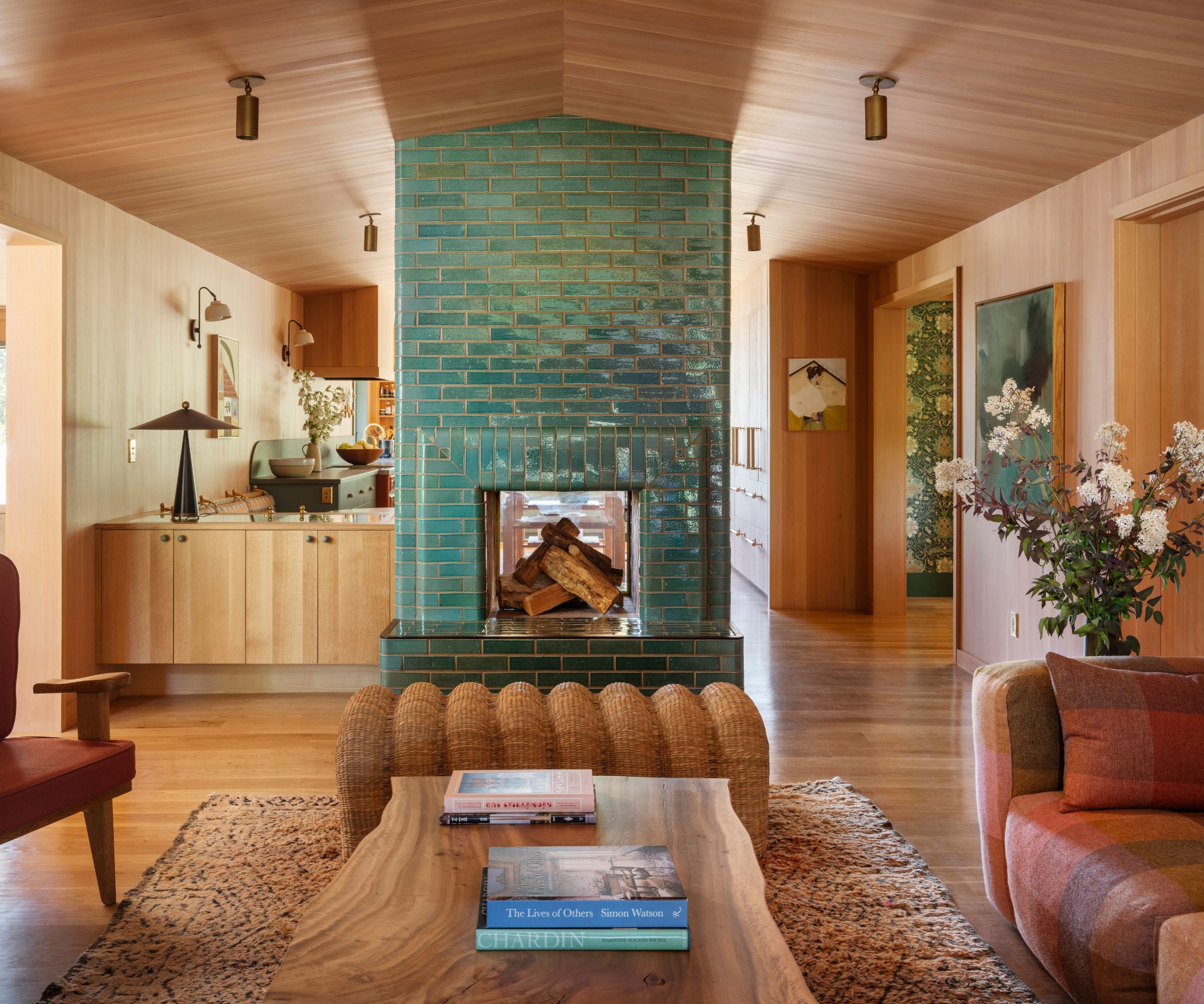
Alongside that standout color palette, is the use of wood.
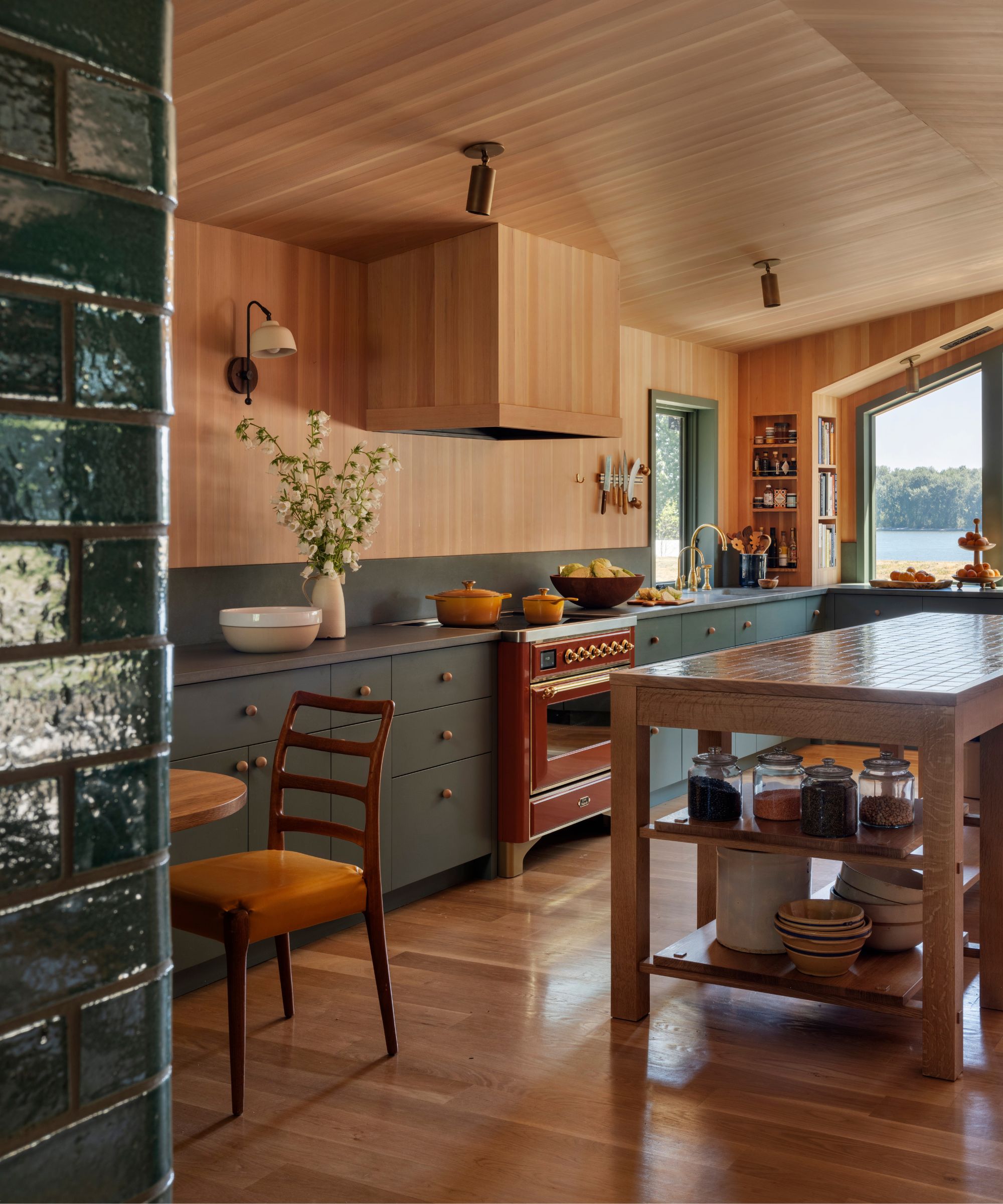
Oregon white oak floors are used in the bedrooms and upstairs living areas, while the ceilings throughout have been clad in Douglas fir and it is used as various paneling ideas for walls. This abundant use of various natural wood tones, found in every room, envelopes the home in a cozy yet luxurious feel and harkens back to the 1970s feel of the original home. A nod to its prior life.
'The colors used throughout the project is a balance of predominantly warm tones with tempered cool ones,' notes Rebecca. 'The walls are nearly all clad in warm golden Douglas fir. The wood floors are sunny, warm, white oak, and the tile ones have a large percentage of warm, terracotta tiles. To balance these warm tones we introduced a family of blues and turquoises; in the wall tiles, the furnishings, the wallpapers, and even sprinkled into the floor tiles.'
'As the house was originally from the ’70s, and although we really gutted it pretty much entirely, we let that era of American architecture guide a lot of our decisions, and it somehow just feels right that way. It’s happy and settled again.'
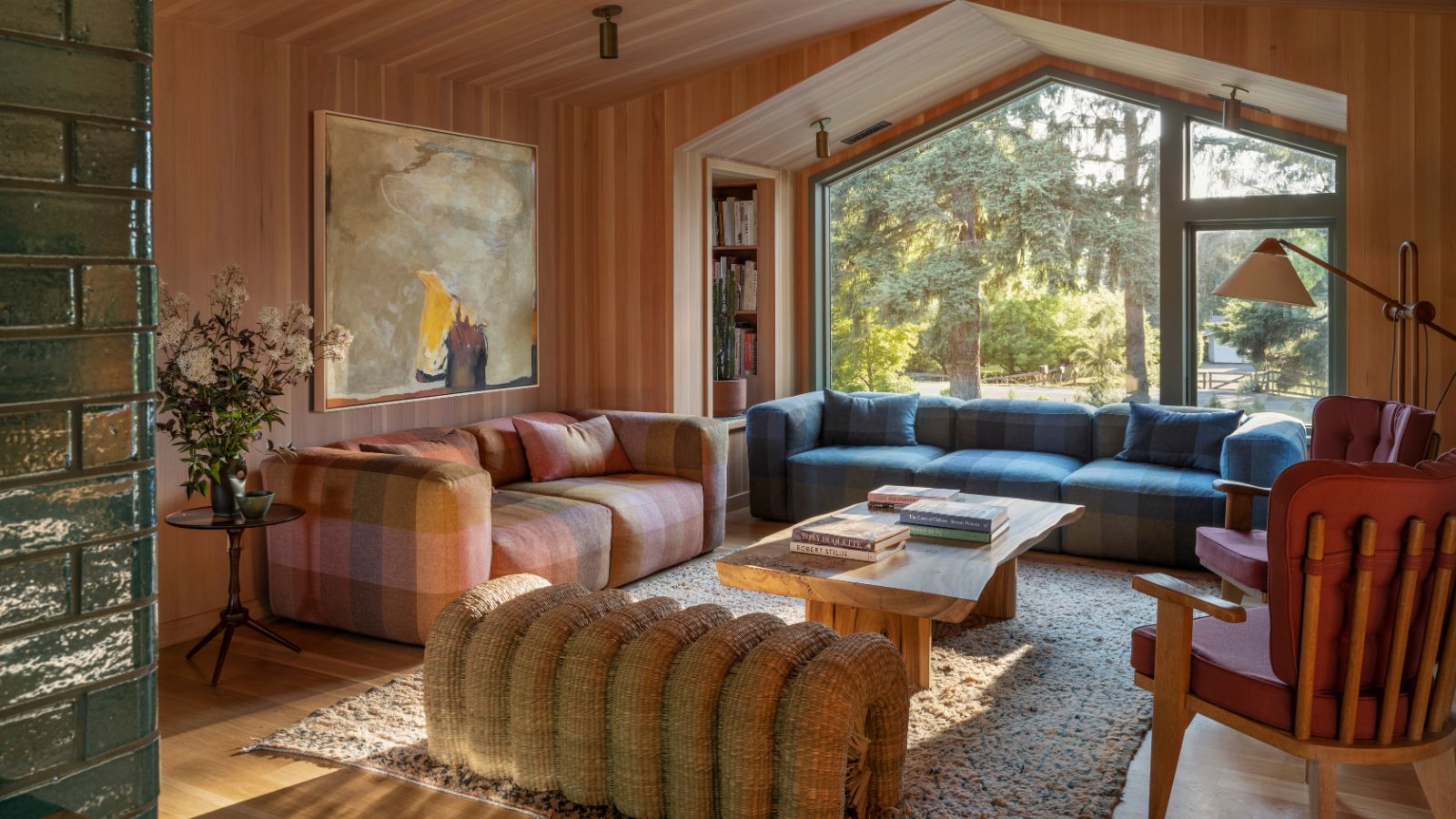
The commitment to paneling is also seen in the kitchen and living room, which are connected by a tiled two-way fireplace. The fireplace is covered in glossy glazed handmade tiles and acts as a divider between these two very open spaces.
The bijou green kitchen pays homage to the home's retro color palette and gives the sense that you're standing in a rather luxurious treehouse. A sentiment heightened by the fact that this kitchen sits on the upper floor with a sweeping view out to the river. The countertops are custom concrete, the oven a touch of unexpected red, and the hardware is Jessica's recurring wooden round knobs.
On the other side of the fireplace, is a cozy living room with plaid seating and a undulating rattan ottoman. The result is welcoming and extraordinarily cool.
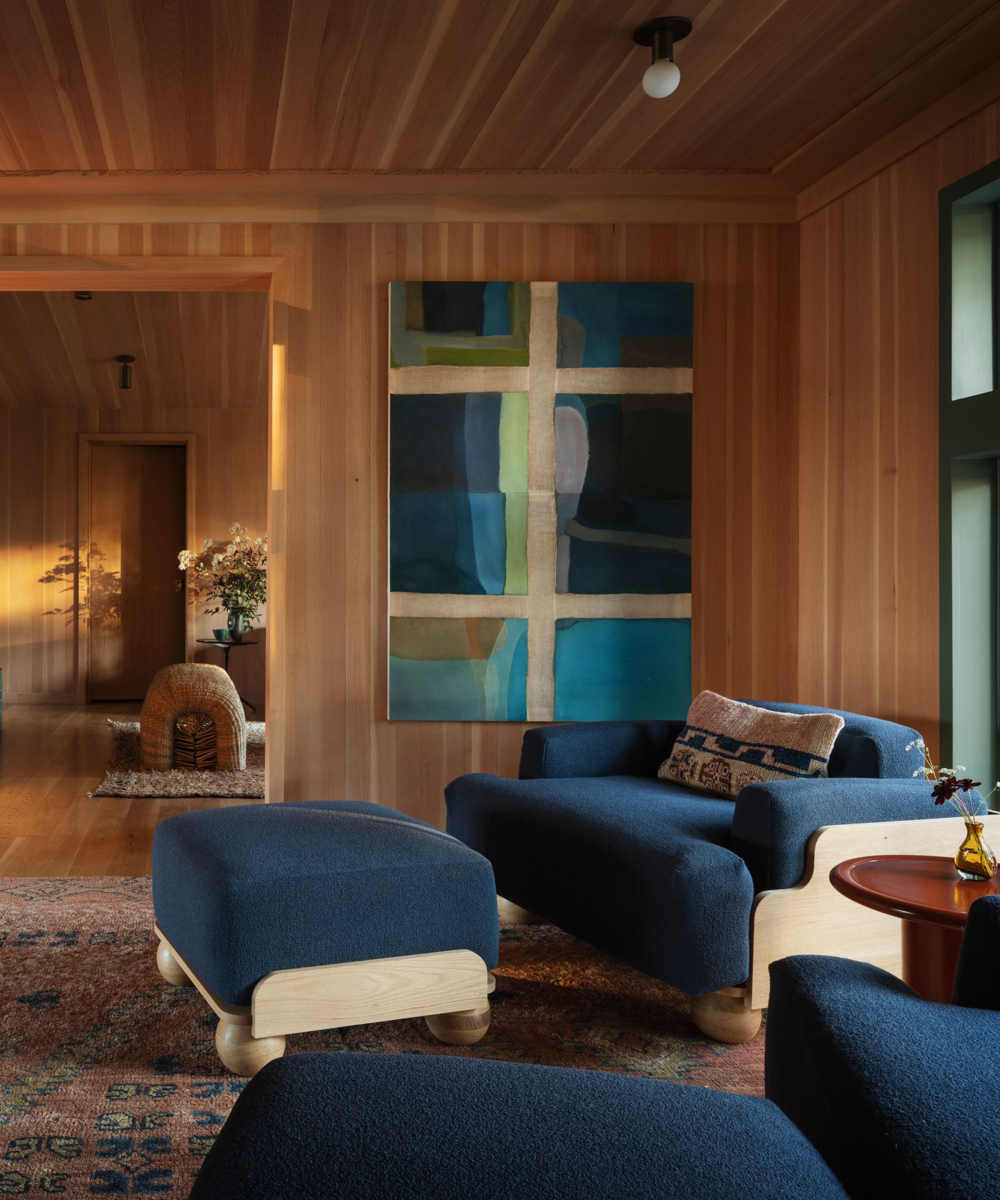
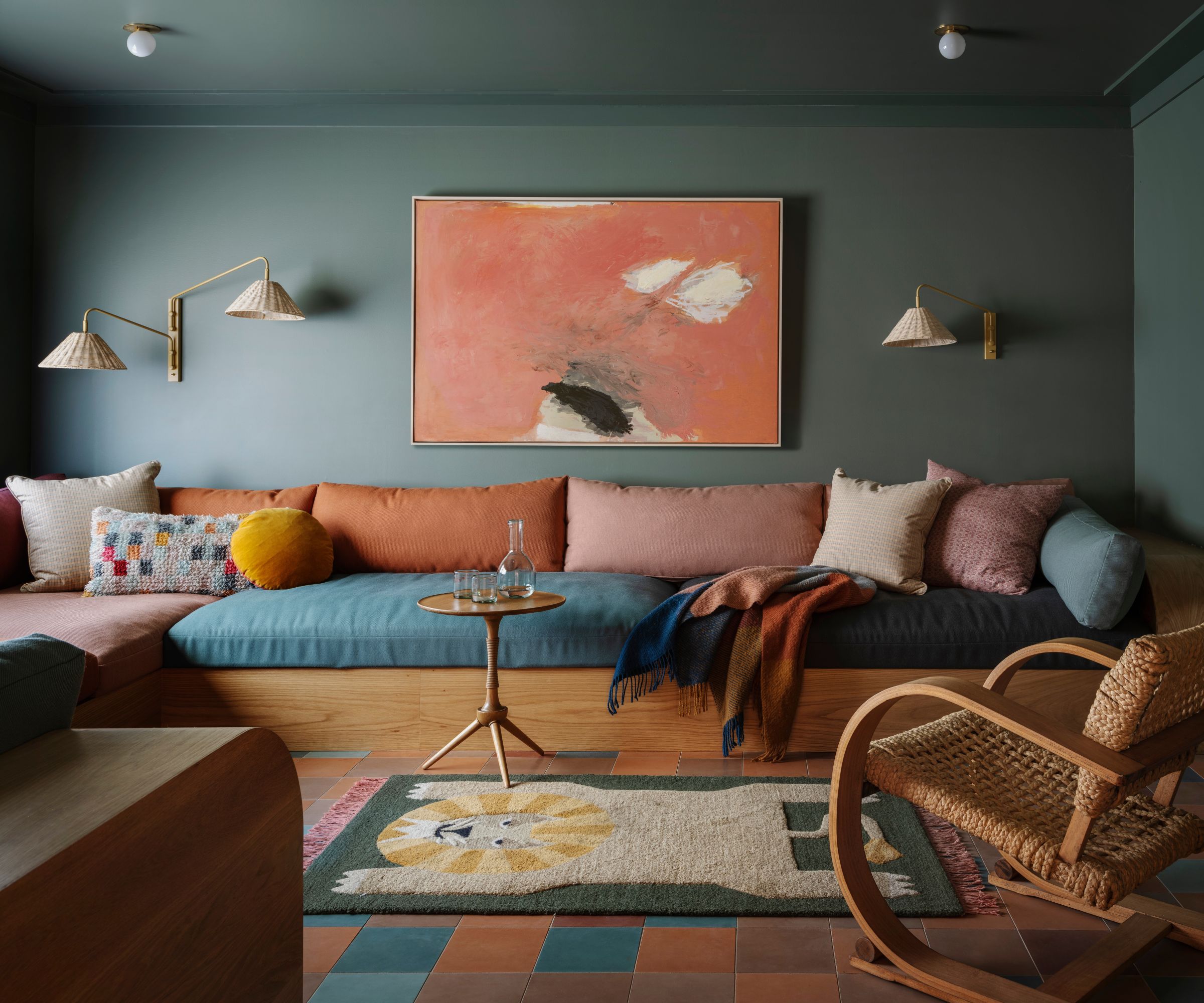
The landing just off the custom staircase is dubbed the ‘Manhattan Room’ by its owner for its sweeping views and was designed for quiet relaxation. Its serene blue tones mirror the river, and the circle motif appears in the lighting and the rounded edges along the Fred Rigby furniture.
The final and most nostalgic detail in this home is the decorative lighting. Many years ago, the JHID team did a light refresh of a restaurant and replaced all the lighting with custom pieces from California ceramicist Heather Levine. That restaurant subsequently closed down, and Jessica rescued the beautiful, earthy lighting and repurposed them for nearly every room in the house. Giving them a second life by the same design team in a new home. Proving that the best homes always have a story to tell.
Shop The Look
The real triumph in this family home is the welcoming, warm color palette, and the homage to the history of the property. A real lesson in taking an outdated design style and bringing it into the modern day while still being true to the bones of the home. I want to move in.