Living rooms should, above all, be rejuvenating spaces. As a result, there are certain colors to avoid – especially if we are looking for a timeless space that is easy to maintain.
While we are more likely to play it safe with the color of our larger furniture pieces, our pillow arrangements often lean a little bolder, but going too bold could be disrupting your living room's peace, designers warn.
Here, interior designers share the four throw pillow colors they feel we shouldn't choose if we want to create a relaxing living area.
The pillow colors to avoid in a living room
Steering clear of these colors will make mixing and matching pillows on a sofa simple and help even the least experienced of us ace our living room color schemes.
All in all, there are three things you need to take into account when it comes to picking out couch pillow colors, begins Artem Kropovinsky, interior designer and founder of New York-based studio, Arsight. ‘Firstly, it is important to opt for timeless colors that won't become outdated,’ he says.
‘Secondly, choose colors that are low maintenance and won't visibly show dirt or stains, and finally, select colors that harmonize with your existing décor or will be easy to match decor with in the future. Some colors do not lend themselves too easily to relaxing schemes leaving them to clash with the rest of the space.’
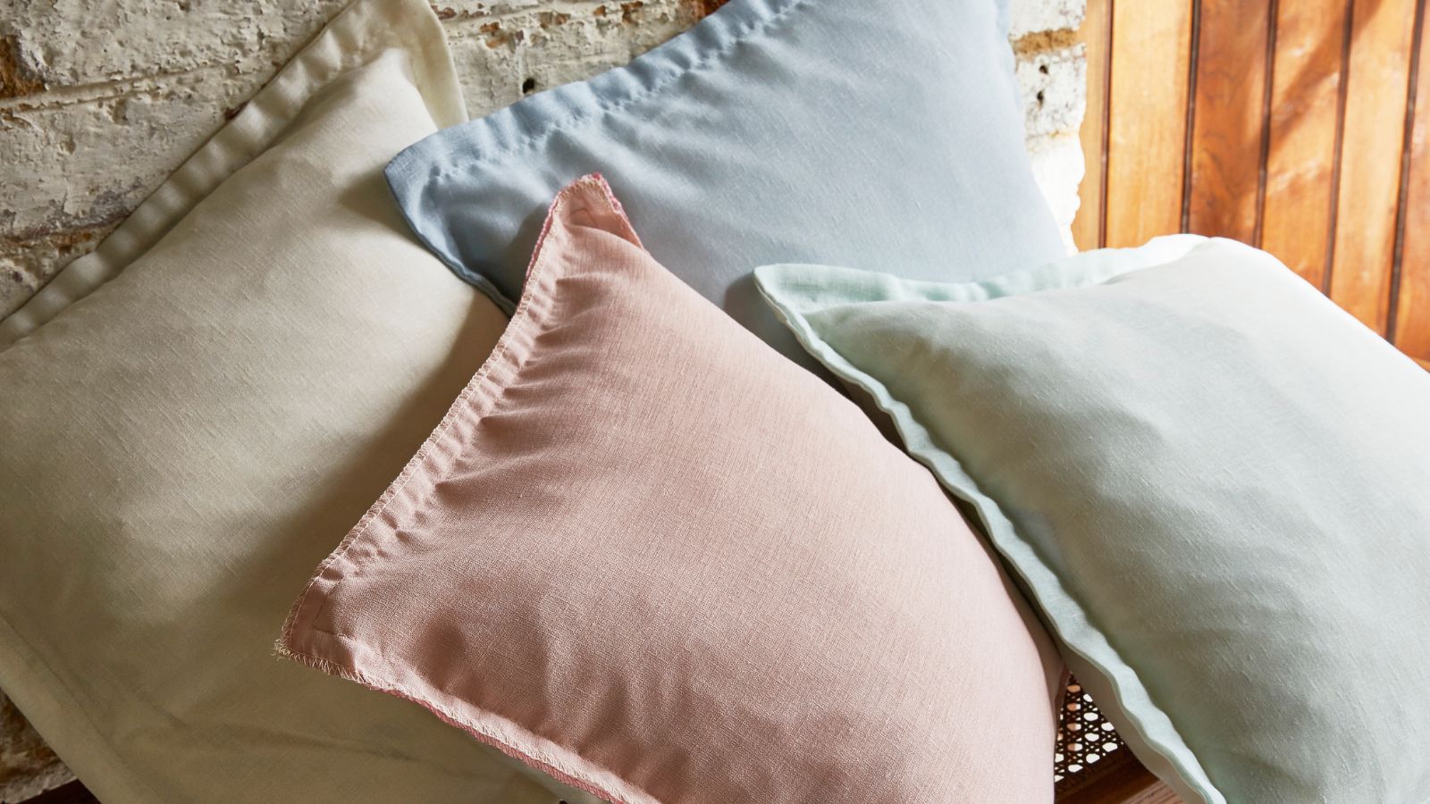
1. White
Many of us choose to decorate with white for a clean and classic look, but it is a common couch color to avoid for a reason – marking and graying easily with everyday use. And while it's easier to clean throw pillows than it is to clean a couch, for the same reason, it is best to avoid stark whites when picking out your couch pillows too.
‘Even with regular cleaning, white pillows are prone to staining and discoloration, which can make them look worn and dingy,’ advises Isfira Jensen, principal designer at Nufacet Interiors, New York. ‘If you do opt for white pillows, be sure to choose a fabric that is easy to clean and maintain – this might mean skipping out on natural fibers,’ she adds.
Instead of picking the lightest white you can find, compromise and consider another timelessly natural shade such as an off-white, beige, or even gray, suggests Artem Kropovinsky. These light neutrals give a similar effect without the stress of keeping them pristine all the time.
Warm and inviting earth tones like brown, green, and tan can contribute to a cozy and comfortable atmosphere too, and carry a similar aesthetic weight to neutral whites.
2. Bright, saturated blues
Frequently listed as one of the most relaxing colors on the color wheel, adding blue into your living room through pillows may seem like a logical step, but picking them up in the wrong saturation can throw the whole space off, argues interior designer Isfira Jensen.
‘Any bright or neon-esque shade can make a statement, but it is often the wrong one,' Isfira says. ‘The can quickly become overwhelming in a living room and can be difficult to pair with other decor elements, going as far as to make the space feel too busy or chaotic.’
If you do want to add color to the space or explore blue living room ideas, then consider toning down the saturation of your pillows by swapping cobalt blue for darker tones such as deep navy, or lightening up the space with pastel shades.
‘Pastel pops will introduce character without overwhelming the space,’ says designer Artem Kropovinsky. ‘This works for a whole range of colors, from blues to pinks to soft green to create a calming and relaxing ambiance.’
3. Bold reds
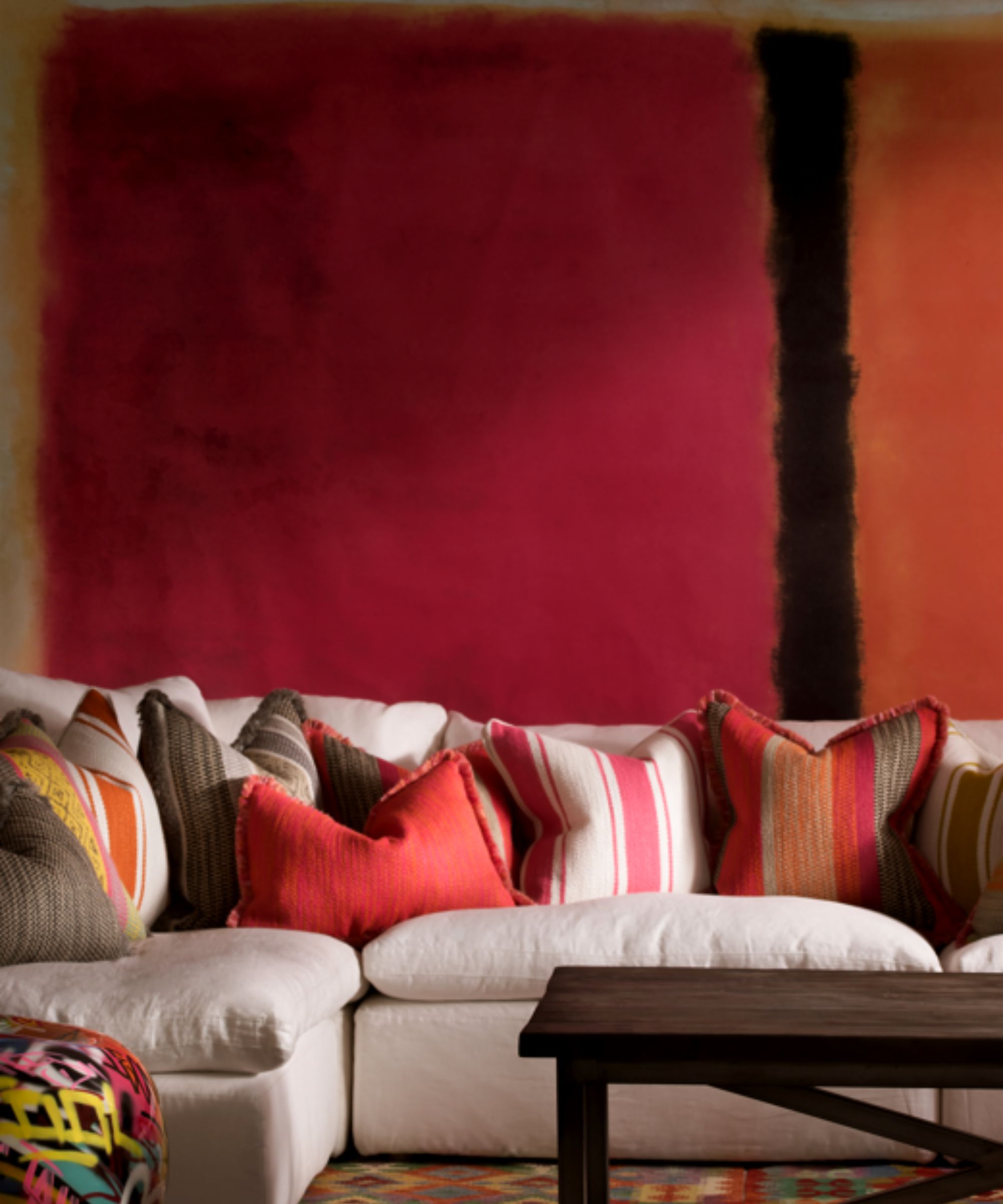
Energizing colors such as reds, yellows, and oranges, can be great picks if you want to make a room feel happy and immediately draw attention. However, too much of a good thing can have the opposite effect, overwhelming the living room and even inducing feelings of anxiety, warns Julio Arco, interior designer and architect at Bark and Chase.
These agitating, energizing shades are also top of the list of pillow colors to avoid for your bedroom to promote relaxation and sleep.
‘Instead, consider using calming colors like blues and greens, which have been shown to be the most preferred interior colors. These colors can help promote a sense of tranquility and well-being while remaining classic and enduring,’ Julio adds.
4. Pillows with multiple colors in jarring patterns
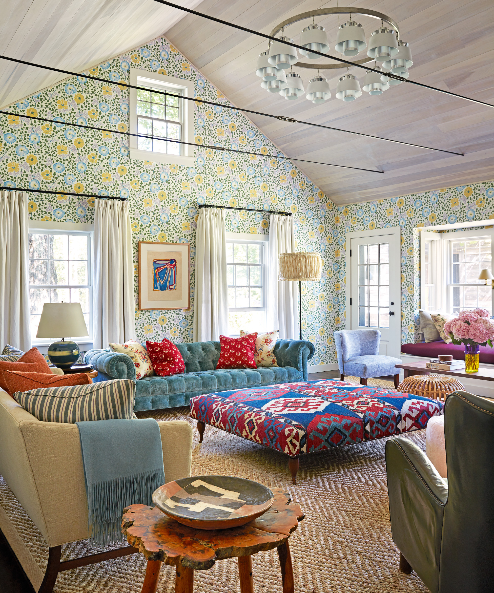
Decorating with pattern is not to be shied away from, but an overabundance of different patterns with different colors can be ‘visually chaotic’ in living rooms, says interior designer Artem Kropovinsky.
‘If you decide to include patterns, use them judiciously and pick patterns that have a few select colors that you carry through the other cushions and the living room decor to keep them grounded,’ he suggests.
FAQs
What color pillow shows the least stains?
Darker-toned pillows such as browns, blacks, and dark grays will be the best at concealing stains and marks from everyday use and accidental spills. These pillow colors are therefore best for busy households with lots of guests, hosting, children, or pets around. These darker shades are also often easier to wash and maintain in the long term too, keeping them looking better for longer.
Should I use warm or cool-toned decor in the living room?
When planning your living room decor and soft furnishings, it is a good idea to lean into warmer-toned colors to help the space feel cozy and welcoming. Cooler tones, despite being able to make a small space look larger, may feel slightly clinical and less relaxing. Warm tones such as earthy neutrals will invite people in and have a more timeless appeal.
Steer clear of these living room color mistakes, from bright blues and reds to family-unfriendly whites as they could render your space uninviting, impractical, or jarring. Opting for muted, warm shades instead will help to keep the room interesting while maintaining a truly timeless appeal.