OK, I get the idea. As it shifts its focus to electric vehicles, the German carmaker Opel realised it had a happy coincidence on its hands. Its logo happens to be a lightning bolt, and lightning is electricity, right? Maybe we can do something with that?
But did it need to do anything? The logo existed, whether it was one of the best car logos or not, and it already looked like lightning. By labouring the point, Opel's gone and designed a new logo that actually looks slightly less like a lightning bolt (or Blitz, as it insists on calling the design).
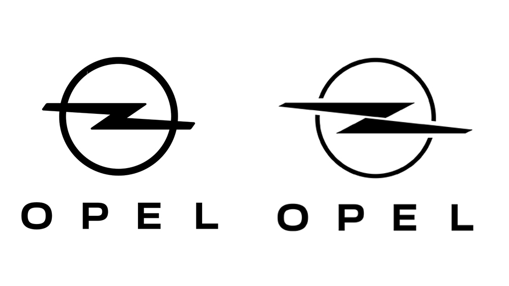
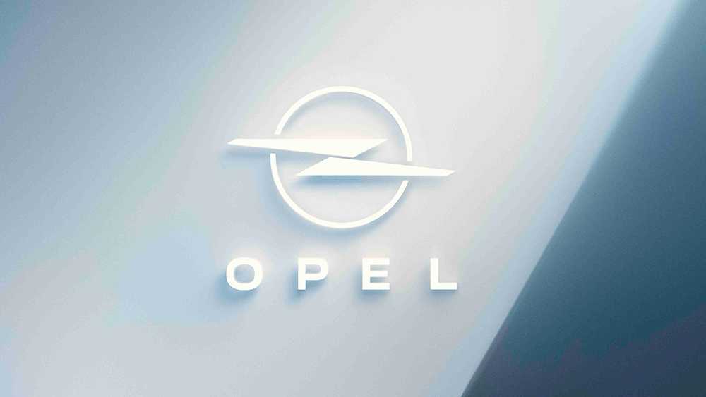
Like the subtle change to the Infiniti logo also revealed recently, the new Opel logo (the brand's second in three years) is billed as an 'evolution' rather than a redesign. The brand wanted to point out that its logo looks like a lightning bolt, which fits nicely with its goal to make its European vehicles fully electric by 2028.
In the video below, Opel says that this means the logo is now more than a logo. It represents what the company is. Erm.. yep, that sounds pretty much like what a logo is supposed to do.
Of its new electric focus, Opel says: "We manifest it with a new and even more energetic Blitz. Like never before it stands for who we are and where we go" (yes, the carmaker also calls its logo 'Blitz', apparently unaware of the negative connotations the word may carry in some countries).
Twitter's having some fun with the design. "I can see Blackadder, the brand consultant, pacing the board room of Opel," one person tweeted. "So you have logo based on lightning and with the upcoming electric vehicle launches you want it a bit more electrified... I have exactly the solution for you." "Just rotating the Opel logo would be good enough for an EV-focused brand," Jaan Juurikas of EV Universe suggested.
Just rotating the Opel logo would be good enough for an EV-focused brand.Inspired by @petteri_bergius pic.twitter.com/U7a0QbHdqPJune 26, 2023
While some think the new logo looks like a 'Z' or, more poetically, like two French fries drifting across the horizon as the sun sets, some have welcomed the fact that it looks less like a rather notorious logo design the brand probably doesn't want to be associated with.
However, others have tried to subtly point out issues with the logo's name, engaging the Opel Twitter account on the matter. Sure, 'blitz' means lightning in Germany, and Opel still uses Vauxhall branding in the UK, but still... "I hope the permanent name for the logo isn't 'Blitz' - I would just avoid that," someone recommended. "What's your suggestion for a new name?," Opel asked, to which the user responded, just call it "the Opel logo". Kudos for Opel for engaging, but this probably won't make our list of the best car logo rebrands.
Opel says the new logo will be appearing on cars from next year.