John Wick poster design has been consistently outstanding for over a decade now, and each movie poster has helped carve out a visual personality that's as effective as Keanu Reeves' retired hitman. Stylised, violent and drawing on iconography from art deco and classic poster design, they've become an essential part of the franchise's identity.
We caught up with the team at Fluid, Lionsgate's go-to agency for all its John Wick posters, to learn more about how they built a visual language that speaks to dedicated fans and casual viewers alike and mirrors the films’ signature flair. Here they reflect on a decade of creating artwork that blends action, symbolism and artistic heritage and has resulted in some of the best movie posters of recent years.
Designing the world of John Wick

Creative director Stacey Bates-McCue, illustrator Justin Sola and designer Faye Woodward have worked on John Wick poster art at Fluid from the first film right up to the recent John Wick Live Experience in Las Vegas and the upcoming spin-off movie, John Wick: Ballerina,
Having collaborated with Lionsgate since the very first chapter, Stacey and the team has grown intimately familiar with the series’ deep lore. This understanding fuels the team's designs, allowing them to embed Easter eggs and layered storytelling for fans to discover, while keeping the artwork appealing on a surface level to newcomers.
“The process for any creative starts with throwing ourselves into the world of the IP,” says Stacey. “John Wick was an easy one with us being fans of the films.”
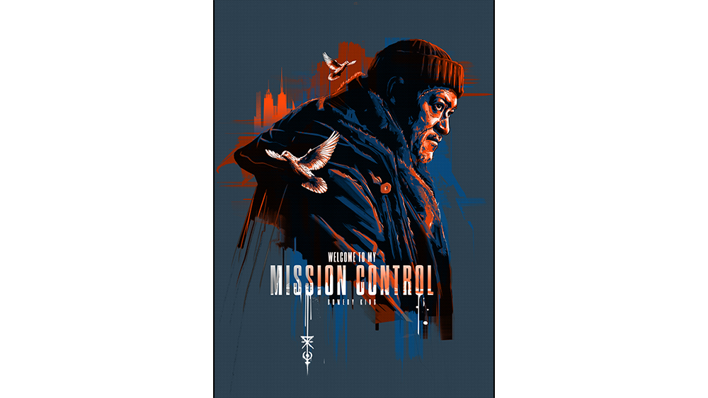
From a hidden bullet in negative space to reflections in shattered glass, their posters are rich in detail and metaphor. “It would fail if it wasn't,” Stacey notes. “A simple silhouette of a nunchuck, or even John Wick himself instantly tells you what you are looking at.”
When it comes to visual identity, the team at Fluid adheres to a number of essential ingredients and core artistic values that ensure each poster feels connected to the previous designs.
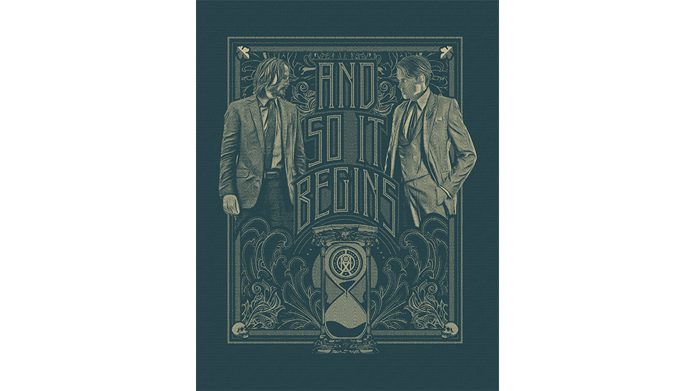
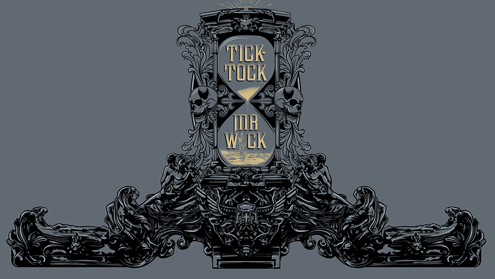
“Contrast, action, elegance, dynamic posing,” Stacey lists. “And of course that circular element that represents so many key elements of the franchise, coin, oath marker, time.”
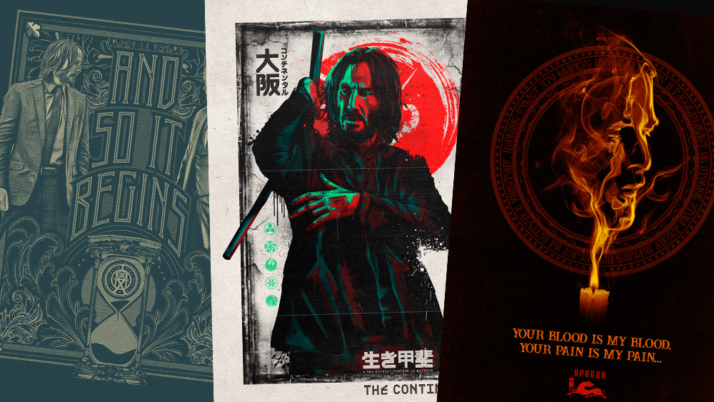
Iconography like the Continental logo (the film's famous 'hotel for assassins'), shattered glass and elegant weapons are incorporated into a design to stir recognition and emotional response in fans.
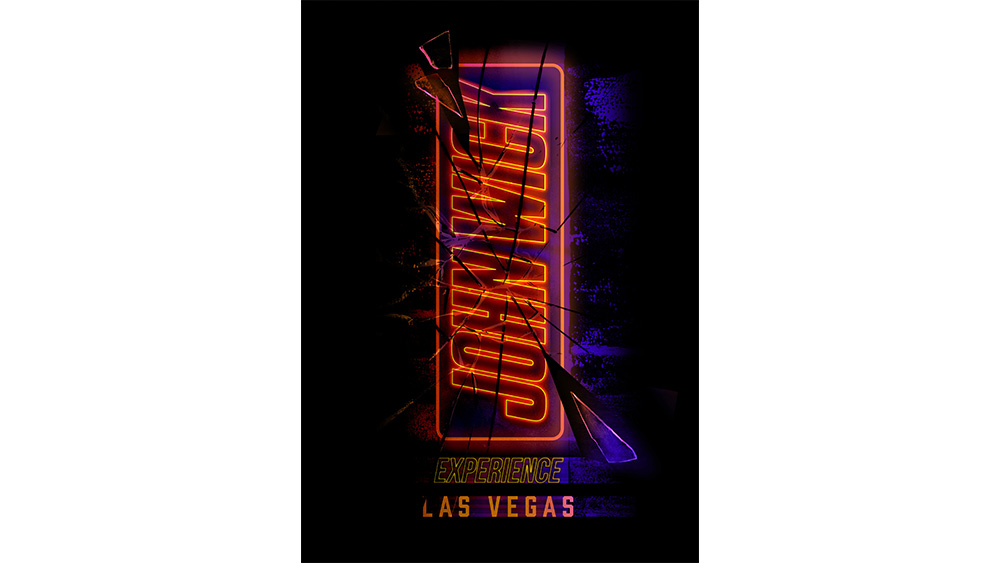
Stacey says these core elements are dialled up or down depending on the specific piece, be it theatrical posters or promotional materials, like those created for the new John Wick Experience in Las Vegas (some of my personal favourites, with art deco inspiration mixing with neo-noir).
That project was particularly rewarding, reveals Stacey. “We added clever montages, vault, roulette wheel, clock, to represent ‘running out of time’ in one circle comp,” she explains. “It leads your eyes up to the art deco-inspired building with a clever silhouette of John walking in, as if it can be you.”
Balancing personal style and the franchise's vision
The artists behind the posters have managed to infuse their own style while keeping in line with the established world of John Wick, as dictated my the films' art direction and world building.
“For me, it’s about finding harmony between creative expression and storytelling needs,” says Justin. “Luckily with the JW franchise, the visual language and creative direction suits my artistic style.”
Faye echoes that sentiment and notes the creative stretch the project has offered: “What I loved about John Wick was the challenge of doing something less comfortable and pushing my own artistic boundaries […] it’s pushed me out of my comfort zone to produce some of my proudest work.”
Each film in the franchise brings new narrative threads, characters, and environments, which in turn inspire the design team.
“We are constantly immersed in the world of design, fashion, and consumer products,” Faye explains. “That helps to keep each project fresh.”
"The franchise has so many cool elements […] the characters, the environments, the storytelling details," Justin adds. "That, combined with some really well thought-out creative direction, makes our job easy.”
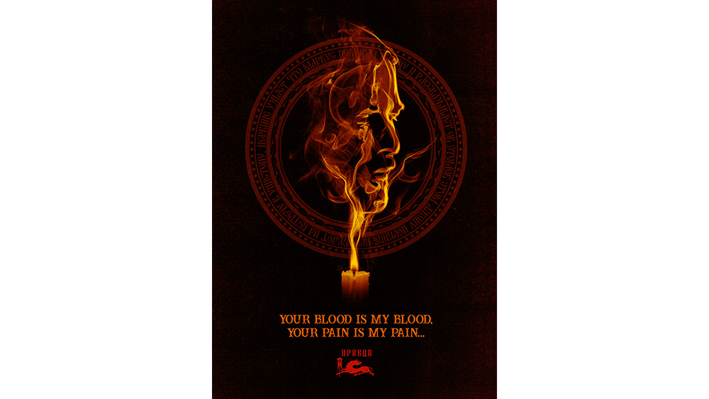
Still, evolution requires careful refinement. Stacey says they revisit past concepts with new perspectives to find original designs “We built out a portrait of John using gun smoke in Film 1 that never got approved. In Film 4, after watching the candle smoke in the Ruskaroma section, we revisited the concept and this time it made the cut. That was a pretty special moment for Justin who designed both pieces.”
Collaborating on a legacy
The trust between the design team and Lionsgate has been instrumental. Lionsgate VP of brand creative, Jerry Sabatini, calls Fluid his "Gold-Star agency".
“We work closely with them in the creative kickoff rounds and mood board stages," Stacey says. "It’s more of a family joint creative effort now. Lionsgate has so much trust in us, which we are super grateful for”.
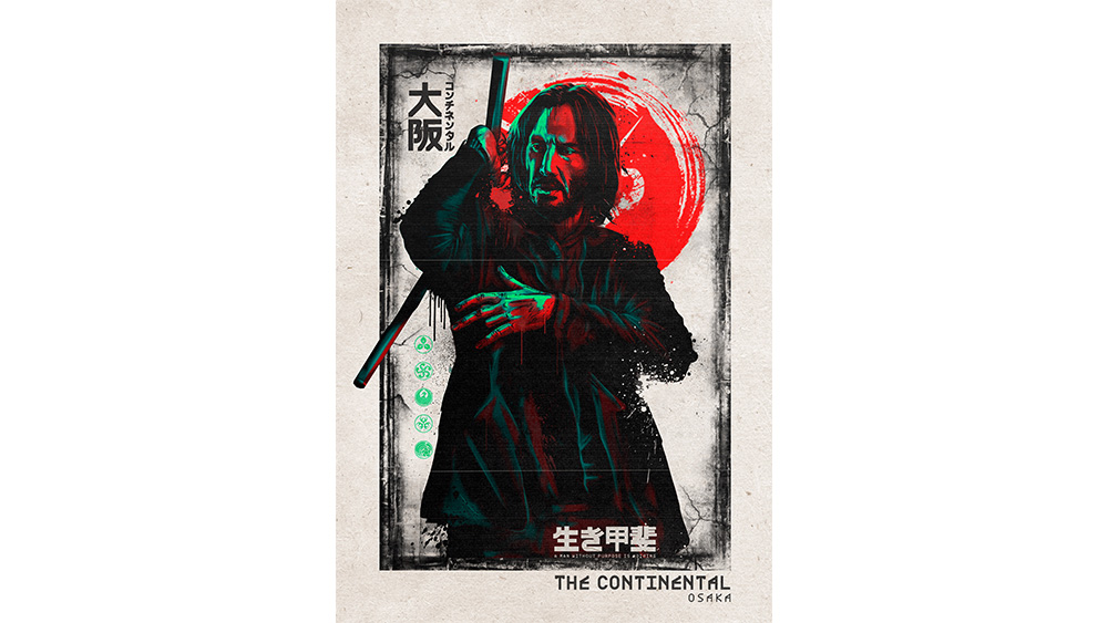
That trust has enabled the Fluid team to maintain continuity while also taking creative risks. From bold palettes, like the black, white and purples core to the brand, to region-specific explorations like deep reds for the Osaka Continental, the posters never feel stagnant or safe. “We are mindful that they have life and layers,” Stacey tells me.
After nearly a decade of collaboration, the designers clearly live and breathe the IP they work on. “Knowing that Lionsgate has returned to us for anything and everything Wick over the years has made us feel very proud as a team,” Stacey says. “The evolution of design has shown us so much.”
As the film franchise continues to expand onto sequels, spin-offs, TV series and live immersive events, so does its artistic universe, one poster at a time. The John Wick poster designs blend smoke, mirrors and bullets into a visual world that’s as unforgettable as the Baba Yaga himself, or as memorable as the John Wick death scene. He is dead, right?
For more Inspiration, see our pick of the best poster designs. Working on your own? See our guide to the best digital art software.