When choosing colors to paint the walls of a living room, it's often a careful balance between adding personality while keeping things livable and calm, and this year's living room color trends find that perfect balance.
We asked interior designers for their favorite living room color schemes for 2026, and while some shades feel bold and expressive, and others more understated. Each shade offers an earthy and grounding quality that makes them easy to layer upon, and crucially, versatile enough to stand the test of time.
And so, if you're planning a living room re-decoration this year, these 2026 color trends are among the most stylish, and we've also rounded up the complementary decor for you to shop for each scheme.
1. Muted Teals
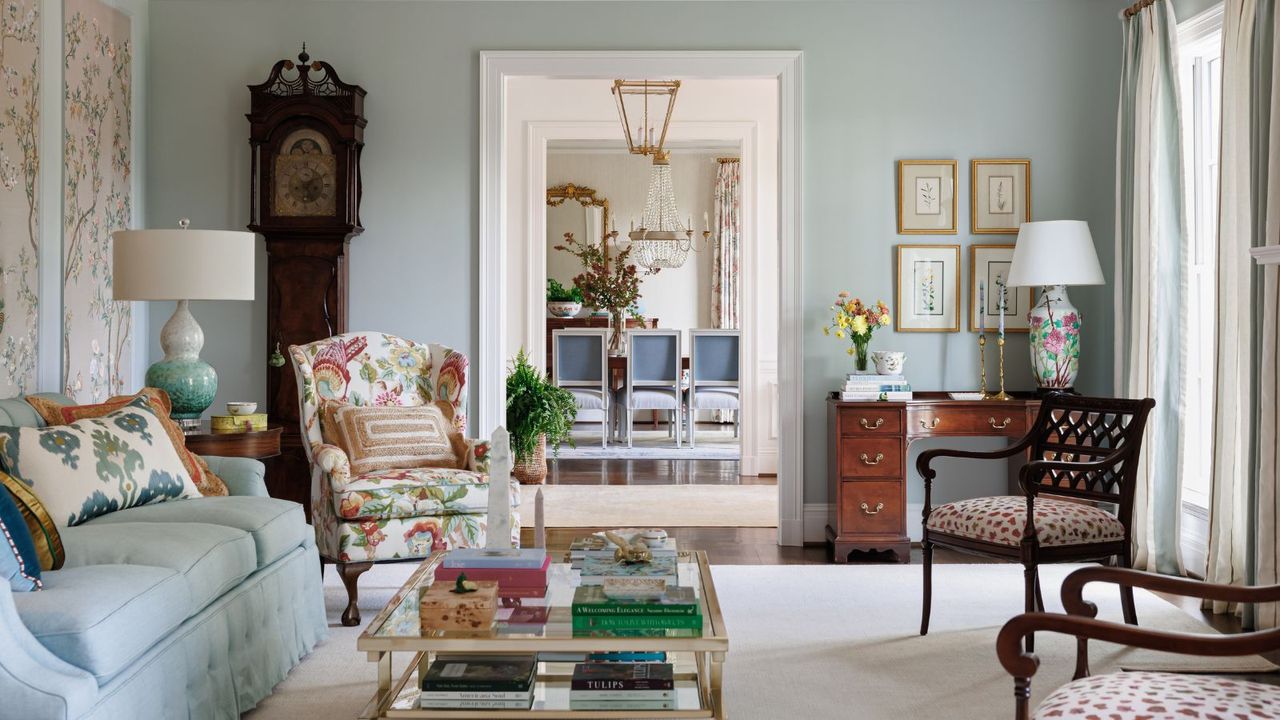
Teal has been getting a lot of attention at the start of 2026, and makes for a gorgeous, serene living room color. And it's more versatile than you might think too. Teal, which bridges the gap between blue and green, ranges from dark and moody to muted and tranquil, and offers color in a sophisticated way. For living rooms, teal paints with a dose of gray in them are versatile to layer with plenty of other colors, and muted enough to feel livable.
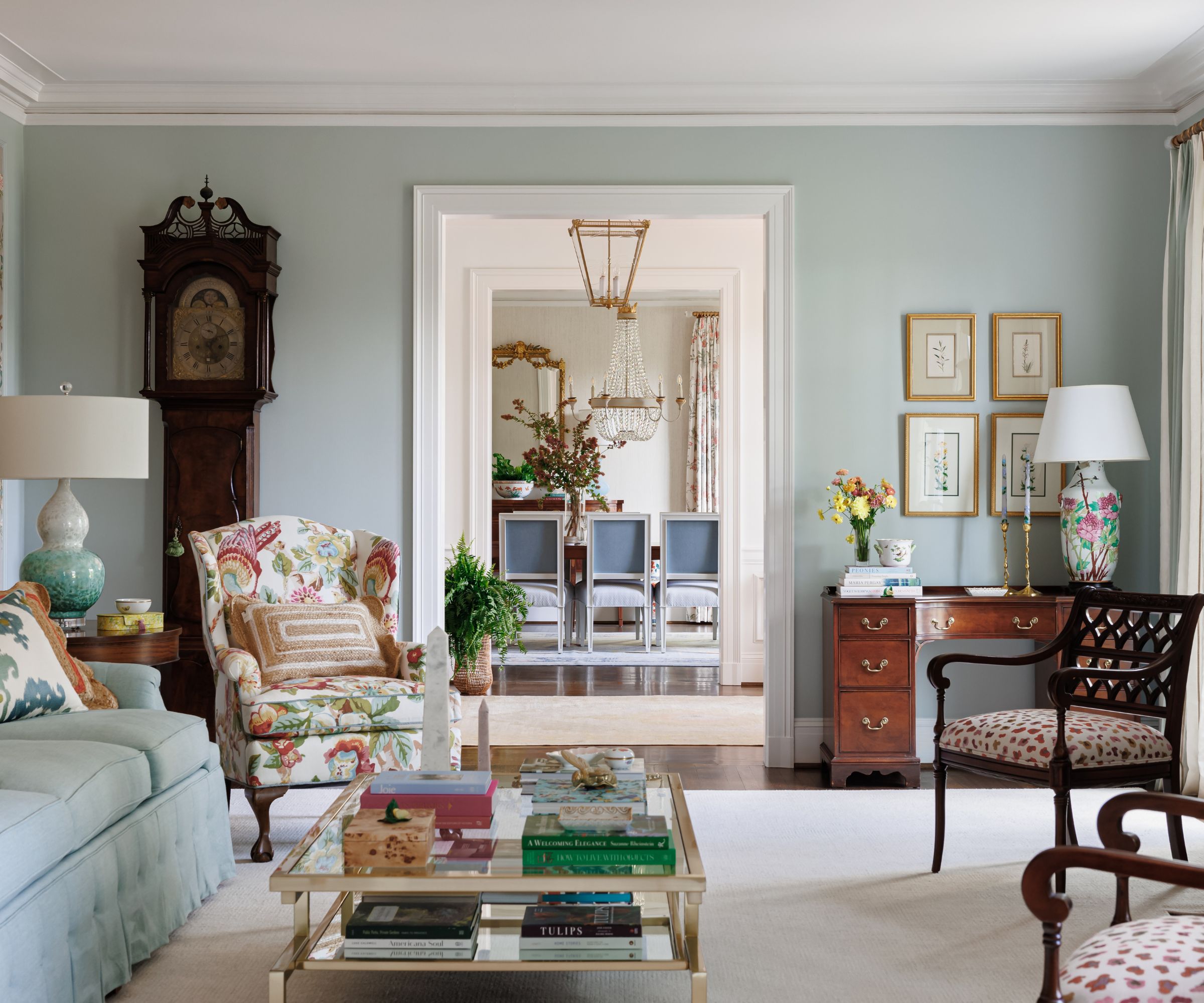
In this pattern-filled living room, the interior designer Michelle Gage opted for Benjamin Moore's Atmospheric on the walls. 'We love a blue-green hue for living rooms,' says Michelle. 'It’s an excellent backdrop to layer great pattern and color into the room.'
Another favorite teal paint for Michelle is Farrow & Ball's Dix Blue. She says that it is 'a great color on its own, but even better when you layer rich emeralds, warm caramels, and soothing pinks on top of it.'
As suggested by Michelle, warm caramel tones pair wonderfully with teal walls, and this pillow offers extra interest with its forest print.
Add rich emerald green to your teal living room with this marble tray – a great addition to coffee tables.
Or, bring dusty shades of pink to your teal living room with this vase with a playful wave design.
2. Dusky Pinks
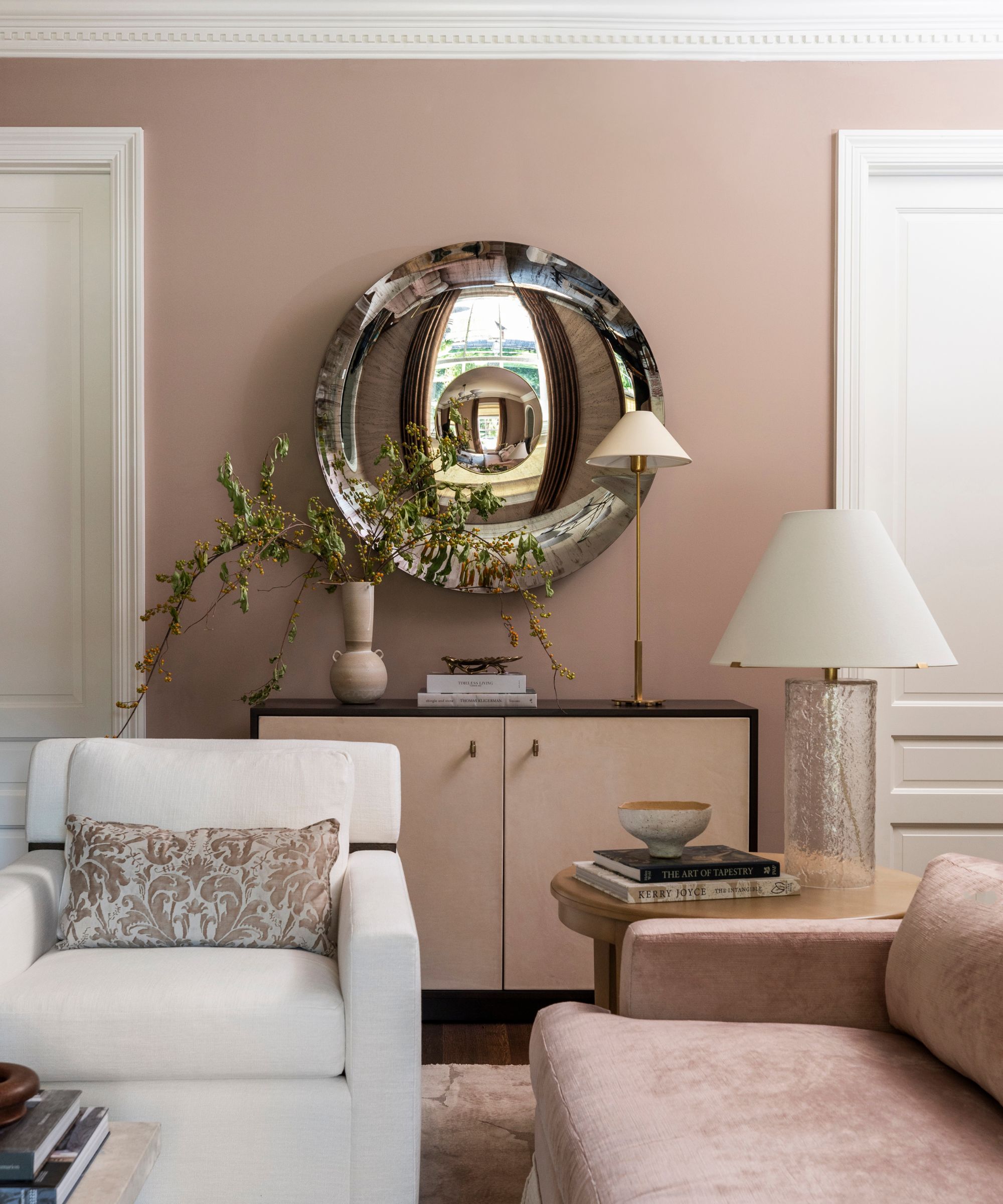
Warm color schemes in living rooms this year are favoring plaster pinks. Adding more color than traditional neutrals, but with a muddy, dusky quality, plaster tones feel sophisticated and easy to live with.
'For 2026, living room colors are moving toward warm, nuanced shades that feel both timeless and inviting,' says the interior designer Marie Flanigan. 'One color I love is Dead Salmon by Farrow and Ball, which feels unexpected yet still functions as a neutral. Its soft blend of pink, brown, and earth tones adds warmth without overwhelming a space.'
'This color pairs beautifully with natural materials like wood, linen, and stone, giving the room a relaxed, collected feeling,' Marie adds. 'It is an ideal choice for anyone wanting character and depth while keeping the living room highly livable.'
Layer natural materials in your plaster pink living room with this wood side table.
Bring more texture to your scheme with these tactile wool and linen pillow covers in a classic shade of ivory.
Stone is another stylish material to incorporate, and these coasters add subtle texture.
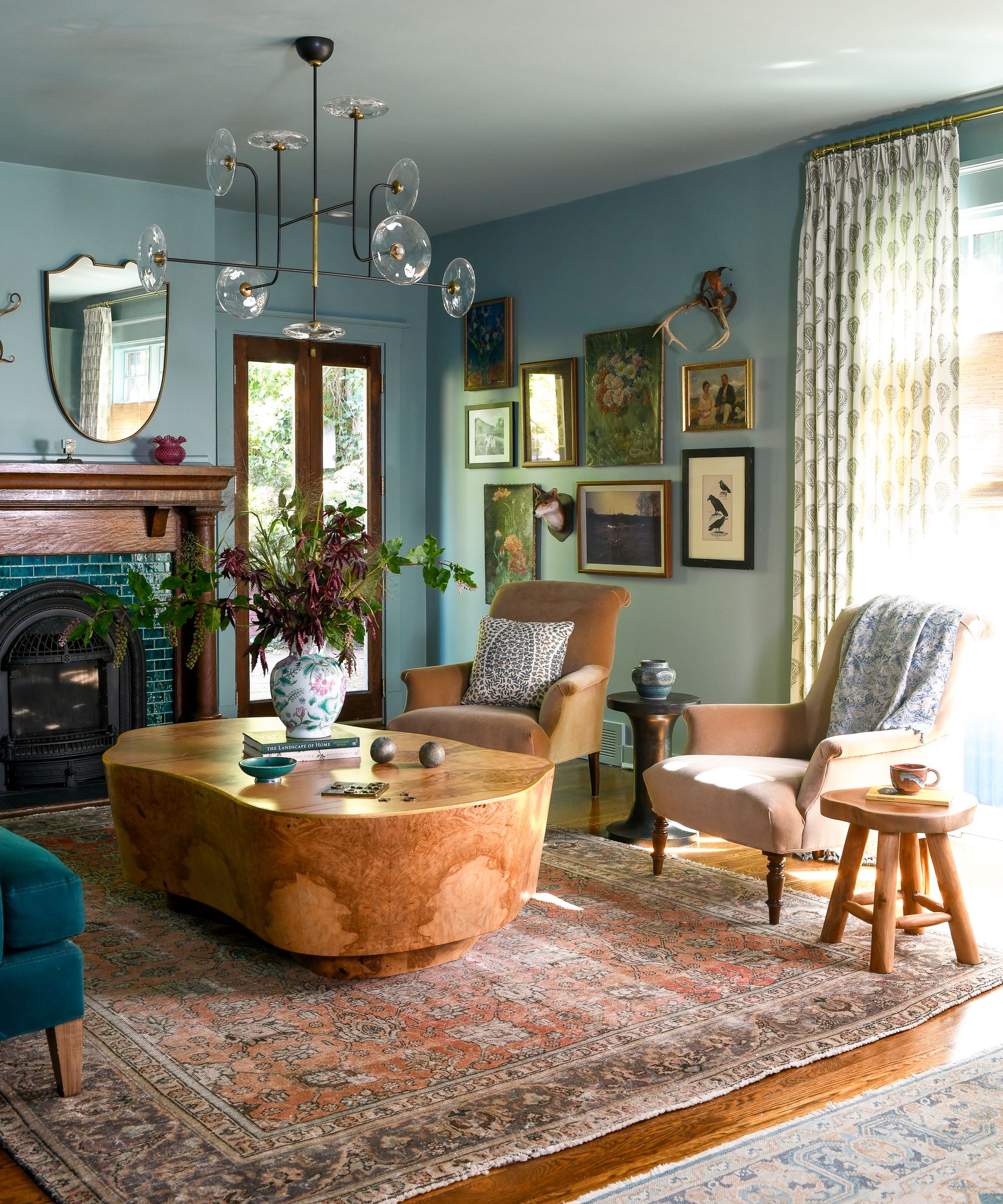
3. Muddy Greens
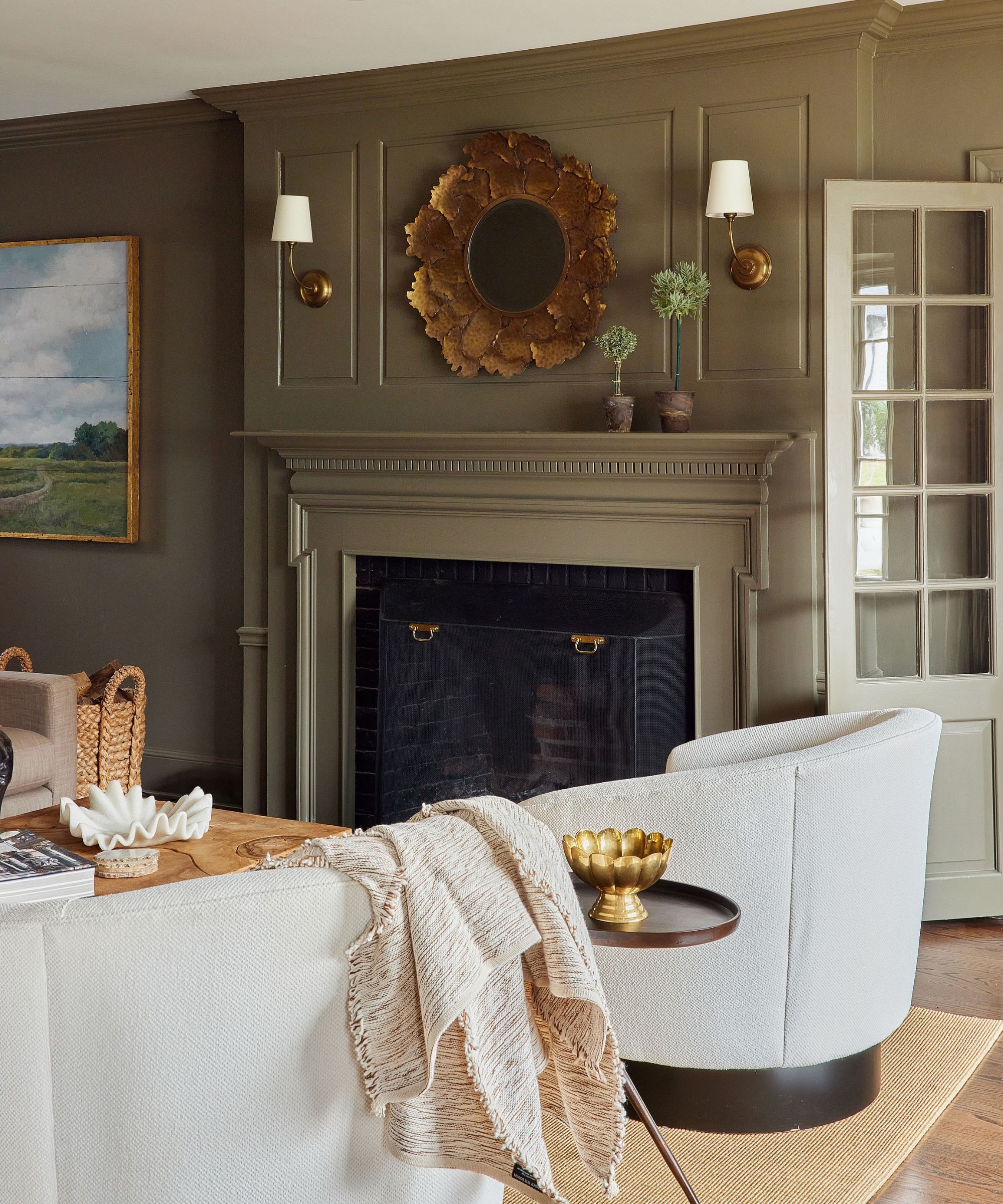
While forest greens can feel dated, designers are favoring muddy, earthy shades as a stylish way to embrace green living rooms this year. 'Hands down, my favorite living room color for 2026 is rich olive green,' says the designer Jessica Hobson. 'It’s not easy to find a grounding neutral that isn’t boring, but this is definitely it: interesting and soothing. It’s cozy in the winter and comes to life in the spring and fall. It also plays so well with so many colors.'
When it comes to the best muddy green paints to try out, Jessica recommends Benjamin Moore's Gloucester Sage, which she used in this living room, and Farrow & Ball's Bancha.
There are lots of ways to style these rich yet grounding shades of green, whether you want to add more color or keep things neutral. 'I especially love it with pops of plum, pink, or pale blue,' adds Jessica. 'It also serves as a great backdrop for artwork, allowing it to pop off the wall. Use brass accents to play into the warmth of this color.'
The warmth of muddy greens lends itself perfectly to warm brass, and these candle holders are a great way to add more coziness.
Continue the earthy look of your living room palette with this linen pillow in a stylish red-brown hue.
This linen throw adds a textural and slightly rustic look and feel to living rooms with green walls.
4. Light and Airy Blues
'We’re leaning heavily into soft blues for living rooms in 2026, especially shades that feel calm, airy, and rooted in nature,' say the designers Sydney Foley and Emma Legg of Kindred Interior Studios. 'These colors bring in personality without overwhelming a space and create an instant sense of ease.'
In this traditional living room, a custom paint shade was used on the walls, but it is similar to Benjamin Moore's Quiet Moments and Sherwin-Williams' Sea Salt, which both have a muted quality.
Paint colors like these are similar to neutrals in that they're versatile and easy to layer upon. 'They work with warm woods, antique pieces, brass finishes, and both bold and subtle patterns,' the designers add. 'They also shift beautifully throughout the day as the light changes, giving the room dimension and life.'
According to Sydney and Emma, a soft, muted blue makes a great alternative to white and beige. 'It adds depth and color while still feeling calm and cohesive with your existing palette.'
Crafted from solid pine, this side table adds a natural feel to living rooms and brings warmth to light blue walls.
These candlestick holders are a timeless choice for living rooms, and would look wonderful styled on a fireplace mantel.
5. Warm Whites

If you want to play it safe, neutrals are always in style and while we are seeing less bright white rooms in 2026, warmer whites are a timeless living room color trend for 2026 and beyond. Offering softness and more coziness than bright whites, the subtleness of warm white paints allows furniture, decor, and accent colors to shine.
'My go-to living room color for 2026 is Sherwin-Williams' Alabaster,' says the designer Kate Hartman. 'This soft, warm off-white adapts beautifully to different lighting conditions and creates a calm, inviting foundation without reading stark or cold. It works especially well in living rooms because it allows furnishings, art, and architectural details to stand out while still feeling cozy and layered.'
Andrea Goldman is also a fan of this classic color trend for living rooms this year. 'A tried and true in any given year is Benjamin Moore's Seapearl,' she says. 'Or our favorite “white” that is not actually white is Benjamin Moore's Silver Satin.'
Add depth and contrast to warm white walls with this patterned pillow cover in a warming shade of brown.
The olive tones of this checkered throw would pair effortlessly with white walls, bringing warmth and texture to the room.
Bring soft pink to your white living room with this glazed vase.
This year's living room color trends are all about softly nuanced hues that feel natural and comfortable to live with. While certain shades, such as teal, offer a colorful look and others offer more restraint, each hue is timeless thanks to its earthiness and soft warmth. Just remember, before settling on a paint shade to use on your living room walls, make sure to sample them so you can see how they look as the natural light changes throughout the day.
.jpg?w=600)