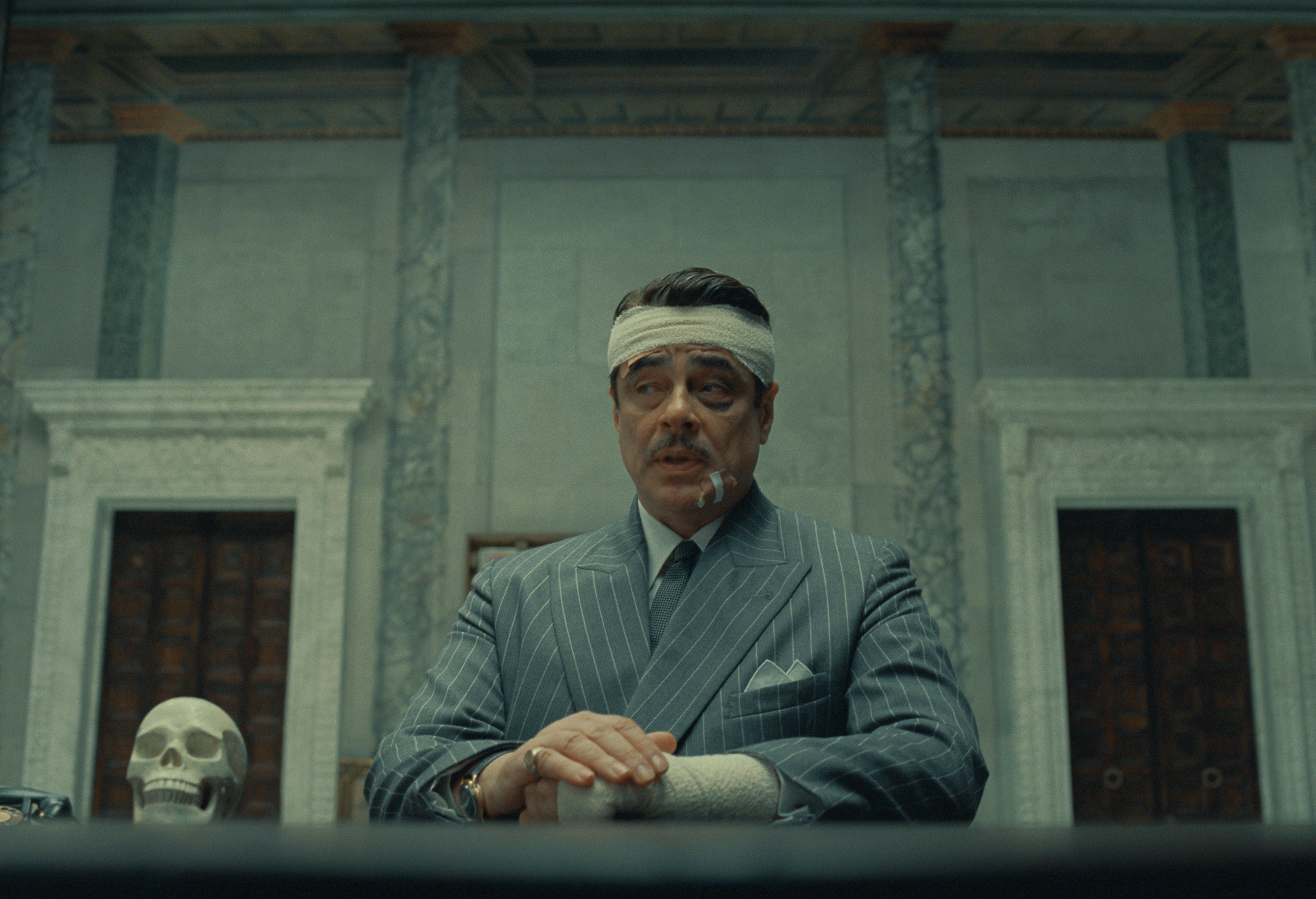
When we saw stills from Wes Anderson’s latest film, The Phoenician Scheme (2025) — a highbrow dark espionage comedy — we were reminded of two things: 1) every one of his frames reads like a high-gloss interiors editorial, and 2) there’s a reason the filmmaker has successfully dabbled outside cinema, too. (You might recall Bar Luce, the stylized, patterned-wall cafe and bar at Fondazione Prada, inspired by Italian mid-century cinema.)
It’s the quiet, the symmetry, the wide angles — yes — but above all, it’s the masterful use of color trends that makes Wes’ worlds (this one, Asteroid City (2023), The Grand Budapest Hotel (2014), and otherwise) so visually unforgettable.
“There’s a warmth, heavy saturation, and contrast to Wes Anderson films,” says Shona McElroy, principal designer at Smac Studio. “The language is exciting, brave, and fun, yet slightly dreamlike. This palette in interior design would highlight a real playful, pretty scheme — that’s both bold yet livable.”
It’s the cool with the warm — the slightly unsettling color psychology of a very chic clash of reds and blues. For Shona, the whimsical palette of The Phoenician Scheme (2025) specifically recalls interiors of Parisian hotels, such as the similarly fantasy-driven Le Grand Mazarin and Le Fantaisie, both designed by Swedish talent Martin Brudnizki.
In this surreal tale of a loathed businessman, his daughter, and a string of assassination attempts, color builds the world. At home, it can do something similar: set the tone for a space that’s a little glamorous, a little absurd, and obviously, highly cinematic.
Below, find styling tips from Shona and swatches to shop to bring the Andersonian thrill into a world of your own.
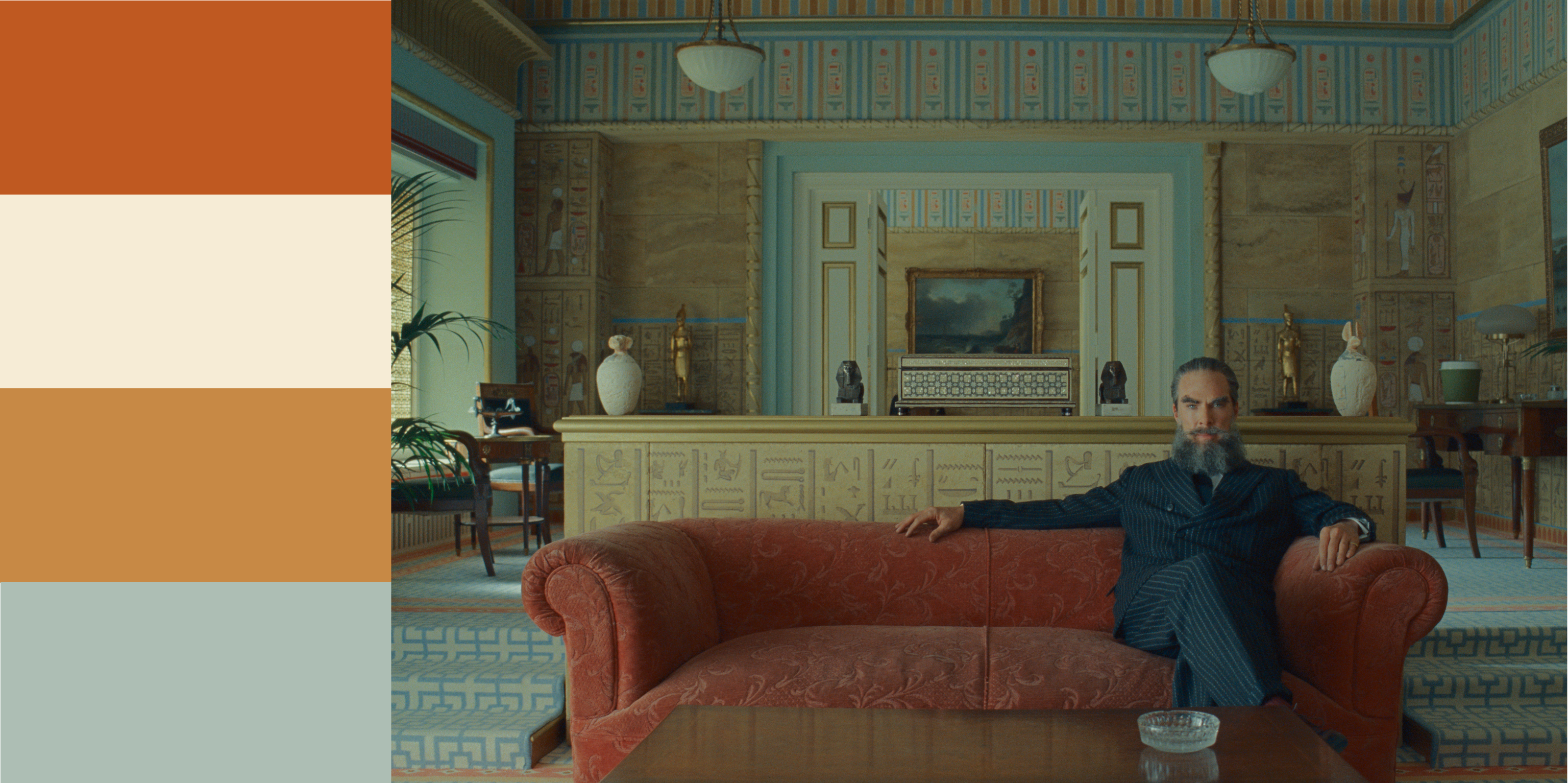
Warm Oranges
Wes Anderson has always had a thing for yellow. But in The Phoenician Scheme (2025), the filmmaker dials it back a touch. “It aligns with the established aesthetic in palette,” says Smac Studio’s Shona McElroy, “however, it feels slightly softer and more sepia overall.” Wes seems to “have moved away from pop yellows and instead introduced buttery/beige yellows, making everything a little more subdued,” she adds.
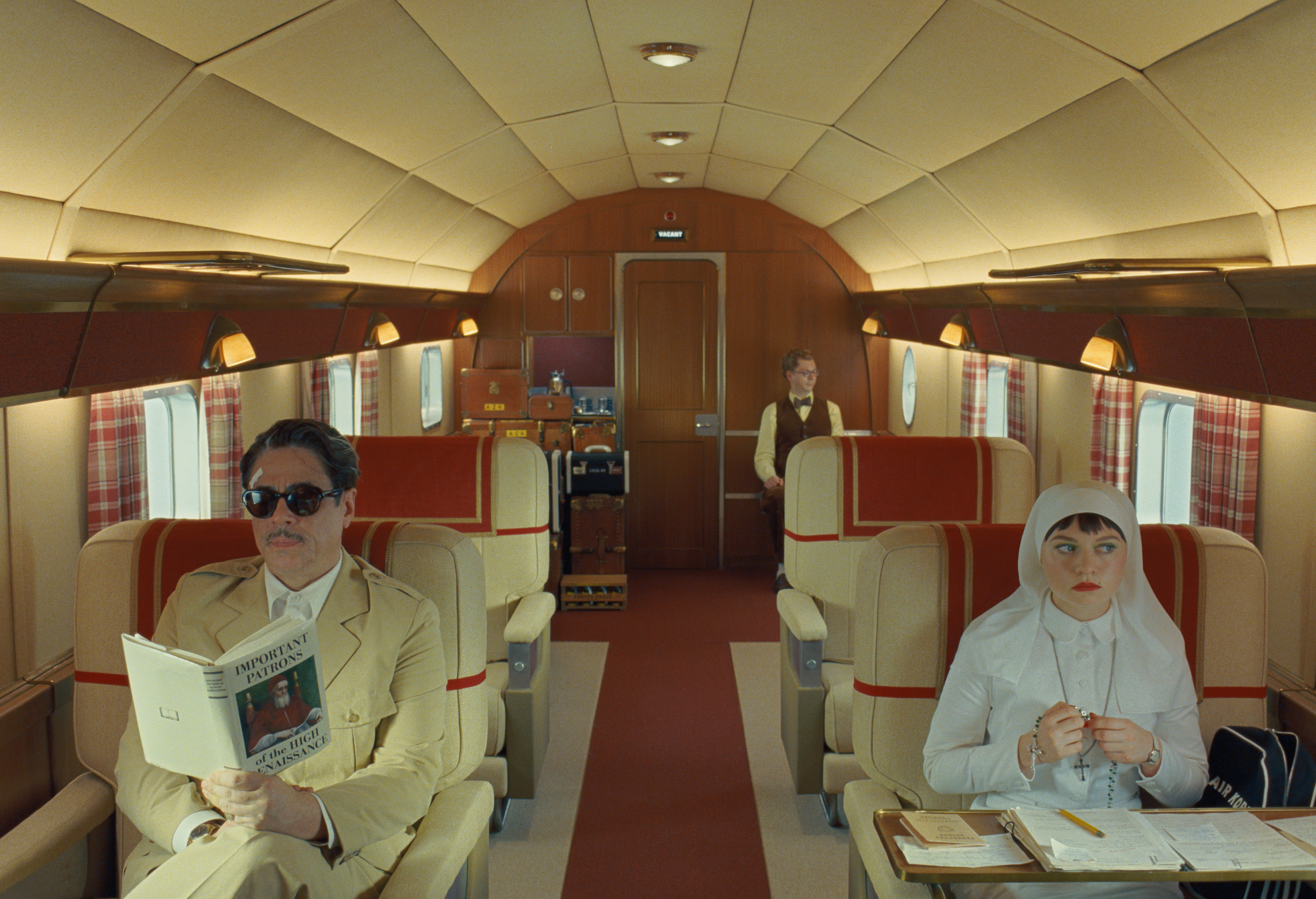
The best example of this is probably the jet scene: a palette of warm creams, honeyed wood tones, golden ochres, and, of course, a healthy dose of orange. Even 30,000 feet up, this combo feels cozy — and ditto for the home.
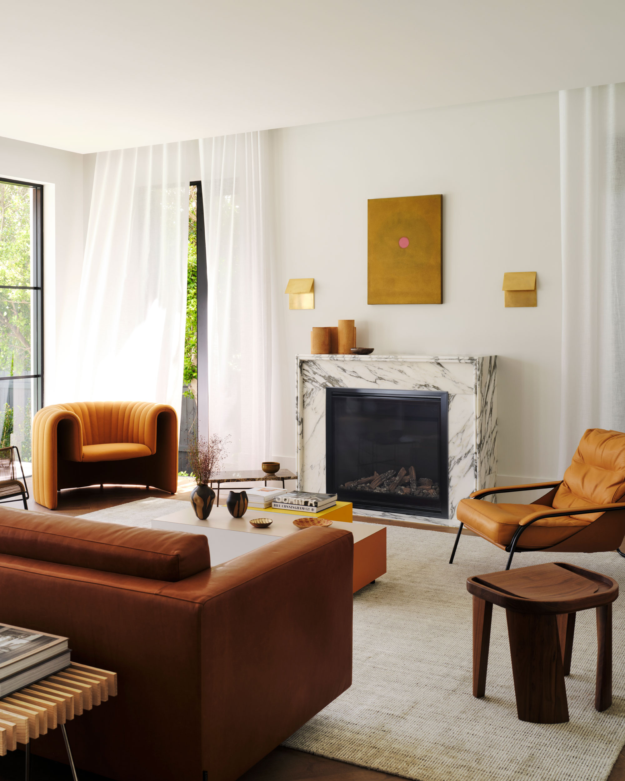
“I always like to start with a base color that the space will be based on,” says Shona — in the living room above, that’s cream. “So if we have a neutral palette but want to bring in color, pick one and make most of the elements in the space follow that. Then we can add unexpected pops in one or two more opposing colors." Marigold and tomato feel like natural fits for this example.
Looks like the leather seat of a 1950s jetliner. This hue is warm, worn-in, and luxe enough to call for a mid-flight scotch.
Little Greene’s burnt orange nails the film’s pivot toward toastier tones.
A golden earth tone that sits squarely between the two, inspired by sunbaked Tuscan villas and Egyptian ochre pigments.
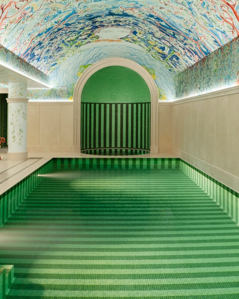
Cool Greens
Thanks to a wave of press circuit moments and well-placed billboards, you don’t need to have seen the film just yet to clock that cool greens are a defining color story. Not so much the prototypical foresty greens, but instead, teal-adjacent shades and barely-there tints that might otherwise read as baby blue to the untrained eye.
The trick here is nuance — subtle tonal differences play together and keep the green-soaked scene feeling dynamic. Think soft sages and earthy seafoams with blue undertones, punctuated occasionally by a chartreuse or olive — greens that each, ever-so-slightly, shake up the palette and prevent it from feeling too one-note.
Despite the international espionage, the film’s visual tone is surprisingly serene, so you can bet that translates beautifully into the home. These cool greens are ideal for bedrooms, offices, and reading nooks. Try them on moldings, trims, or architectural details to add dimension without oversaturating the room.
Call it blue, call it green — either way, this jewel-toned hue by Graham & Brown delivers the kind of cool, cinematic richness worthy of its name.
Unexpected? Sure. But so is Wes Anderson’s entire visual vocabulary. Works just as well on full walls as it does on a single cabinet door or molding detail.
Farrow & Ball calls it a “chameleon color,” and we would agree — its shapeshifting quality makes it the perfect whimsical mediator between greens.
Blues and Reds
This is where things get fun. Red and blue is the least orthodox color combination of the bunch, but also (possibly due to its patriotic potential) more generally. The Phoenician Scheme (2025), however, manages to sidestep all that by muting the saturation and shifting the proportions.
“Blue and red is totally in!” confirms Shona. “We saw a load of red in Milan last year — deep burgundies, blood tones.” But paired with faded blues, it reads cooler, and not to mention easier on the eyes for everyday.
It’s the same thinking behind the ‘unexpected red theory.' That vivid red lip worn by Mia Threapleton’s Liesel, paired with a nun’s habit against a cool blue wall, is textbook. And that same principle applies to other punchy contrasts.
“Look at the color wheel to decide what’s opposing — for example, blue and green would be juxtaposed with orange and reds,” Shona explains. “I think this is where the unexpected red theory comes in — the theme is disrupted in a really cool way by a completely opposing yet complementary color.”
Point being: don't be afraid of the clash.
Somewhat smokey — but why? That’s the mystique. This mid-blue with cool gray undertones feels appropriately moody and cinematic.
“Minnie” allegedly means rebellion — fitting, no? A crimson that burns (kind of) quietly.
A borderline-neon red that swerves just shy of orange. Think ‘race car’ against the hush of slate and stormy blues — a high-octane contrast that Liesel would love.
Want to dive deeper into the world of Wes Anderson? We'd recommend checking out these interior designers with a uniquely Wes Anderson-inspired style.