Rounding up the best Pride logos of 2023 has been a tougher ask than in previous years. It seems that more than a few brands have decided that doing even the bare minimum is too much like work, or too much of a ‘statement’, and have resolved to simply keep their heads down.
Some of the brands featured in our round-up of 2022’s best Pride logos haven't made much of a fuss at all in 2023. We haven't even had a cringeworthy new Coca-Cola bottle or a two-bottomed Whopper for goodness' sake.
It’s not altogether surprising, given the sustained anti-trans backlash from right-wing culture warriors that has seen brands like Target and Bud Light targeted for their Pride campaigns. In the heyday of rainbow capitalism, people often joked that the corporations would abandon the LGBTQIA+ community as soon as supporting it became inconvenient, or a threat to the bottom line. Well, there they go.
Our best Pride logos roundup this year is an attempt to highlight the brands that are doing more than paying lip service to standing with LGBTQIA+ people, especially when so many others aren’t even doing that much. We’ve looked for those who are putting their money where their mouth is and supporting queer causes, or at the very least have put more thought into their June rebrand than slapping ‘logo_transparent.png’ on top of ‘pride_rainbow_download_free.jpg’ and calling it a day.
So, here’s to more than the bare minimum. And don’t forget to check out our guide to the best logo designers if you feel like you can do better.
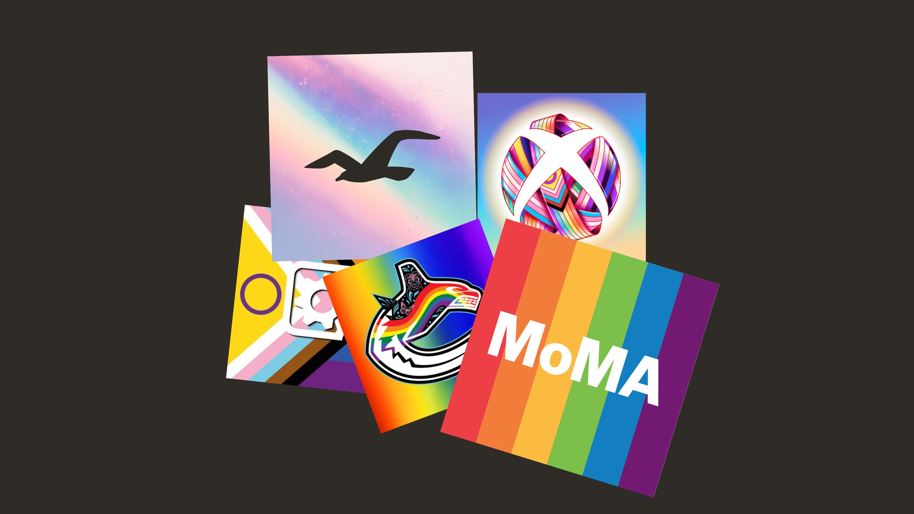
01. Hollister
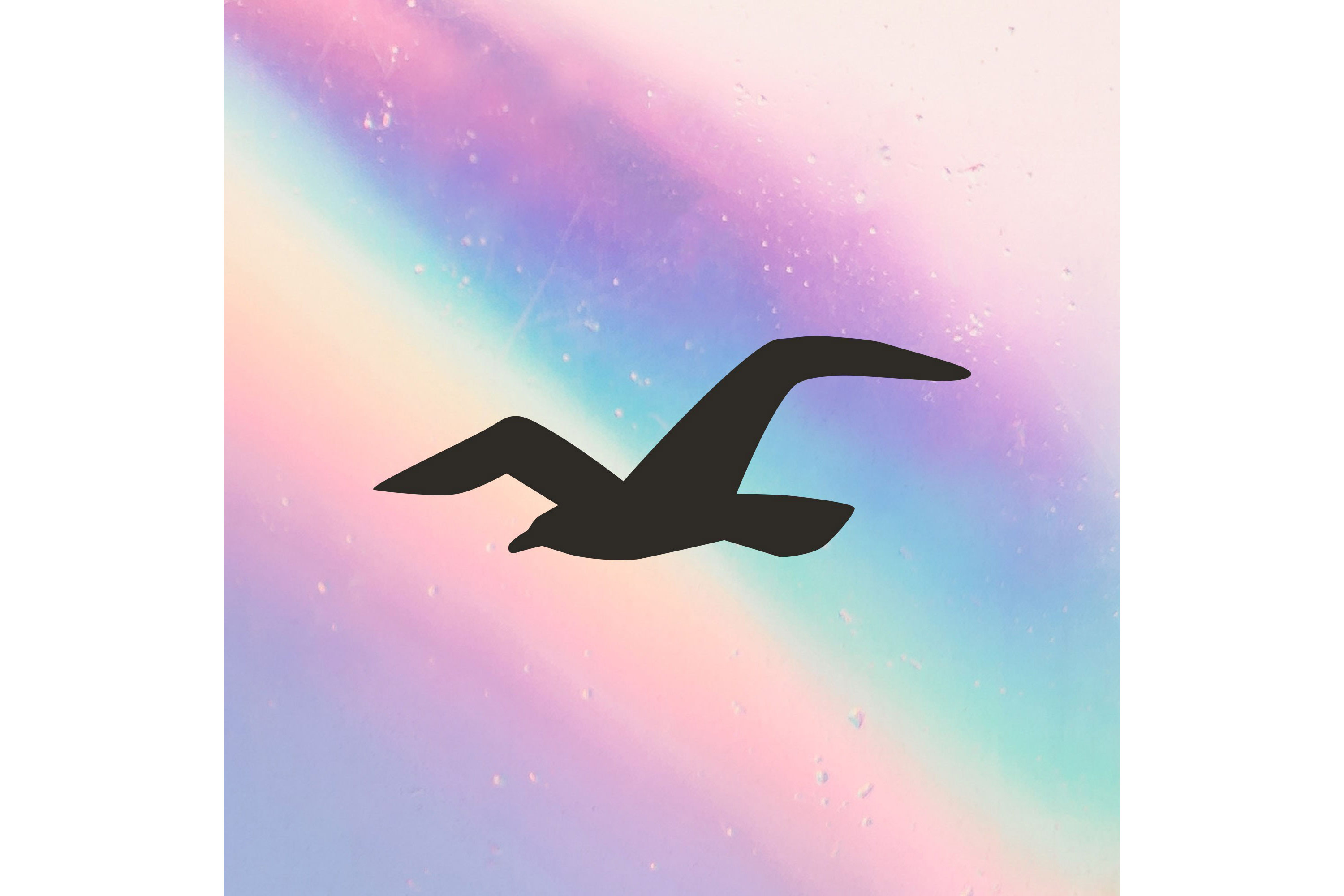
A simple but effective pastel reinterpretation of the Pride flag colours helps Hollister stand out from the crowd this June. There’s some fun interpretive ambiguity in those soft white marks beneath the colours, too – they look almost like stars, or perhaps the scratches on an old film print. We can also appreciate the restraint shown in refraining to slap the Hollister name all over the new logo instead just relying on the iconic bird design to represent the brand.
Hollister is showing its allyship in more concrete ways too, releasing a new Pride collection in collaboration with GLSEN, the Gay, Lesbian and Straight Education Network, a charitable organisation dedicated to creating safe and inclusive schools for LGBTQIA+ youth. The clothing brand has also pledged to donate $250,000 to GLSEN regardless of how much (or how little) the collection sells. Given how anti-trans campaigners use the excuse of ‘protecting’ children and schools to push for repressive queerphobic legislation, supporting a schools-based cause like GLSEN feels, genuinely, like a good response. Fair play.
02. Bank of America

You can argue that a brand has an easier time of it during Pride when their logo is already a flag, but we can still appreciate the elegance of Bank of America’s rainbow refresh. Note in particular the way the top-left square uses negative space to form the white stripe at the centre of the trans flag, the same way the usual logo uses it to form the white stripes of the American flag. Lovely stuff.
Bank of America has a long history of actively supporting its queer employees, running an ‘LGBTQ+ Pride Ally Program’ to encourage all employees to show allyship. The company also runs Unconscious Bias training to combat prejudice, and works in partnership with Love Has No Labels to promote LGBTQIA+ acceptance. The bank was nominated as one of the 100 best workplaces for diversity by Fortune magazine and Great Place to Work Institute, and received Corporation of the Year 2020 at the National LGBT Chamber of Commerce.
03. SEGA

This is a lovely clean effort from the legendary video game company. We particularly like the way it uses SEGA’s classic cobalt blue as the starting point of the rainbow before transitioning through the rest of the spectrum.
SEGA is generally one of the more active video game companies during Pride Month, holding regular fundraisers for queer causes – last year the company raised more than £18,000 in partnership with Twitch for transgender advocacy charity Mermaids. According to the company’s social media, SEGA will be holding another fundraiser this year for ‘an LGBTQIA+ charity’, though it has not yet specified which one.
04. Xbox
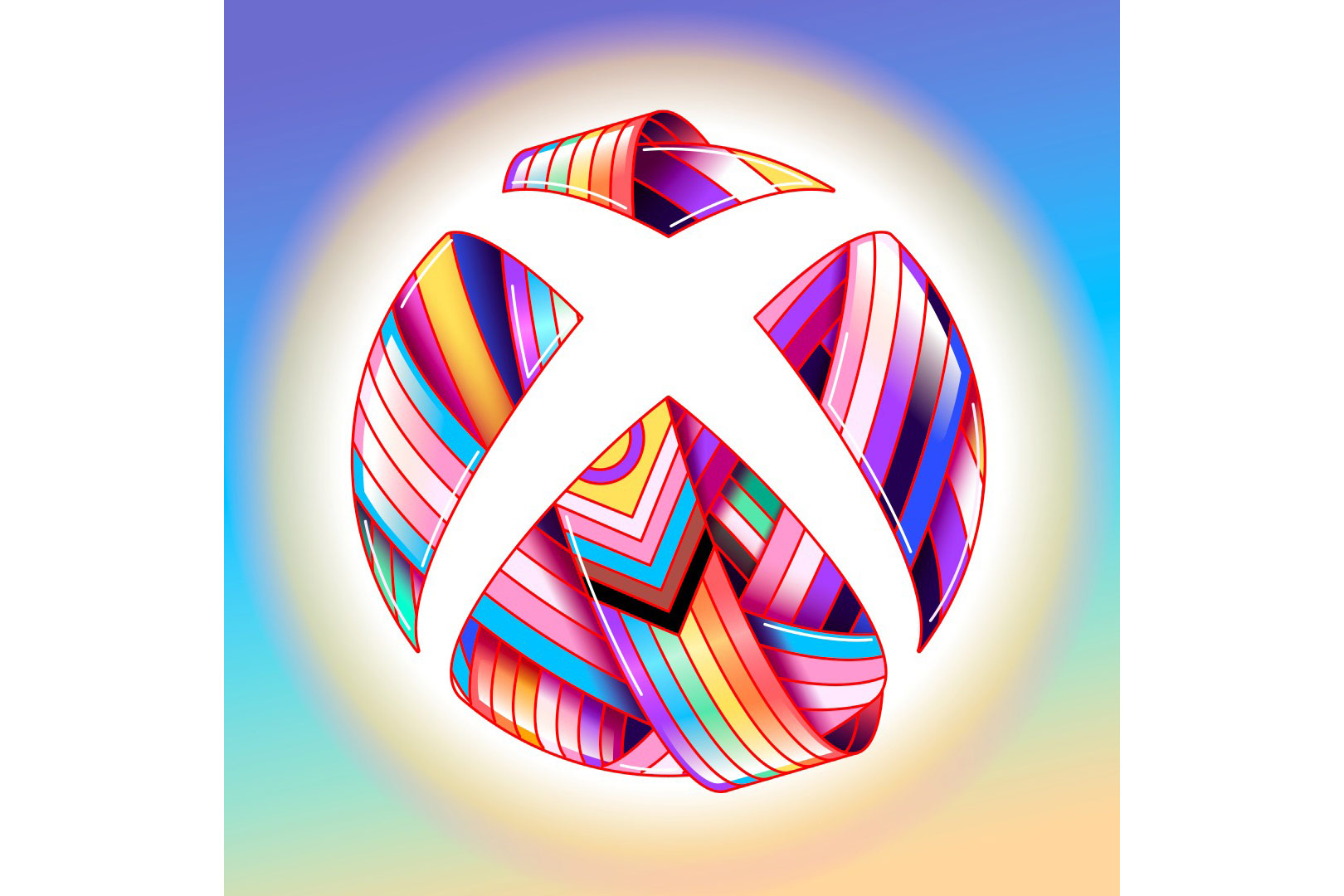
Sticking with video games for now, here’s Xbox’s vivacious Pride rebrand. The fact that the ‘X’ is made out of negative space means that the rest of the logo can be as busy as you like without compromising legibility – and boy, is this one busy. Representing quite literally all the colours of the rainbow and more, this bold design feels like it shouldn’t work, but does.
As part of its ongoing commitment to LGBTQIA+ advocacy, Xbox kept this Pride-themed redesign on its socials for a whopping three days before replacing it with one that was Diablo IV themed. Hope you all feel extremely represented, see you next year.
Okay, to be fair, we should acknowledge that Xbox did announce a ‘long-term partnership’ with GLAAD to help increase queer representations in future first-party Xbox titles. ‘Representation is a vast and multifaceted topic: it can mean more LGBTQIA+ characters, more story moments featuring LGBTQIA+ themes, or even creating worlds LGBTQIA+ players can feel at home in,’ said Pav Bhardwaj, Chief of Staff of Xbox Marketing, shortly before being crushed by a giant Diablo IV-branded blimp. (Not really.)
5. Vancouver Canucks
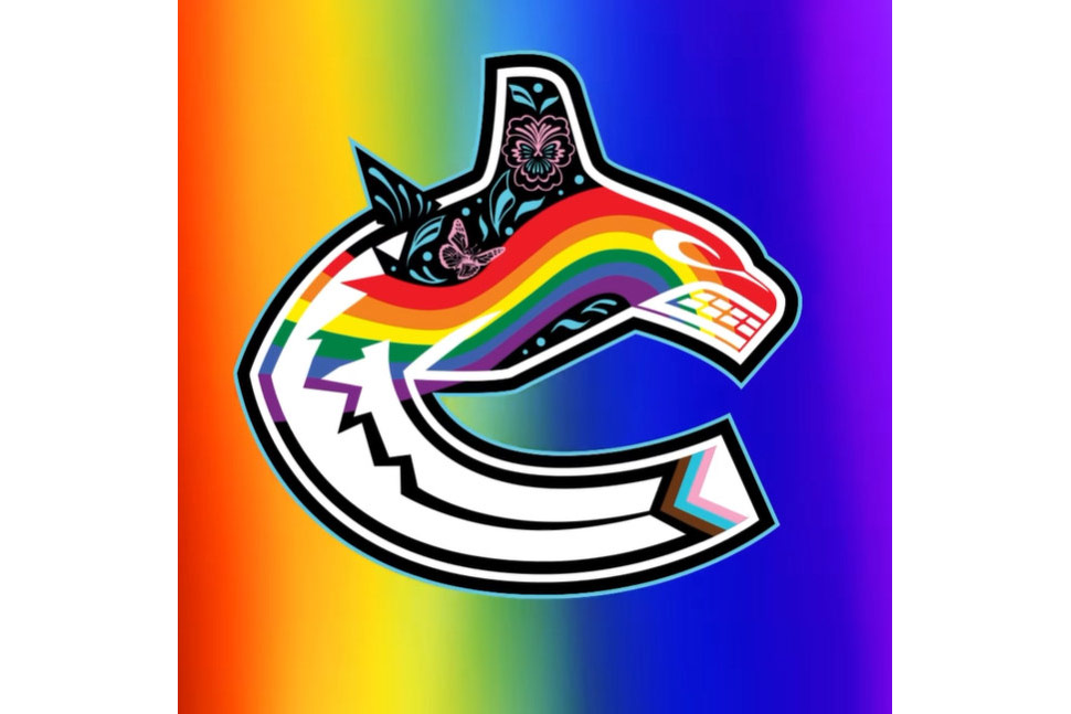
The above image is a still screenshot of the redesigned Pride logo of professional ice hockey team the Vancouver Canucks, which does not do it justice. To get a true sense of the thing, you really do need to see it in motion:
The Pride logo of a metropolitan ice hockey team did not need to go this hard, but we are glad it did. In fairness, team has good form for supporting queer communities – it holds an annual ‘Pride Game’, which this year was against the Calgary Flames at the end of March. It included a full drag show, performances by queer artists, and a $20,000 donation to QMUNITY, a queer community space in Vancouver.
6. Gearbox Entertainment

Video game fans may know Gearbox as the company responsible for the popular Borderlands franchise, as well as titles like Godfall and Tribes of Midgard. This Pride-themed rebrand is a fairly simple one, but we like in particular the way the brand echoes its own gear logo with the unbroken circle from the intersex flag, a detail that often goes unincluded in Pride-themed designs.
Gearbox is based in Texas, and has been outspoken about the discriminatory, pointlessly punitive anti-trans legislation being passed by the state’s governor Greg Abbott. The company’s game Borderlands games have also been nominated for a GLAAD Media Award and multiple Gayming awards for their queer representation.
7. Boots

UK health and beauty retailer Boots goes with a bright and poppy paint-splash Pride rebrand. It also calls to mind the limited-edition eyeshadow palette Boots is selling as part of its Pride collection this year.
Boots is generally pretty sound on stumping up cash to support the LGBTQIA+ community – it sponsors the local Pride in its home town of Nottingham, and its Pride Alliance Business Resource Group has been shortlisted at the British Diversity Awards for its work raising awareness of LGBTQIA+ issues.
8. MoMA: The Museum of Modern Art

And finally, we know we said we wouldn’t be rewarding the old ‘logo on a rainbow’ standard, but this effort from MoMA just has such understated class to it that we had to let one slip through the net. The soft, matte colours on those stripes give the logo a retro 70s feel – it is, quite simply, very chic.
Also, MoMA actually houses a key part of the queer legacy in its collection, having acquired artist Gilbert Baker’s original iconic rainbow flag from 1978.
In an interview with MoMa, shortly after the museum acquired the flag, Baker said:
"I made it in 1978 and I hoped it would be a great symbol but it has transcended all of that—and within short order—because it became so much bigger than me, than where I was producing it, much bigger even than the U.S. Now it’s made all over the world. The beauty of it is the way that it has connected us."