A competitive and creative decade in advertising, the 1970s was an era when talented copywriters, photographers and directors could shine, whether on the pages of magazines or on TV – particularly as TVs were increasingly commonplace in homes and colour was outpacing black-and-white.
The 1970s saw ads refocus to become consumer-centric over product-centric. Advertising began to show more cultural and social awareness – though sexism was still rife. Brands increasingly used comparison tactics in campaigns, much of which was reigned in as new regulations came into play. Audio branding saw success, jingles came into their own, with humorous campaigns abound and punchlines a plenty.
Here, in no particular order, designers, directors and other industry experts pick their top adverts of the 1970s. See more of our features on ads by the decade here and you can also explore our logos by the decade series, including the best logos of the 1970s.
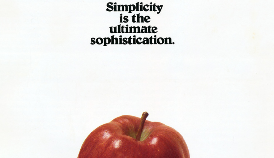
01. Apple

“Apple’s advertising really came into its own in the eighties and nineties. But they’ve been masters of wry humour and simple copywriting from day one. I love the cover of their first marketing brochure from 1977, announcing the Apple II computer. It’s simple in the extreme,” says Orlaith Wood, creative director at verbal branding agency Reed Words. The ad pays tribute to Apple’s love of simplicity, which goes beyond a design principle, and is upheld by the company’s as its driving force and inspiration.
“There are no product details whatsoever, but it tells you just enough to make you want to know more. Each word is doing something clever. The quote ‘Simplicity is the ultimate sophistication’ – often attributed to Leonardo Da Vinci – puts Apple’s company ethos front and centre. It’s a bit pretentious, and I respect that. It fits the brand,” Wood continues. “Apple goes on to stake a claim on the generic term ‘the personal computer’, implying that ‘there is no other’. And that’s what I like most about it: the confidence. This was a brand telling us that our perceptions of what an apple is were about to change. They weren’t wrong.”
John Randall, senior graphic designer for Magpie Studio agrees that the power here lies in simplicity. “Opting to promote a product without showcasing its image was undeniably bold,” he says. “The stripped-down aesthetic of the ad, paired with the poignant copy line vividly illustrates Apple's philosophy – a principle deeply ingrained in the company's identity to this day. To me, these ads epitomise the perfect harmony between copywriting and graphics, a delicate balance that continues to inspire marketers and advertisers to this very day.”
02. Hovis
A hugely popular ad of the 1970s, this nostalgia-fuelled Hovis TV commercial, 'Boy on a Bike', was crafted by iconic director Ridley Scott, paired with Dvorak’s New World Symphony, performed by the Ashington Colliery brass band.
“It is an absolute classic,” says Ozzie Pullin, director with production studio Anattic, who specialises in music videos, commercials and fashion. “No bells and whistles, just a simple strong honest story that has heart, which I feel most commercials nowadays don’t have. It feels like now everyone is all about transitions, wide angle lenses and camera work and the story falls short.”
03. Cinzano
“Joan Collins. Man spilling drink on wife. Increasingly ridiculous circumstances. What’s not to love? But, the best thing about these silly Cinzano ads from the seventies is the scripts,” says Orlaith. “You feel like you’re watching a sitcom instead of an ad – and yet the product features are weaved expertly into every spot. It’s brilliantly self-aware writing that embraces Cinzano’s reputation for being a little bit posh and ‘continental’.”
The unlikely celebrity pairing combined with a little slapstick humour makes for a classic '70s commercial that spoofed many competitor alcohol ads of the time that were aimed at a trendy, younger audience. “Once you’ve seen a few, you’re waiting for the punchline, and that’s okay – a good ad should make us remember, she adds. “As a cheeky bonus, there’s proof that puns can be classy, with the glorious line: ‘The aroma wasn’t built in a day’.”
04. Campari
“The Leonard Rossiter Cinzano campaign with Joan Collins was a campaign everyone talked about in the ‘70s, but for me I loved this Campari ad with Lorraine Chase,” says Rob. The 1979 TV ad was created by agency J Walter Thompson (JWT) and pairs actor and former model Chase with actor Jeremy Clyde who is trying to woo her in a sunny location. Her cockney accent punchline soon became a catchphrase, which was originally inspired by the track ‘Luton Airport’ by British girl band Cats UK.
“For months every kid in the playground, every parent, anyone and everyone at the drop of a hat would say ‘No…Luton Airport!’ – it just caught hold and became part of culture. Totally irreverent. That doesn’t happen now. The ads now don’t have the status. Pity.”
05. Fiat and the feminist graffiti

Next up, praise for some iconic graffiti that was famously added to a Fiat 127 Palio billboard advert. “I remember seeing this poster and laughing out loud,” says Dave Buonaguidi, ad expert, author of Blah! Blah! Blah!: Memories and advice from one of British advertising's mavericks, and printmaker known as Real Hackney Dave. “It was a different time then so this sort of shit was totally normal, but it was the first time I had ever seen really well written graffiti having a response.”
According to Glasgow Women's Library, the photo was taken in London by Jill Posener in 1979, who later released the 1982 photobook Spray it Loud. “This ad was opposite my place of work. I had to stare at it out of the window. A colleague and I went out and added the graffiti,” Jill says of the ad. “It was a way of taking over the poster. By writing angry but humorous graffiti, we were also making the point that ad agencies don’t have the monopoly on wit.”
06. Coca Cola
“The story behind how the commercial came about is so refreshingly genuine (pun intended). The creative director's plane got redirected and he had to spend the night in Ireland waiting for a different flight. He witnessed several other passengers, who were as disgruntled as him the previous day, laugh and bond over their shared misfortune while drinking Coca Cola on the day of their new flight,” says Caroline Hajny, film director, working across fashion, music and commercials with production studio Anattic. “The idea that something as simple as a soft drink can so easily bring people together and represent something they have in common, regardless of where they're from, sparked the idea for the song and campaign.”
The ad, with creative direction from McCann Erickson’s Bill Backer, was released in 1971. Several shoots had been rained off, resulting in new locations and recasting, and a final budget that topped $250,000 – a hefty amount for the time. However, the 'Hilltop' ad was a huge hit around the world.
“I think this ad really reflects the zeitgeist of the seventies: the idea of peace, love and unity, Woodstock just a few years prior to its release, the peace movement against the Vietnam War," Caroline adds. "A lot of similar themes are reflected in the lyrics and images that must have really resonated especially with young consumers at the time. No wonder it had such a great impact.”
07. Martini
“This commercial is the perfect marriage of branding, sports and lifestyle. Oozing with the lavish seventies ‘la dolce vita’ lifestyle, it perfectly positions Martini as an aspirational brand, identifying itself with the glitz and glamour of the Monaco Grand Prix,” says Caroline. With creative direction from Barry Day of McCann Erickson, the ad features an alluring mix of beautiful people, sunshine and fast cars.
“Prominent branding throughout never lets you forget who this commercial is for – and while I personally think this is the commercial's weakest point, their sponsorship of the Brabham F1 team offers a wonderful excuse to feature the logos as excessively as they do. It's shot beautifully, combining documentary style footage of the race and spectacle around it with elaborate and poised shots of watchers enjoying Martini – this advert manages to sell a lifestyle and feeling rather than a product.”
08. Cresta
“When I was very young, my first ideas of cool were shaped by an animated (in every sense) polar bear who advertised a long-gone fizzy drink called Cresta with the words ‘It’s frothy man’. I mean, he wore sunglasses, come on,” says Olivia Triggs, founder of London-based illustration agency, Breed. Compared to other soft drinks of the era, some critics argued that, given the unusual frothy texture and mediocre flavour, the ad was a triumph of marketing over taste.
“The bear was created by John Webster for BMP (before they added the DDB),” Olivia adds, “who was also responsible for Cadbury's Smash Martians, and the Honey Monster. That’s some portfolio. Rimsky-Korsakov!”
09. BMW
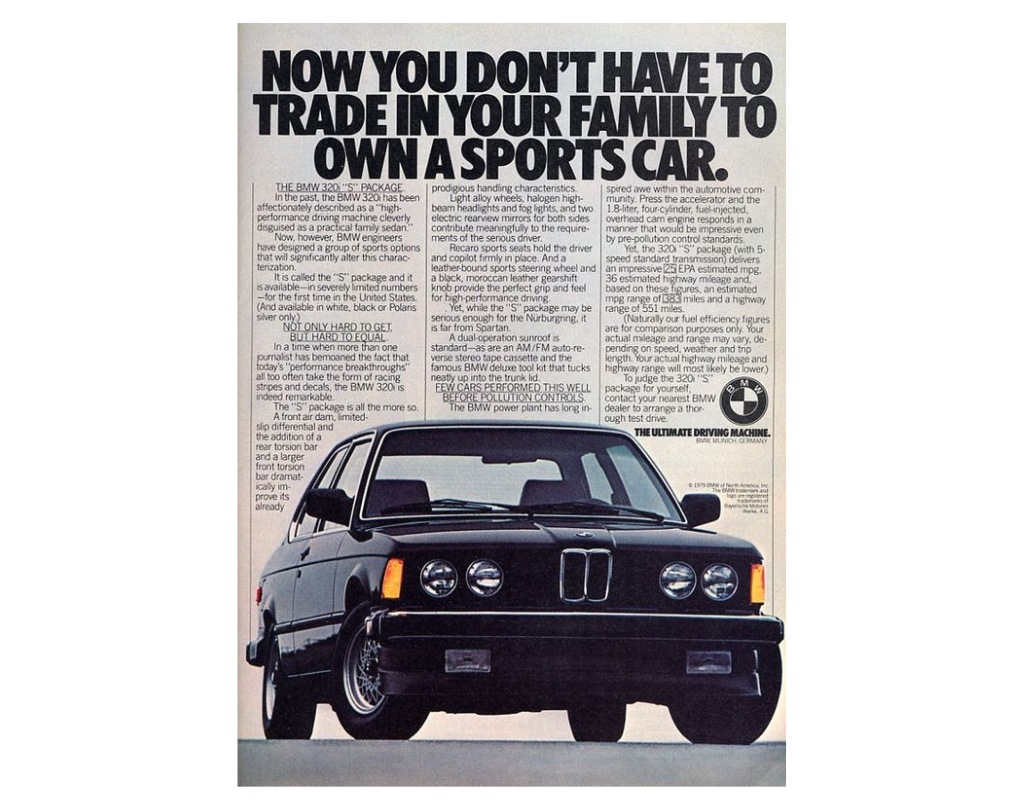
“The 1970s were less time-volatile with the end of the Vietnam War, Watergate and the Beatles' breakup. Advertisers focused on developing a precise brand positioning to differentiate their product, often captured in a brand line that captured the core product difference or benefit,” says Allen Adamson, co-founder and managing partner of creative agency Metaforce and author of Seeing the How: Transforming What People Do, Not Buy, To Gain Market Advantage, highlighting Ammirati Puris iconic repositioning of BMW for US audiences as 'The Ultimate Driving Machine', which he says exemplifies the trend. Elsewhere, the company’s 'Freude am Fahren' slogan (from 1972) was translated more closely, in the UK for example, as 'Sheer Driving Pleasure'.
“Their brand positioning turns a traditional-looking sedan into a feeling like a Formula One race car to consumers,” Adamson adds. “Ralph Ammirati's brilliant art direction and Martin Puris' elegant copy transformed the brand.”
10. American Express
As air travel increased during the mid-seventies, American Express launched a hugely successful campaign to promote travellers cheques, with a slogan from ad agency Ogilvy & Mather: 'Don't Leave Home Without Them'. This later became 'Don’t Leave Home Without It', as the card replaced the cheques. Each commercial was presented by a celebrity, often well-known more for their name but not instantly recognisable, such as author Stephen King and Looney Tunes voice actor Mel Blanc.
“Ogilvy transforms an ordinary credit card into a global status symbol with the ‘Do you know me?’ campaign,” says Adamson. “Having somewhat ‘unrecognisable’ global celebrities like Luciano Pavarotti and Broadway's Carol Channing in their iconic ads gave the card unmatched prestige.”
11. Benson & Hedges
“I grew up in the UK in the seventies and TV was my education. So, the ads were everything and I could choose so many. One that hit hard and left a scar was this for Benson and Hedges. I saw it in the cinema and probably wasn’t supposed to, but it was so cool. It’s still cool today.” says Rob Fletcher, founder and executive creative director of creative agency Isobel, of the surreal, glamorous commercial by Benson & Hedges that was said to be the most expensive ad ever made at the time.
“Later, when I joined the industry I discovered it was the celebrated ad agency Collett Dickenson Pearce (CDP) and Hugh Hudson (director of feature film Chariots of Fire), but that didn’t matter to me. It blew me away. I think this ad was the reason I wanted to be in advertising (and probably the reason I started smoking too).”
12. Schlitz Brewing
A small brewery founded in 1849, Schlitz's popularity spread through the midwest until becoming one of the largest beer producers in the USA in the early 1900s. Through the '60s and '70s the company’s in-your-face TV ads featured a live bull breaking through walls to “create a rebellious brand identity in a time of growing unrest”, says Mike Perry, founder and creative director of New York-based creative agency Tavern.
“There’s no better time in history for beer design and creative than the 1970s when brands were inviting us to a raucous party by constantly pushing boundaries in colour, font, and language. One excellent example of this golden era can be found in the beer brand Schlitz Brewing,” Mike says. “The ‘70s saw the brand lean further into the use of a bull mascot and concept. The bull appeared in stark black, electric blue, or bright red on silver labels – drawn as if about to charge off the can. Ads featured intriguing, sometimes famous characters who demanded viewers not refer to Schlitz as just some ordinary beer, but as something different all together. The ‘say bull’ message has viewers feeling like they’re about to say a swear word, while reinforcing a life-of-the-party, seize-the-day tension – further backed by a bull crashing through and joining in.”
“One can imagine that during a decade of intense growing pains in the US, symbols of strength and dominance letting off steam might have played well with beer drinkers of the era.”
For more great adverts, see our best prints ads of all time roundup.