Marked by widespread social and political change, the 1960s saw an increase in alternative lifestyles, counter-cultural movements and human rights reforms. The trippy psychedelic styles and bold statements of youth culture in this radical era influenced everything from art and music to advertising in print and in motion, and resulted in some fantastic 1960s logos.
Following on from some brilliant 1950s adverts, the '60s was known as the 'golden age of advertising', with the rising popularity of television helping brands connect with their audiences in new ways, alongside a wave of more exciting print ads, led by imagery, humour and emotion.
Here, in no particular order are the top ten ads of the 1960s, as selected by designers, ad directors and other industry experts. See all our posts on the best ads by decade here.
01. VW
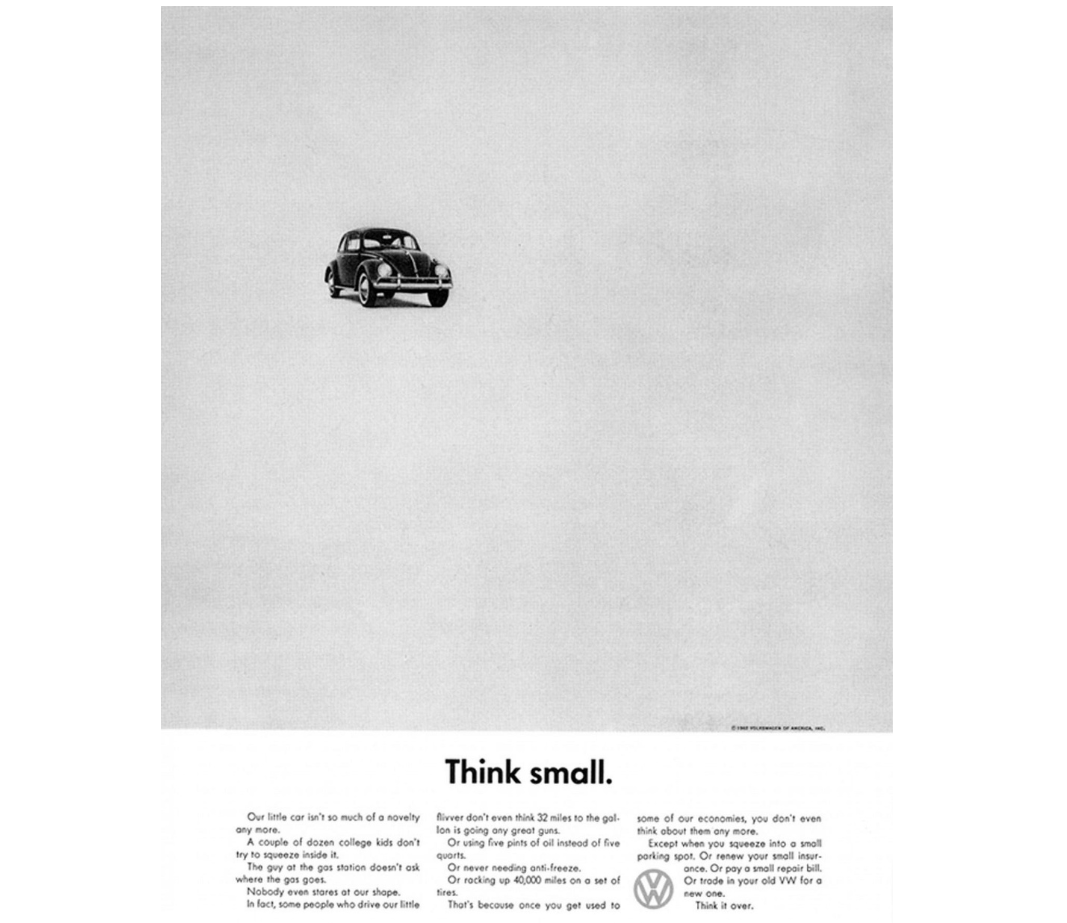
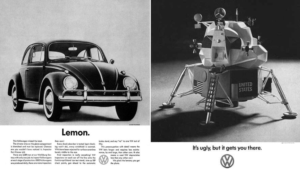
Created by ad agency Doyle Dane Bernbach (DDB), VW’s print and TV ads were the most popular choice for the 1960s among the industry contributors we spoke to. They have been hailed as the ads that helped change advertising, fuelled by compelling copy, simple visuals and relatable themes.
Highlighting the VW’s print ads in particular, John Randall, senior graphic designer for Magpie Studio, says they are an enduring testament to the power of innovative marketing. "Bernbach's forward-thinking philosophy, which seems commonplace today, was groundbreaking in its time. He championed the notion of concept-driven advertising, where ideas took precedence over mere product promotion," Randall says, noting that DDB helped to overhaul its VW’s image by shedding its wartime associations in order to appeal to the US market, while cutting through the noise of prevailing print ad trends of the time with an emphasis on simplicity.
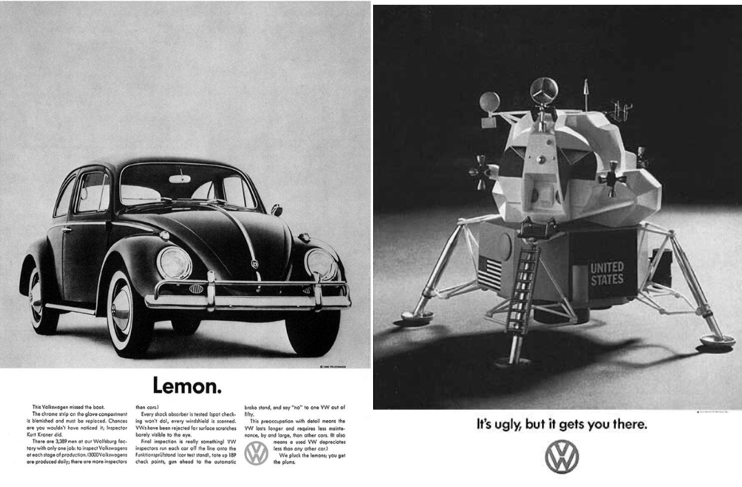
Less is more, Jonny Aldrich, managing director of branding and design agency Deuce Studio, agrees: “Some of the most minimal and clever adverts around, with simple one- or two-word headlines combined with minimal photography, create a visually stunning adverts that would look just as good in a newspaper today as they did then,” he says. “Of course, this advert fits perfectly with the German brand’s values and ethos, they are all about being functional, and their advertising reflects that too.”
“You can always find fresh and exciting ideas in car commercials – this one is super simple and straightforward, and that’s why it’s so brilliant,” says Caroline Hajny, film director, working across fashion, music and commercials with production studio Anattic, pointing to the ‘Few things work as well as a Volkswagen’, in particular. “A series of relatable, frustrating everyday moments lead up to the car’s hero moment, highlighting what’s most important to the average consumer: reliability.
The ad’s audience are normal, everyday people and what better way than speaking to them by addressing normal, everyday problems? This ad gets straight to the point and is what I call a ‘no bullshit commercial’ – and that’s something I can definitely appreciate in a world of flashy images, breathtaking stunts and polished products.”
As well as the simplicity of the ads helping them stick in the mind, comedic elements were also used to creatively enhance receptivity of consumers. “The irony and wit of the 1960s advertising was exemplified by DDB’s brilliant VW ads,” says Allen Adamson, co-founder and managing partner of marketing collective Metaforce, and author of Seeing the How: Transforming What People Do, Not Buy, To Gain Market Advantage. “During the sixties, all American cars were large, and, the bigger, the better they sold. Taking a product negative of a car being small and turning it into a benefit was revolutionary. They also pushed against the belief that spending more money on a car was a benefit.”
02. Ford
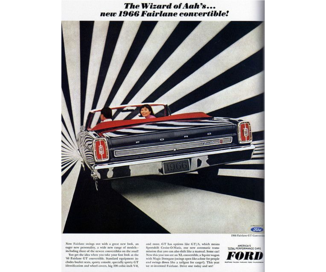
Jonny highlights another favourite car ad from 1966 for a very different reason. In the era of power, speed, custom looks and stylish design, the appeal of cars was also their cool-factor, as demonstrated in this 1966 Ford Fairlane GT Convertible ad campaign.
“I absolutely love the opposite end of the spectrum too, with these Ford ads. The car itself is very cool, and the total opposite to the functional VW bug. It's out there, it's got its top off, it's fast and it's stylish. Hence, the advertising look and feel reflects that, with the bold attention grabbing patterns in the background.”
03. US Public Service Announcement
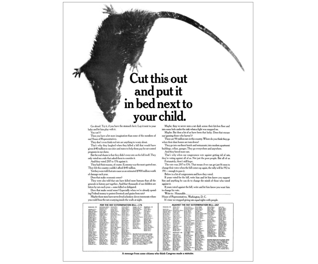
“This 1967 PSA is spectacular on every level: it’s a confluence of social activism and salesmanship as well as emblematic of a new wave of American graphic design that was brilliantly embodied in advertising’s Creative Revolution, ushered in by DDB,” says Professor Nancy R Tag, former ad agency creative director and founding director of City College of New York’s master's in branding and integrated communications.
The full-page newspaper ad was conceived by DDB’s Bert Steinhauser, with copy by Chuck Kollewe, and aimed to publicly shame Congress for not passing the Rat Extermination Bill. “It made such an impact that President Johnson wrote to them: ‘Your timely and imaginative advertisement must surely have played an important part in persuading Congress of the necessity for this vital legislation'.”
“In my household, this was always referred to as ‘The Rat Ad’ by my husband, who, back in the sixties, was called up from the bullpen at DDB to do the mechanical for it. In his telling, he was yelled at by Steinhauser for not sizing it to his exact specifications. ‘Let it float on the page,’ my husband sheepishly suggested – which led to a short exile back to the bullpen before getting a second shot at being an assistant art director at the storied agency.”
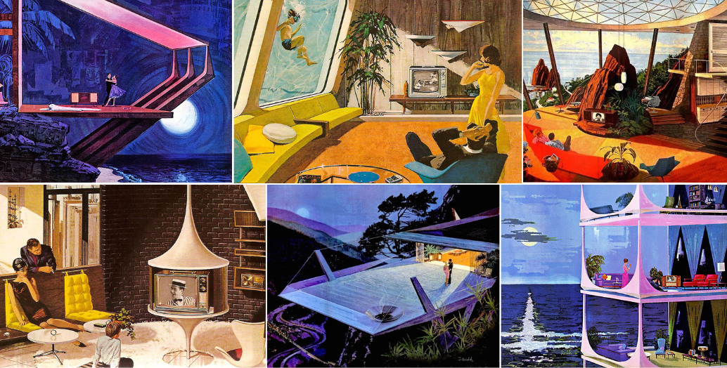
04. Motorola
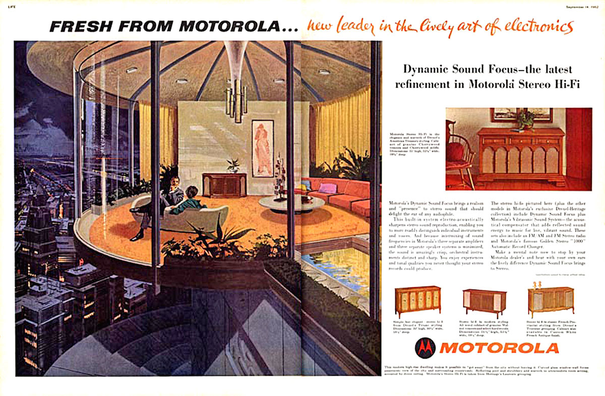
“As an architecture fan, I was very happy to recently stumble upon this series of Motorola ‘The House of the Future’ press ads from the early sixties. They feature Motorola products in spectacular modernist homes that never existed except in the beautifully painted illustrations of one Charles Schridde,” says Olivia Triggs, founder of London-based illustration agency Breed.
Painted by Schridde, the ads depict retro-futuristic buildings often in a beautiful natural environment or modernist metropolis, alongside various electronics and home entertainment equiptment. They featured in various publications including Life Magazine and the Saturday Evening Post. “If Charles was still around, I’d definitely be trying to add him to the roster of my own illustration agency,” Olivia adds.
05. Bob Dylan
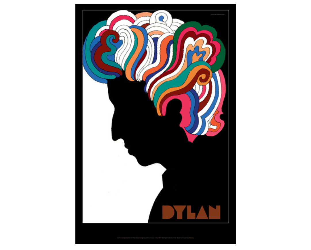
“With my graphic design background I couldn’t help choosing my favourites of the era based on a designer,” says Lauren Hall, illustrator and designer, with Brilliant Artists. “Milton Glaser, a pioneer in graphic design history, created the iconic Bob Dylan poster in 1966, commissioned for Dylan's Greatest Hits album. It’s one of my favourites of Glaser’s beautiful work.”
The late American graphic designer is believed to have taken inspiration from a Marcel Duchamp self-portrait, for the psychedelic poster that accompanied the album, with Dylan’s side profile in black with colourful, curly hair. “Featuring Dylan’s silhouette with vibrant, psychedelic hair, its bold design. The contrast of the vivid, swirling colours and dark silhouette perfectly reflect Glaser’s rebellion against the modernist ‘less is less’.”
06. Galt Toys
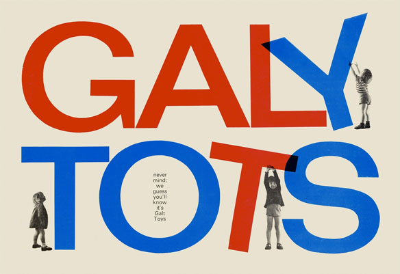
Highlighting another of her favourite graphic designers, Lauren points to the influential work of Ken Garland. “His work in the 1960s includes the iconic First Things First manifesto about the role of designers in consumer culture. An advocate for designers to use their skills for more socially responsible purposes. British toy company Galt Toys was one of the companies that embraced Garland’s ethos.”
Published in 1964, the manifesto was a reaction against consumerist culture and called for a return to the humanist dimension of design. “In the 1960s, Galt commissioned Garland to [work on campaigns, branding and packaging] that focused on imaginative play and the benefits of their toys, instead of just pushing products,” Lauren says. “I love that it balances playfulness and functionality using vibrant colours and whimsical illustrations.”
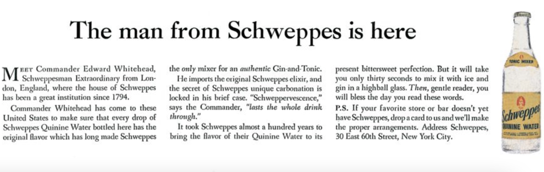
07. Schweppes
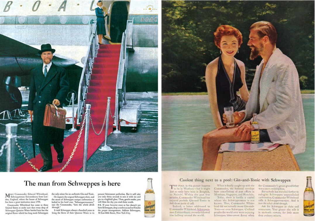
For Allen, the use of distinctive and recognisable characters was one of the most significant advertising innovations of the decade, which is still a tactic for enhancing engagement for ad campaigns and branding used today. He highlights the Schweppes’ use of Commander Whitehead for its Tonic Water, the suave then-president of the company, which ad agency Ogilvy's included in the ads. An example utilising and building upon the personalities behind brands in order to attract consumers.
“Before this, most advertising focused on the products,” Allen says. “Ogilvy created a persona to leverage the image they wanted the product to embody. For Schweppes, it was a globetrotting explorer; for Hathaway, it was a sophisticated man with an eye patch to make him unforgettable and distinctive.”
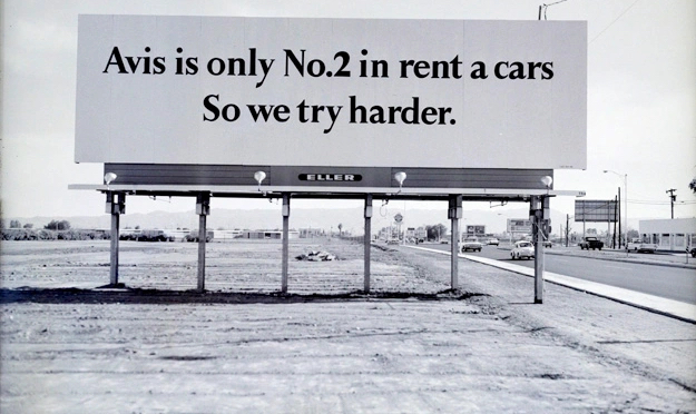
08. Avis
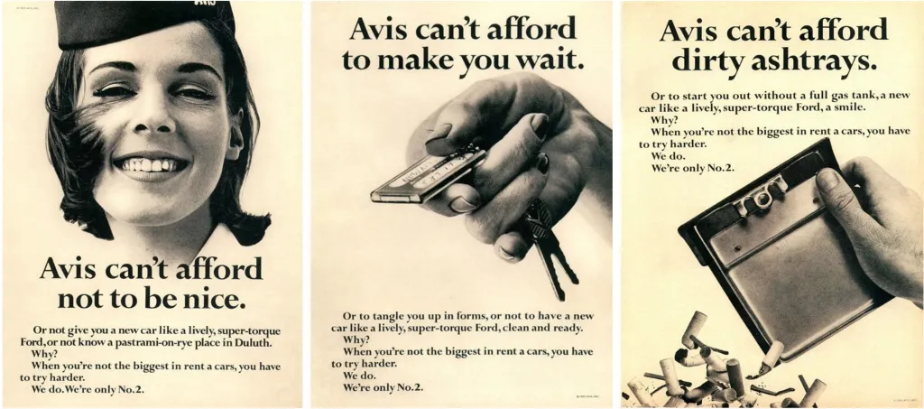
“I’m a writer, so naturally I’m a big fan of copy-led ads – and the 1960s was a golden decade for them,” says Orlaith Wood, creative director at verbal branding agency Reed Words, who points to the example of Avis’s 1963 'We try harder' campaign as a case in point. “The ads are disarmingly honest, making Avis sound like the scrappy underdog. They turned their secondary status into an advantage – because being second best means you work harder to keep customers happy,” she says.
The ads, which were an instant hit, were an obvious dig at long-time rival Hertz, with a potent slogan written by DDB copywriter Paula Green. “The simple sepia imagery lets the words do the talking. ‘We try harder’ is everything a good slogan should be: simple, true and iconic. What can we learn from it? When everyone is scrambling to be the best, play on your vulnerability. And, don’t be afraid to throw a little tactical shade on the competition.”
09. Alka Seltzer
“In my head, I always think creativity should progress – become more sophisticated, more abstract, more clever as the years go by. In advertising, I don’t think this has happened. If this ad for Alka Seltzer from the sixties ran today, it would still be the best thing ever,” says Rob Fletcher, founder and executive creative director of creative agency Isobel.
Sometimes referred to as the ‘Spicy Meatball ad’, the 1969 TV commercial’s slogan was instantly memorable, uttered several times throughout, as the actor repeatedly bumbles the line, therefore repeatedly eats the meatballs, leading to the voiceover calling for Alka Seltzer. “[It is] sharp, fast, pithy and still relevant. Crisply directed and electric. And the product owns the narrative. Something advertising has sorely forgotten.”
Fletcher also points to another Alka Seltzer ad from 1969, ‘The Unfinished Lunch’ (below), featuring a room of prisoners chanting. “Again if this ran today it would stand out above everything else. I love the fact the only dialogue in the whole ad is the product name. And shouted by hundreds of people. Follows no rules.”
For more in this series, see our best adverts of the decade page, and don't miss our best logos of the decade series.