Mexican lager brand Sol has unveiled a sunny new look, bringing its heritage design into the modern day. With a refined focus on the younger crowd, Sol's rebrand builds an authentic new voice that cuts through the noise of the drinks sphere.
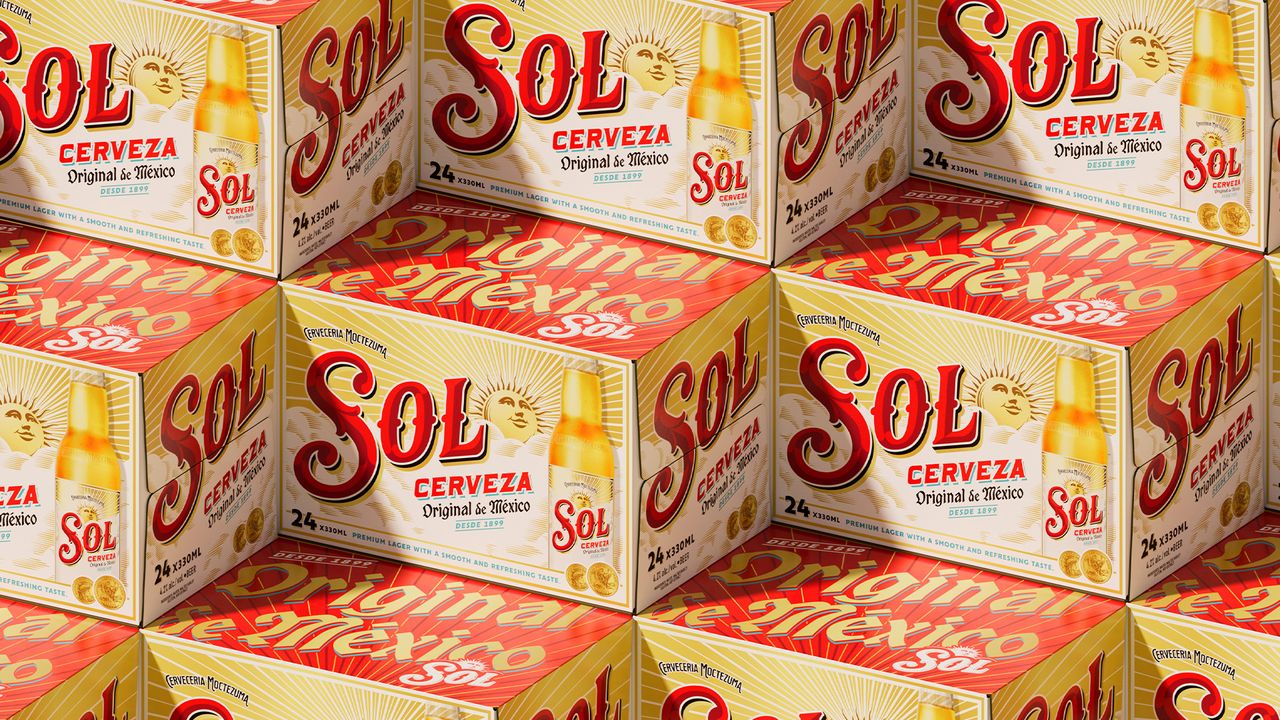
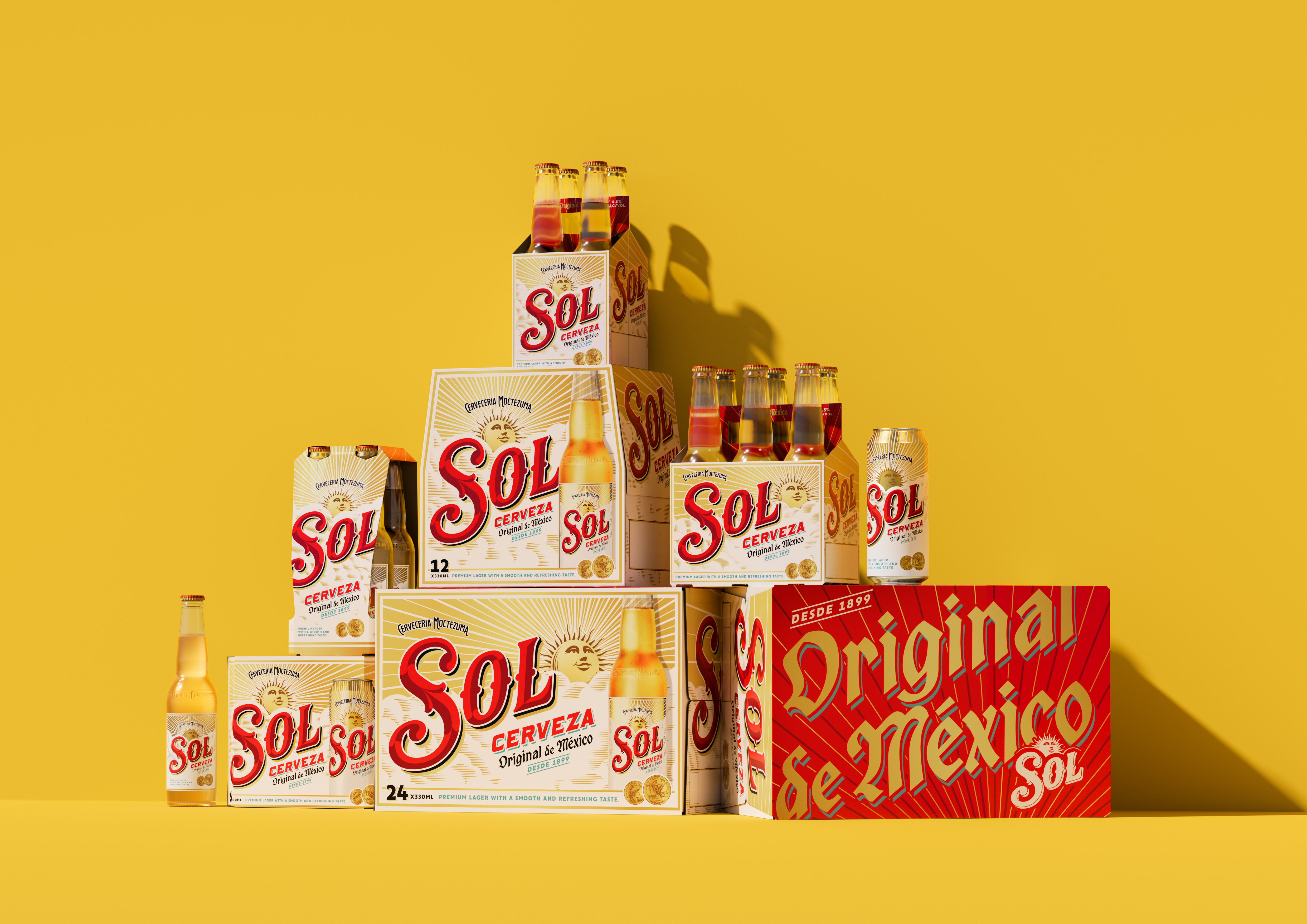
The best rebrands are often a careful blend of heritage and contemporary design, and Sol's new look is no different. With a revitalised wordmark, vibrant colours and custom typography, the new look is not only a visual revamp but an all-out curated brand experience.
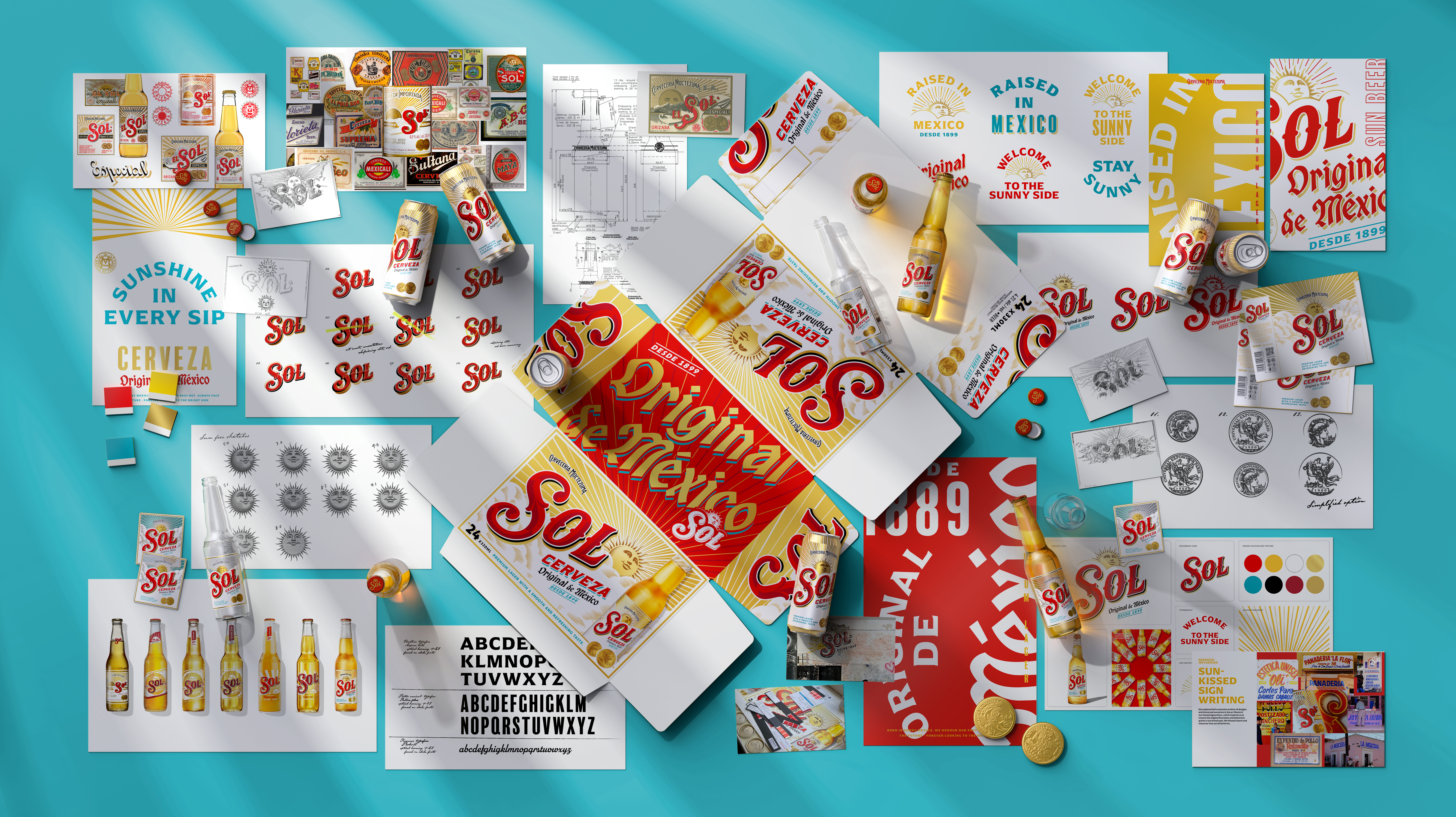
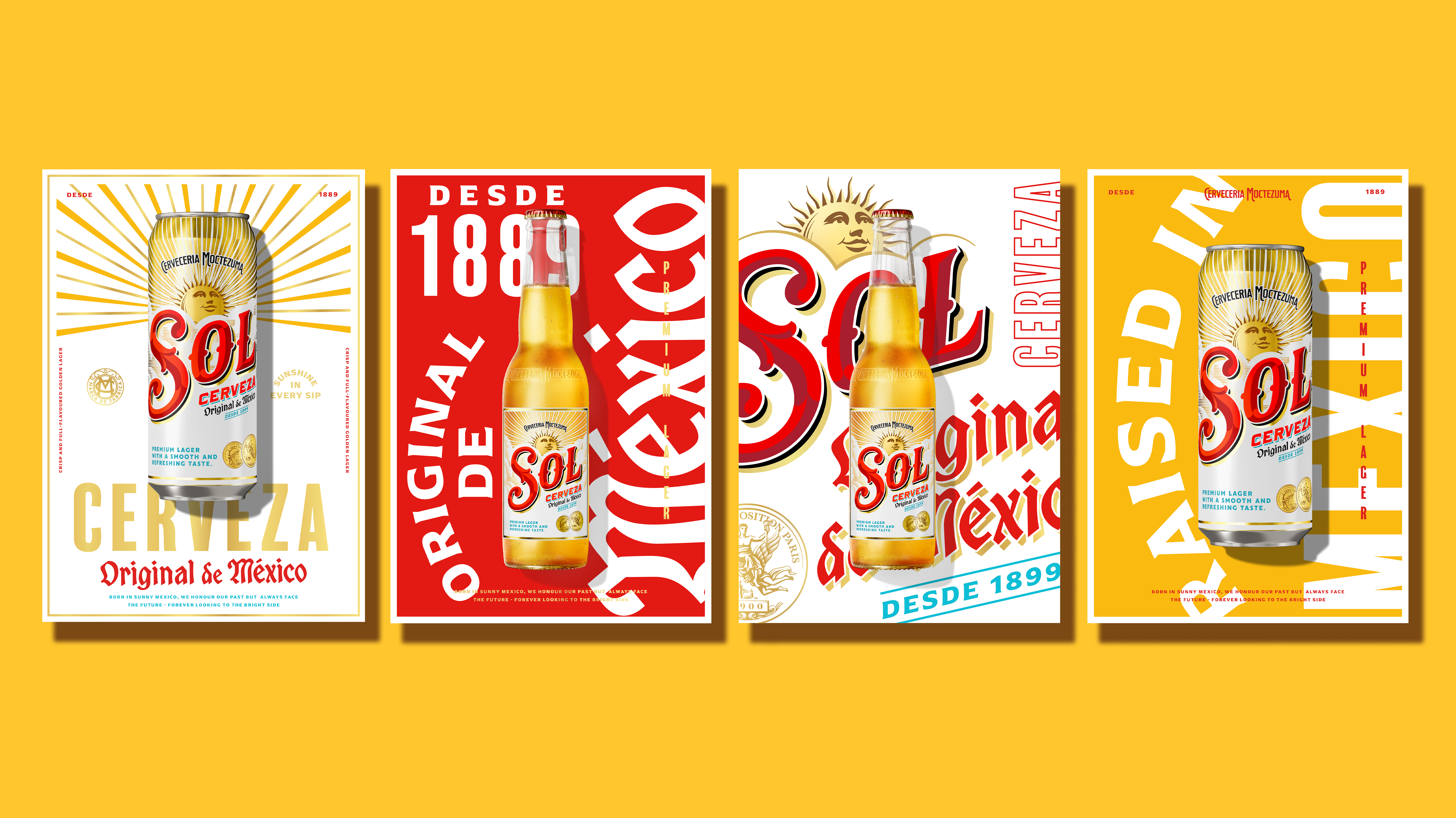
Created by Manchester-based design agency LOVE, Sol's new brand identity was built upon reaching its target demographic of young adults. With a careful blend of heritage design elements and contemporary energy, the new look shines in its refreshed familiarity that feels both new and comforting.
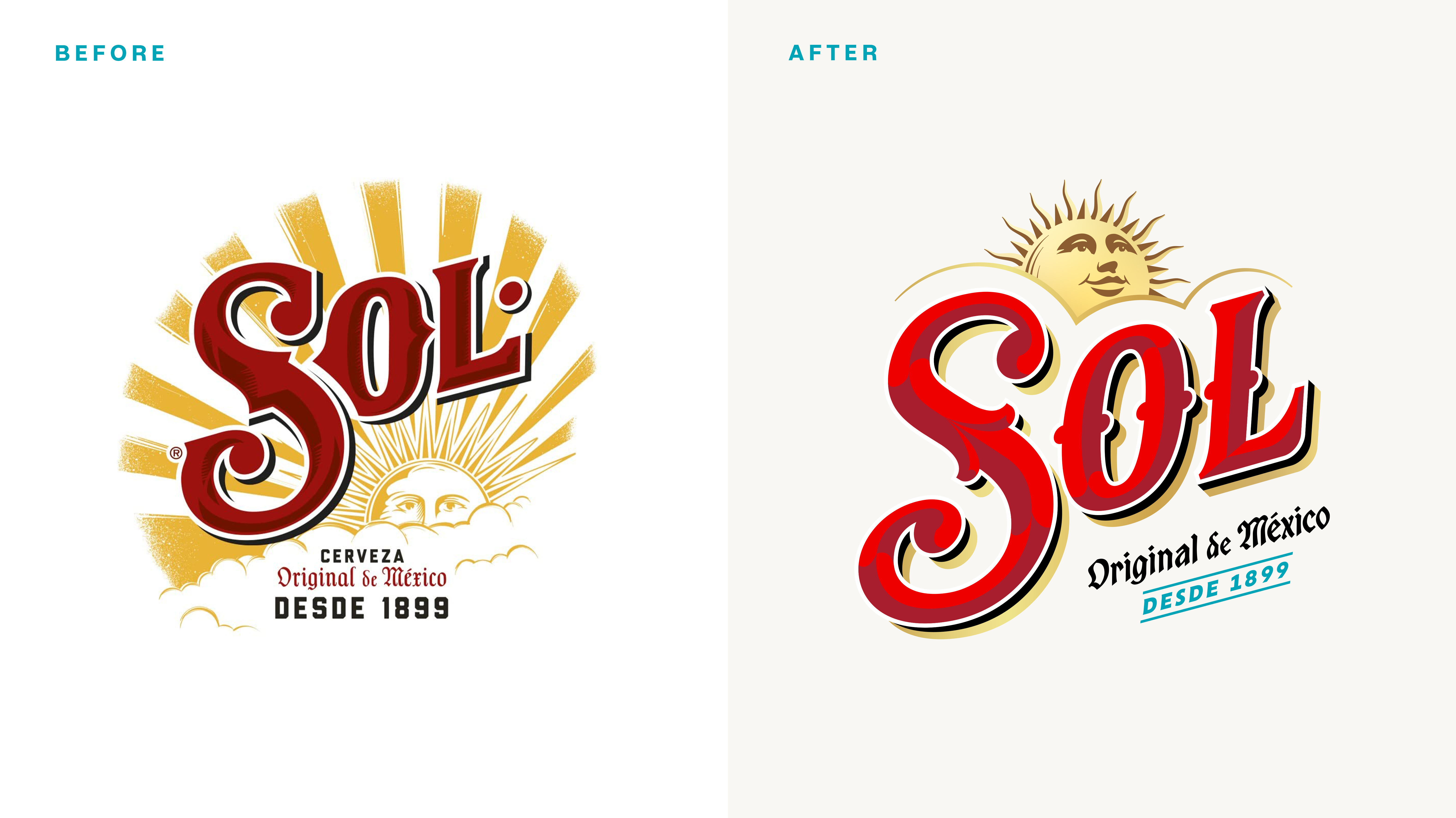
Teaming up with acclaimed illustrator and lettering artist Tobias Hall, all key design elements on the bottle label were given a visual refresh. Inspired by Sol's creative archive, the new wordmark evokes the lettering of its historic labels, breathing new life into Sol's rich design roots. Custom typography also takes inspiration from ornate archive labels, while the illustration of the Paris Exposition gold medal won by the brand in the early 1900s has also been given a contemporary revamp.
"The young adult consumer expects brands to be authentic, culturally relevant, and visually compelling,” says Eve Warren, design director at LOVE. “Leaning into young adults’ appreciation of ‘newstalgia’ (using the past to inspire something new), we dialled up Sol’s heritage, presenting it in a fresh, modern and more premium way.”

Tied back to its Mexican roots, the sun icon has been elevated to show its full face, reflecting the brand's joyful and optimistic new positioning. A vibrant new colour palette elevates the brand's signature red and gold, while the introduction of teal evokes a breezy, blue sky vibe that creates both playfulness and a luxe appeal.
But it's not just the visuals that have changed. Sol's rebrand is just as much a shift in attitude, honing in on its consumers to shape its identity. “By focusing on design that is both emotionally resonant and commercially impactful, we aim to set Sol apart from competitors", Warren adds. "The new identity marks a bold return of Sol’s authenticity and heritage, shaped for young adult beer drinkers.”
For more design inspiration, check out the Affinity rebrand or take a look at Soho Radio's rebrand that nails the sticker book aesthetic.