Accenting every architectural detail in a crisp, bright white used to be the safe bet — sleek, reliable, and surprisingly versatile. But, "Now that approach often feels sterile and unfinished," says interior designer Lauren Saab. Should doors and trim be the same color in 2025? And if not, what should we be doing?
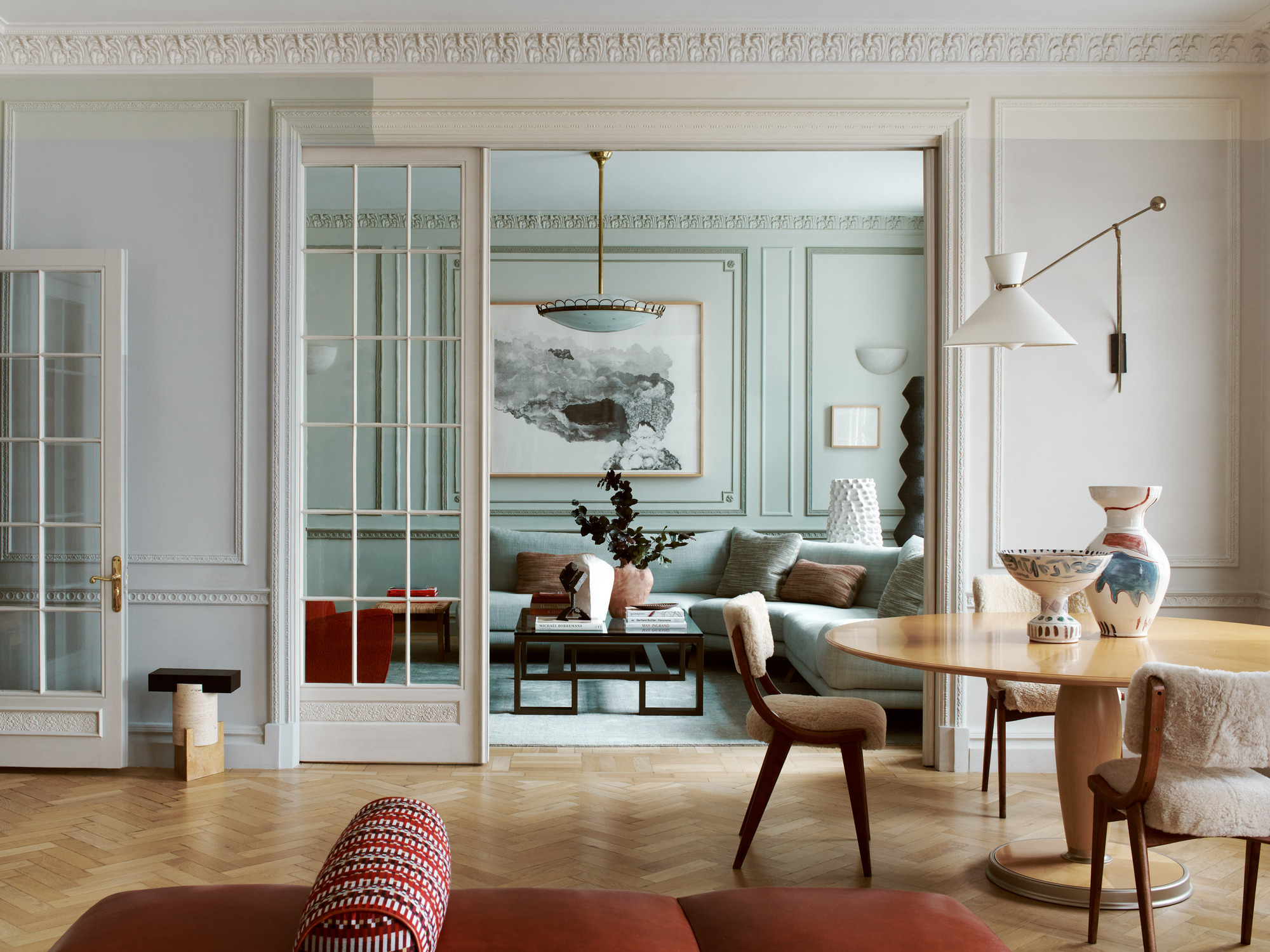
Trim and doors are no longer just background details in our interiors. Designers are using these features to sculpt perspective, sharpen palettes, and give rooms more visual structure. "When painted the same color, they create a quiet envelope that feels intentional and calm," explains Lauren. "When painted differently, they act like framing lines that pull focus and anchor the space."
So, whether you choose to match your doors and trim or make them contrast, the key is having intention. How much presence do you want the architecture to have in the space? What architecture do you have to highlight? Then, choose what color to paint your interior doors and trims accordingly. Let's find out what the designers are doing.
Should Doors and Trims Be the Same Color?
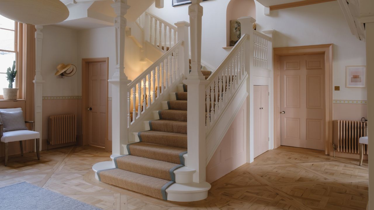
"Matching your door color to your trim color works best when the goal is quiet cohesion and the architecture can hold its own," says Lauren Saab. Typically, it's the more common approach. Just think about color-drenching — using the same color helps to create a certain visual harmony in a space.
This is a common design choice simply because millwork (like doors and trim) is crafted in the same or similar materials, making them an unspoken pair.
Using the same door and trim color ultimately creates a softer look, but that doesn't mean boring; you can still introduce bold colors or contemporary trends when matching the shades.
However, "When everything fades into the same shade, a room can start to feel flat and forgettable," warns Lauran.
"Contrast in design is where the magic happens. For instance, a darker trim can sharpen the architecture, and a painted door can pull the eye through a hallway."
Denver-based interior designer Peggy Haddad of Peggy Haddad Interiors adds that, "People are getting bolder and more playful with color trends, even in architectural details. Trim and doors are no longer an afterthought; they’re a design opportunity." Matching feels soft, contrast adds depth and definition.
How Designers Paint Doors and Trims in 2025
1. Bold Color Statements
So, if we're leaning away from painting wall trim white as the default, what should we be doing instead?
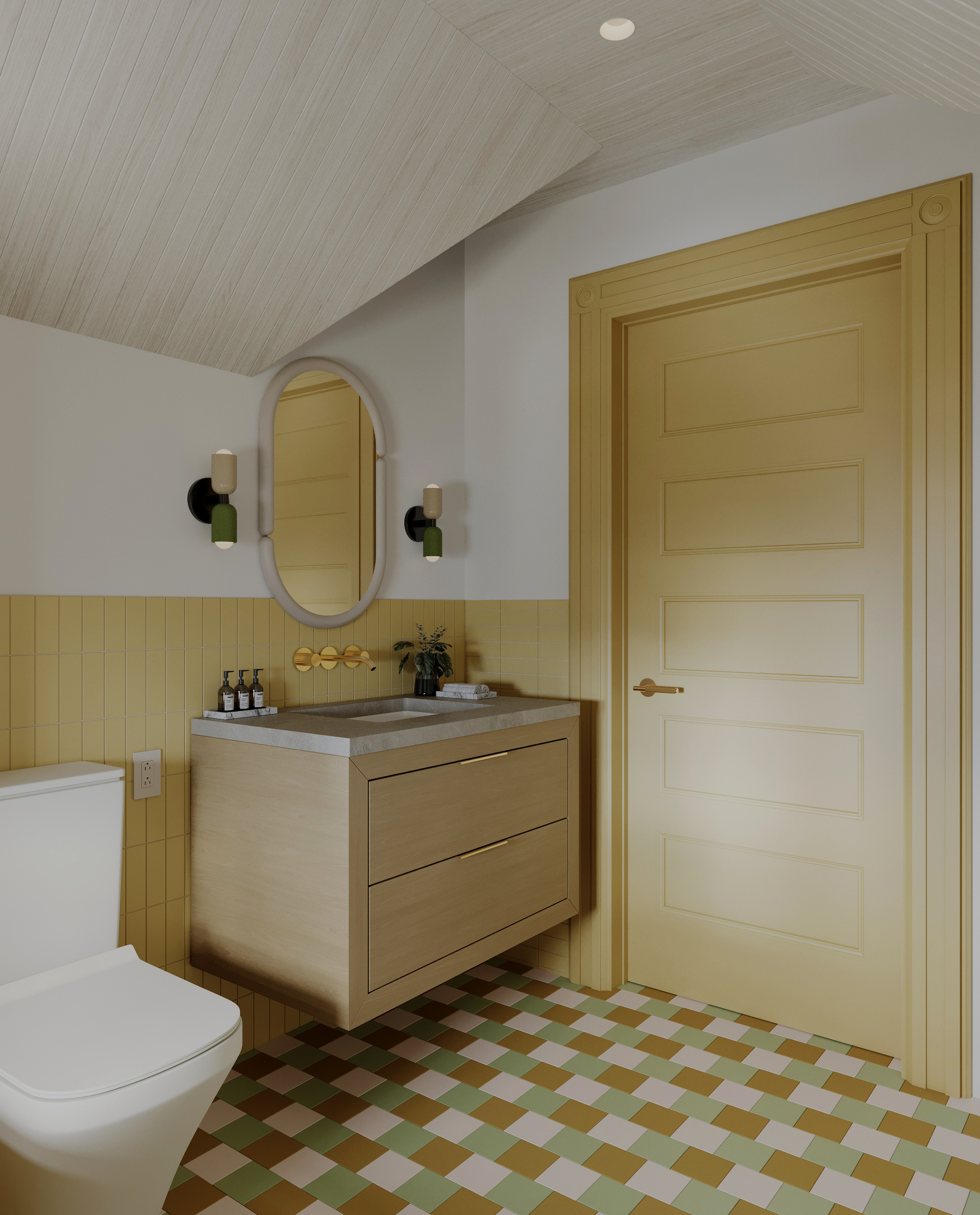
The details that used to disappear into the architecture are now doing the heavy lifting. Trim and doors frame the entire space, and going for a bold look (whether that's through decorating with saturated colors or unique tonal variations) will help your color scheme feel more contemporary.
When going the rich colors route, Lauren says, "Bold trim and bold doors can absolutely live together, as long as the materials or tones speak to each other. Matching them creates a sculptural envelope that feels deliberate and immersive, while separating them builds tension."
There is no wrong move if every surface is pulling its weight. Get experimental — the mistake is playing it too safe and fading into default. "When done with purpose, a contrast becomes a composition," adds Lauren.
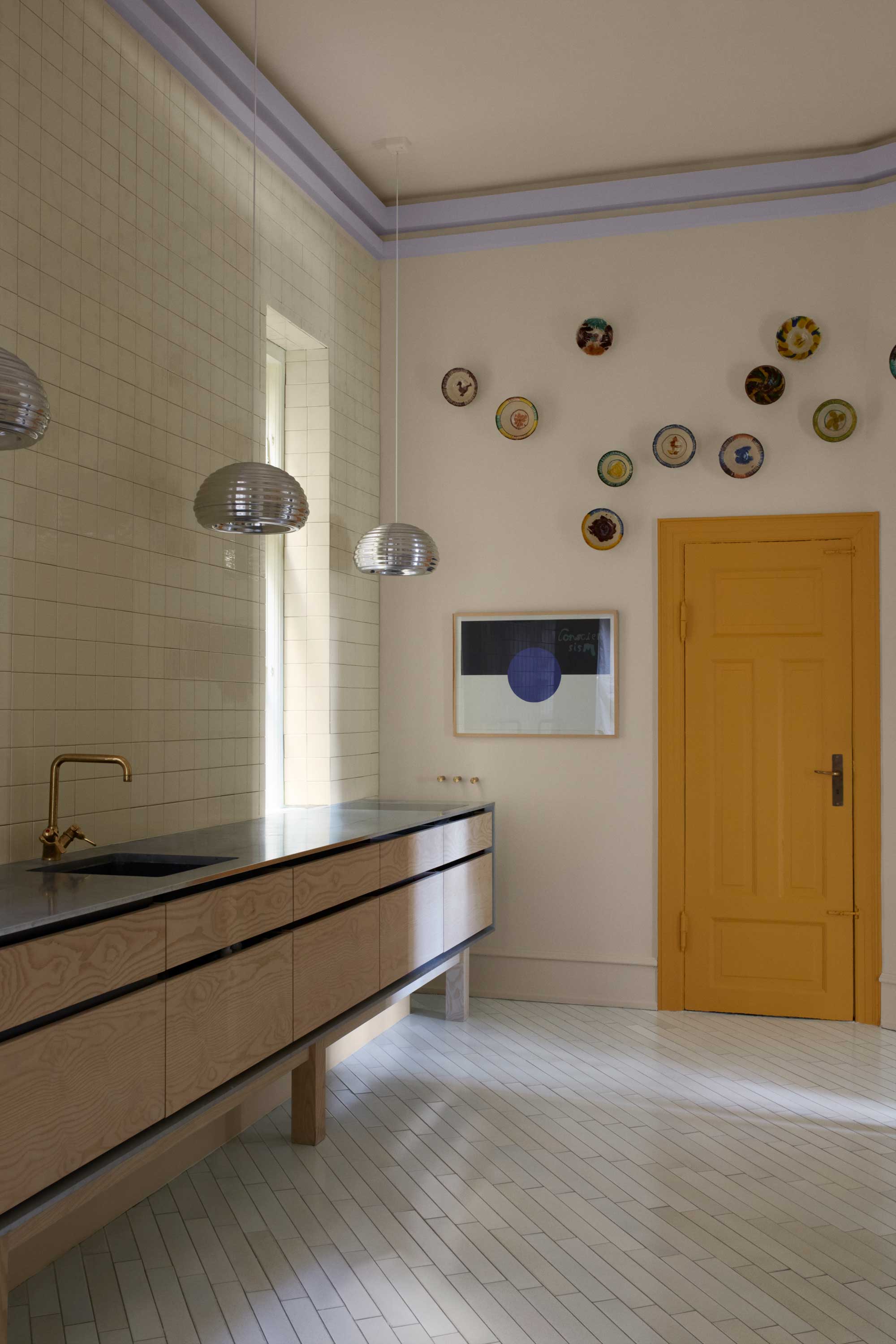
2. Interesting Materials and Curated Contrast
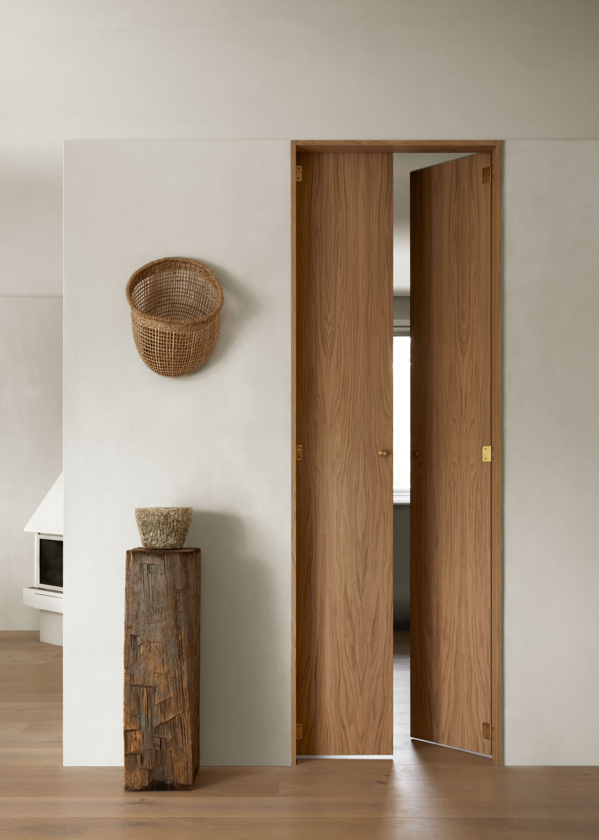
So, what are the best trim colors for 2025? White is quickly falling out of favor, and designers are replacing it with warm putty tones, inky charcoals, or natural wood finishes. These color choices still follow a neutral color scheme, but have that extra bit of flair that makes them more interesting.
Imagine a warm wooden door with a darker-stained trim or a rich charcoal-black next to a natural timber door — it's subtle yet stylish and playful.
"I just finished a project where the walls and trim were a warm off-white, and just the doors were the most perfect warm gray," says Peggy. "The contrast added subtle interest while still feeling soft and classic."
This warm, light gray would look stunning next to an off-white thanks to its subtle undertones.
I love the idea of contrasting wood stains between doors and trim. A dark wood stain always creates a stylish aesthetic.
You could also make your wooden trim more interesting with this DIY flat molding. This item comes with eight feet of trim.
3. Highlighting the Architecture
Another way to pair door and trim colors is to use the details to highlight certain features of the room that you want to stand out.
Jo leGleud from Maddux Creative says, "We often use varying hues of the same color for picking out architectural detailing such as a bead or trim on a panel." This technique gives the impression of increased depth within the panel or molding and adds interest to the space.
"Where the room is already quite busy, we might choose to keep the detailing matching, to allow other areas to be the focus," adds Jo. On the other hand, suppose the panelling is particularly intricate or warrants the drawing of attention. In that case, "you could add other colors to carry the light or a strong contrasting color which feels more playful," Jo continues.
This light purple paint is a fun twist on a classic color scheme. Pair it with other pastels for a modern take on traditional design.
Pointing is one of Farrow & Ball's most popular neutral colors and is a great alternative to stark white.
This sage green keeps things light while bringing in a hint of the natural world.
Whether you choose a matching trim and door moment or a color statement that pops, the key to getting it right lies in expressing your style. The biggest design mistake you can make is sticking to the 'rules'. And the same ethos can be applied to whether your trim and ceilings should be the same color.