While Scandinavian interiors are known for their clean lines, natural materials, and a general focus on simplicity, the colors used in these spaces serve as endless inspiration. If you enjoy colors that feel as calming as they do timeless, then Scandinavian color palettes are for you.
“Scandinavian-style interiors have a sense of balance and elegant simplicity that often features desaturated shades and off-whites," explains color expert Dominic Myland. "Muted colors and light-reflective tones bring a sense of space and calm to any room."
In addition to the soothing neutrals often seen in Scandinavian design, more colorful tones such as earthy greens, blues, and rust tones feel equally evocative of this style. To help you bring this tranquil and understated aesthetic into your own home, we've found four Scandinavian color palettes to inspire you.
1. Lights Neutrals With Touches of Green
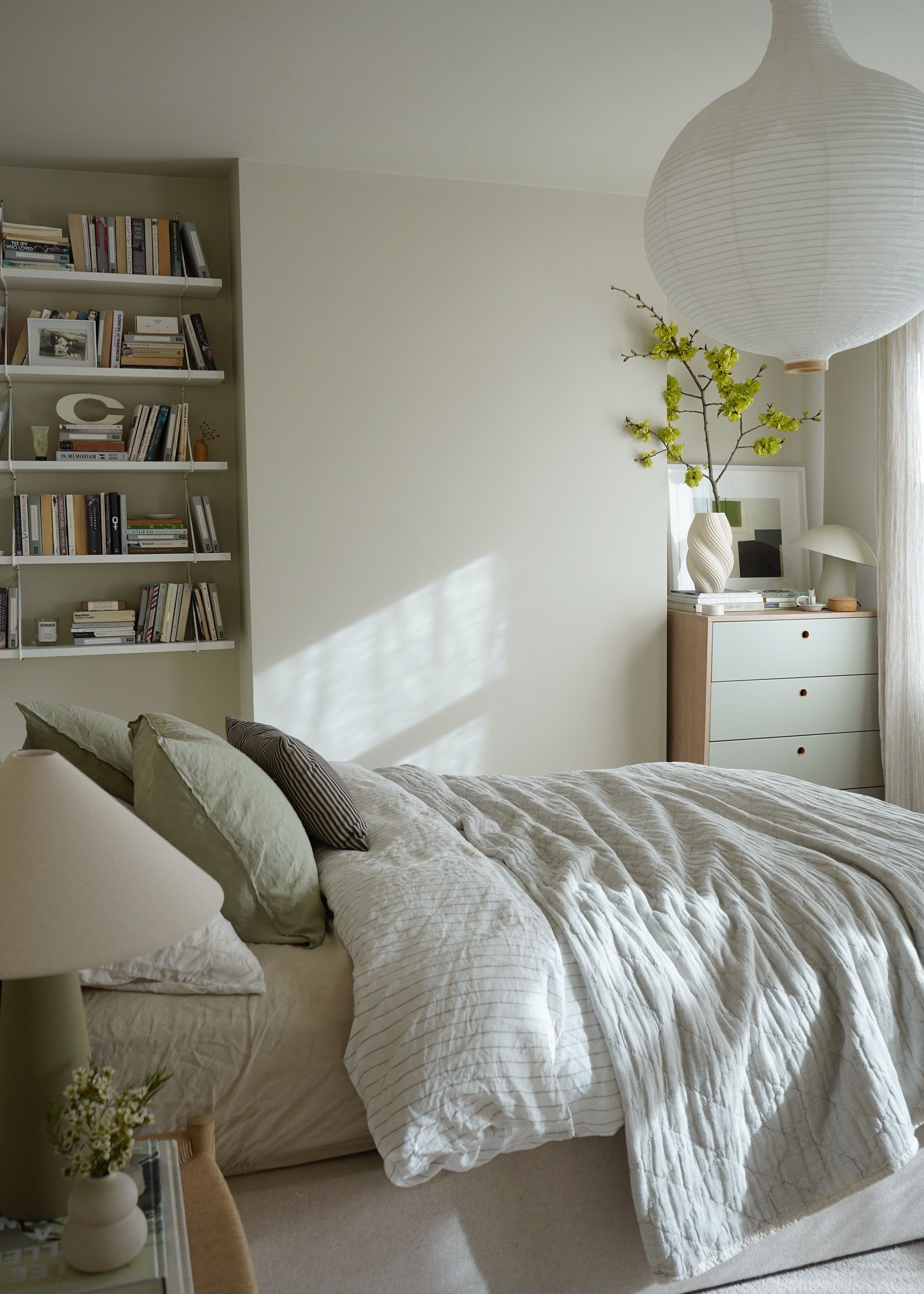
Perhaps the most iconic of all the Scandinavian color palette variations, an array of light neutrals complete with accents of muted green feels reflective of the understated and calming nature of the style. While light neutrals achieve a bright and airy look, pops of green nod to nature and bring warmth to the palette.
The work of London-based interior designer Cate St Hill perfectly encapsulates the simplicity of Scandinavian color palettes, such as in the pared-back bedroom above. "I like to use the walls in a space as a neutral backdrop, then allow any furniture, accessories, or art to bring the color and add life to the room," she says.
Amongst the calming neutrals that feature throughout her own home, Cate says that green is the accent color she's most drawn to. "I can’t seem to get enough of it," she adds.
While decorating with neutrals provides a backdrop for your room — think soft grays and warm whites — muted shades of green paint add interest. That said, for a more subtle look, take inspiration from Cate and incorporate green through decor. "I love adding color with lamps, cushions, bedding, and plants," she says. "Green feels restorative and uplifting, helping to prevent any neutrals from feeling flat or boring."
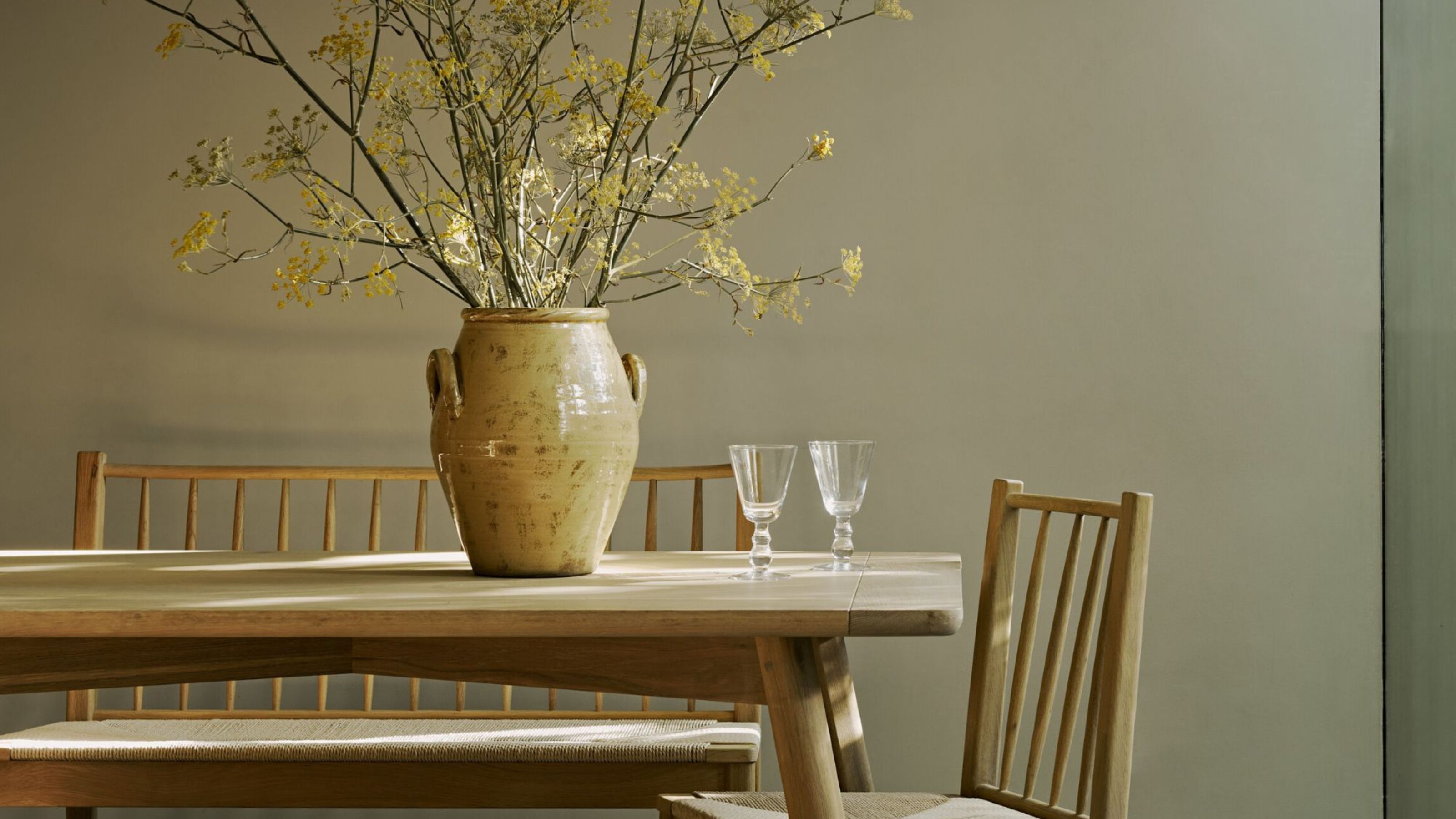
2. Layered Shades of Warm and Earthy Neutrals
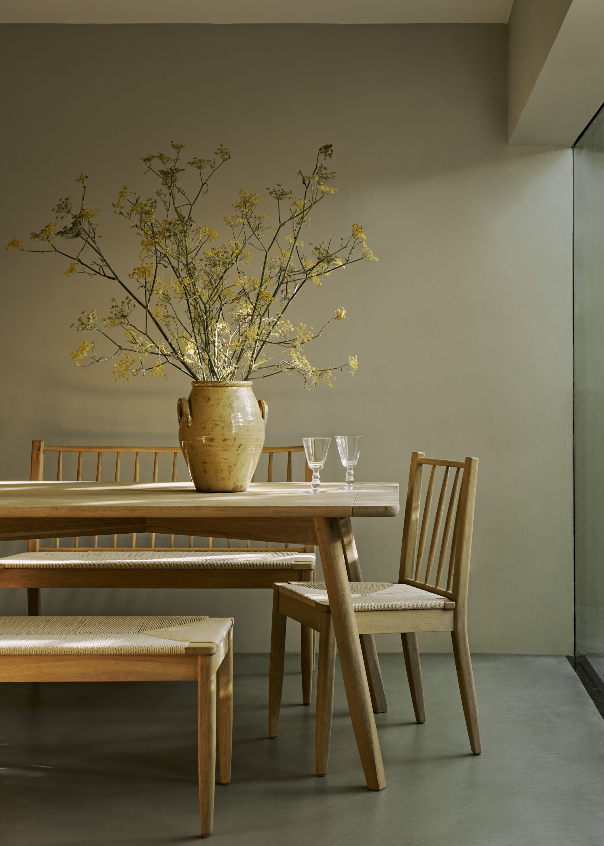
This Scandinavian color palette continues to reflect the simplicity of neutrals but comprises richer and earthier tones. Reflecting the hues we associate most with nature, a palette of rich neutrals — think warm sand tones and earthy taupes — creates calming spaces with depth. While this color palette is timeless in its own right, experts say the key to its success lies in the use of texture design.
"Scandinavian style has quiet confidence — it’s all about creating calm, considered spaces using tranquil colors, natural textures, and timeless materials," explains Fred Horlock, design director at Neptune. "Pale woods, muted whites, soft grays, and the occasional inky blue or sage green form the foundation, but it’s the tactile elements — raw linen, natural oak, woven rush — that bring it to life. In interiors, texture carries as much weight as color, grounding the space in nature and creating a sense of serenity."
This dining space, painted with Neptune's Driftwood (a rich putty shade), is brought to life through the various earthy textures, from the wood tones and woven bench to the glazed ceramic vase. To elevate this Scandinavian color palette further, use warm white paints as an accent color, whether on the ceiling or trim, to provide the right amount of lightness.
3. Off-Whites With Burnt Orange
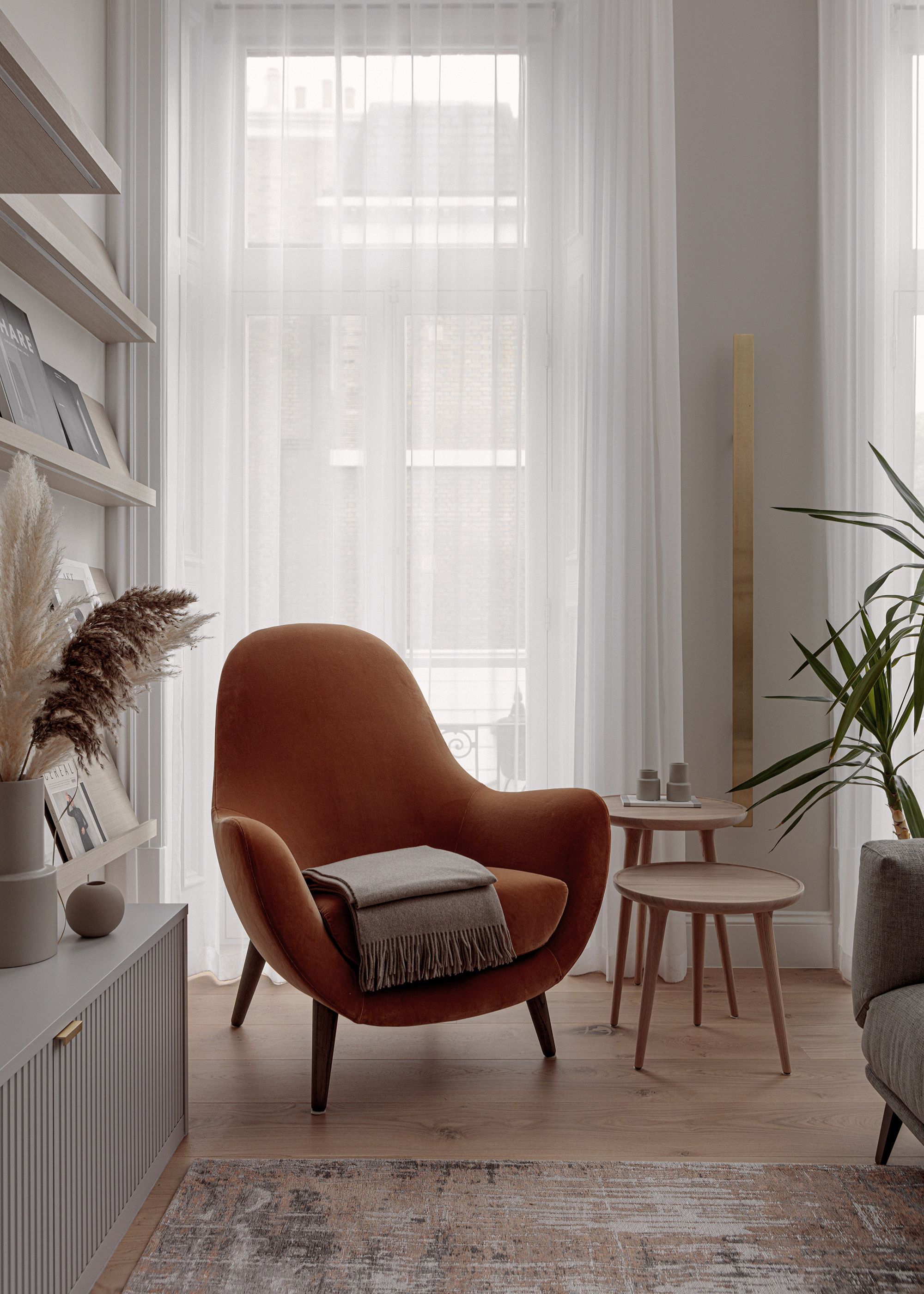
An array of off-white forms the base of this Scandinavian color palette, while muted orange tones add interest and warmth. Creating a more crisp and modern feel, this palette celebrates the beauty of decorating with white.
While it's easy to rule out richer shades in favor of an all-neutral scheme when designing with a Scandinavian color palette in mind, this living room proves that bolder colors can be used, but choosing the right tone is important.
"By using muted tones, the overall atmosphere remains calm and balanced," observes interior designer Kashi Shikunova, director at YAM Studios. "The deep burnt orange adds a layer of warmth, enhancing the soothing and warm atmosphere that’s typical of Scandinavian interiors."
This Scandinavian color palette is complete with wood tones, which ensure the use of white doesn't feel stark and provides a link to the warmer burnt orange accent color.
4. Calming Shades of Blue
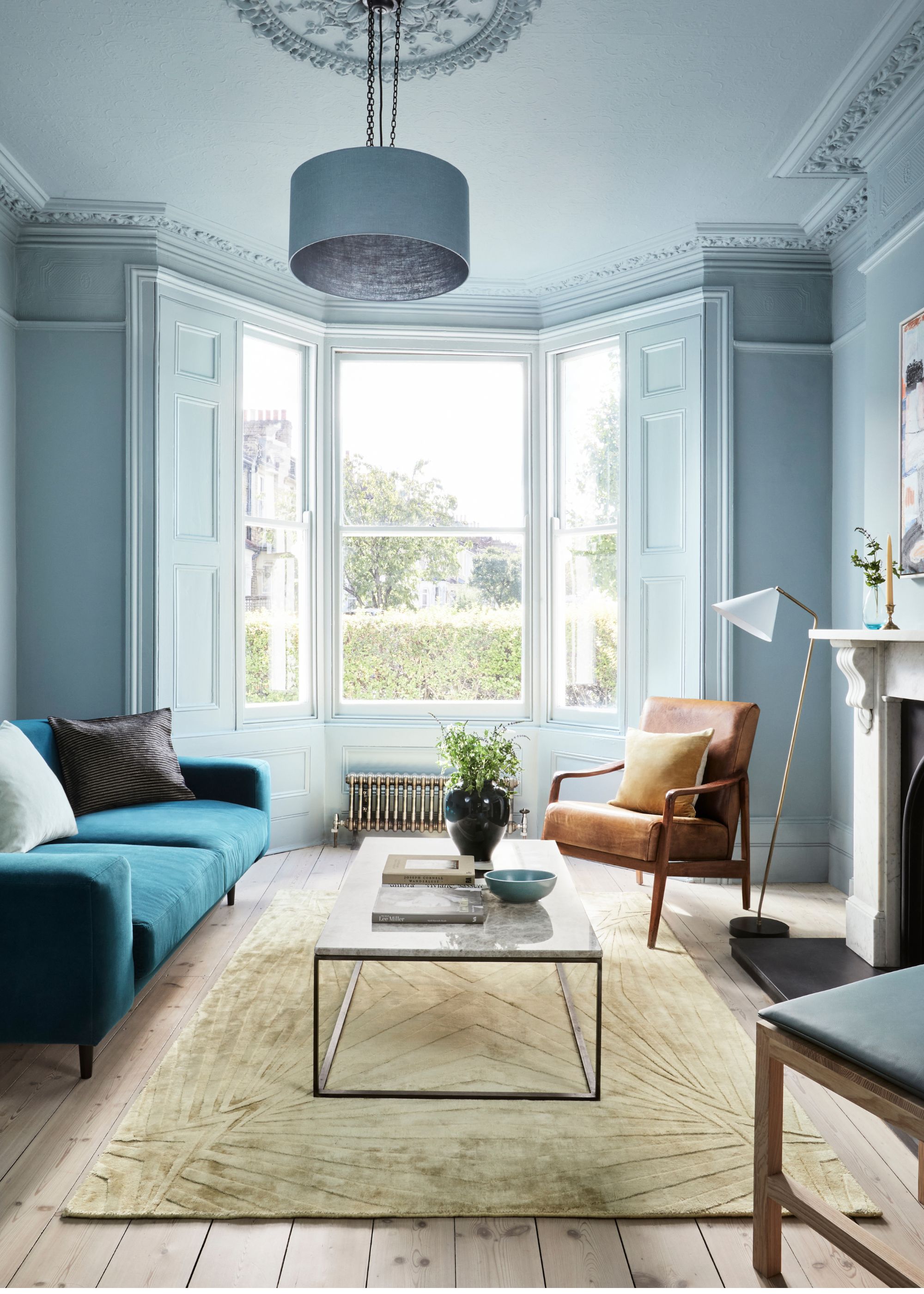
Scandinavian color palettes aren't just about neutral rooms with pops of color. A thoughtfully chosen blue paint, used to color drench a room, creates a deeply tranquil space that still feels aligned with the natural world.
Here, Mylands' Long Acre No.102, a soothing blue-gray paint, coats the room, while darker blue accents through the furniture add depth. The key here is to use your chosen shade of blue paint to fully coat the room, including the ceiling, woodwork, and even the doors, to create a cohesive space with no harsh contrasts.
"These soft colors help open up interiors, working especially well in smaller or low-light spaces by creating an airy, harmonious atmosphere," notes Dominic Myland, of paint brand Mylands.
While a light and airy blue is a gentle way to bring more color into your Scandi living room, you can also take this idea darker, says Dominic. "Stronger colors can be seen in Scandinavian interiors. Some personal favorites of mine are Forest and Stockholm from The Dependables, our collaborative collection with Beata Heuman; they feel modern and classic at the same time," he adds.
Calming colors are the grounding base of Scandinavian-style interiors, whether that's light neutrals or muted blues and greens. These hues are timeless and celebrate the focus on simplicity in Scandinavian interiors.
Once you've decided on your preferred color palette, focus on adding decor with minimalist forms and clean lines from the best Scandinavian design brands to complete your scheme.