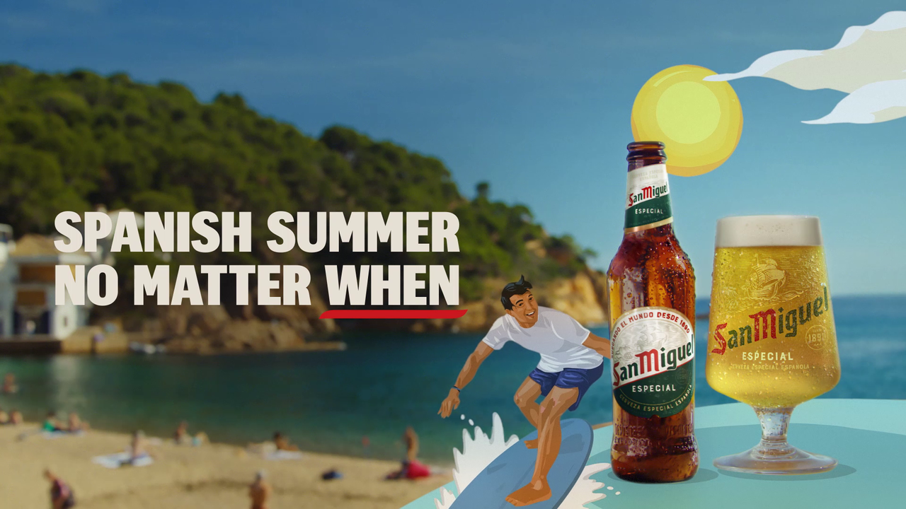
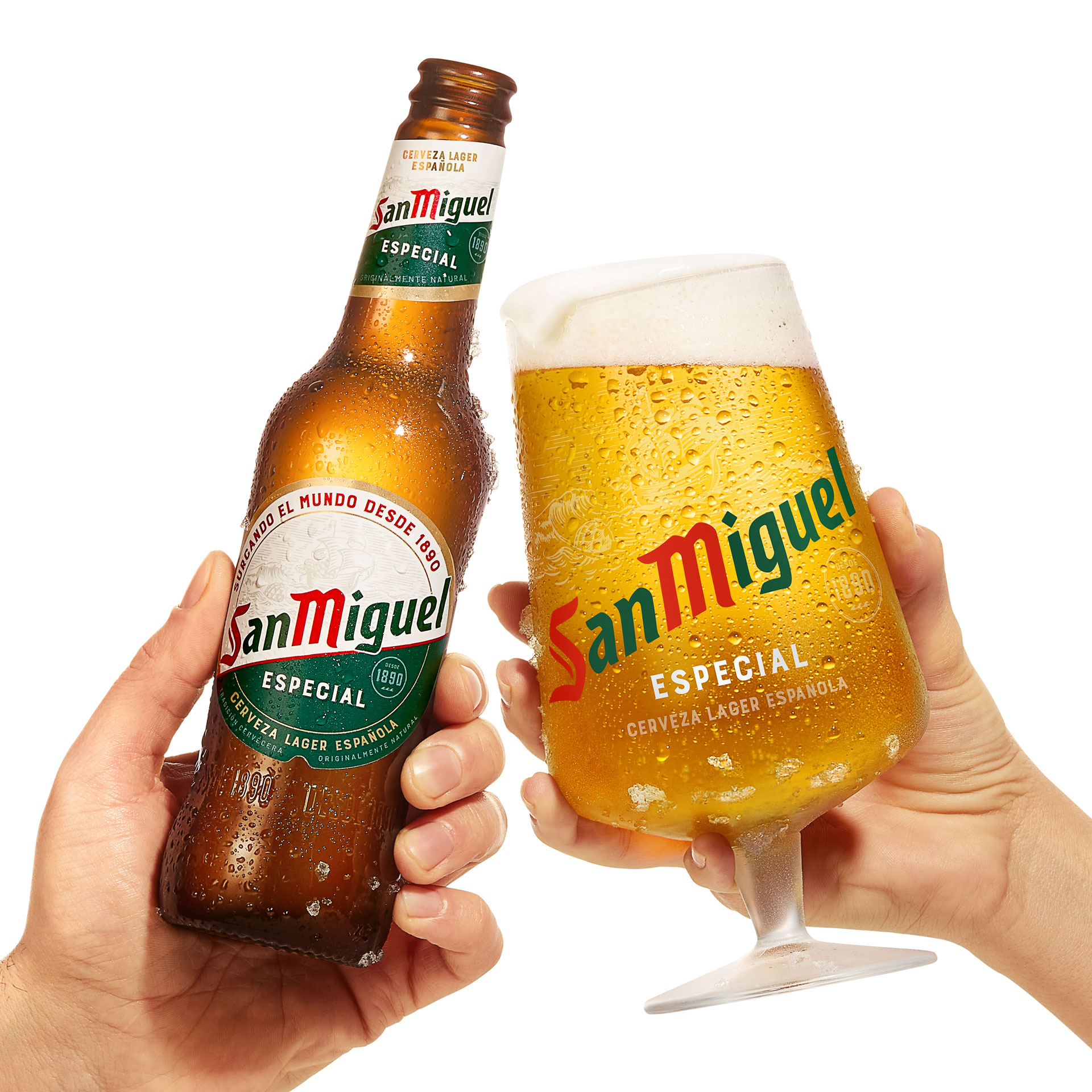
As the clocks change in the UK, hotter days are around the corner. And capitalising on those sunny feelings is beer brand San Miguel, which has recently been redesigned for the first time in a decade. The new look has been developed to help aid brand recognition, visibility on the shelf and reinforce the beer's premium positioning.
San Miguel has also relaunched its campaign, 'Spanish Summer, No Matter When'.
But this isn't one of those logos that's been designed on vibes alone. The new packaging was developed using your bog standard consumer insight plus neuroscience tools. These included EEG and eye-tracking technology, which tracked the way users interacted with the brand in real shopping environments. This is the first time I've heard of such technology being used, even among the best rebrands or the best logos of the 2020s.
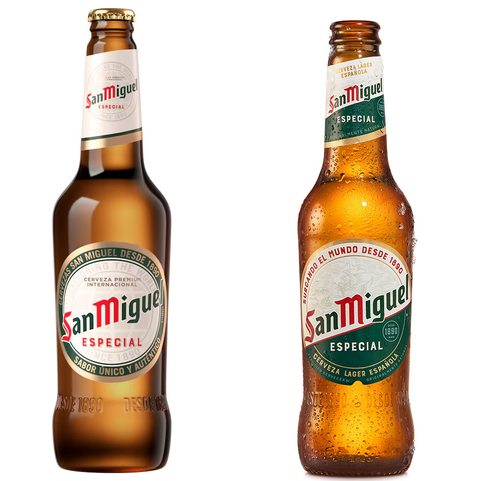
While the differences between older packaging and this new look aren't huge, there are subtle variances. The green has been leant on more in the new packaging and I think the whole thing looks a bit slicker.
The results have been effective too. According to testing, the new design delivers stronger emotional response, improved perceptions of 'premiumness' and higher brand recognition compared to previous designs.
The new look is being rolled out across Europe, including its home market, Spain, and the UK.
“San Miguel has been part of the UK market for over 30 years and is strongly associated with Spanish sunshine and holiday moments," says Sunny Mirpuri, partnerships director at Budweiser Brewing Group. "With the relaunch of Spanish Summer and the introduction of our refreshed packaging, we’re reinforcing those cues as we head into the key trading period for the category."
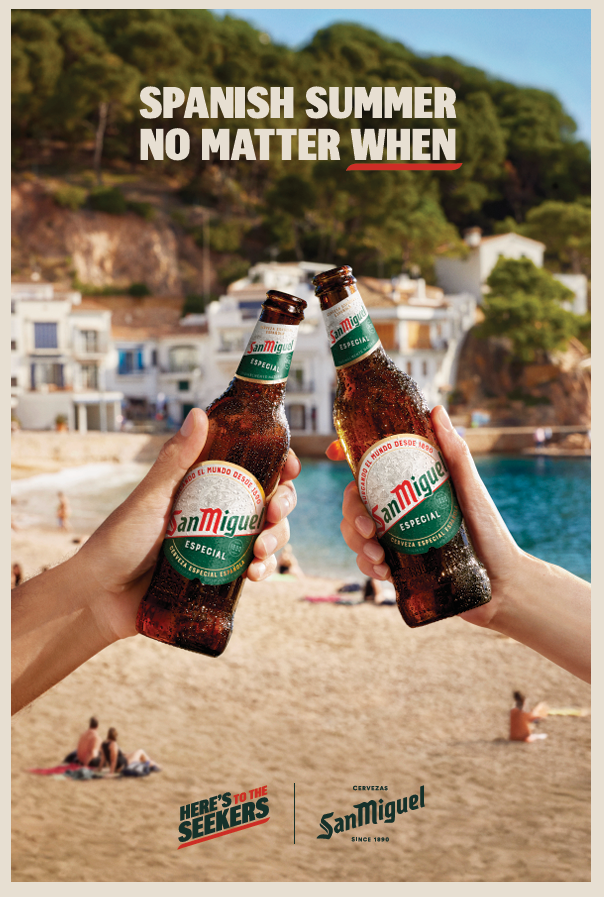
Ed Hussey, senior brand manager for San Miguel UK, says: “The clocks going forward consistently marks a shift in consumer behaviour. It’s the moment when we start making more spontaneous plans, meeting friends after work and returning to outdoor social occasions. For many, it genuinely feels like the unofficial start of summer.”
For more on packaging redesigns, see the Warburtons new look.