In July 2013, HM Treasury announced that seven major lenders would release mortgage data for Great Britain’s 10,000 postcode sectors. The statement that this would help “highlight those more deprived areas where banks are often not willing to lend” seemed particularly promising because it had the potential to significantly increase transparency and hold banks to account. As a researcher who focuses on neighbourhoods, poverty and housing, I wanted to examine these claims to see if there were any obvious lending gaps in poorer areas.
The results show that there are lending gaps but also demonstrate that without full disclosure by the banks, it is impossible to say whether they are “not willing” to lend. Nonetheless, it appears that Nationwide and Santander lend most evenly across all area types, whereas Barclays and HSBC seem to focus on high income neighbourhoods (see London map below, for example).
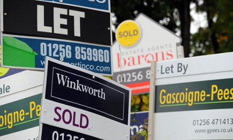
The new mortgage data covers nearly 75% of the market – roughly £900 billion – and seven different lenders: Barclays, Clydesdale and Yorkshire, HSBC, Lloyds, Nationwide, Santander and RBS. Two of these institutions received significant injections of public money during the financial crisis, but all seven agreed to publish details of how much they lend at the local level, which is a very welcome development.
When the data was released in December 2013 there was a lot of media interest, though it tended to focus on high value areas. For example, SW11 6 between Battersea and Clapham Common in South West London was reported to have the highest outstanding mortgage debt, at £649.4 million. With only 1,637 mortgaged properties, this is at least £400,000 of outstanding debt per household, but in reality the figure is probably much higher as the data do not cover the entire mortgage market.
This focus on rich areas is interesting enough, but it overlooks a long tradition of academic and policy research that examines financial exclusion in poor neighbourhoods. The most famous studies of this kind come from the United States and focus on the “redlining” of poor areas as a way of denying credit to poorer African American residents.
The racial and social dimensions are different in the UK but I wanted to examine the extent to which patterns of lending vary between institutions and whether any particular banks appear “not willing” to lend in more deprived neighbourhoods. For this, I used mortgage lending statistics in combination with Census data on socio-economic status.
I compared the eight main categories in the Office for National Statistics Socio-Economic Classification to the lending patterns of the seven banks. The ONS classification goes from group 1 (‘higher managerial’) to 8 ‘(long-term unemployed’) and serves as a reasonable proxy for income and class, but of course is not perfect. Even so, the results in the table below are quite revealing.
The figures indicate the strength of the relationship between the percentage of persons from each social group and the percentage of lending coming from each institution. The strongest correlations (above 0.5 or below -0.5) are highlighted.
Correlations between area classification and lending share, by institution
When you compare the percentage of people in each broad social group to the percentage of lending from individual institutions, clear patterns emerge. For example, when the share of “higher managerial” employees in an area is higher, the lending share from HSBC is much higher. The same appears to be true of Barclays. Conversely, when the percentage of long-term unemployed persons is higher, the lending share from Lloyds is higher.
This may be interesting, but of course it doesn’t tell us why these relationships exist. As any half-decent statistician will tell you, “correlation does not equal causation”. Therefore, I tried to dig a little deeper into the data.
The next thing I did was focus on Liverpool, an area of the country with a relatively high share of deprived neighbourhoods. I looked at all postcode sectors in the L postcode area and then focused on lending in areas with a higher proportion of poorer residents. What I found is that both Barclays and HSBC appear to lend disproportionately less in poorer Liverpool postcodes. RBS and Santander lending in these areas was about the same as their national average. However, all of this might be skewed by other factors, such as application volumes, branch locations, and of course house prices.
So I went one step further and explored HSBC lending patterns in relation to house prices (using data from HM Land Registry). For this, I plotted lending against house prices for all Liverpool postcodes and then just in the poorest areas (using the ONS classification). The results suggest that in poorer areas of Merseyside HSBC lend differently and that the link between house prices and lending from HSBC is very weak in more deprived neighbourhoods, in contrast to the Liverpool postcode area as a whole. Nationwide, by contrast, appear to lend in the same way across all Liverpool postcodes, rich or poor.
What are we to conclude from this brief analysis? That some banks lend differently in different areas? That some banks don’t lend much in poor areas, or assess risk in different ways? Perhaps, but none of this should be news to us. The key point is that the current data release don’t really tell us that much beyond what we’d already expect. As the late US finance professor George Benston noted in 1979 when writing about redlining, “when demand is not accounted for, there is no way to determine the reasons for any given level of supply”. His subsequent statement that in the absence of this data “the most that can be demonstrated is that a particular lender serves an area differently” seems particularly apposite, and in the context of the new data, pretty frustrating.
In light of the analysis reported here, the claim by the Treasury that the new data “will provide significantly more detailed disclosure than in the USA” seems rather far-fetched since we don’t have any information on mortgage applications, loan types, property types, levels of approval, ethnicity, gender, or the income of borrowers, as they do in the United States under the provisions of the Home Mortgage Disclosure Act of 1975. This means that we certainly can’t make any robust claims relating to financial exclusion or “redlining” from the data we currently have, welcome though it is.
The solution to this rather opaque situation is in theory quite simple and was advocated by Friends Provident in 2012, four years after the financial crisis. Rather than the voluntary disclosure system we have now, we need a statutory approach to banking transparency if we’re serious about accountability and transparency. As noted above, such an Act has existed in the United States since 1975 and although it’s not perfect, it does provide a level of detail beyond what we currently have and helps identify, as the Treasury might wish, those areas where banks are “not willing” to lend. The new dataset is a very welcome development and I applaud the Treasury for making it happen but it doesn’t presently go far enough. My hope is that the gaps in the data will in future be filled in and that we can truly know which banks are “not willing” to lend in poor areas, and why that might be.
Alasdair Rae is a lecturer and researcher at the University of Sheffield in the town and regional planning department. @undertheraedar
Acknowledgement: thanks to Owen Boswarva for providing useful comments and to the Council of Mortgage Lenders.