When it comes to green, picking the right shade is key. While trend cycles can feel fleeting, sage green and olive are two variations of the color that we keep coming back to, boasting a certain level of timelessness. But, between these two well-loved tones, which feels the most relevant for 2026?
I spoke to interior designers to get their take: in short, olive green seems to be leading the way among green color trends for 2026. While sage green is certainly still a stylish choice for creating calm, muted spaces, many designers are currently decorating with olive green more, thanks to its richness, warmth, and earthy quality that ranges from vibrant mid-tones to much darker, moodier shades.
With the verdict settled (for now, at least), read on to discover the best way to style olive green in 2026 for the most design-led look, as well as designers' tips for bringing sage green up to scratch.
Why Designers Are Favoring Olive Green in 2026
There's a notable appeal for olive green right now — ranging from light variations that bring optimism and warmth, to richer tones that add moodiness. "I have been using rich olive tones in many of our projects lately," says Natasha Lyon of Appreciation Project. "This deep, earthy color can often elevate a space, instantly making it feel cozy and calm."
For interior designer Cleme de Grivel, it's olive's ability to add depth that makes it feel more current than sage green rooms. "Interiors are moving towards richer, more characterful palettes and olive brings warmth, depth and sophistication while still feeling natural and timeless," she says.
OWL LONDON interior designer Iwona Budnik is also feeling more drawn to the darker shade. "Olive green seems like a holiday — a verdant Mediterranean garden we all wish we could escape to," she says.
The appeal of olive green also reflects a broader shift towards color confidence, with richer shades being embraced instead of defaulting to paler color schemes. "The softer greens have had a long run, but clients are becoming more confident with color, less interested in a safe backdrop, and more interested in making a statement," explains Greg Daulby, designer at Cor Domi. "Olive green rewards that confidence; it only really works when you commit to it. Sage isn't going anywhere, but olive feels like where the more interesting design conversations are happening right now."
One of the biggest differences between sage and olive green is that olive is a much warmer color. "Where sage is about light, olive is about warmth as there's yellow in it, which makes the color feel lit from within," explains designer Rachel Robinson, founder of Dunham Robinson. "I'm drawn to it in moodier, more grounded spaces: studies, snugs, hallways."
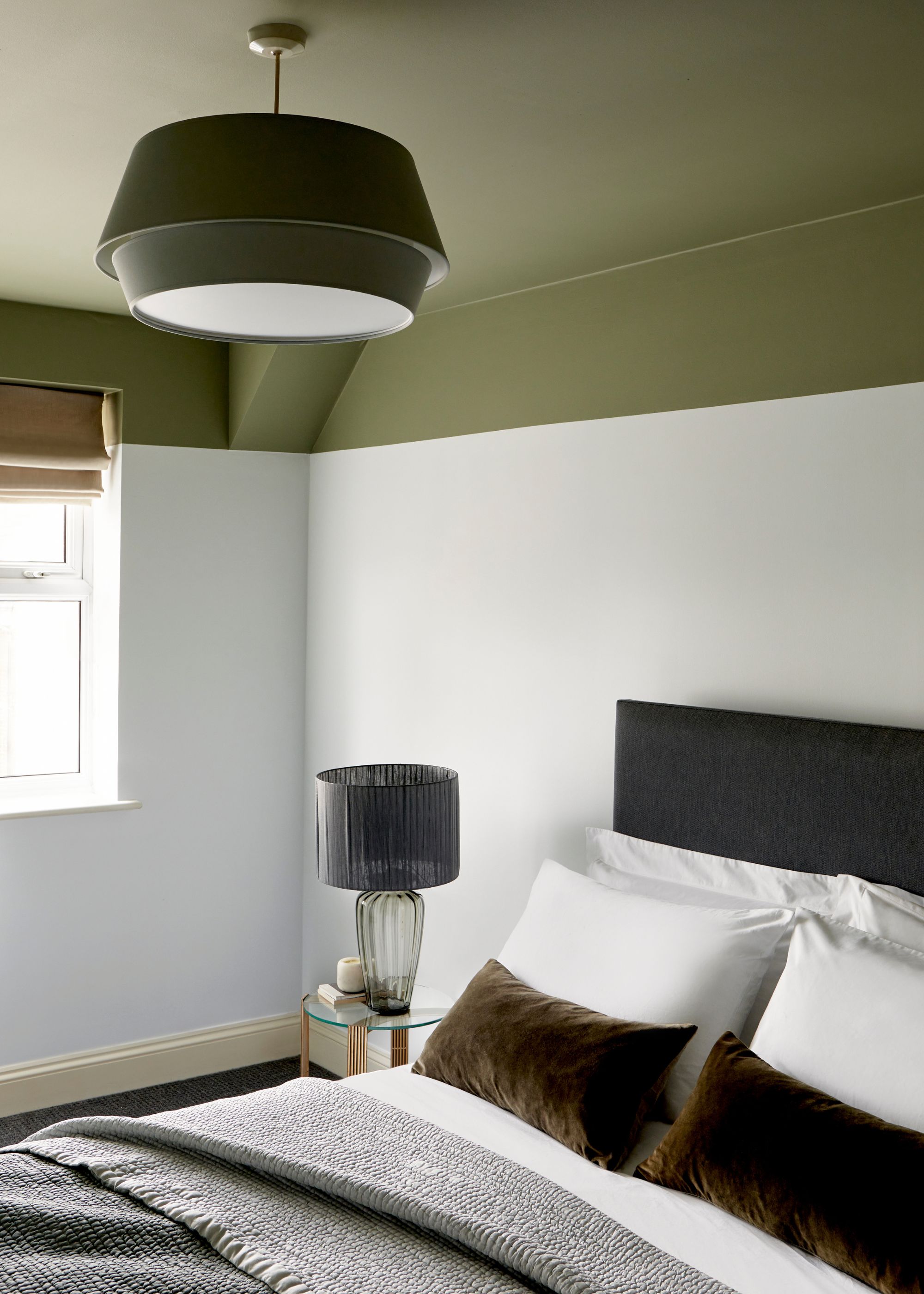
Because of its depth, it works especially well as a color to drench a room in, where it feels immersive and dramatic. "We love wall and ceiling color drenching, including applying the color on joinery to really set the scene," says Iwona.
This paint technique works especially well in smaller rooms, where it sets a cozy atmosphere. "Olive green has much more depth, so I’m naturally drawn to it for moodier spaces such as guest bedrooms, studies, or dining rooms, especially layered with brass, darker woods, and patterned textiles," adds Cleme.
Beyond paint ideas, this warm hue also works well as a decor color, alongside neutral walls. "Applying the color through block fabric on upholstery and contrasted with small pattern elements on cushions and lampshades will bring the scheme well together," Iwona adds.
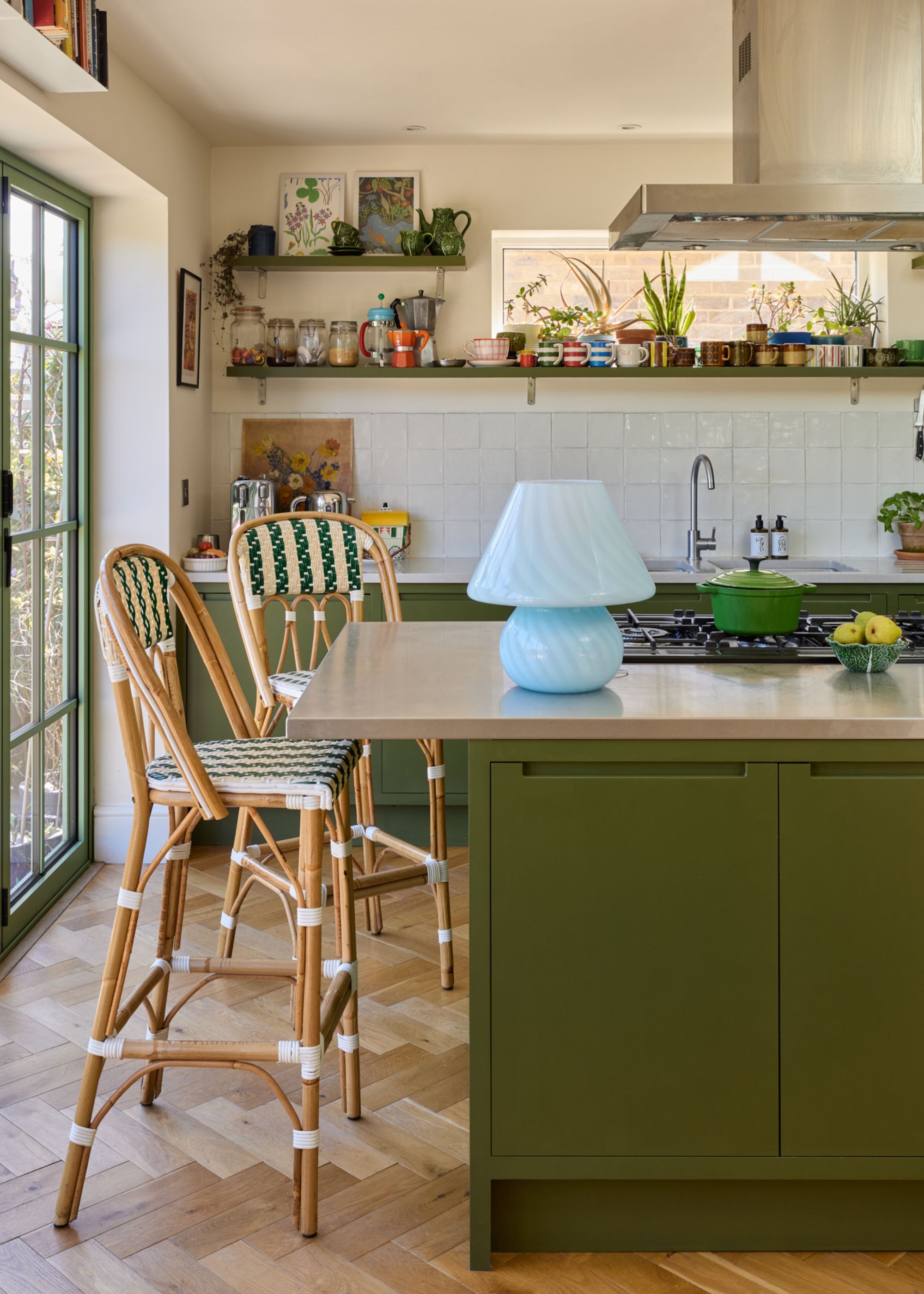
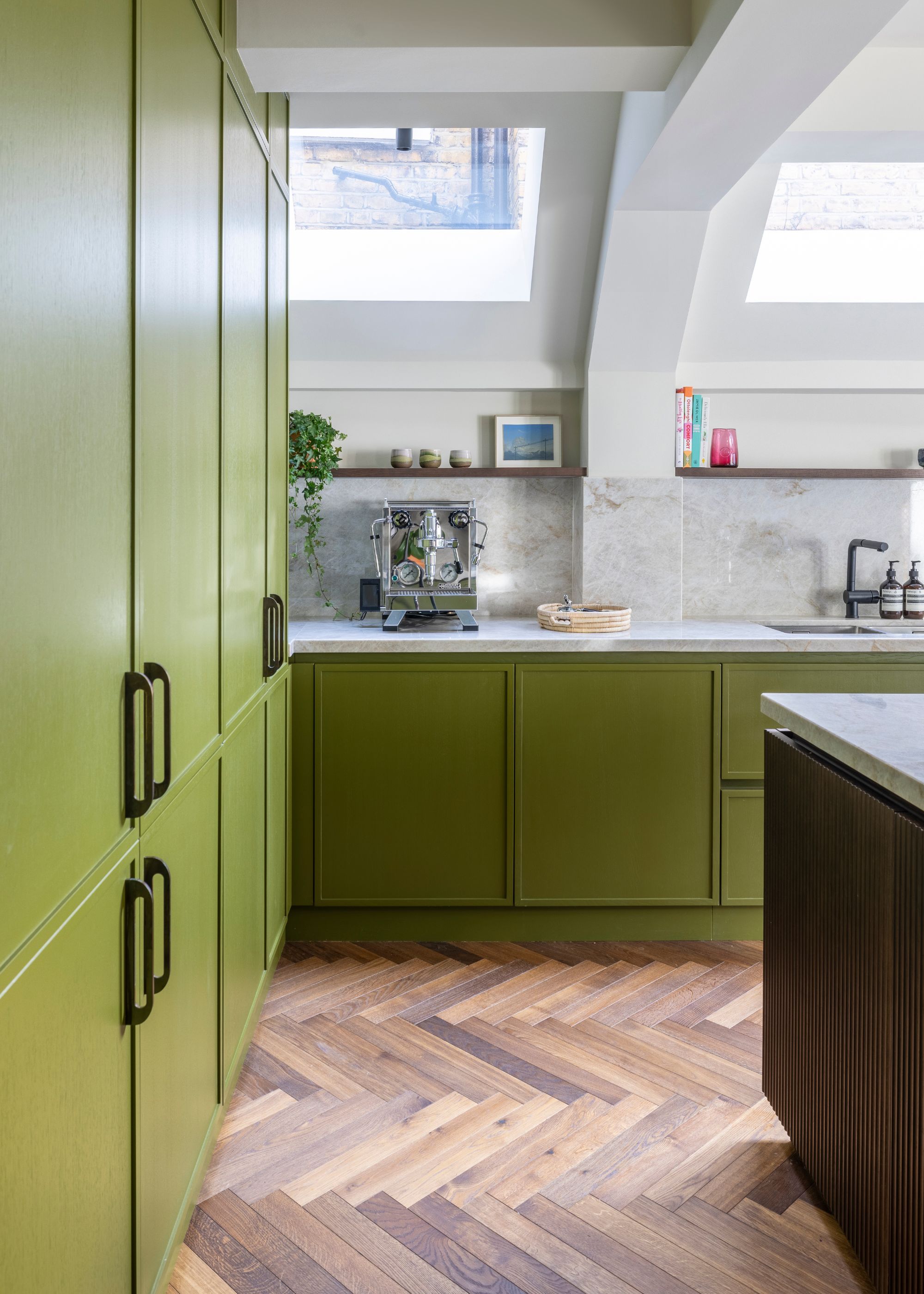
Olive also makes for a very design-led yet timeless kitchen color idea, especially when used alongside soft neutrals, for an elevated scheme. "I have used it in my own home and on several projects lately because it brings in tranquility to a space," says Natasha, who often uses olive green on kitchen cabinetry.
"It works particularly well when the kitchen opens onto the garden, pulling in the lush greens from outside," she adds.
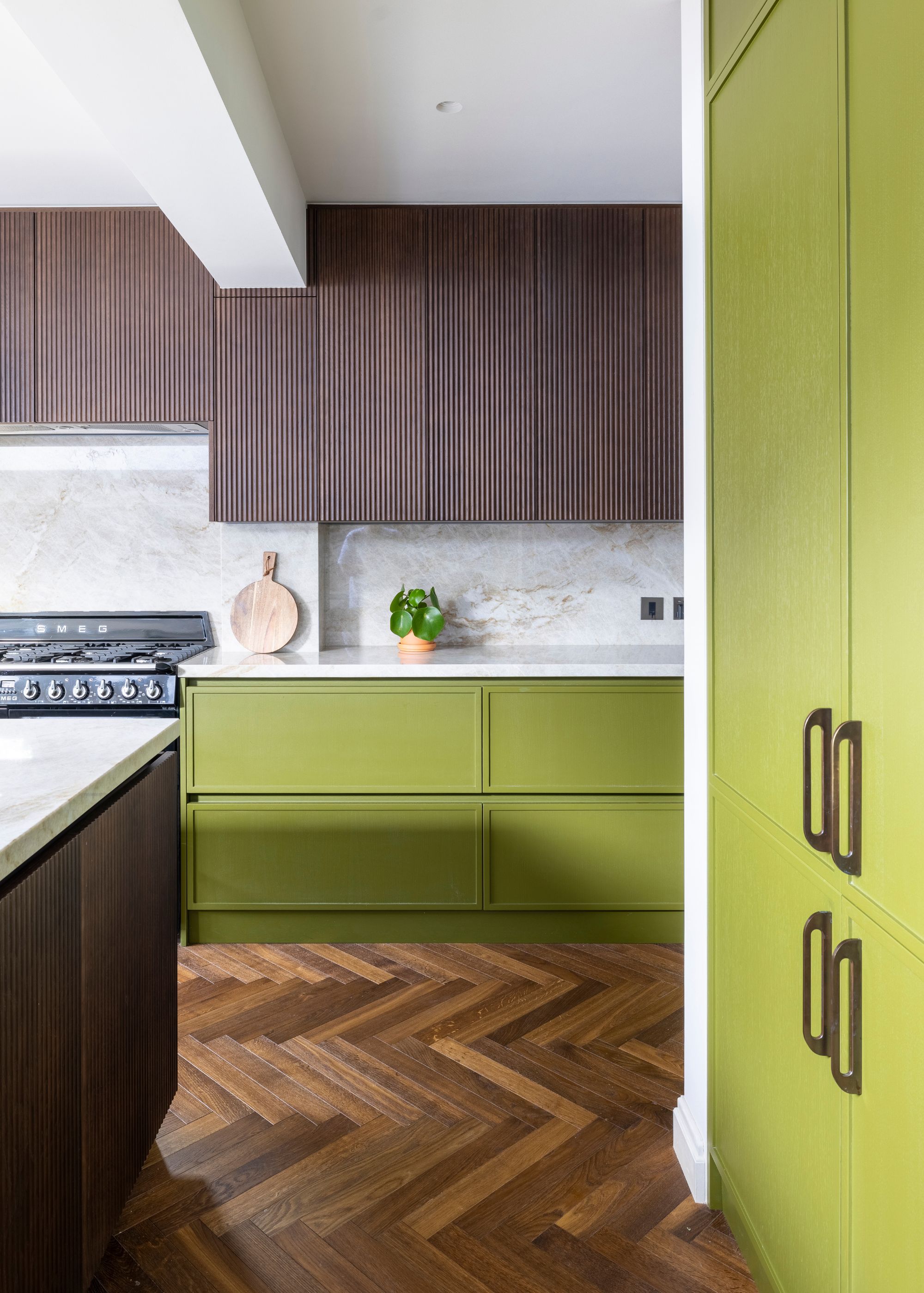
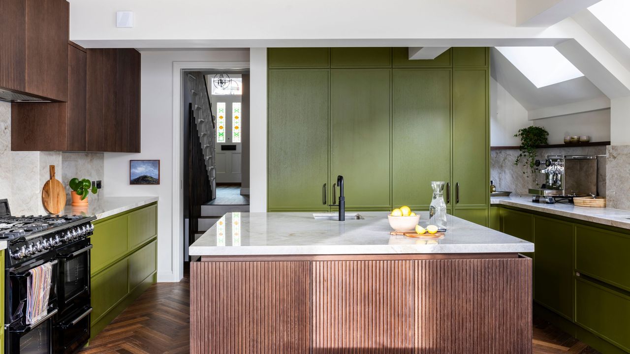
In this modern kitchen, a warm shade of olive brings energy to the space, while the dark wood tones add depth. "The tone grounds the space and gives it a real sense of identity," explains designer Greg Daulby. "The key with olive is balance; it needs natural materials and good light to stop it feeling heavy."
When it comes to the best natural materials to layer, designer Rachel Robinson recommends brass, tan leather, earthy terracotta, and clay. "The mistake to avoid," she adds, "is using olive as a half-hearted accent; it asks to be used in volume, confidently."
How to Style Sage Green in 2026
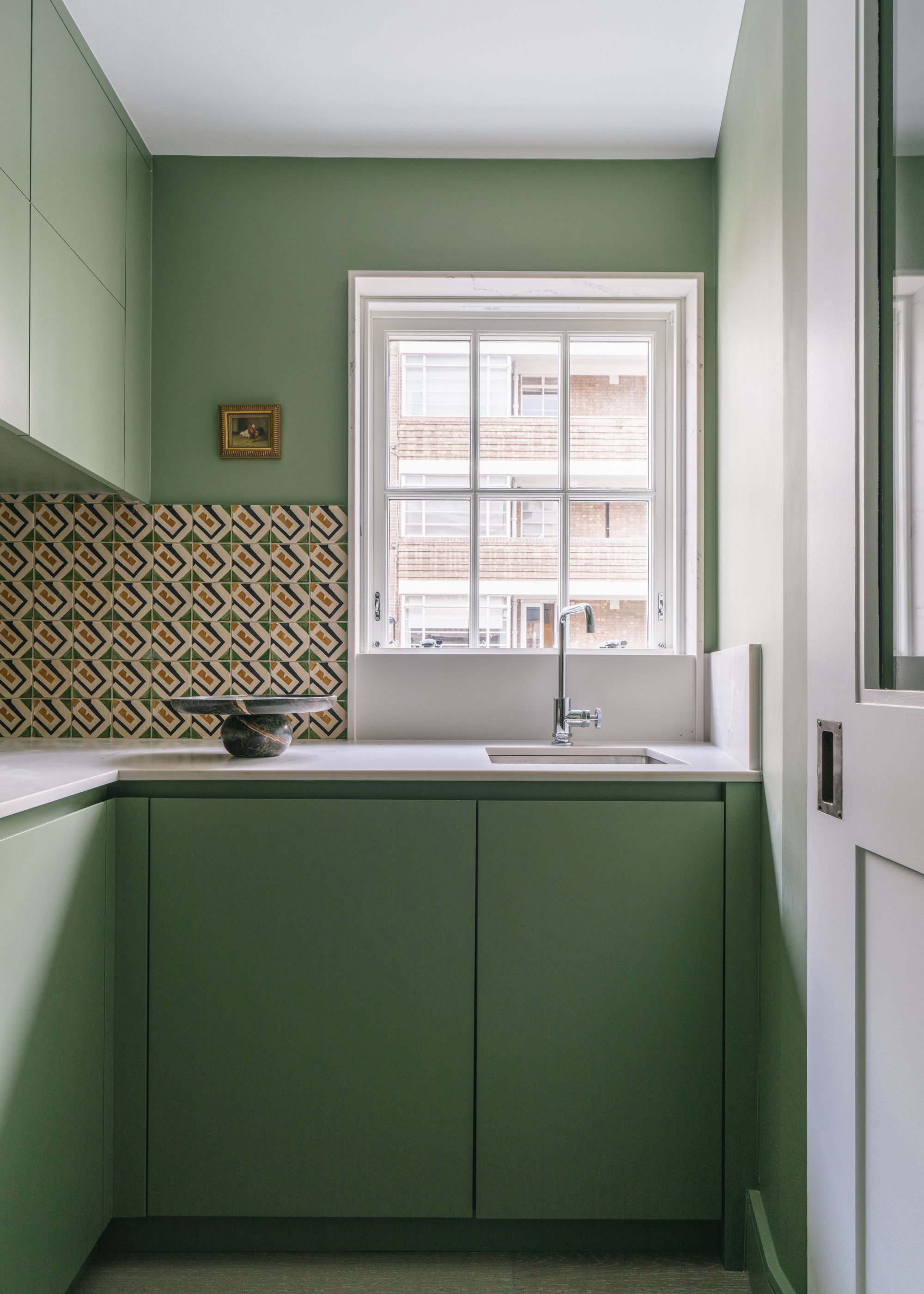
While olive green feels more aligned with current trends, that's not to say decorating with sage green is outdated. Far from it — many designers are using this soft, soothing hue in their schemes, especially when the space needs to feel calm and pared-back.
"Sage green brings a cooler quality, hence why it would indicate to use it for areas such as bathrooms, utility rooms, or even a dressing room — fresh and bright," says Iwona.
For Tola Ojuolape, creative director at Tola Ojuolape Studio, sage green is still a favorite in 2026, as it allows a quieter starting point for bold design ideas. "It acts as a backdrop to the more dominant palettes and textures we use," she says. "It feels more current to me for that reason: it has a neutral feel, but one we can layer color against in interesting ways."
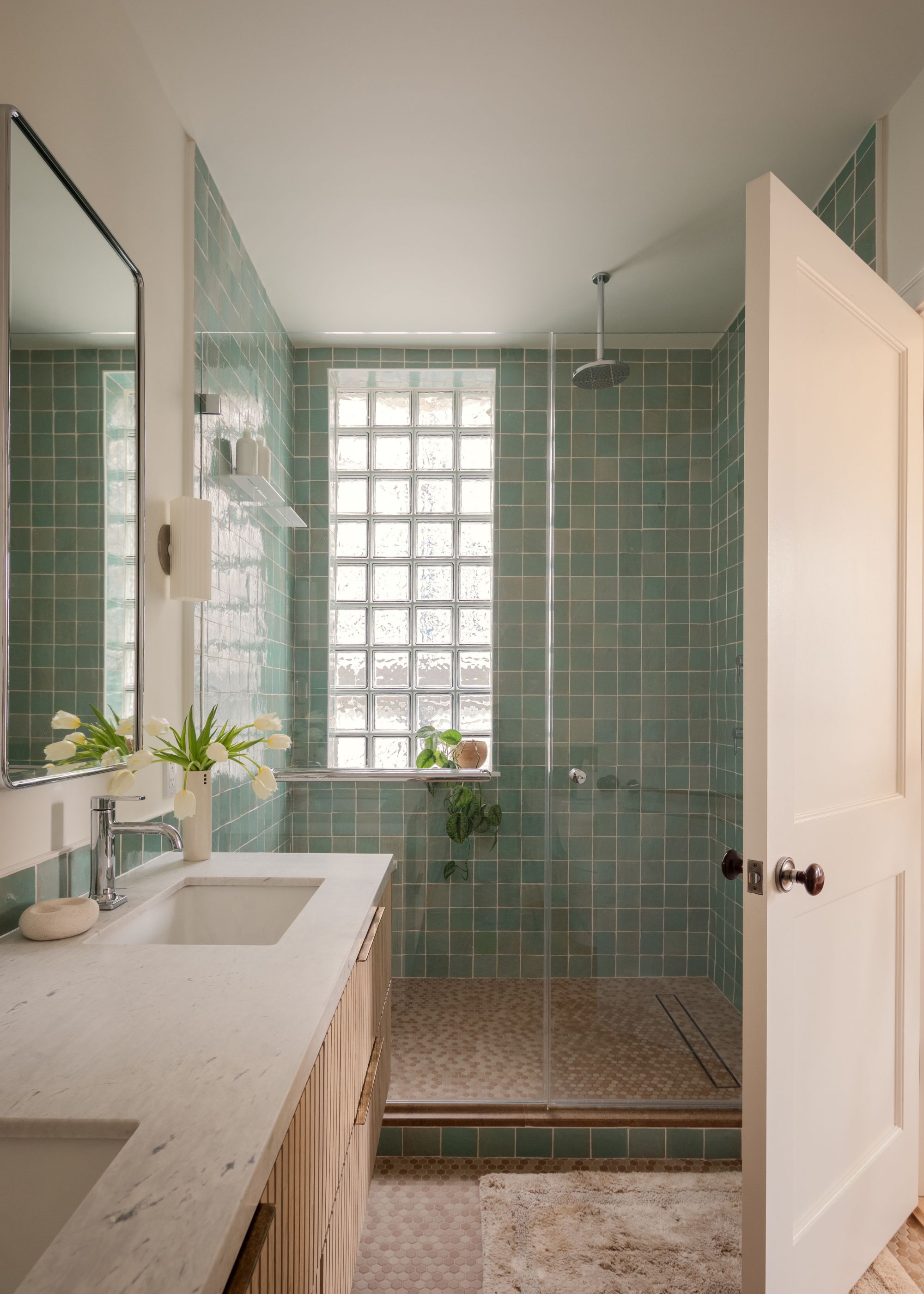
"Sage is a color I reach for whenever a room needs to feel calm and light-led — bedrooms, dining rooms, kitchens, bathrooms — anywhere you want the architecture and the objects to do the talking," says Rachel.
Sage green can start to feel outdated with certain applications, though. Accent walls have generally fallen out of favor, with many designers recommending a much bolder use. "What's making sage feel particularly of-the-moment is the way people are using it now: wrapping ceilings, layering it tonally rather than as a single accent wall, letting it sit against pale woods and chalky finishes rather than statement contrasts," Rachel explains.
And, much like when using olive green, designers also recommend color drenching with sage green. "It softens the whole envelope of the room and stops sage feeling like a color you've 'applied'," Rachel adds. "Avoid bright white in the same space; a chalky off-white or limewash sings against it in a way clinical white doesn't. Pair it with pale oak, brushed metals, and matte textures."
While olive green is a favorite for many designers this year, the best green for your space should reflect how you want it to feel, whether that's light and airy or rich and grounding. Keep in mind that these are the green paint colors to avoid if you want your space to feel modern.
For more inspiration, subscribe to Livingetc's newsletter.