Most of the best-kept interior design secrets come from one place: the great outdoors. From the colors we decorate with to the textures we incorporate, it always works to take a leaf from Mother Nature's book, particularly when it comes to lessons like the 3/3 vertical color rule.
Never heard of it? It's a color rule that builds a palette in vertical layers, mimicking natural patterns. "The base is anchored by a darker color which transitions to mid-level colors at eye height with the lightest tones above," explains interior designer Olga Doykhen. Imagine rich, damp, dark soil at your feet, the soft greens of foliage sprouting up around you, and then the soft glow of sunshine from above.
To form a better understanding of what this looks like conceptually in a home, I asked interior designers to break the design rule down even further. Discover more below.
So, What Is the 3/3 Vertical Color Rule?
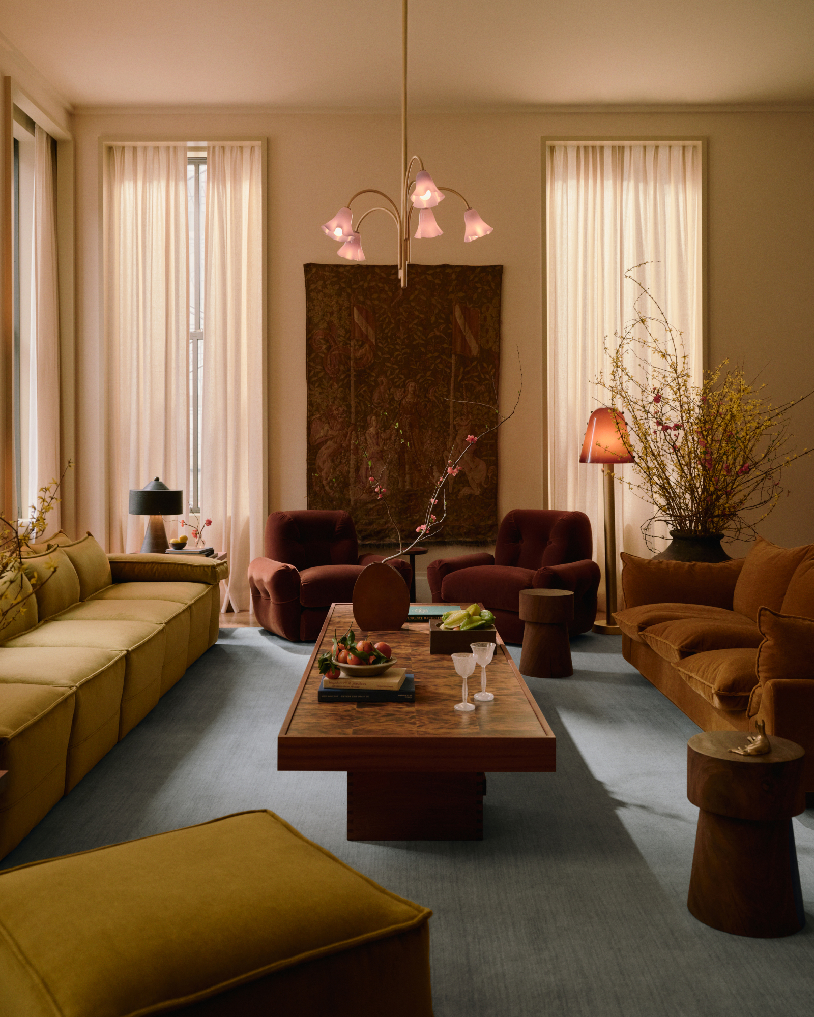
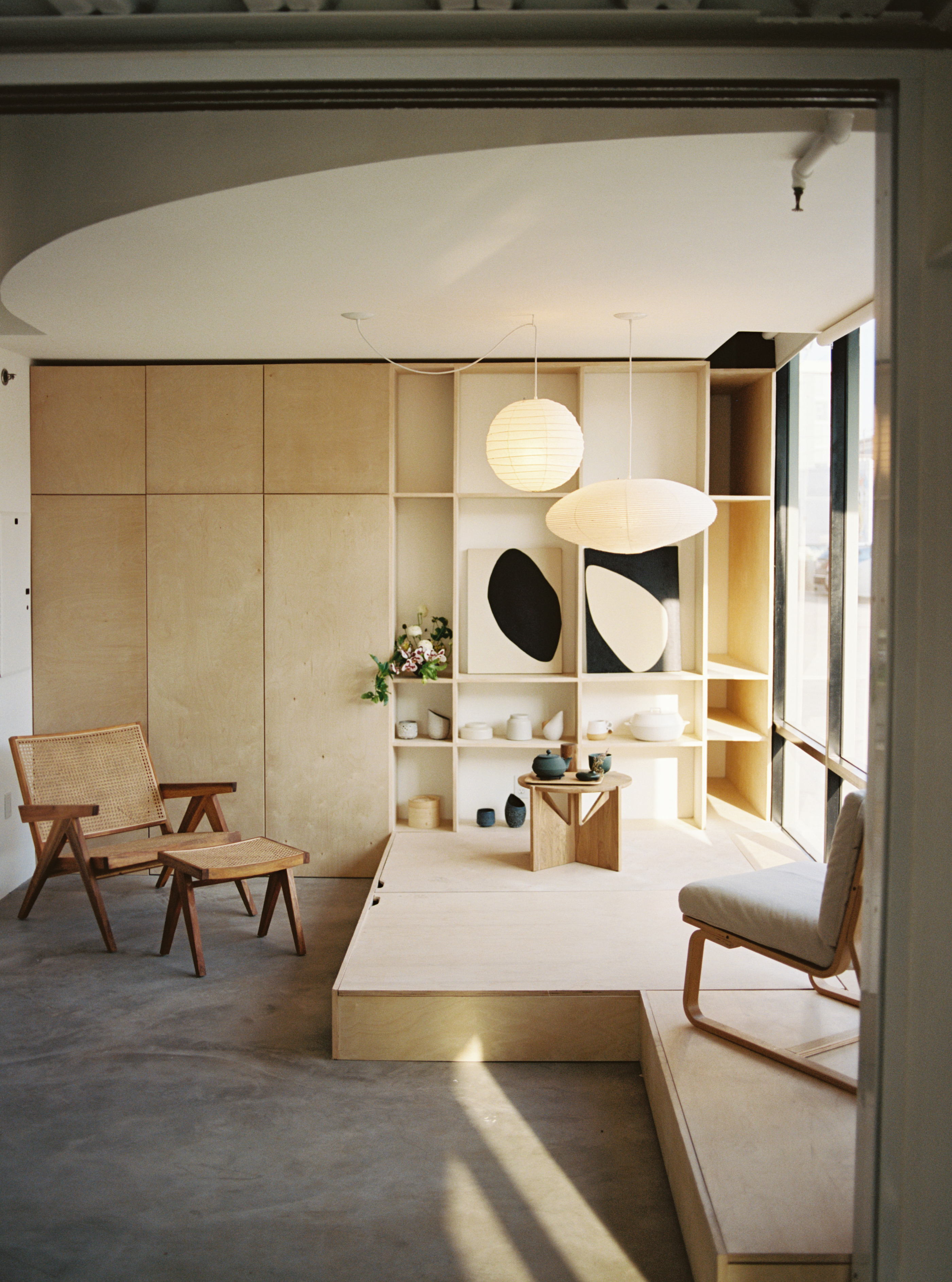
Once again, this approach to decorating with color takes its lead from nature — as all of the classic, most timeless aesthetics do — splitting the room into three 'levels' to mirror the palette of the forest. Dark colors are placed at the base, and the scheme gets lighter and lighter as tones rise through space. "It's also known as 'the forest floor principle," describes Livingetc's color expert, Amy Moorea Wong.
"The bottom layer represents the dark, shadowy floor of the forest with deep, heavy hues anchoring the room via flooring, rugs, and low cabinetry," she continues. Then the middle layer brings "the mid-tones of semi-shaded tree trunks or low plants to balance the palette on walls and large pieces of furniture."
And finally, there's the sunny top layer, where the palest hues sit — the ceiling, upper walls, or high shelving, which make the space feel open and not top-heavy. "Et voilà: your very own (rather abstract) indoor woodland," says Amy.
The 3/3 vertical color rule takes this grounding familiarity and molds it into something we can replicate in interior design. It's about creating serenity through calm color palettes and balance in design, all while making the decorating process more streamlined.
How to Apply the 3/3 Vertical Color Rule in Interiors
When applied indoors, the 3/3 vertical color rule creates an intuitive sense of flow. "We may not consciously register why it feels 'right,' but our minds respond to the familiarity of this order," explains interior designer Olga Doykhen. "It’s a way to make a room feel harmonious without looking overly designed."
"The ground inherently feels like a safe, sensible, stable space for weight (literal or visual) to be, while light, airy shades feel as though they belong skyward, here one minute, floating into the distance the next," adds Amy. The 3/3 vertical color rule soothes and calms us as it taps into this instinct through color theory.
On paper, it feels like this rule might only apply to green room ideas and earthy color palettes, but Amy assures that this is one rule that’s inclusive and universal. "The magic is in the shift from dark to medium to light, not in the hues themselves," she says.
This principle can work well with an array of tonal palettes that feel timeless, including:
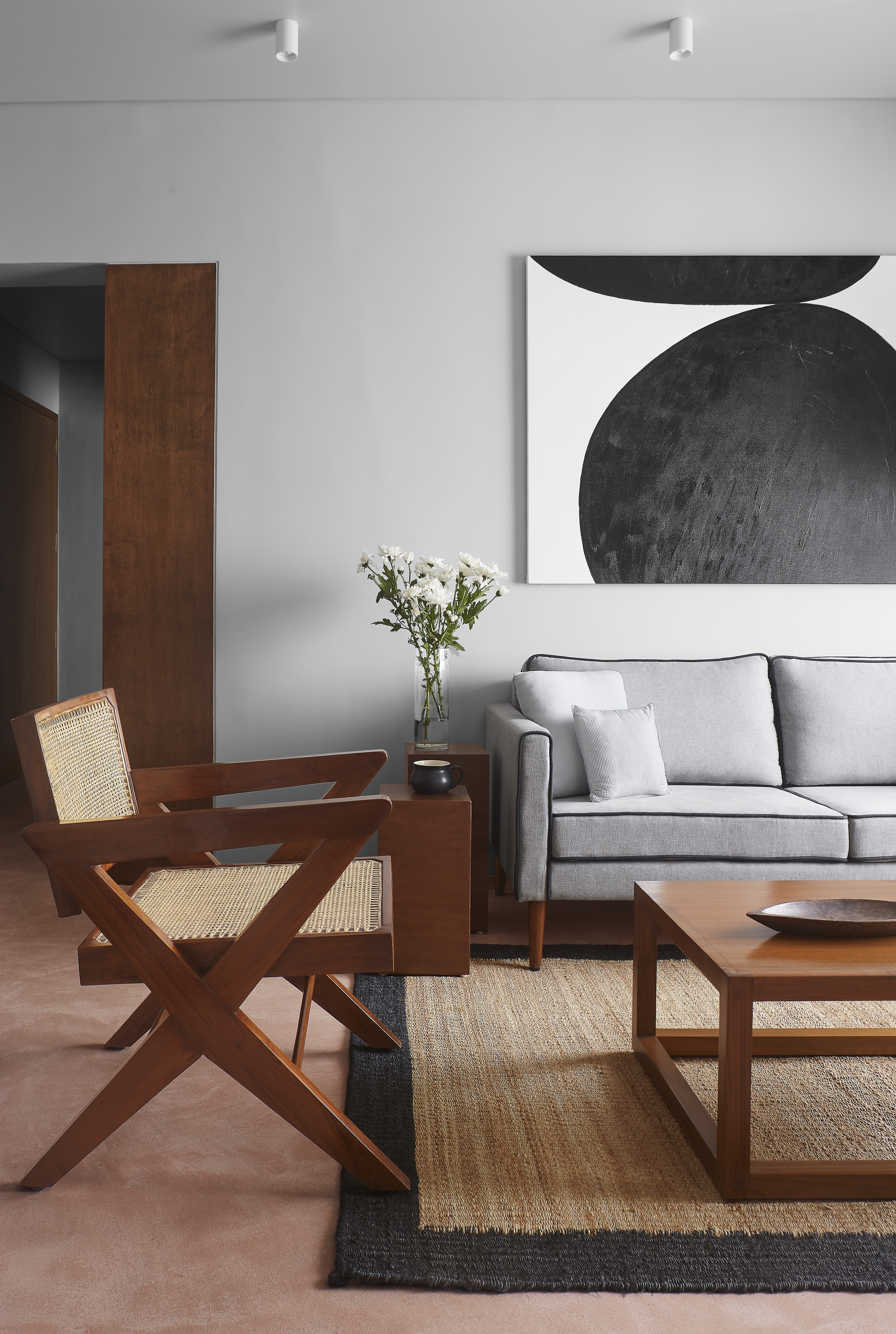
- Neutral luxury: "I envision a warm stone or espresso grounding the base, soft mushroom or greige through the mid-level, and an airy linen or chalk white above," says Olga.
- Earthy minimalism: You could also go for more contrast in your design by using "deep charcoal at the base, rich clay or warm ochre mid-level, pale ivory or plaster at the top," she adds.
- Classic monochrome: And lastly, "Black or near-black grounding, mid-gray through the center, soft white above is the class take on monochrome with this rule," Olga shares.
If joyful colors and brighter hues are more to your taste, the 3/3 vertical color rule can also work with bolder colors. The key is to maintain the progression from darker at the base to lighter at the top.
"For example, deep burgundy grounds the base, muted terracotta and ochres through the middle, and a dusty blush or pale cream above," says Amy. "Even with statement colors, the gradation keeps the space cohesive."
It would work perfectly when applied through the latest 'color capping' technique, where you layer different shades of the same color on your wall. But the best thing is, it doesn't just apply to paint. The same rules can be used for furnishings, demonstrating the nuances of intentional decorating.
The 3/3 vertical color rule isn’t about strict formulas; it’s about channeling nature into interiors. "It’s the decorative alternative of a bright, cloudless day, pulling the eye upwards and subtly reminding us of the joy of the outdoors and the innate need we have to reach for the sun," says Amy.
And with nature at its core, you can sleep peacefully at night knowing this will never be an outdated color rule.