
Martha Stewart's favorite color has been so well documented that it is now often referred to by those in-the-know as 'Martha green.' This example of how it's been used on her Lily Pond veranda is a testament to how versatile it can be.
If you're not familiar with the shade, it's a soft, powdery sage green, which can be spotted in many of her home decor schemes, spilling over into everything from her prized ceramics collection to her kitchen floor tiles.
We recently shared how Martha Stewart's 'odd' dining room color is still so iconic, some 30 years on, and how her grey-green entryway is poised to dominate 2026 color trends.
The particular 'Martha green' used for her veranda was called Araucana Teal – Martha Stewart's very own paint shade, which has since been discontinued.
James Mellan-Matulewicz, the creative director of luxury wallpaper brand Bobbi Beck, explains the appeal of the shade: 'Green is exceptionally versatile and works beautifully alongside a wide range of materials and furniture styles.' He adds, 'A light sage green adds a touch of warmth, pairing effortlessly with pale woods and minimal detailing.'
Shop 'Martha green' accessories
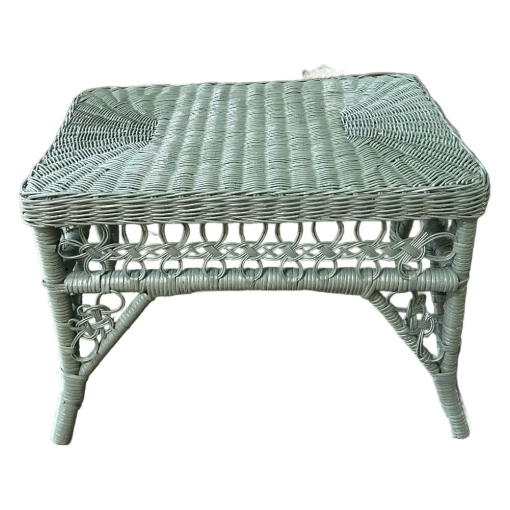
This vintage footstool combines the trend for rattan furniture with the distinct shade that Martha Stewart's veranda features. You could also trawl thrift stores and paint your own pieces.
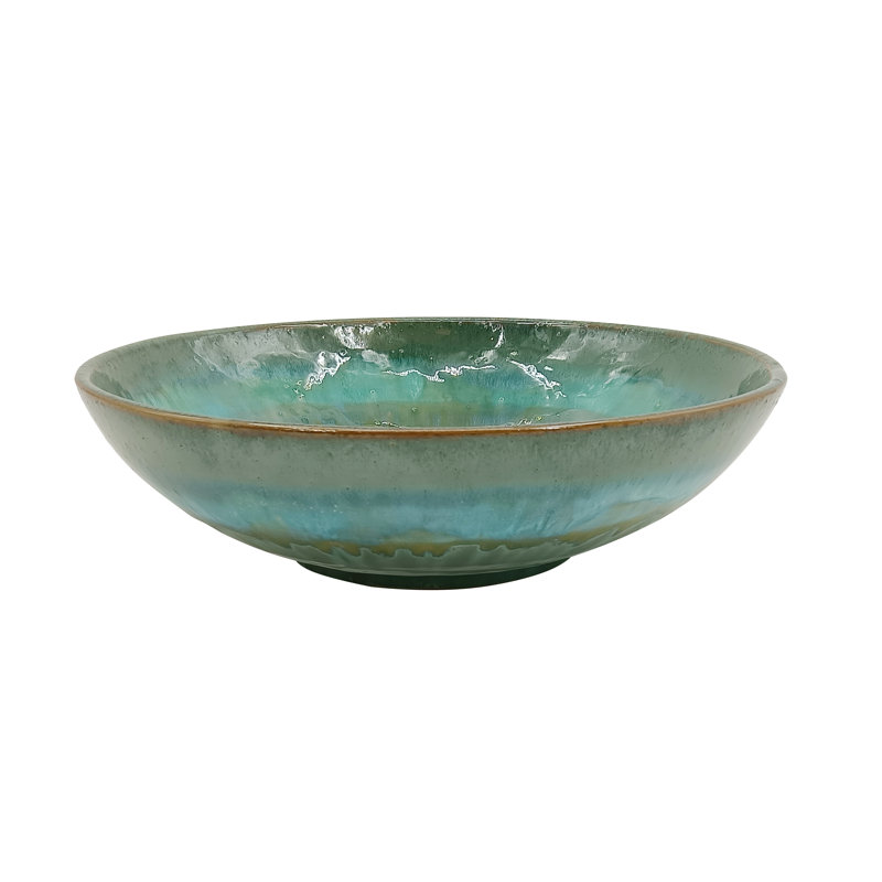
Dotting decorative accessories like bowls (you could fill this with floating candles for a romantic look at evening falls), is an easy and inexpensive way to inject an accent color into your space.
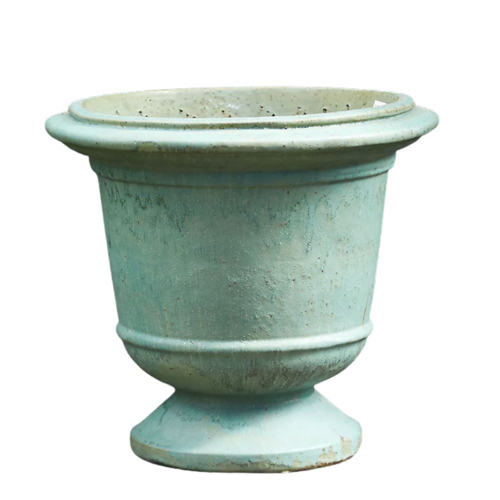
Use oversized urns in 'Martha green', filled with leafy plants, to flank doorways to your outdoor space. We love the aged look of this one, which has a distinctly verdigris hue.
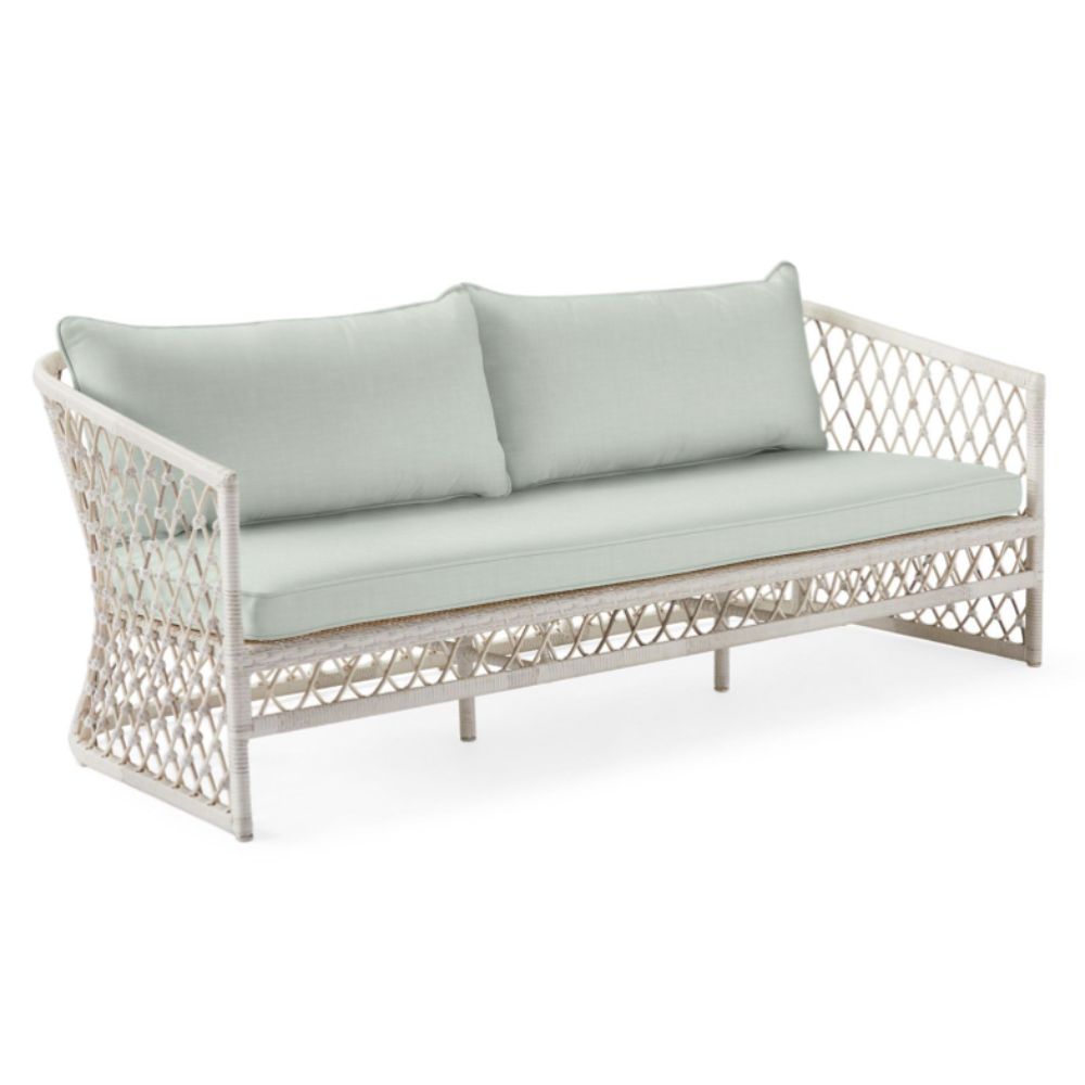
If you can't find green wicker furniture, you could pick the shade up in the upholstery. This sofa has the same look and feel as Martha's but you could ring the changes with different seat covers.
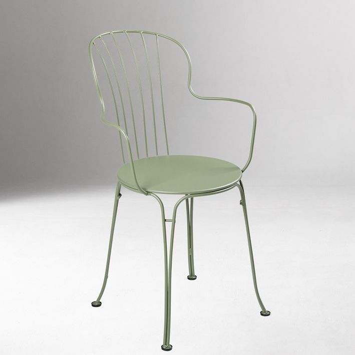
This stylish bistro-style chair is reminiscent of European cafes and we love the pastel shade, while the metallic structure mirrors the cast iron pieces in Martha Stewart's veranda.
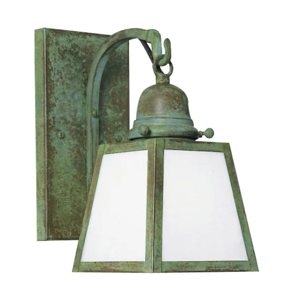
Martha Stewart's salvaged wall brackets make a real statement but you can achieve a similar look with a lighting sconce light this one which has an aged bronze verdigris patina.
One reason that this shade works particularly well for Martha's Lily Pond veranda is that it feels like a natural extension of the outdoors, which makes us feel calm and relaxed. James says 'Because green is so closely associated with nature, it creates an inviting feel within the space, bringing a grounded and restorative quality'.
The painted beadboard ceiling makes the space feel bigger, as well as lighter and brighter. If you're exploring color-drenching ideas, whether indoors or out, this is a prime example of how the trick can make an otherwise dark or enclosed area feel instantly more spacious.
Martha has matched the ceiling color to her painted door frames and even her rattan furniture, which floods the area with a natural freshness. Combining this with the peach cushions brings just the right amount of contrast.
The thrifted verdigris brackets and bowls, set on either side of the doorway, give the whole space an eclectic and collected feel, while the oversized planters connect the indoors, drawing the eye out to the garden.
Martha Stewart's use of this iconic soft green on her veranda is just one example of how the shade can lift your decor, whether with paint, furniture, or accessories. You can try it yourself by starting small with accent pieces before committing to painting a whole area. We promise you won't look back.