
It's no secret that Kate Hudson's Pacific Palisades home is among our favorites in California. The Knives Out actress, who repurchased her old childhood residence, has used the space to experiment with some of the boldest retro design quirks (from its gold patterned wallpaper to its vibrantly tiled kitchen). However, not every space is designed to make a statement – including, most aptly, her yoga room.
Kate recently shared a look inside (arguably) the most tranquil space in her home, designed, fittingly, with yoga in mind. Some of the room boasts a fresh, white palette – but other parts feature a hue that's getting color experts more excited. The tone in question: a soothing light blue.
'Pared back, dusky pastel shades are wonderfully soothing and feel tranquil while also adding a hint of color to build a scheme around,' notes Benjamin Moore's director of marketing, Helen Shaw. And, as the expert explains, blue is the very best of these shades.
'Pale blues are particularly great for conjuring a connection to the outdoors, which will encourage a feeling of calm – think peaceful summer skies with no cloud in sight,' Helen says. In her home gym, Kate has almost exclusively decorated with sports equipment – including a selection of Peloton dumbbells that adorn her white shelving.
However, in other spaces, most specifically our living room or bedroom – Helen recommends pairing with 'linen and rustic accents' such as rattan 'to create the ultimate haven of relaxation.'
And Helen is not alone in her admiration of this therapeutic tone. Mar De Carlo, the founder of Physical Awakening (a registered prenatal Yoga School with Yoga Alliance) emphasizes that blue is known for its non-stimulating qualities and, therefore, makes it the ideal hue for a yoga space.
'Studies show that any blue bedroom color promotes relaxation, calms the nervous system, and supports a tranquil atmosphere,' she says. 'When our eye registers blue, it causes the hypothalamus to produce more melatonin and the adrenal glands to reduce cortisol.'
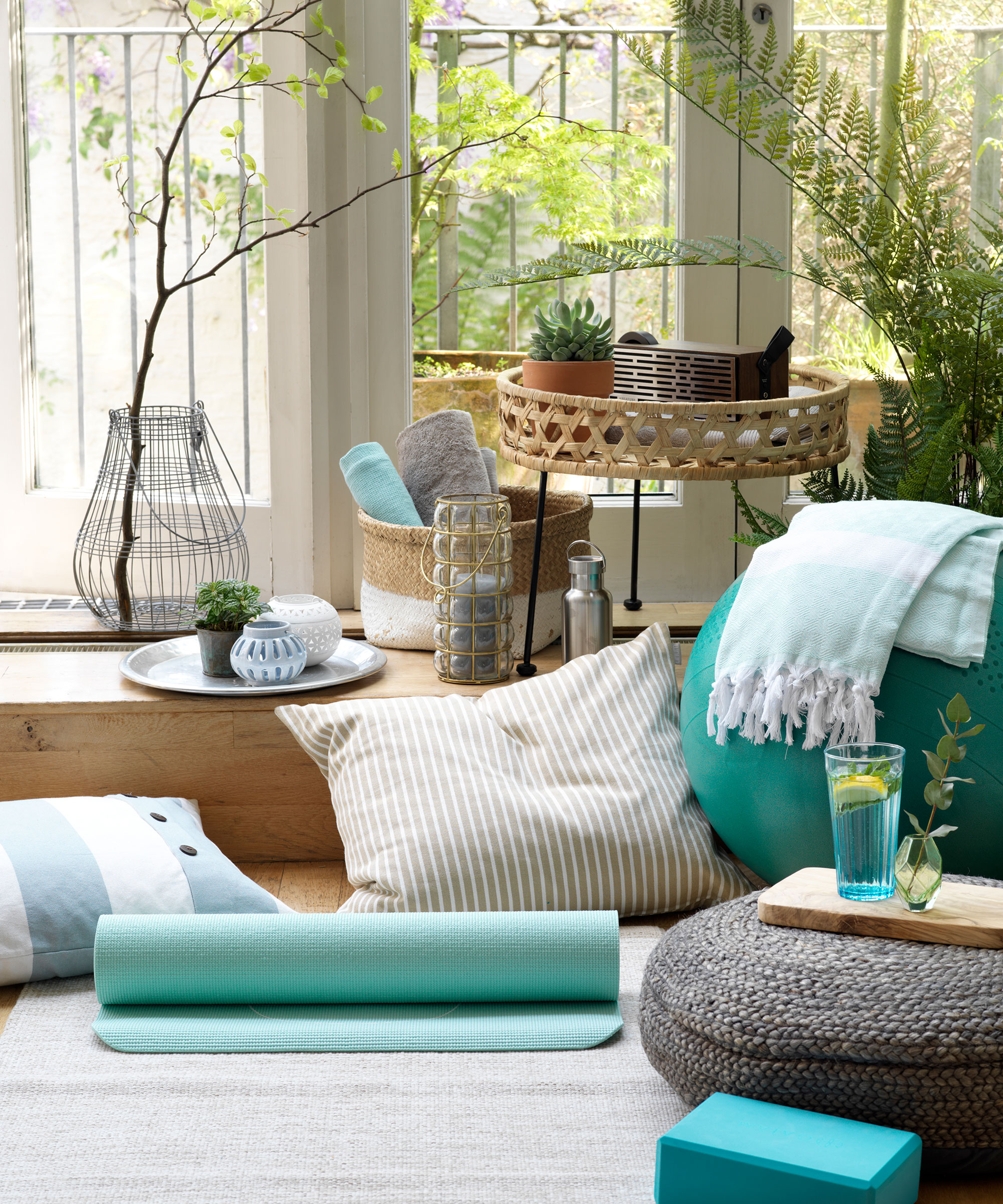
As mentioned, yoga rooms are not typically places of inspiring decor (hence the lack of more aesthetic accents, like linen and wicker), but that doesn't mean these spaces need to be boring. Using pockets of blue paint is one way to introduce an impactful amount of color (especially when this hue is known for its therapeutic qualities) – but we can take inspiration from Kate's vibrant yoga mat, too.
Kate's Yogitoes mat is sadly no longer available, but there are similar patterns that are equally as striking against a white or neutral floor. We particularly love this colorway below.