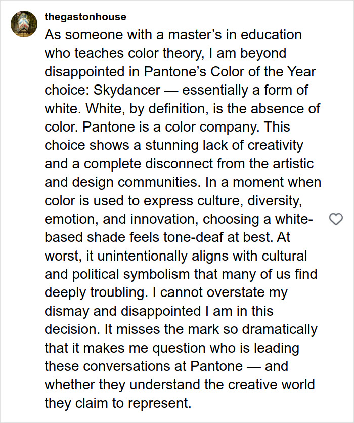
The political divide in the United States has now reached Pantone’s Color of the Year.
The Pantone Color Institute has been selecting a color of the year since 1999, guided by “the color/colors that are bubbling up across design,” spokesperson explained.
Pantone’s Color of the Year for 2026 is Cloud Dancer, an off-white shade that, according to the institute, symbolizes calm in a frenetic society.
The Pantone Color Institute has announced its Color of the Year for 2026…and it’s a shade of white
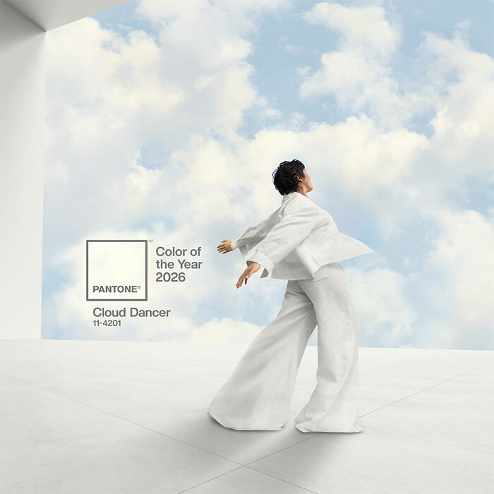
Image credits: Patone
The color is “associated with new beginnings” and “signifies our desire for a fresh start,” Leatrice Eiseman, executive director of the institute, told CNN.
But a large group of people took issue with the selected hue, claiming that the “whitewashing of America has gone too far.”
One critic said Pantone—which, for the first time, has chosen a shade of white as its Color of the Year—failed to “read the room.”
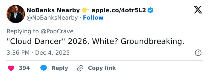
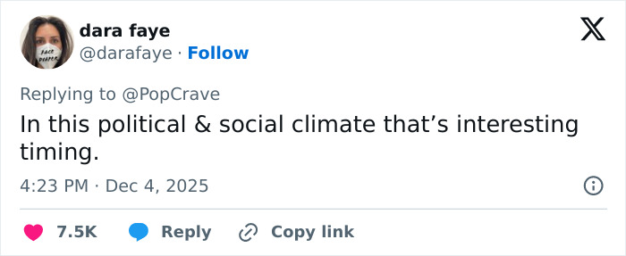
“In this political & social climate, that’s interesting timing,” another person noted.
The US recorded 11,679 hate crimes in 2024, half of which were motivated by race or ethnicity, according to recent data from the US Department of Justice.
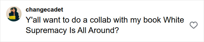
“It’s not just out of touch, it’s symbolic. It’s a reminder of who still controls the narrative. They are openly mocking us, choosing purity white as the cultural color of the year while the rest of us are screaming for humanity,” a separate critic wrote.
The off-white shade, called Cloud Dancer, is meant to symbolize calmness in a frenetic society
Another commenter said Pantone’s shade of white was a “political statement” to US society. “Call me too woke, I don’t care. I don’t think I’m wrong.”
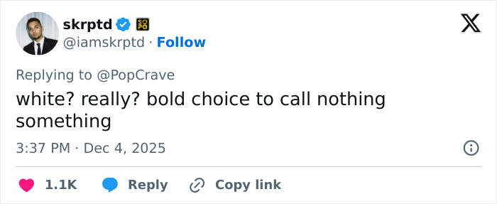
Someone else labeled the choice “tone deaf.”
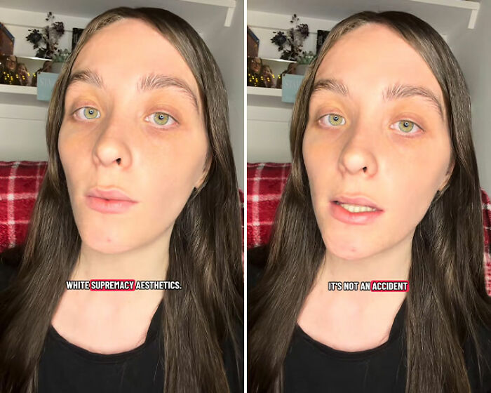
@lilivhope Pantone really chose white as the Colour of the Year… and honestly, I’m not even shocked anymore. In a year defined by genocide, far-right violence, censorship, police brutality, and the loudest rise of white supremacy we’ve seen in decades, they picked the one colour loaded with symbolism. It’s giving the same tone-deaf energy as Sydney Sweeney’s jeans ad — like they genuinely don’t understand (or don’t care) how this reads. It’s exhausting. We’re watching human rights collapse in real time and they’re out here aestheticising whiteness as a global trend. #fyp #politics #pantone #news #commentary ♬ original sound – Lili 🏴

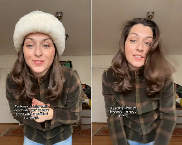
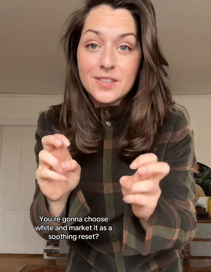
Others compared the move to Sydney Sweeney’s controversial American Eagle ad, which featured a play on the words “jeans” and “genes.”
“It’s giving Sydney Sweeney has good genes. You’re going to choose white and market it as a soothing reset? For who, babe?” someone else asked.
“This feels racist,” agreed another user.
Several people have accused Pantone of racism, claiming that the choice represents a “political statement”
@raebaebae28 “Color of the year” in the year of white supremecy #pantone ♬ original sound – Rae

However, not everyone believed Pantone’s decision was ill-intentioned. “Pretentious? Yes. Racist? Doubtful. I’m all for calmness and peace in these times,” one person shared.
Some compared the color choice to Sydney Sweeney’s American Eagle jeans ad

From a creative perspective, many argued that Pantone should have selected a different color and even debated whether white is a color in the first place.
“I’m so sick of white… especially for interior design,” one netizen wrote.
“I wonder if the folks at @pantone were told, as I was when I was a child, that white is not a color… It’s the absence of it,” shared someone else.
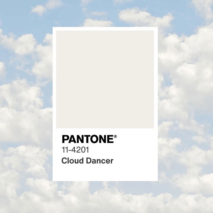
Image credits: Patone
Others mocked the very concept of a “Color of the Year” and its fancy names, writing, “Oh good! We have a cute new name for ‘white.’ Now our American flag can be Tomato Puree, Cloud Dancer, and Cerulean.”
This is the first time Pantone has selected a shade of white as its Color of the Year
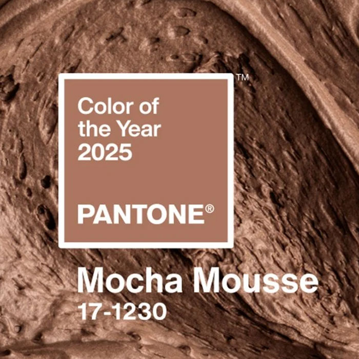
Image credits: Patone


The company described the Color of the Year as “a billowy white imbued with serenity” that “invites true relaxation and focus, allowing the mind to wander and creativity to breathe.”
Pantone is considered a leading authority on color, forecasting design trends, and advising brands.

Previous choices for its Color of the Year included 2025’s Mocha Mousse, “a mellow brown infused with a sensorial and comforting warmth,” and 2024’s Peach Fuzz, “a light, fruity tone that conjures peace and serenity.”
Shortly after the criticism erupted, the company’s vice president, Laurie Pressman, told The Washington Post that “skin tones” had no influence on their latest color choice.
The institute has denied the accusations, explaining that the decision wasn’t influenced by “skin tones”
@pantonetiktok Introducing the Pantone Color of the Year 2026, PANTONE 11-4201 Cloud Dancer. A lofty white neutral whose aerated presence acts as a whisper of calm and peace in a noisy world. PANTONE 11-4201 Cloud Dancer symbolizes a calming influence in a society rediscovering the value of quiet reflection. A billowy white imbued with serenity, it invites true relaxation and focus, allowing the mind to wander and creativity to breathe. In motion and in pause, Pantone Color of the Year 2026, PANTONE 11-4201 Cloud Dancer drifts between light and ethereal, a living calm that invites renewal, vision in serenity and creative release. To discover more about Cloud Dancer visit the link in our bio. #pantone #coloroftheyear #clouddancer ♬ original sound – Pantonetiktok
“With Peach Fuzz and Mocha Mousse, people were asking if this was about skin tones,” said vice president Pressman. “And I think we were going, ‘Wow, really?’ Because, for us, it’s really about, at such a basic level, what are people looking for that color can hope to answer?”
Executive director Eiseman addressed the creative critiques, clarifying that it wasn’t a matter of “defaulting to white.” Instead, she said the neutral shade will “open up new avenues and ways of thinking.”
“It’s hard to understand how they didn’t anticipate controversy over this color choice,” one user commented