Choosing the right paint shade is no mean feat - between undertones, how it looks in different light and combining multiple shades, it can be a stressful undertaking. Of course, you can order the testers, try them out around your home and then make the decision, but why go through all that stress when interior experts have the answers?
To help you streamline the decision-making process and put the testers away, we've asked design professionals what their favourite paint ideas are, so you can get that dreamy Instagram-ready look without all of the faff. There are a few popular paint brands that seem to dominate the scene, but are they worth the hype? And if so, what makes the often talked about shades so popular?
From Farrow & Ball to Lick, these experts have the top recommendations for the paint trends you need to know about, so you can hit buy and get to decorating...
The best paint colours - according to experts
Knowing how to choose the perfect paint shade will require some careful consideration into the size and shape of room you're decorating, as well as where the light hits it. While you might love a particular colour, the reality is that it might not look great in that room, so you want to take the undertones into account when picking your paint.
There are, however, some paint colours that are so well formulated and effortlessly cool that they will satisfy most tastes and rooms - here are a few of them, as confirmed by interior pros.
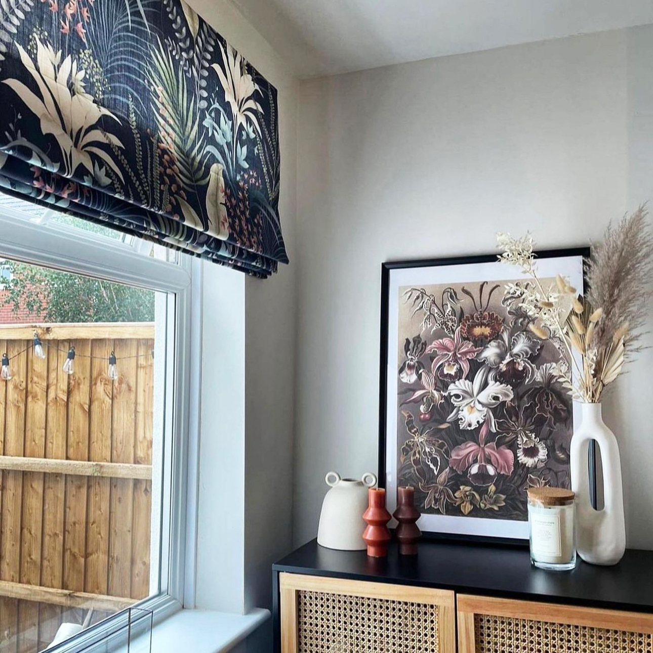
1. Farrow & Ball 'Railings'
Farrow & Ball is a heritage brand that no end of interior designers rave about. Yes, they might be on the pricier side but the shades (and quality) have become iconic. If you want to wow guest's with your in-the-know decor, Farrow & Ball Railings is the one to turn to.
Ideal Home's Editor, Heather Young, is a self-proclaimed F&B fan. 'I’ve used Farrow & Ball’s Railings in my living room. It’s a soft black with a grey blue tint that feels much gentler than a hard black. I love how it changes during the day - much softer in daylight and then warm and cosseting when it’s dark', she says.
'I have a lot of house plants and Railings is a great background for the leafy greens. It’s also super versatile when it comes to picking accent shades - at the moment I’ve got pops of red, but it really would work with any colour. My final tip for Railings is to use Farrow & Ball’s Dead Flat - you can use the same paint on the walls and woodwork. All have a rich, matt finish that feels almost velvety.'
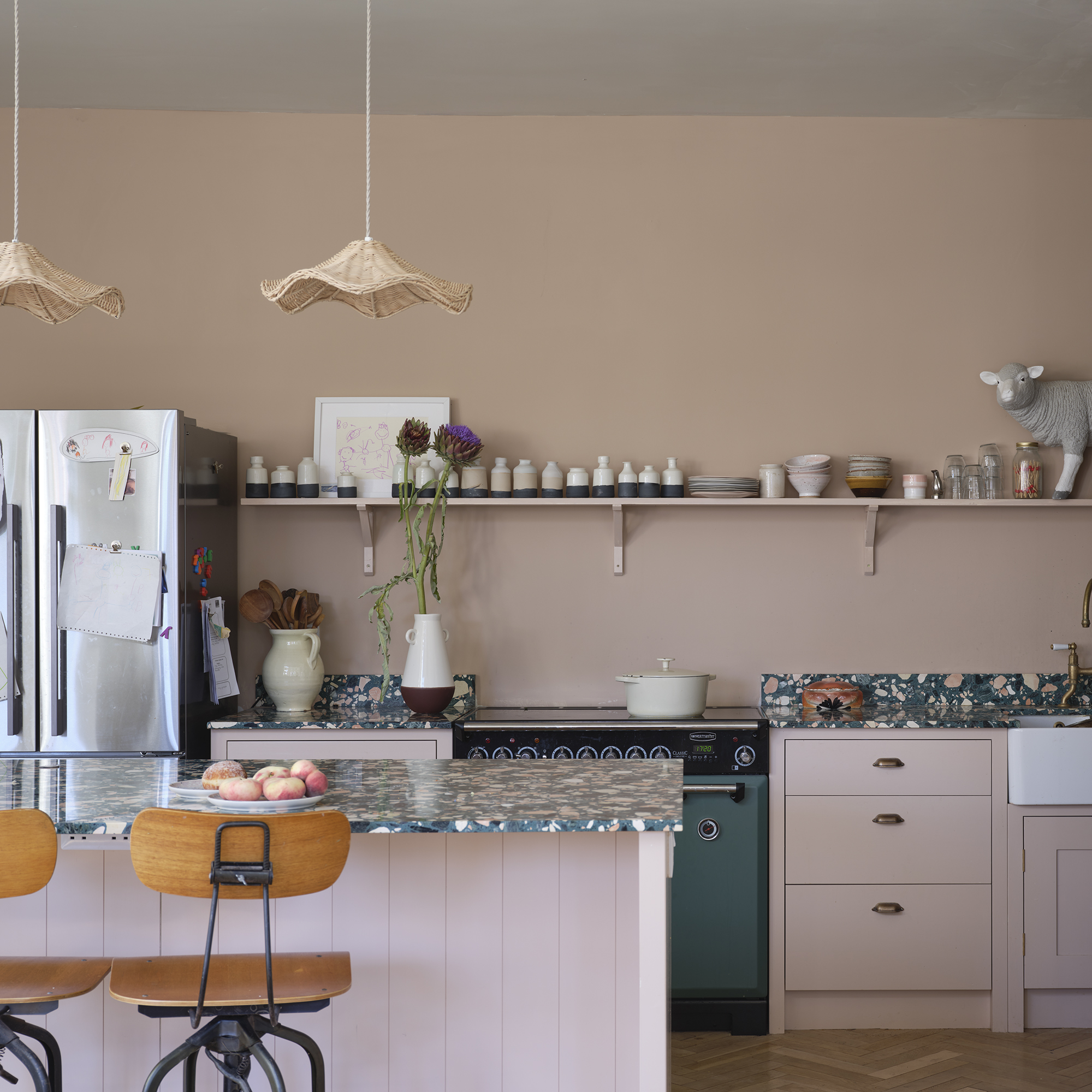
2. Little Greene 'Slaked Lime Mid 149'
In need of something more neutral? Sophie Clemson, director and co-founder of The Living House swears by Slaked Lime Mid 149 by Little Greene.
'It's one of our go-to neutrals as it works with so many different colours and styles. If you're looking for a warm off white paint colour this is perfect,' Sophie recommends.
'Slaked Lime Mid works in so many different rooms due to it being a warm neutral colour. When renovating my own home, I used this colour in several rooms because I knew it would work with other colours I would later introduce. If you're looking for a warm neutral to use on an expanse in your open plan kitchen or if you're looking for a soft neutral for your bedroom to make it cosy, then Slaked Lime Mid is my recommendation.'
She continues, 'One of the best things about Slaked Lime Mid is that it's from the Slaked Lime colour scale family by Little Greene. This is where they have different depths of colour, so if you're struggling to know what colour to paint your woodwork, you could opt for Slaked Lime Deep for a subtle contrast, and you know it's going to work.'
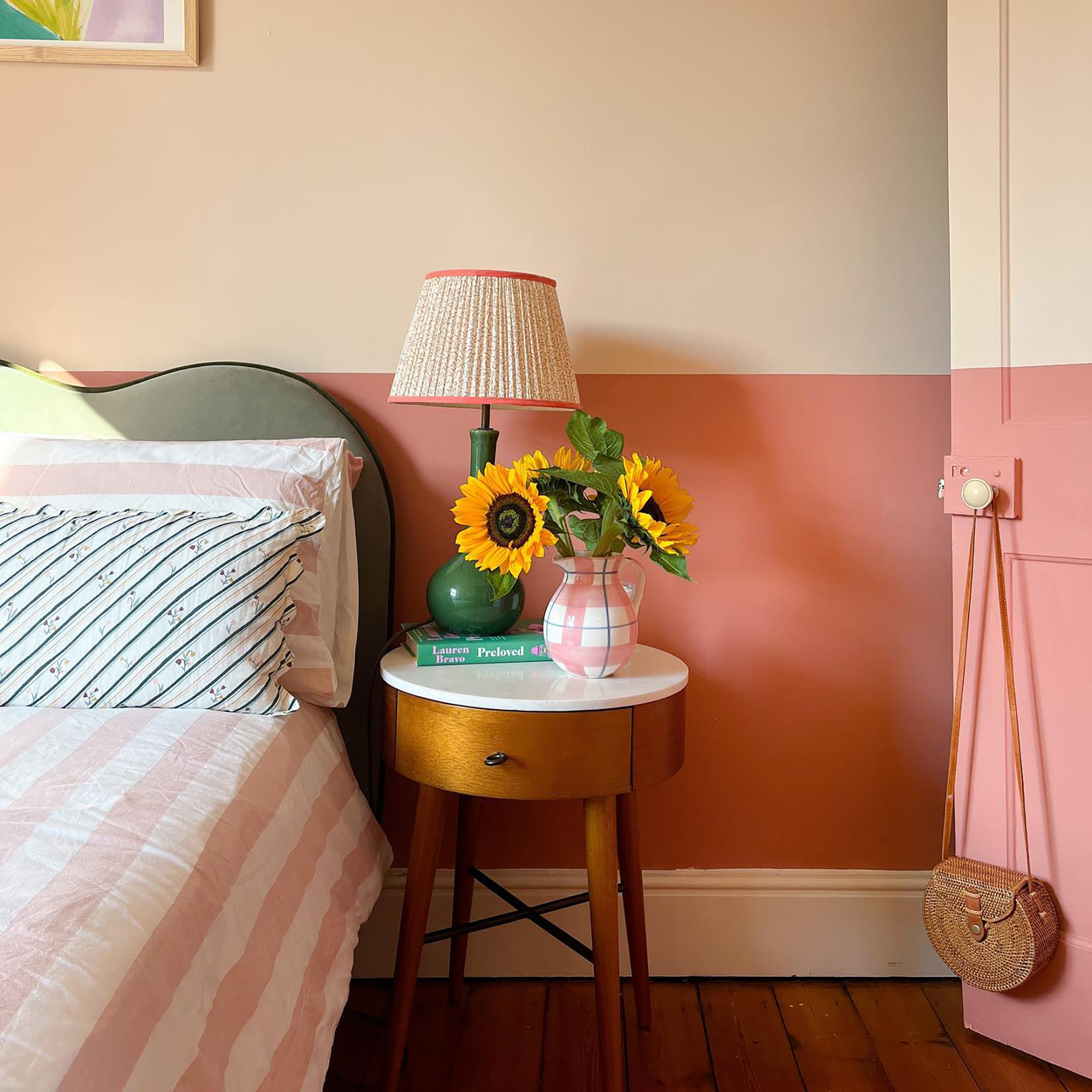
3. Farrow & Ball 'Setting Plaster'
Pink is the biggest paint trend we've seen in 2023 and so far in 2024 - and we're obsessed. No longer seen as a feminine bedroom shade, pink has become a newfound neutral tone that adds a touch of warmth to a room. The best pink paint for this new trend is Farrow & Ball's Setting Plaster.
'Earthy pinks always work for every room in a home, adding warmth where needed for those ill-lit spaces, flattering the complexion as a bathroom wall colour or a surprisingly successful cabinetry colour in a kitchen. Look no further, this shade is your friend - meet Setting Plaster,' recommends Farrow & Ball Brand Ambassador, Patrick O'Donnell.
4. Lick 'Red 03'
The hype for pink continues with Lick's Red 03 - a warmer shade with red undertones that create a timeless colour scheme.
'I absolutely swear by Lick’s Red 03. It has all the characteristics of a pink - warm, enveloping, comforting - whilst also being as physically stimulating as any other red shade. When I created it, I wanted to form a terracotta, earthy red that transported you to the Mediterranean and gave a space a grounding, cosy feel,' says Tash Bradley, Director of Interior Design and Colour Psychologist at Lick
'Red 03 is super versatile. It's a bright, bold colour that can go in a north, south, west, or east facing room, so it has no limits. It looks incredible on kitchen cabinets, on the ceiling of a living room for a burst of colour. You could even colour-drench a bedroom for a cocooning feel,' Tash continues.
5. Mylands 'Clerkenwell'
Picking the right white or cream paint can be a surprisingly difficult task, but one that interiors experts have mastered. Too pink, too yellow, too blue... the undertones of a neutral paint will make or break it. The one that is just right? Mylands 'Clerkenwell'.
'The colour is a warm off white, with yellow and pink undertones,' says Daniele Mancinetti, interior designer at König Design Studio. 'It changes colour continuously throughout the day, at its best at sunset when it projects this warm golden light all over the room (super flattering on your skin complex too – #AddedValue).'
Which shade are you leaning towards? Neutral, pink, or maybe a little bit of everything in different rooms around your home...