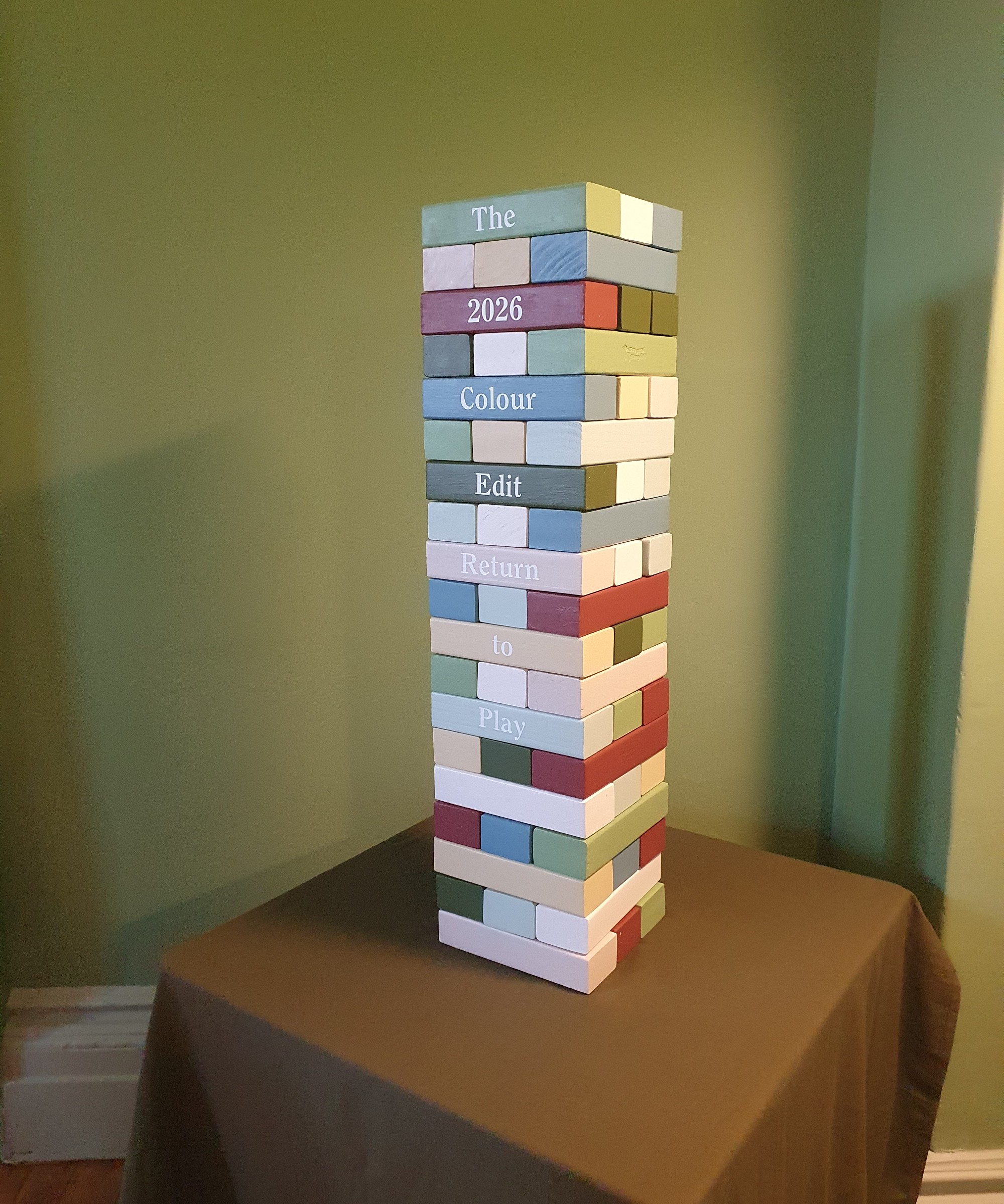
Last week, I got an early first look at the Lick colour edit of the year for 2026. What struck me the most about the colour palette of eight paint shades were three particular colours that have been major colour trends this year and, according to Lick, they’re not going anywhere next year.
These colour and paint trends are neutrals which, of course, never really lose their appeal. Instead these are statement shades, making their way into Lick’s colour edit exactly because of their playful nature. I’m talking about matcha green, butter yellow and cherry red.
While most other brands name a single colour of the year, Lick chooses a handful of shades from its existing offering of paint colours, creating a colour palette that’s set to define the year ahead.
‘This palette, these are OG colours,’ says Tash Bradley, director of interior design at Lick and author of Master The Art Of Colour, available at Amazon. ‘There are some colours that were there when we first launched. And people are like, “oh, I’ve never seen this green before”. And I say, “yes, you have!”. It’s just because you’re seeing it next to something else!’
The motto of this colour edit is ‘return to play’. As Tash often says, she believes in ‘decorating like no one’s watching’. And this palette was designed to spark joy and encourage people to create homes they love, rather than to impress others – Lick’s own take on dopamine decorating.
‘The 2026 Colour Edit is about letting go of rules and rediscovering the joy of play through colour. These shades take the nostalgic primaries we all grew up with and give them a refined twist – colours that feel both joyful and deeply grounding,’ Tash says.
And these were the 3 stars of the show…
Green 18
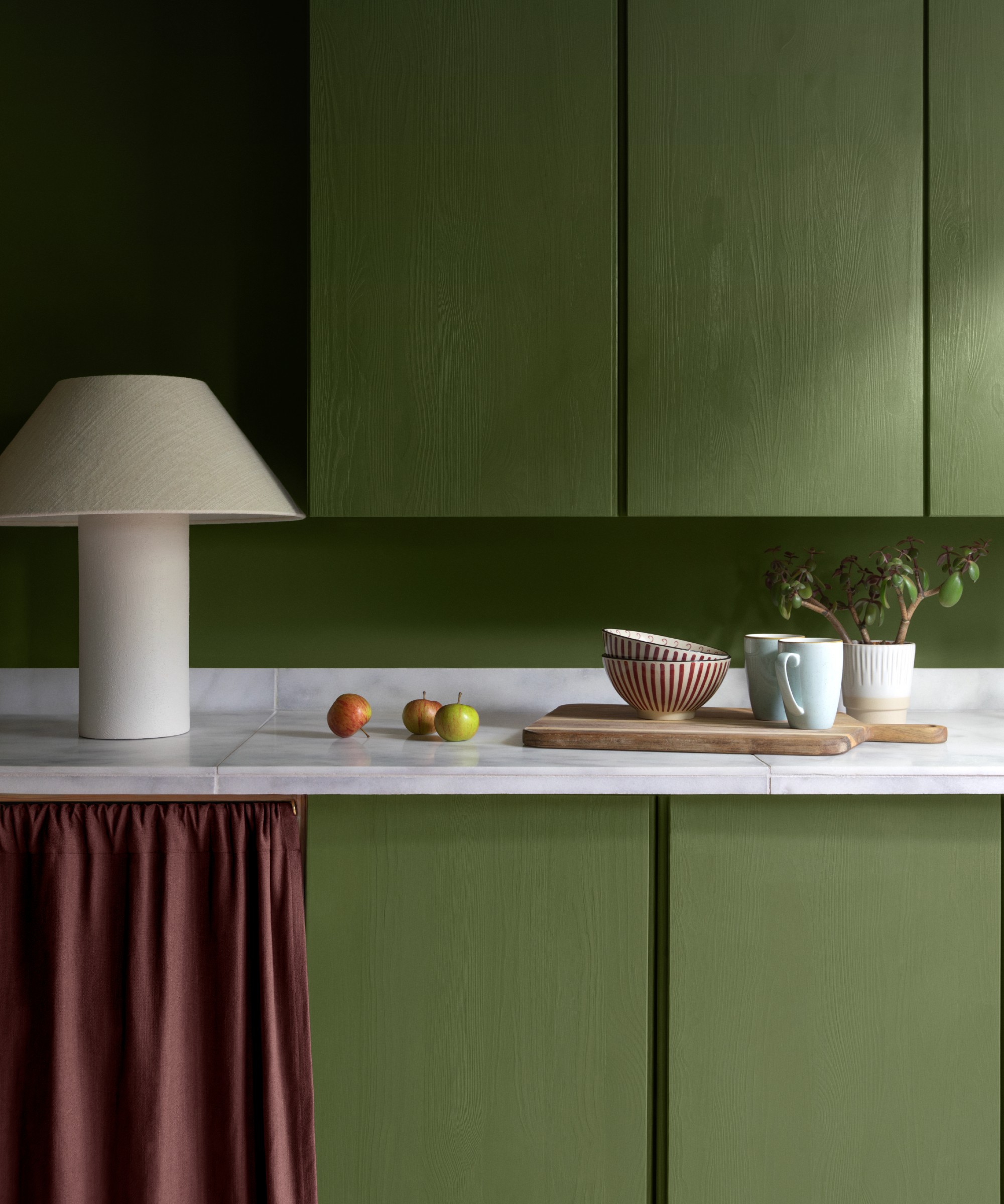
Lick’s Green 18 is the hero colour of this colour palette. It’s the shade that I was surrounded by as I (along with other guests) sat in the dining room of the historical landmark of Clissold House in London’s Stoke Newington during the reveal of the Lick colour edit 2026, painted in this very colour. And it was during this evening that Tash from Lick called it ‘the perfect matcha green’.
She also describes it as ‘earthy and grounding, the kind of colour that connects you straight back to nature and creates balance in the home’. And while all of the colours in the 2026 edit work beautifully together, this green looks especially great paired with Lick’s Red 06.
Whether you go for a green kitchen idea on the cabinets like in the image above or colour drench your walls in this matcha green shade, it will look spectacular.
Urban Outfitters is one of the best places to shop for fun and unusual homeware and pieces of furniture like this chunky lounge chair in matcha green velvet.
I've had this John Lewis cushion with a contrasting scalloped trim (in a different colourway) for over a year now. And due to the design's popularity, the retailer keeps adding new colourways including this statement green.
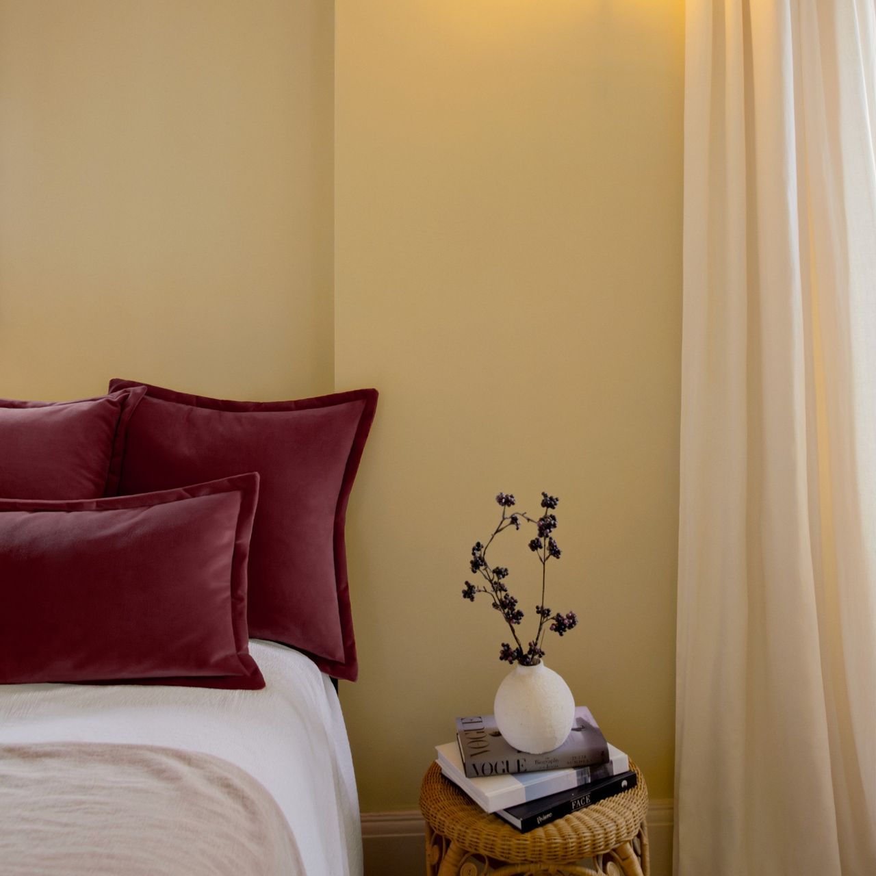
Red 06
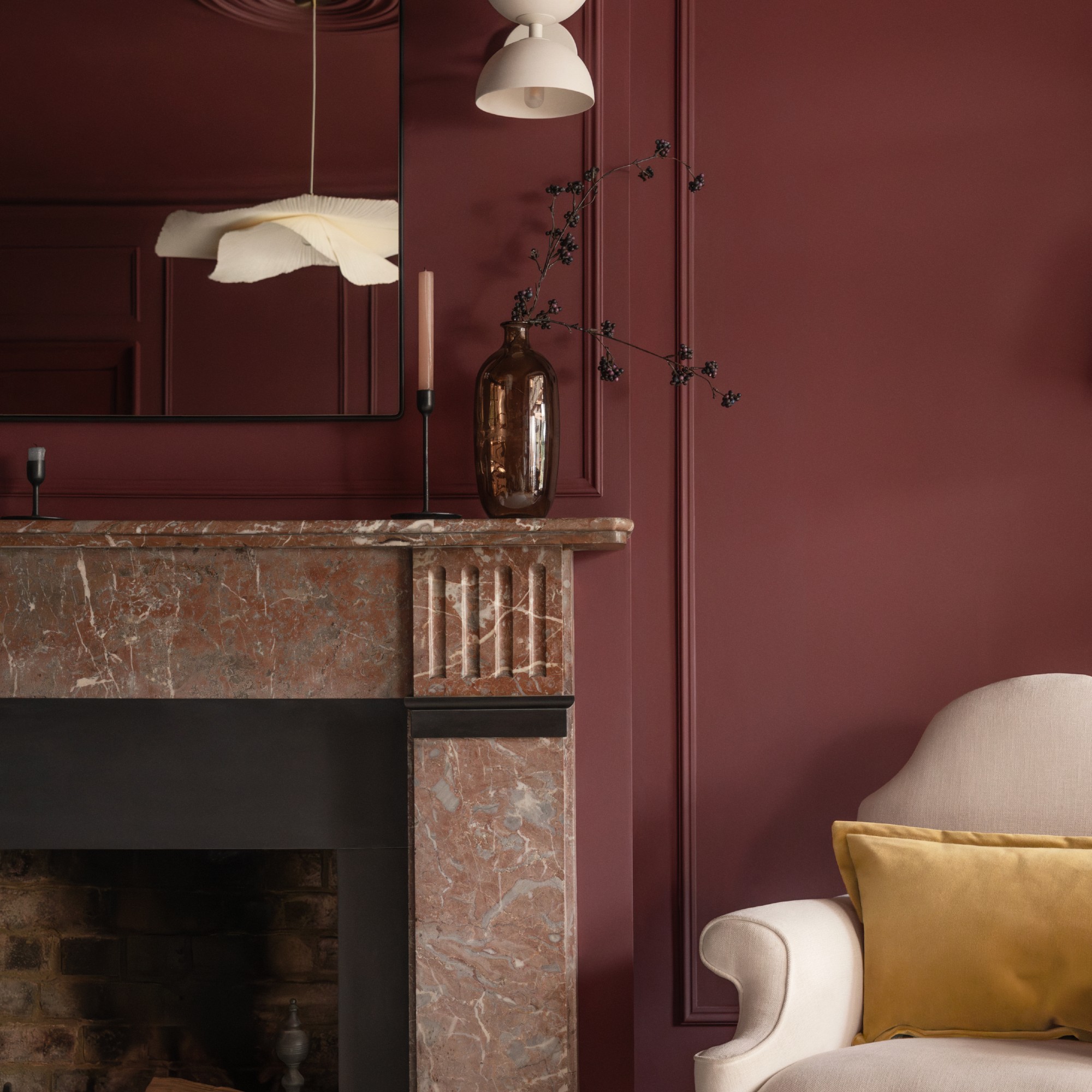
It was at the end of last year that Pinterest named cherry red as the shade that’s going to be everywhere in 2025. Of course, Pinterest was right on the money. And according to Lick, the home decor trend of deep, dark reds like Red 06 is not going anywhere in 2026.
‘Red 06 is a rich, wine-toned red – it’s romantic, nostalgic and instantly brings depth, drama and warmth to a space,’ Tash says.
And even though it’s one statement shade, it looks beautiful paired with pretty much any of the other colours in the edit, including both of the greens (there is another darker, more olive green in the edit called Green 05), the statement Blue 18 and even Yellow 07.
Red 06 is a dark shade of red paint which is perfect for spaces where you're ready to embrace and reinforce the feeling of cosiness, and do it in style at that.
I'm a big fan of H&M Home table lamps, including this designer-looking number. Available in a range of colourways, this matt burgundy shade looks particularly stylish.
I've been seeing this style of high-gloss, chunky, curved pieces a lot lately - and I'm very much here for it. Especially when they come in such a gorgeous shade of dark red as this Habitat side table. But green is available, too.
Yellow 07
Butter yellow has been dominating both the interiors and fashion space. And 2026 is not going to be any different. But one colour combination I’m seeing increasingly more of and which Lick recommends, too, is pairing the buttery yellows like Yellow 07 with burgundy and dark red shades like Red 06.
‘Yellow 07 has that buttery, nostalgic glow - it radiates optimism and joy, instantly lifting the mood of any room,’ Tash explains.
I know it can be difficult to commit to butter yellow wall paint as we've all been somewhat traumatised by magnolia walls. But Lick's Yellow 07 is nothing like magnolia, it's more saturated than that, more yellow, more butter.
You can also embrace butter yellow on accessories and even pieces of furniture. Mustard Made is a brand of metal locker-style cabinets that's all about uplifting pops of colour - and this butter-coloured cabinet is simply joyful.
Alternatively, you can opt for something smaller, a little touch of butter yellow, like this glass vase from Danish design brand Broste. I love the simplicity of the curved shape paired with the gentle buttery colour.
Tash concludes, ‘More than a design trend, this palette represents a cultural shift: we’re moving away from decorating to impress, and instead embracing colour that makes us feel. It’s about creating spaces that spark creativity, stir emotion and remind us of the freedom of self-expression.’