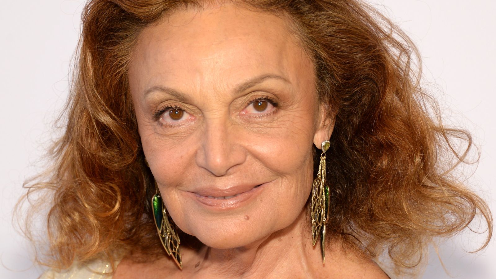
The first time I tried on a Diane von Furstenberg wrap dress, I thought it was the most beautiful, interesting thing I had ever put on my body. Though the colors and clashing patterns shouldn't work together, they simply did. I'm still in awe every time I wear it.
It's no surprise, then, that the iconic fashion designer is the one to convince me of another unexpected print combination: leopard and zebra print together.
I spotted the animal print trend in DVF's space in a portrait by Gillian Laub, as part of a series documenting famous New Yorkers' living rooms. Just like her fashion line, Diane's living room delights in the pairing of prints most would never dream of using together. Somehow, it works every time.
Shop the Animal Print Edit
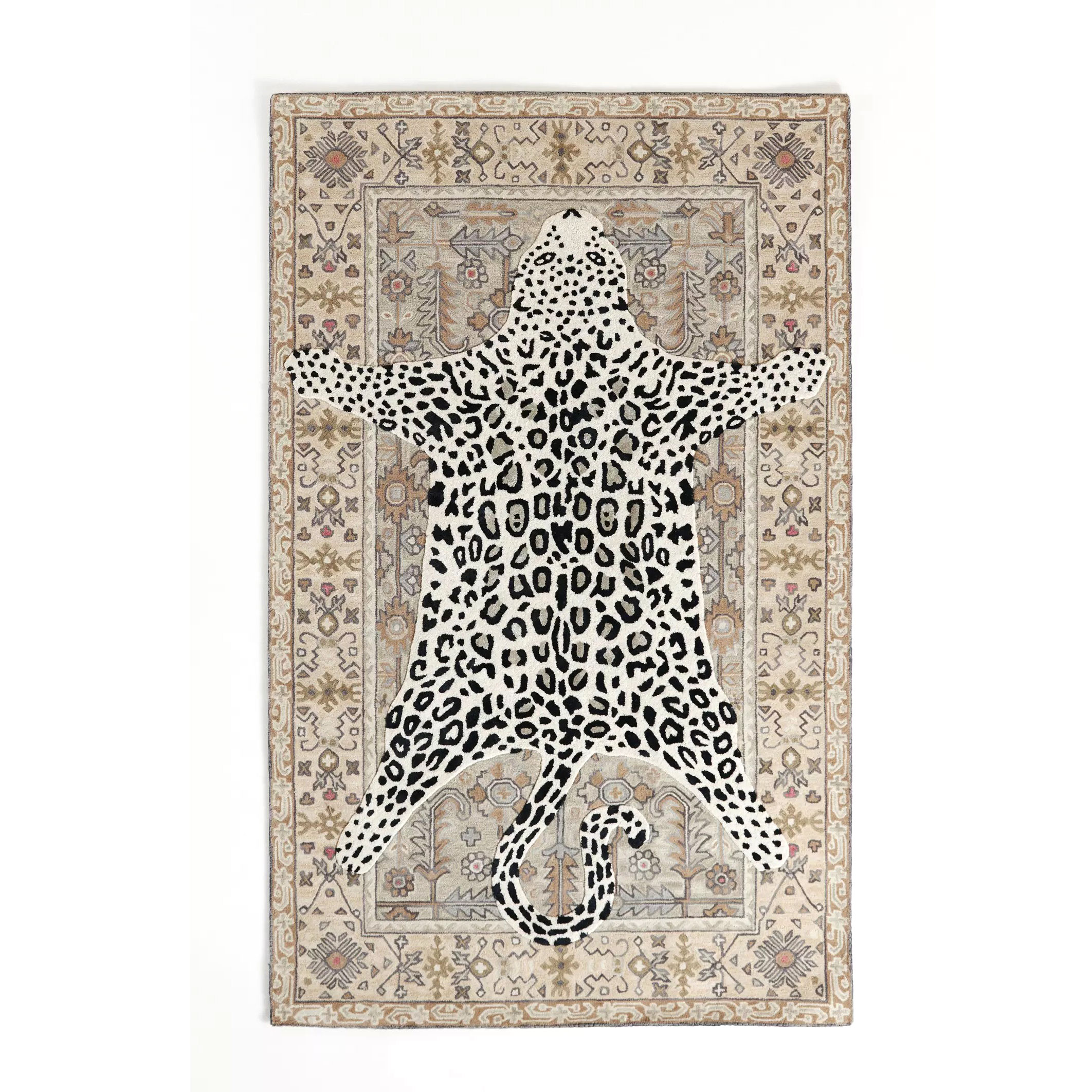
Don't be afraid to introduce animal print to your home. A rug is the simplest and more effective way to add color, pattern and texture to a space with minimal effort. The trick to decorating with animal print is to remember that less is more. Going for an outgoing leopard print design? Then balance it with plenty of neutrals for a sophisticated look.
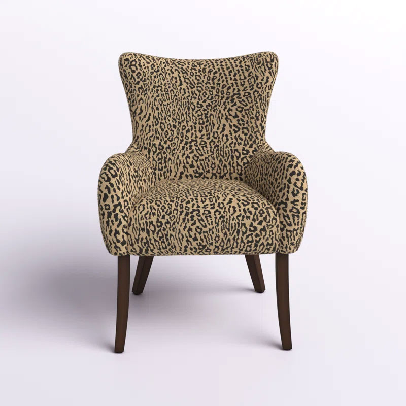
More is definitely more when it comes to pattern this season – we're seeing all kind of motifs being given the catwalk treatment, but none more so than leopard print on armchairs. This piece is ideal for injecting personality into a space, and can enliven even the most featureless room.

Designed by Sarah Sherman Samuel, the mastermind behind Mandy Moore's recent remodel, this design pillow is a must-have accessory for your sofa or daybed. The gold-ochre colorway is the color of the moment.
The fashion designer's living room idea uses a leopard print rug next to her white sofa with zebra-printed trim and cushions. This unexpected combination foregrounds an even more unusual accent: a massive portrait of Diane von Furstenberg herself. The overall effect is striking, whimsical, and glamorous.
I'll admit, when I heard that animal print was set to be one of the biggest interior design trends of 2025, I was less than thrilled. I couldn't shake the image of the print as the gaudy adornment of early 2000s spandex wear. However, spaces like DVF's have helped me come around. It demonstrates that the jungle-inspired prints can look every bit as elevated and classic as the stripe.
So, what sets DVF's design apart from the monstrous spectre of the leopard-decked bachelor pad? First, though the living room sofa is speckled with print, it's broken up with solid white. Rather than a full animal print sofa, Diane integrates zebra print with a few carefully chosen cushions.
Second, the fashion designer integrated a stripe of purple at the bottom of the couch for contrast. Again, the color is an unexpected pairing that works very well.
To mix patterns in your own living room, I recommend following Diane's example and pairing a large print with a smaller one. This contrast helps to break up the design and make it look interesting, rather than busy.
Ultimately, design is an art about play and experimentation. Sometimes, the most unexpected combinations are the best ones.