Being an interiors enthusiast, I consider myself to be across all the latest interior design trends and leading decorating practices. It therefore feels only fitting to share my experience of using the expert-recommended 60-30-10 rule of using colour to redecorate my home.
After speaking to Emma Deterding, founder and creative director of Kelling Designs, I gained a better insight into how interior designers use the latest interior colour trends with a more balanced approach.
As a result, what was a feature wall is now a larger area of block colour, all my neutral wall colours now coordinate seamlessly with my large furniture pieces to create a greater sense of cohesion, and I've selected just one smaller accent tone. Here's how the 60-30-10 rule inspired me to create a more balanced colour scheme to make my home look more expensive...
What is the '60-30-10 rule' of interior design?
"The 60-30-10 rule is a general guideline interior designers use to introduce colour into a space in a balanced way," explains leading interior designer Emma Deterding.
"It states that a room should be decorated with 60% of a dominant colour, 30% of a secondary colour and then 10% of an accent colour, and is a great starting point for creating a cohesive colour scheme."
Having been keen to makeover my living room for ages, the excuse to try this interior design secret gave me the nudge I needed to start my project to see how this colour theory helps to create balance.
How to use the '60-30-10 rule'
Emma explains how to divide the colour ratios to apply this decorating rule when decorating a room. "The dominant colour will be the one that covers the largest areas of the room, such as walls, floors or large furniture pieces."
"The secondary colour will be used on furniture, textiles and smaller decor items, and the accent colour will be used on the smaller decorative accessories (think cushions, artwork, vases)."
It works well mainly because it can help to create a cohesive colour scheme, with the secondary and accent colours complementing the dominant colour.
This considered use of colour helps to provide a balanced feeling across the space, "keeping it grounded and easy on the eye," says Emma. "It offers flexibility in that it works with any colour palette, from bold brights to monochrome and neutrals."
However, there are no hard and fast rules after all, sometimes it's worth breaking decorating rules to make your home feel bespoke. Emma says: "The 60-30-10 rule can be adjusted depending on the colours being used, while allowing for a unique look."
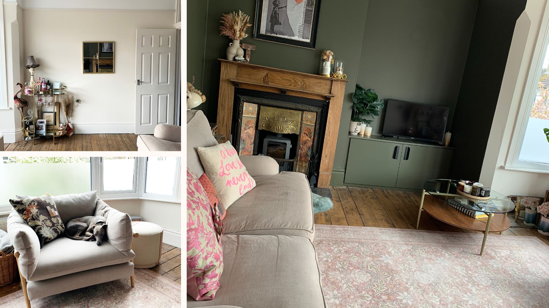
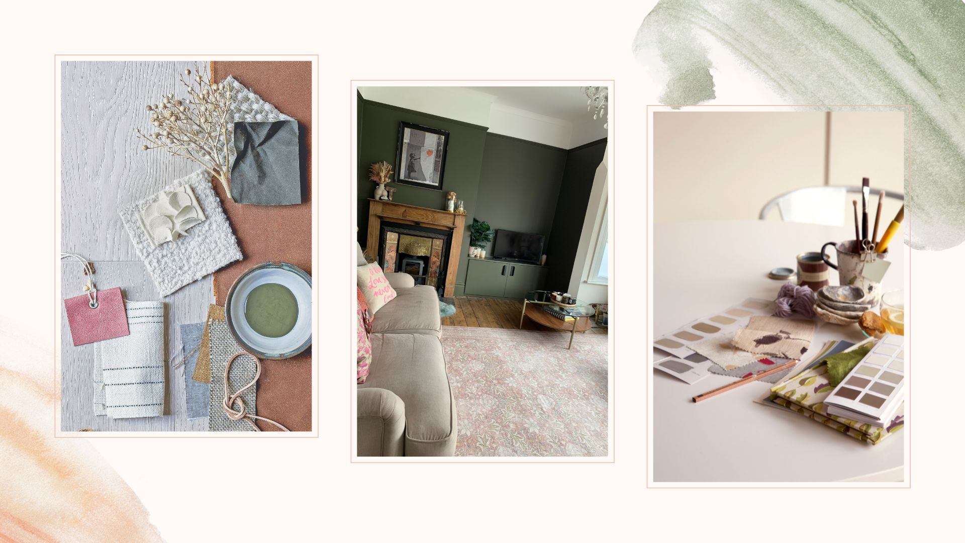
Not one to completely conform when it comes to my own decor, I used the 60-30-10 rule but made my dominant 60 percent colour a neutral that incorporates walls, ceiling and large furniture staples such as my sofa and armchair.
This enabled me to use a secondary 30 percent colour on the walls, which are painted in one of the new Farrow & Ball colours, the striking and elegant shade 'Reduced Green'.
The 10 percent accent colour is pink, which is subtly added via cushions, vases and the print of my stunning new Ruggable Morris & Co Simply Severn Soft Pink Rug.
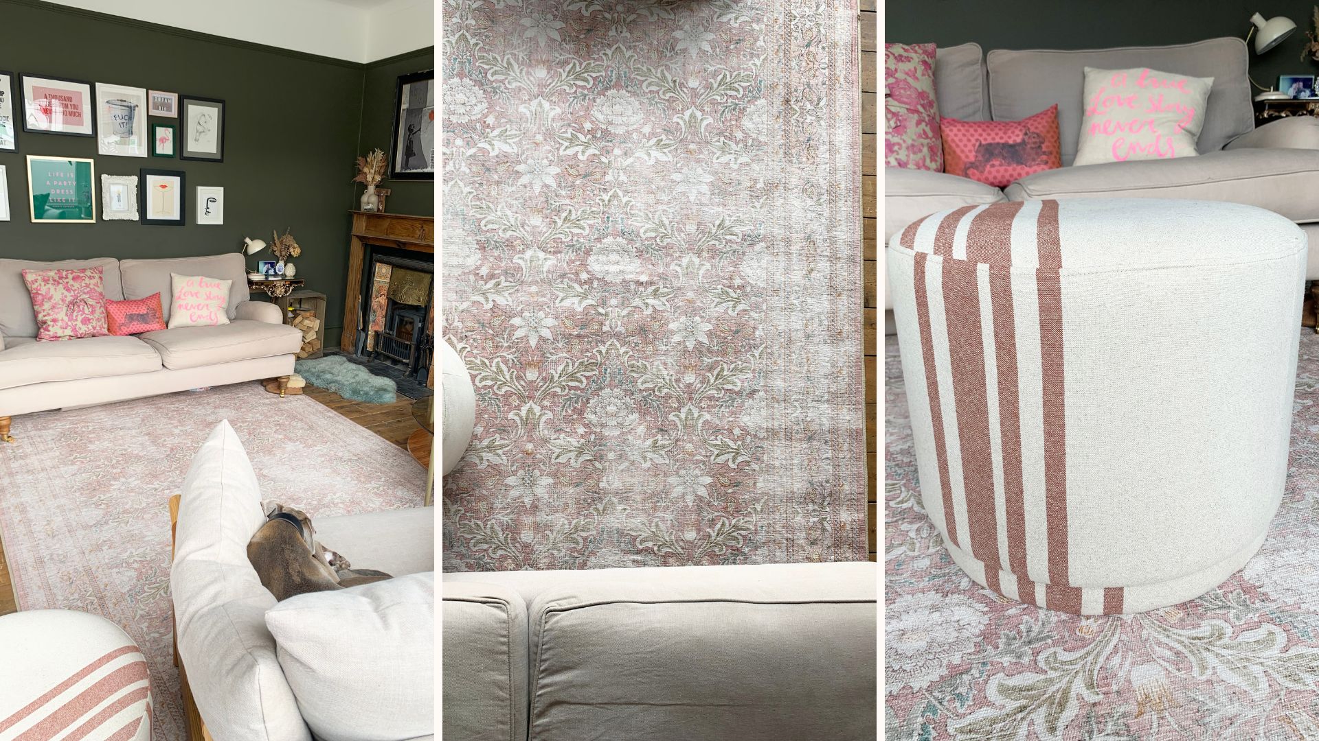
I was keen to tie pink into the scheme because I have used Farrow & Ball's Sulking Room Pink, one of the best pink paint colours in my opinion, in two connecting rooms. Therefore, there's an even greater cohesion from one room to another.
"Designers often adjust the percentages based on space and the overall aesthetic we're trying to create - ultimately, it's about creating a colourful design scheme that is balanced, harmonious and easy on the eye."
Does white count as a colour in the 60-30-10 rule?
What role do the best white paint colours play in this interior design practice? "White definitely counts as a colour in the 60-30-10 rule. In most cases, white would form the 60 percent colour," says Emma.
"Especially in minimalist (minimaluxe decor) or Scandi-inspired interiors where a clean, neutral backdrop is needed to allow other colours and textures to stand out."
"That being said, white can also function as the secondary or accent colour, providing balance and contrast for bolder, brighter shades." This might be the case for the maximalist decor trend, where bold colours dominate.
"The versatility and neutrality of white make it a valuable addition to colour schemes, even though it's technically the absence of colour," she concludes.
I could not be happier with the way my living room refresh has turned out, and I am putting this down to the more considered and balanced approach to how I've used colour.
The next room on my list to redecorate is the bathroom, and I will most certainly be applying this colour rule when redesigning the space.